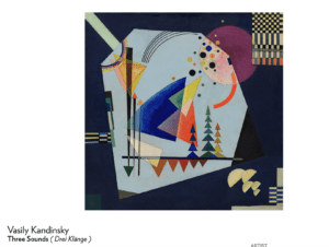
I chose Vasily Kandinsky’s Three Sounds because I was captivated by his use of simple shapes and the contrast in colors that was incorporated in the artwork. I also enjoyed the overlapping of shapes and the transparency of the shapes as they overlapped one another. The piece seems simplistic yet chaotic.
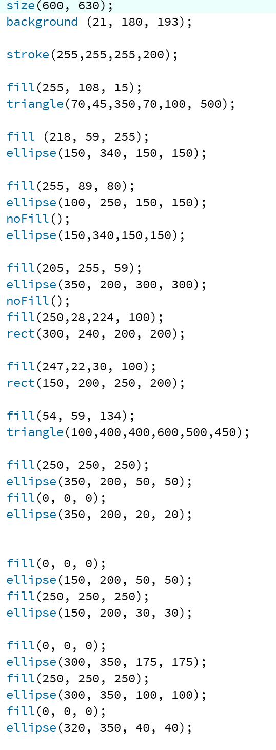
In my process of creating a work inspired by Kandinsky’s Three Sounds, the hardest part was trying to place shapes in a specific area. Since the program works on a coordinate system I did a lot of trial and error.
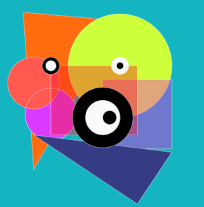
In my piece created by Processing, I wanted to play with the idea of colors really being the forefront of the piece. Unlike, Kandinsky who used a dull background and chose certain shapes to be vibrant, I used primarily really neon colors. To contrast the neon colors I added circles filled in with black and white. Like Kandinsky’s piece, he too plays with the contrast of black and white in the far right corner. I think that although our pieces are not identical, being inspired by Kandinsky, I utilized a lot of his techniques. Kandinsky used a lot of overlapping in his piece, which I too attempted to incorporate in my processing project. Like him, I also utilized simple shapes like circles, triangles, and squares.
I believe that in some aspects Processing was a good means of realizing my design and in other ways, it wasn’t as good as a media. To start off, I think it wasn’t good because I felt a little bit constrained and limited as to what I could do. I was unable to add some of the textures and gradient of colors that Kandinsky had in his work. In my perspective, the emotions in a painting drawn by hand cannot be imitated in a work drawn on Processing.