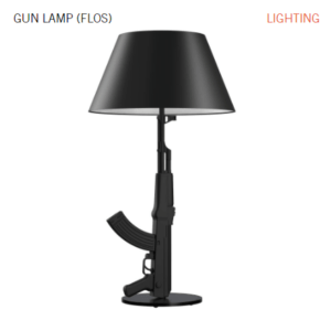
After looking through Starck’s designs, I found out two that are most intersting/odd to me personally.

This gun lamp design is the one that I found intersting. The design had done a “leap out of the box” job in using the muzzle part of the gun has the lever part of the lamp, and use the trigger of the gun in the usage of lighting up the lamp. This design has a profound or even ironic meanning without any text. One has to confirmably pulls down the trigger in order to see the light, it is a prerequisite, not a choice, that part of the personally understanding is what I could take out of this design, and more importantlly, it comes without a word. The design does not have any text on it, but in itself is the biggest, and most strong condemnation to war crime and violence.

This is not a product but a logo design that appeard on the website. Perhaps it is due to the uncanny valley effect, I think the image looks very unpleasant to the eyes, or even somewhat creepy.
Seeing human shape distorted into the shape of a long neck bottle, while at the same time seeing the product of the same shape being held at the person’s hands, gives me the illusion that the person is itself the product. That is from the emotional side, from a more physical/violent side, it looks like the person is being heavily fractured and was stuffed inside of a larger long-neck bottle.