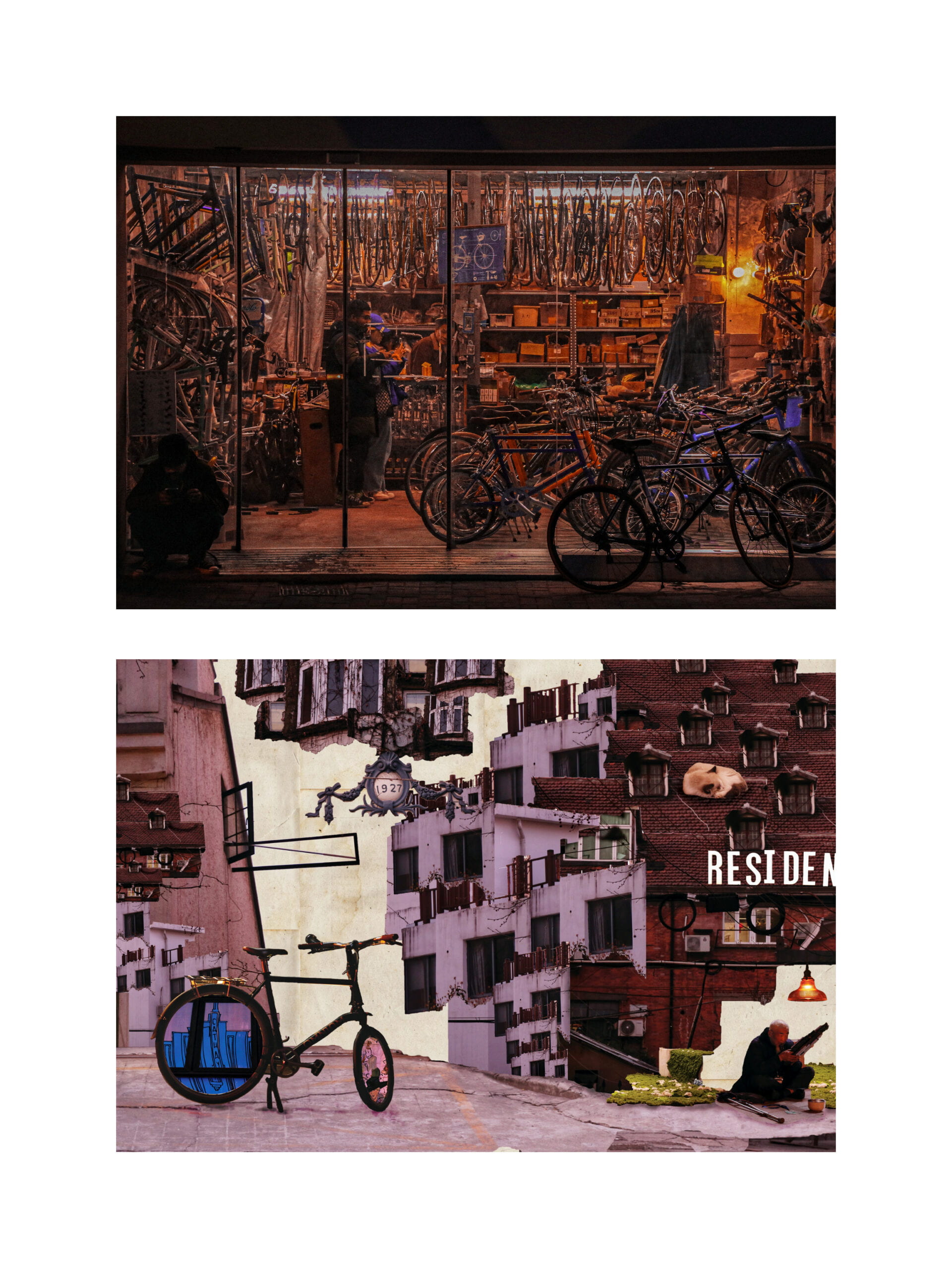
Photo Diptych
Freddie
Concept and Design
I love walking and wandering around middle Huaihai Road and the cosmopolitan community around it. This is a very unique and representative area that both perfectly reserves traditional architecture back to Republic of China one hundred years ago, including buildings constructed by foreign colony rulers and local residents, and witnesses the vast development of capitalism, socialism and globalization. My initial intention is to display the cultural impact here in Shanghai.
My original design for the diptych is mainly about: the first picture will capture a significant impact and conflict displayed by different elements on those streets, such as a modern signboard in front of an extremely old building and a relatively new one built 30 years ago in the Reform and Opening Up, and the second picture will expand and complicates this impact, I can keep adding elements that demonstrate cultural impact to showcase the charm of this developing cosmopolitan city.
Manipulation process
My first contact sheet is mainly shot on Middle Huaihai Road, Changle Road and Jinxian Road. These are three parallel roads but each have its characteristic. Primarily I captured different elements on this road including old buildings, old infrastructure, vintage stores, modern bars and street views. In the first contact sheet, I didn’t find an obvious contrast, but instead, professor Ian viewed my photographs and pick one and pointed out the contrast inside. Though abstract, I once tried to manipulate the second one based on this photograph:
However, I found all my materials are mainly old objects, but the elements in this picture, though displaying strong contrast, are in a modern style. I either needed more materials or found another first picture. So I went on my journey for the second time. This time I walked through some different roads like Julu Road and Nanchang Road. Compared to the previous journey, these roads are older and more quiet. But in the meantime, they also contain several conceptual stores or entertainment venues.
I should emphasize that all my photographs are captured in that certain moment. Any staged photography are excepted from my work. So when I saw this bicycle shop on Julu Road, my attention was immediately drawn and I quickly took out my camera and took a few shots. I sent them all to professor Ian and asked of preference. We chose this picture as the first one in the diptych:
In this picture, though the modern elements are not so concrete, but I did capture several bicycles that had very bright colors. So I decided to emphasize those bright colors inside a mainly faded orange-decorated picture. Similarly, I will use old buildings as the background and main content and insert several small but significant elements to echo and interact with the first picture.
The main connection between two picture is a design of using bicycle. Since in the first picture all bicycles are inside the shop but only one is outside. I decided to use one single bicycle in the second picture to indicate a journey from the inside of the store to the outside world of the community I’ve documented. Also a second connection is the intensity of the accumulation of bicycles, so I tried to repeat and either expand and shrink the buildings un the second picture to echo with the intensity of bicycles. Last but not least, I added apparent elements such as a wanderer playing Sheng, a traditional Chinese instrument, a sleeping cat, an old-fashioned light, a neon sign and an old plaque. These elements align with the bright color appeared in the first picture, making two pictures connect more tightly.
Conclusion
Overall my project reflects on the impact and harmony between fresh capitalism and the old culture in Shanghai a hundred years ago. The area where I took these pictures really displays a multicultural and cosmopolitan landscape. It thus highlights the diversity and comprehensiveness of Shanghai.
If I had more time, I would decorate the repeated building more carefully. Since a lack of time, I couldn’t make effects other than cutting the right figure and brighten or darken some places a bit to make the picture more harmonious.
Attachment

