Sound Visualization
Freddie
Aruarian Dance
Nujabes
My Concept and Design for the Project
The song I chooses is a little bit different from a common one. It is a type of music called Jazz-Hiphop. But my chosen song uses a sample song called “The Lamp Is Low” written in the 1960s by a Brazilian Guitarist called Laurindo Almeida. He mainly played guitar in a rather jazz style but he added local musical culture in Latin American areas. BUT, the sampled song isn’t the original one, the song with the same name is actually another classical jazz song written in the 1930s performed by Mildred Bailey, a jazz musician. But this isn’t even the end. This original version of “The Lamp is Low” is actually using a sample music called “Pavane for A Dead Princess”. A piece of piano music written by Maurice Ravel which is a classic music.
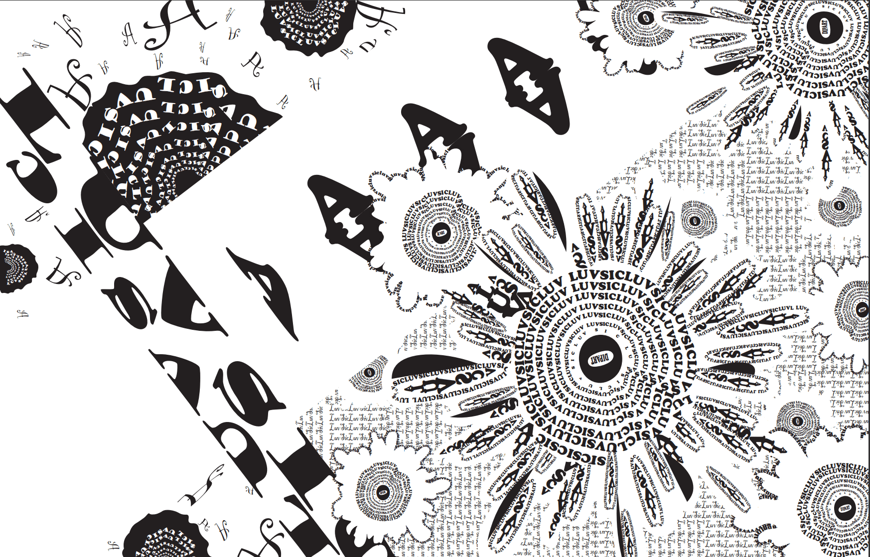
So after I’ve done so much research on this piece of music, I can find so may elements insider them that I intend to use in the visualization project. Due to the piece of music itself is an interlude in a Japanese animation called “Samurai Champloo”, I consider the two main elements: sunflowers and katana. I also consider a pavane dancer, but using negative figure indicating a dead princess, which, also build up to the sentimental rhythm and the feeling behind the Nujabes piece, but the element of princess is making the whole picture too messy so I eventually abandon the exact figure of a process but instead using negative figure of sunflowers without petals to indicate death. The sunflower stands for happiness, peacefulness, positivity but katana stands for death, fight, conflict, injury. The song sounded like mostly happiness but a bit sadness to me so I planned to use the two thirds of picture for happiness and peacefulness and one third of the page for the implication of death and fight.
As for the graphic design, especially for details, I use a lot of closure and similarity as the application of Gestalt Theory. I deliberately blur the line of the katana and the edges of the sunflower because the song is using lots of distortion and it doesn’t include clears sound effects even not the beats of the drum. So I think closure perfectly shows the blurred objects and soft feeling of the music, which no only covers up the katana, namely, covering up the unhappiness and mental injury that a departure may bring about, but also shows the endless boundary of gorgeousness of sunflowers. Considering figure/ground, I conceal most parts of the katana and only remain the handle and a small part of the body. I don’t want something sharp in this graphic design because it contradicts the relaxing vibe of the music.
My visualizing process
My first draft drawn by hands looks like this. I consider this as the basic organization of the picture.
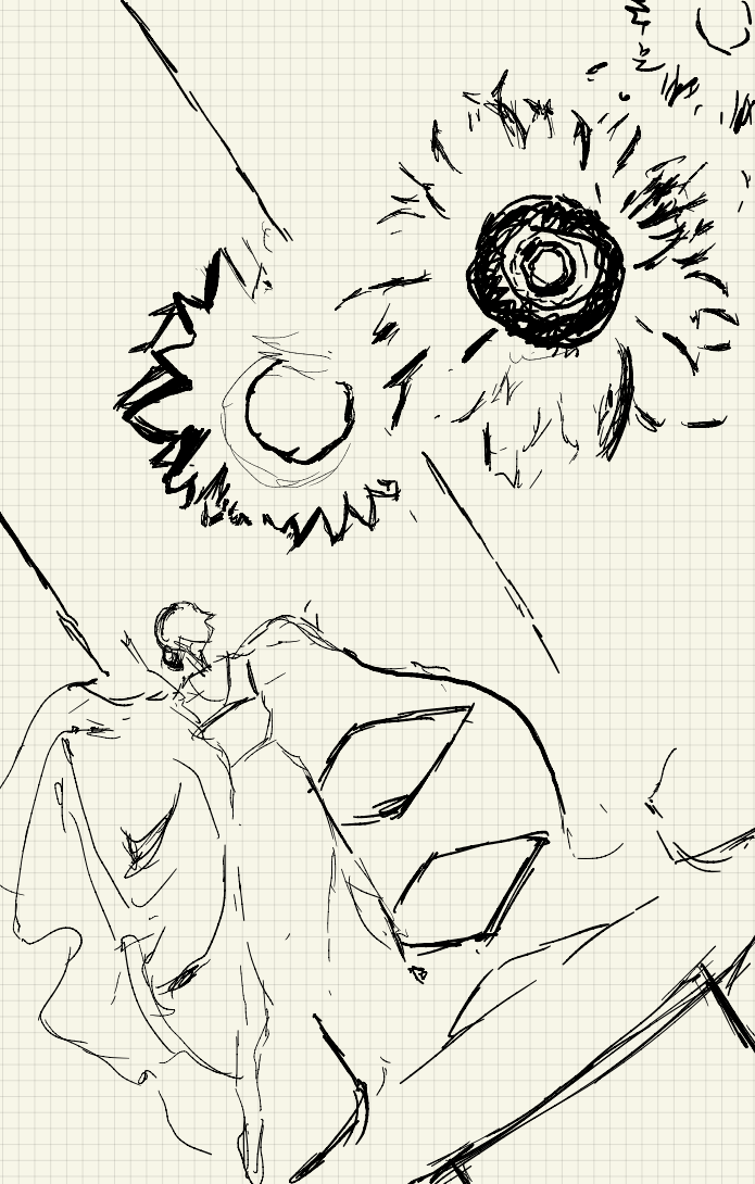
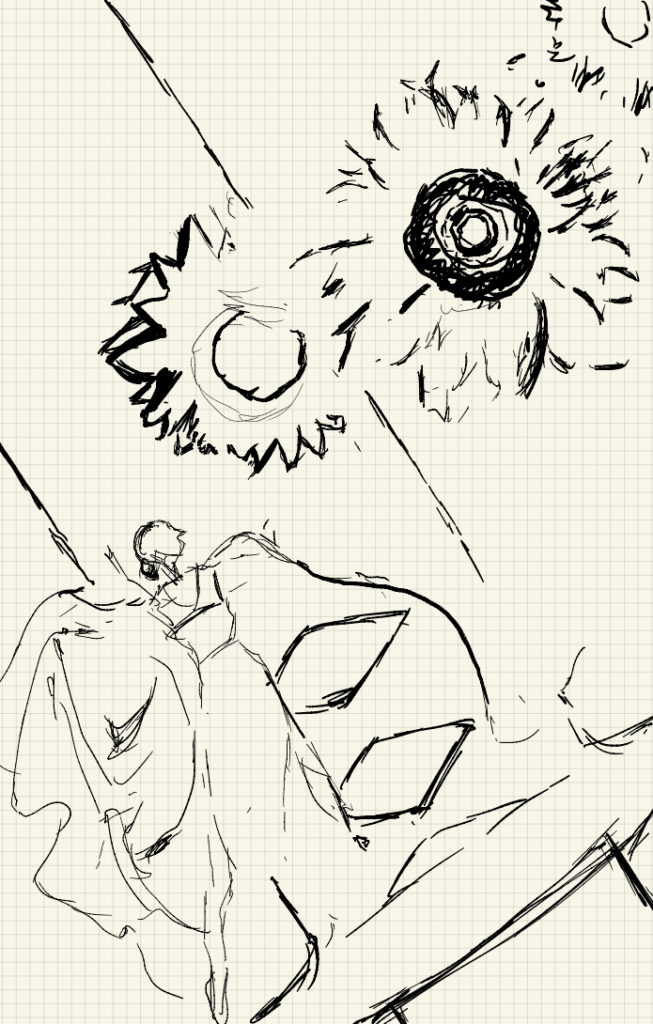
Then I use the Adobe Illustrator to draw the figures of flowers and the katana. There are a few elements I would like to mention:
On the left side I created some prismatic figures to show the Japanese style of Katana in order to let people recognize the figure of a handle as part of the katana: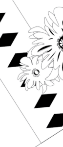
In the center of each sunflower I used different fonts of letters including a big “O” and many phrases “Luv Sic” which is a deliberately mis-spelling of the words “Love Sick” adapted by Nujabes as well as other Hiphop artists using similar techniques as a custom. Since the words are mis-spelled, it can’t be considered real words actually so they are properly used concerning the rules of this project:
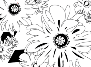


I added many layers to show the relation between flowers. Some of them look like this:
By the Mid-Critique, I merely completed the positive figures of the flowers and an initial figure of the sward. And I still have a big area of blank which I initially think of adding a dancer figure:
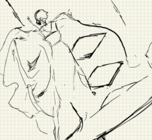
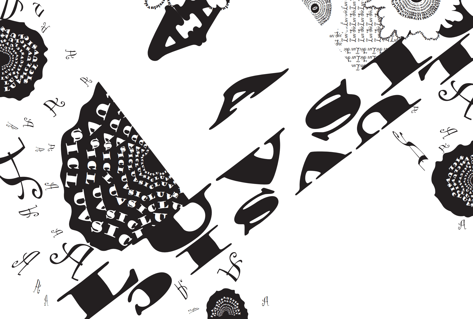
But during the critique, my colleagues and professor Ian both said that add a dancer is too much for the picture to generating a theme. My professor tells me that the balance between the katana and the sunflowers are good so I won’t need more elements to fill the picture fully. So after the Mid-critique, I begin to work with the bottom left corner where I put several negative figures of sunflowers without petals. I also use many “A”s with a very light and decorated font to indicate the fallen petals. The effects should look like this:


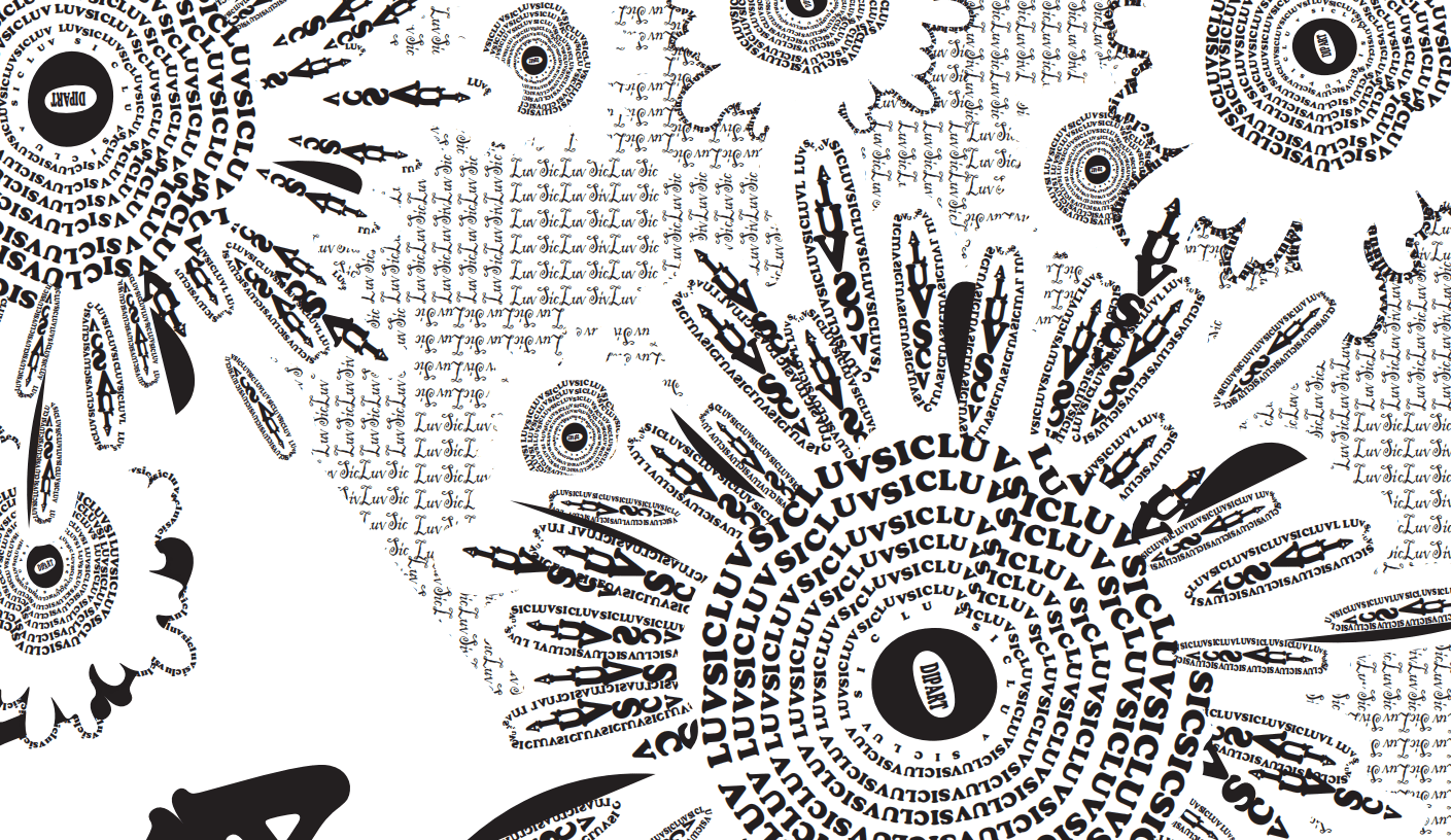
The negative figures of flowers using white decorations indicates death and sadness, as mentioned before, so then I use the opposite settings for the sunflowers indicating happiness and peacefulness. In order to adapt to the use of closure, I add a new layer of the figure of sunflower under each one, and I created small blocks of text all written in the words “Luvsic” and I adapt a very light and soft font in order to not making the whole picture too concrete so that it doesn’t feel like some music with hard beats. Finally I changed the figures on the katana into text with a concrete but rather smooth type of font:

My conclusion and reflection
I think my project reflects multiple aspect of the piece of music called Aruarian Dance itself and some many context behind it. Even though I have many different elements at hand, I kind of generate and categorize them and made them into only two elements : sunflowers and a katana. If I had more time, I would keep working on the blank part of the katana. My initial thought is to blur the line of the body part of it, but it seems to be missing something in this part that makes the whole picture a little bit out of balance. I’m been thinking adding some scars and bloodstain in this part using negative figures.
This is the overview of my Sound Visualization Project:
