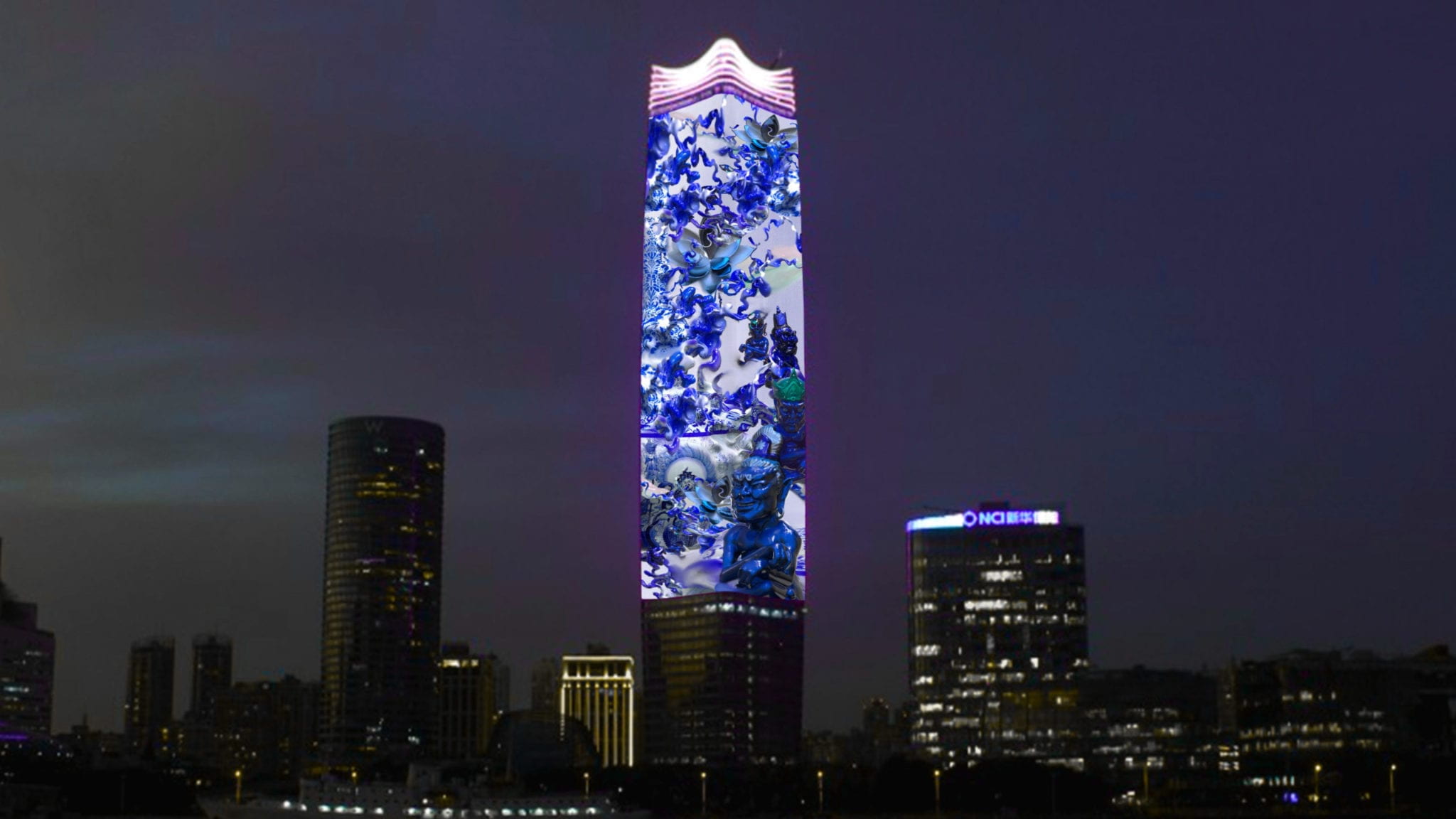
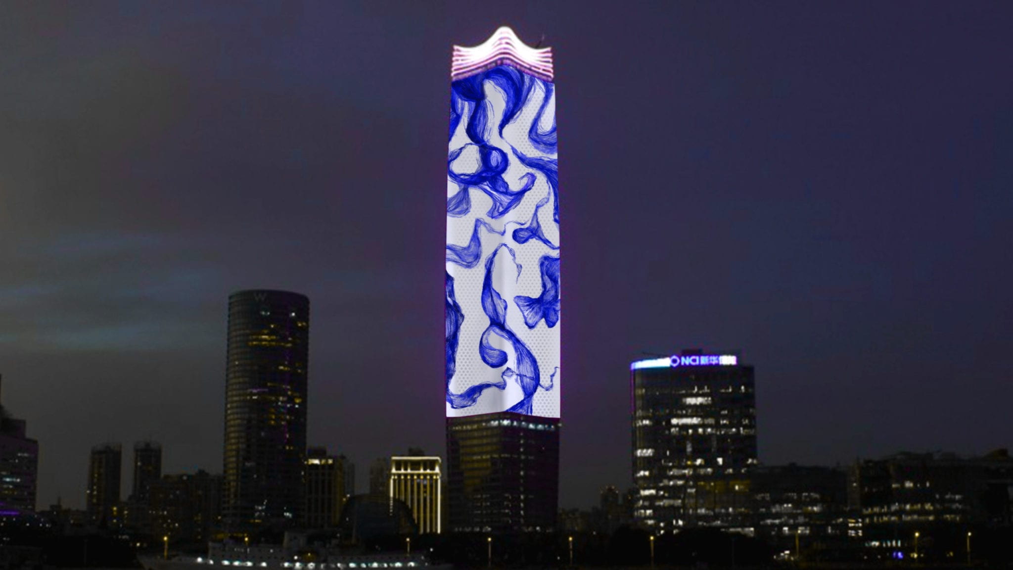
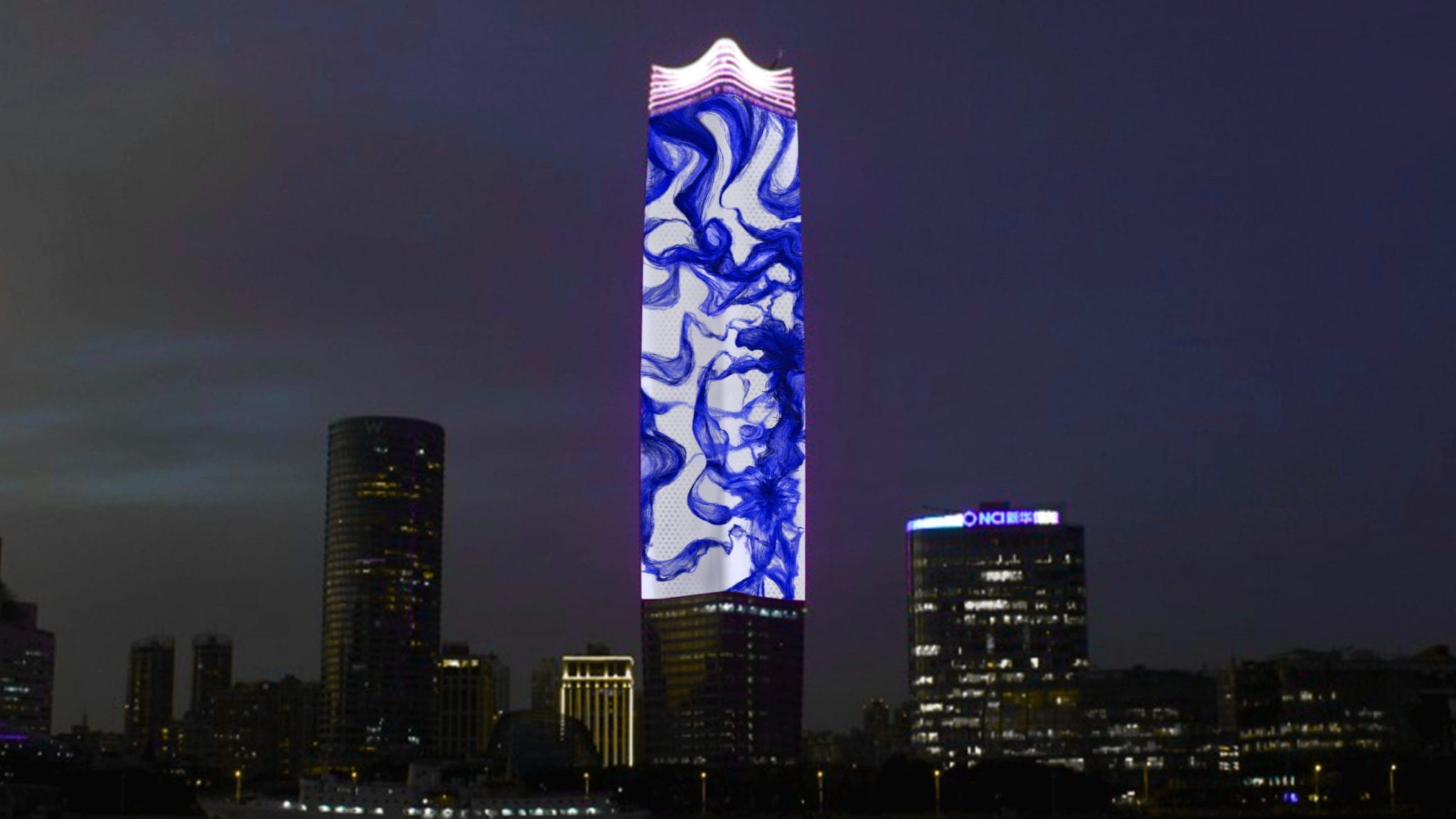
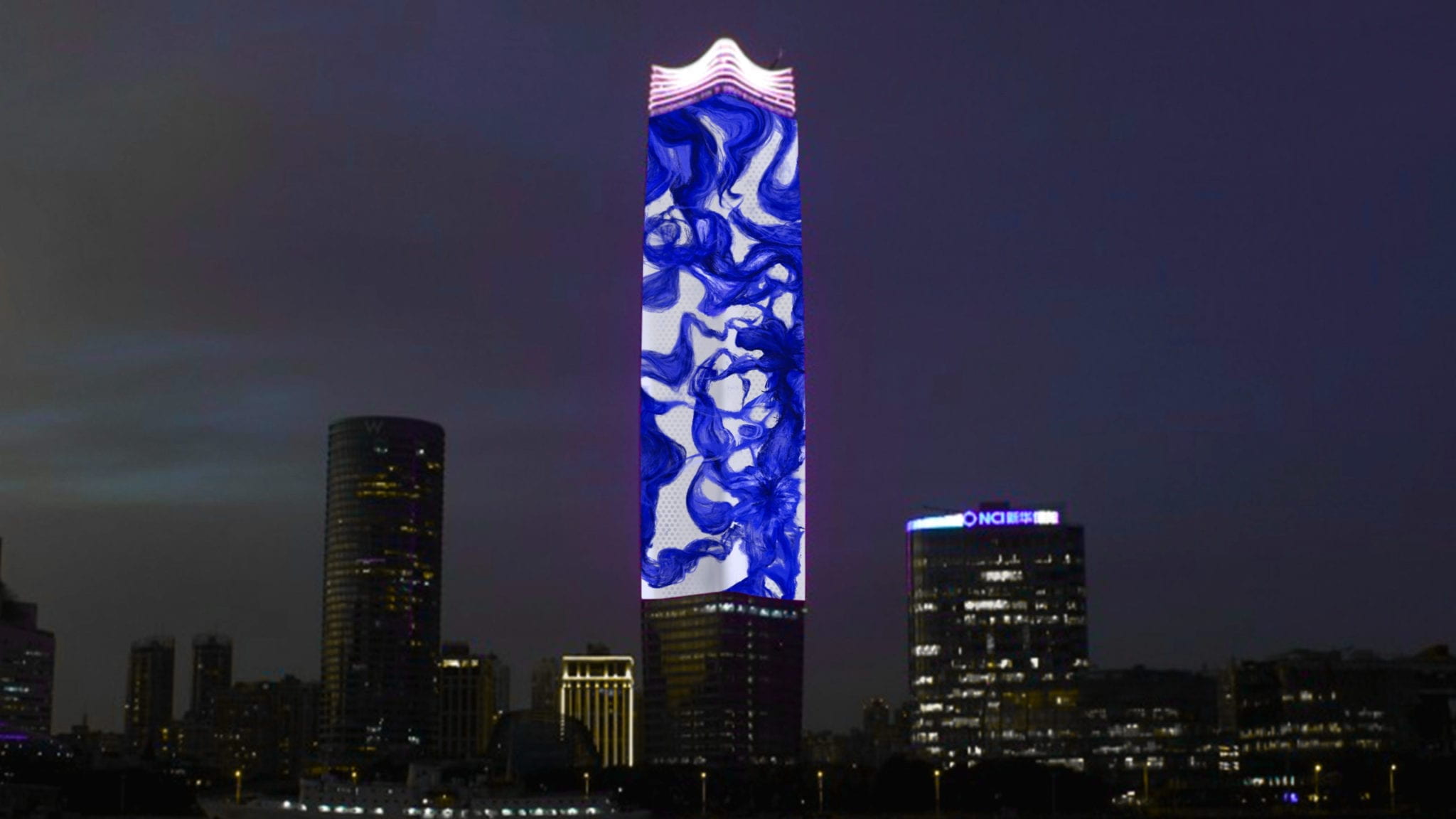
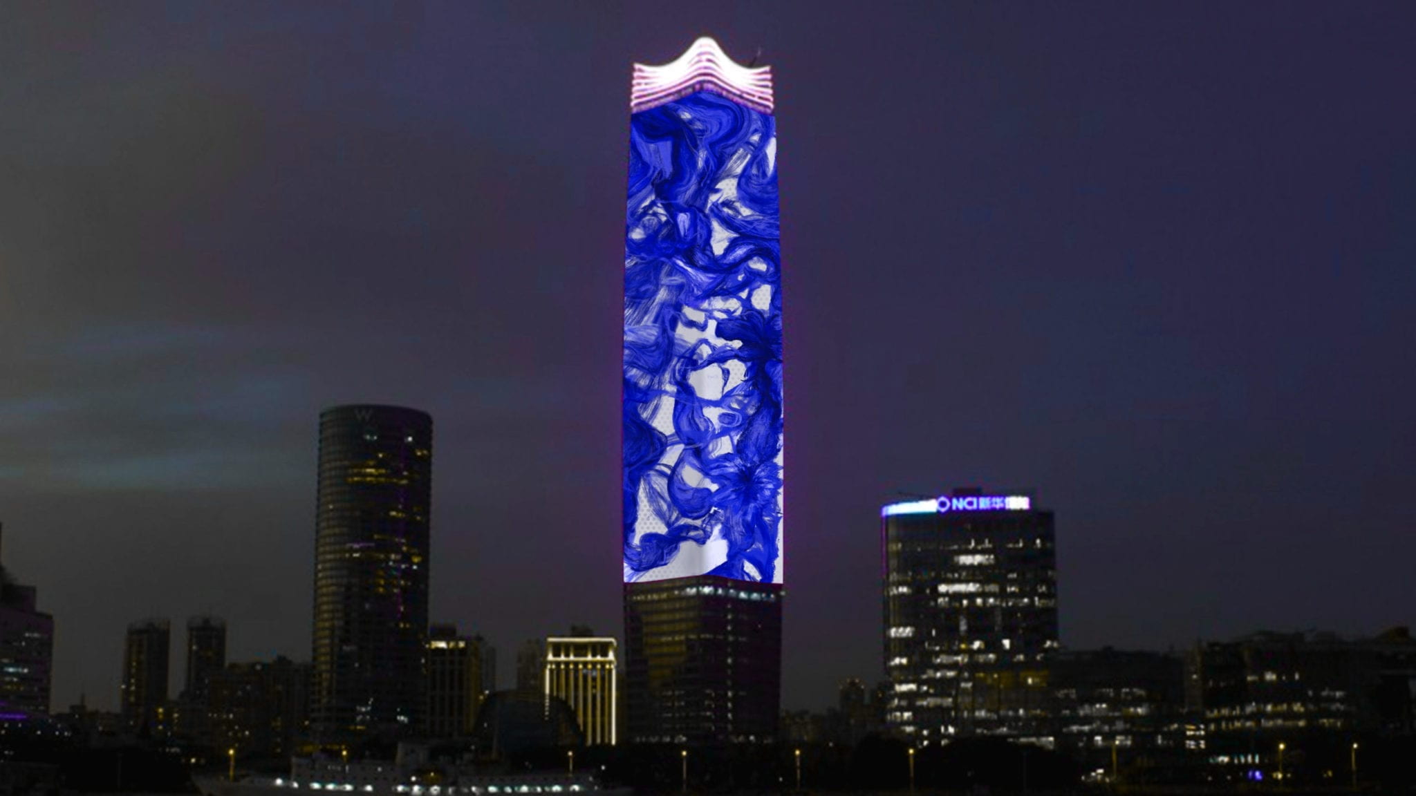
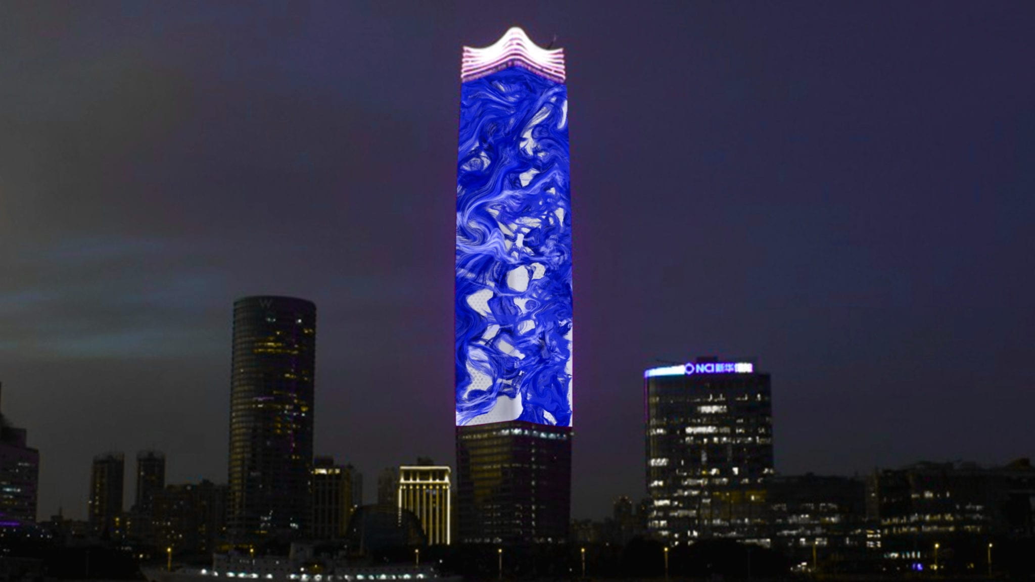
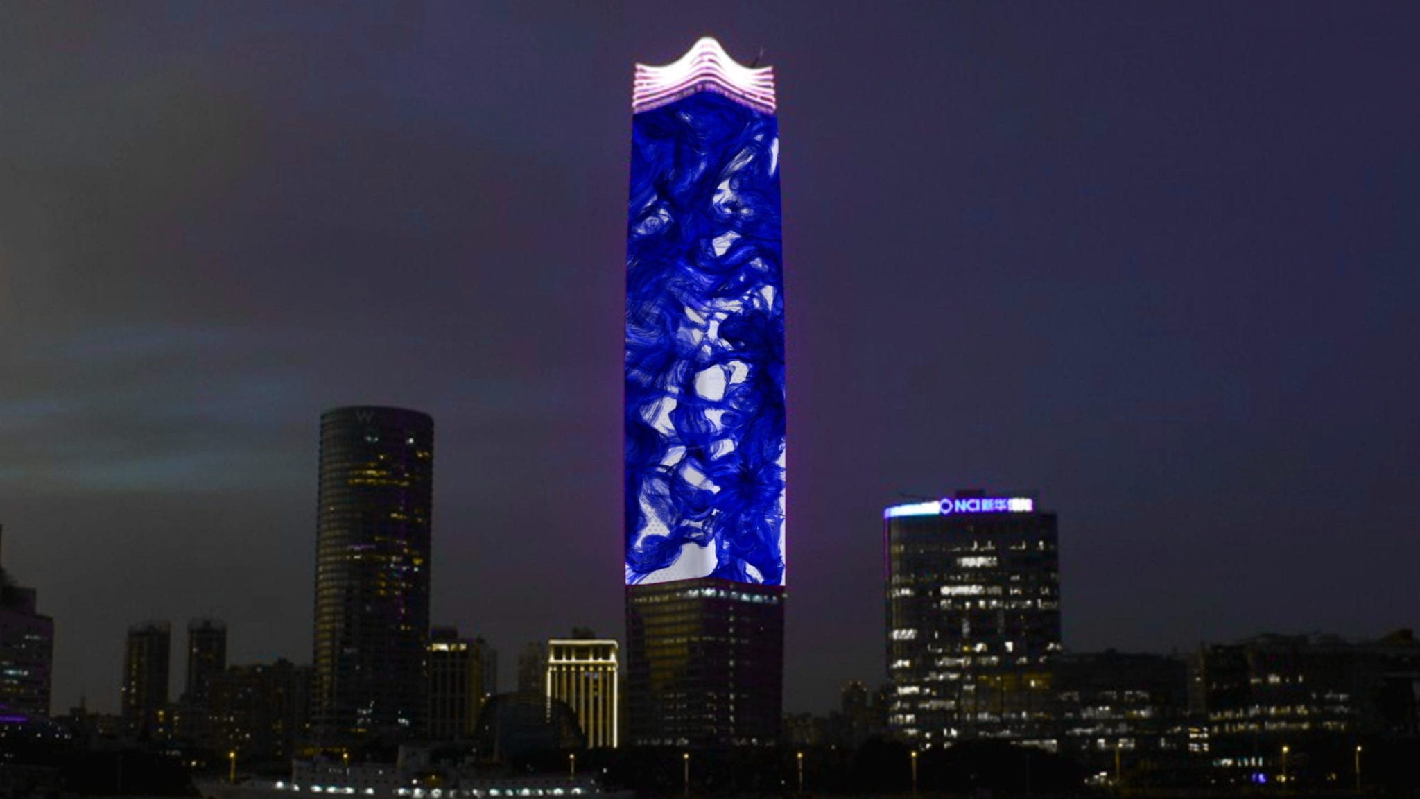
Media Facade of White Magnolia
General Background Information
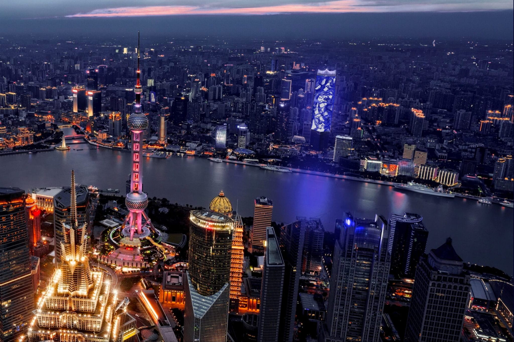
White Magnolia Plaza (Sinar Mas Center) is a complex designed as a mix-used community, consisting of three towers and a series of smaller-scale buildings. It is located next to the Huangpu River from Pudong, situated in the North Bund riverfront district. The tallest tower has a height of 320 m, which is also the tallest construction in Puxi. It is a 69 floors office building, covering a total area of 57,000 m2, with a gross floor area of 420,000 m2.
Design
The design of the tower has an organic form, inspired by magnolia, the “city flower” of Shanghai. Extracted from elements of two overlapping Magnolia, the designers use an abstract polygon as the footprint of the tower. The organic shape is extruded upward with a steam line curvature, slightly inflating in the middle and tapering inward to the top, ending with a capital shaped like a magnolia with seven pedals. The base or the podium is designed to mimic the flow and shape of the river valley, connecting all the smaller constructions next to the skyscraper.
I believe the content of the media facade should inherit the design principles of the tower itself, organic and metabolic. It would be better if it contains elements of magnolia, maybe abstractly and indirectly.
Client Analysis
The wealthy white-collar elites, the hipsters from the W hotel, and the young families in the surrounding residential areas should be the primary target for this project. During the day, White Magnolia Plaza holds business meetings and gatherings for office workers. At night, it is the sanctuary and playground for youngsters, providing a variety of nightlife activities. For North Bund residents, the Plaza is a good place for shopping and entertainment during weekends. However, the screen contains a far wider range of target groups besides the audience living nearby. Given its unique location, angle, and height, the screen is highly visible to audiences on both Pudong and Puxi. One side of the screen is facing directly at the Lujiazui Financial business District, and the other side facing The Bund. Since these two locations are must-go attractions for tourists, the screen would be impossible to miss.
Taking account of all these factors, I believe that the content on the facade should be exquisite, graceful, and elegant in order to represent Shanghai as an international hub. I would like to include some sort of Chinese elements in the content. These symbols don’t have to be very obvious and direct in terms of form, or else it would be cringy as hell.
Concept Research & Design
Concept 1: Porcelain
(Inspired by my previous project)
