Prompt
Document the exercise you did during the class and comment on your experience with 3D modeling and how Rhino compares to what you have used for 3D modeling already. If you have zero experience, comment on how you felt using the software. Finally, comment on your expectations for taking this course.
why do we visualize data?
What do you think makes a data visualization/physicalization good? How does this compare to Art?
Do you see any benefits of designing data physicalization compared to traditional digital visualizations?
Data-objects: Thinking with your hands (NYU Book Link) —> Download the chapter here
Response
(1)
The interface of Rhino is very intuitive and user-friendly, and the 4 different views (top, front, right, and perspective) make it easy to double-check the shape of my objects from different angles. I got in touch with Blender a little bit this summer, and I somehow feel like Blender is easier to use because I prefer using tabs to using the search box as it requires your hand to leave the mouse and type on the keyboard. While Rhino does have more powerful functions that I could explore as my experience accumulates. For the course, I expect to learn more about the world-famous data physicalization artworks and the concepts behind them besides learning the software. I also hope to grasp an understanding of collecting and analyzing data properly and efficiently.
(2)
We’ve led a digitalized life for so long that when we think about data, we immediately think of numbers and statistics stored in a digital device, while only when a dataset is visualized, no matter in a graphic form or physicalized, it gives meaning to the data that originally doesn’t make too much sense to its audience, which helps us a lot on our way trying to understand the world. Especially, data physicalizations acquire a stronger impact. “When data is represented in three-dimensional space, we gain access to at least three additional variables: space, form, and material.” Now that the information is accessible to people’s perceptual senses, including but not limited to the visual, they don’t just learn it, they experience it. As we all know, “creating an experience is an instrumental step for information to be perceived, synthesized, and transformed into knowledge.”
To make data physicalizations outstanding requires us to think about it from different perspectives. The dataset should be informative and have a reasonable amount for us to have a ground to build on. It will be better if the dataset is consistent with how we want to tell the story and the concept we hope to convey. Thinking about these issues helps us collect and analyze the data in a more efficient way. The visualization implies ideas better if it’s intuitional and interactive. When the body is engaged in movement and interaction, more interpretations can be triggered, thus a deeper relationship between the artwork and the audience is built. Last but not least, considering the choice of objects is always essential in the process of physicalizing the data. Physical objects can more or less have a symbolic meaning or a cultural association, and that’s what artists should be careful about. If the choice of object is against the cultural tradition and religious belief of most of the audience, the data might be perceived in a bad way. However, if artists make a wise choice of the object to represent the data, it enhances the impact. For instance, this piece of enabling wearables is jewelry (as a choker) that represents the percentage of women who have suffered sexual abuse from their partners across the globe, but its other form (as hand jewelry) also represents a self-defense weapon, which is a good choice of objects that elevates the meaning of the work.



You may ask, why data? Without data, we can also create digital visualizations that are meaningful and aesthetic. Personally, I believe that data in an artwork gives an objective perspective so that the audience wouldn’t feel highly manipulated by how the creator thinks when looking at the artwork. Instead, they may feel the freedom of interpretation and a stronger correlation between the physicalization and the real world they experience. In April this year, I went to an exhibition of Liu Jiayu, a new media artist based in Lo
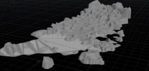 ndon and Beijing. One of her installations, The Riversides (2017), is an impressive 3D scanning project using real-time data. It projects a flowing creek in Beijing on the riverside of the Thames River, London. “It allows the experience of the natural state of GMT+8 time zone in the GMT+0, as the visitors walk along the riverside and recalibrate the flowing nature of different cultures,” Jiayu explained. I was deeply impressed by the work and I could imagine people who are emotionally connected with the two cities appreciating the work in person, feeling the power of two cultures tangled in the shimmering digitalized river.
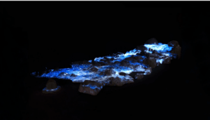

That’s the magic of designing data physicalizations rather than traditional digital visualizations as it is so related to our real-life experiences and the objectivity of the data in a sense sets the audience free.
