Part1
Project Description
Into the Explosion: the dreamy part about fireworks
p5js. code
https://editor.p5js.org/sf3972/sketches/C6WnOFHCt
Elevator Pitch
The explosion is momentary. Captured the moment when particles in a firework explode and become smoke, what’s momentary is turned into something eternal.
Abstract


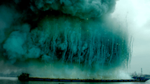
The project is inspired by the Chinese fireworks artist Cai Guo-Qiang who paints the sky with explosives. Specifically, I selected a scene from the explosion event for the opening of his Ninth Wave Exhibition in Shanghai in 2014, where the black smoke rises upright and expands into a huge, natural slow-motion effect in the air, leaving enough time for people to be immersed. Then billows of green rose and myriads of stars glimmered briefly among them, blending green and black to reveal the reality and emptiness of outer space.

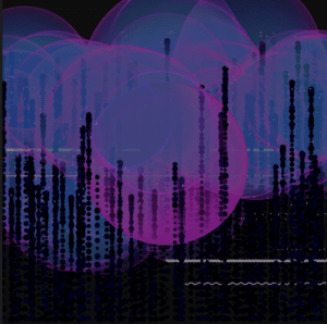
The explosion is momentary. The beauty it creates is irreproducible as the sparks are in a state of constant change each time. And the fun thing is, when the explosion happens, it is always out there in the sky or in the distance, making it unable to observe it in a close way. What if we have an imaginary microscope? What would we see? It’s a thing that’s fascinating only by thinking about it. Billions of particles meet and part, reacting with the air, formatting fleeting beauty. I chose to use vertical lines soaring up to demonstrate the formation of fireworks. By using the oscillation and the frame count comprehensively, I changed the size and color of each dot and make up the lines. In addition, the Perlin noise might be a good way to interpret the explosion of fireworks, as they are both made up of tiny particles and shown in a random way. Eventually, there are tiny sparks that pop up wherever a soaring line ends. The color palette of the project mainly consists of two colors, pink and blue, which creates a dreamy and cyberpunk vibe for the canvas.
Part 2
1) Process: Design and Composition

In an attempt to reach a complementary balance, I decided to make something sharp in the front and create a misty, blurry background so that there is a contrast that is fun to look at. My color choice is dark pink and blue, with the black and transparent background, they together create a dreamy, surreal vibe. For the interaction part, users can click the mouse to create random curly lines, which do need improvements because they seem a bit disconnected from the main objects on the canvas.
2) Process: Technical
Describe the technical development process of your project. Describe the technical challenges that you faced, solutions you found as well as compromises you had to make.
What could have been implemented better and what changes you would make if you had the chance to do it all over again? What discoveries did you make along the way? Be as detailed and specific as you can.
I’ve decided to use Perlin noise for the background from the very beginning, and thanks to my practice in previous mini projects, I inserted the noise and adjusted it smoothly. Additionally, I added a life span to the noise under the guidance of one of the learning assistants so that it wouldn’t keep generating to mess up the canvas. Apart from that, I wanted to create something with real-life physical motions in the front. Thus, I added velocity and acceleration to the array of dots.
What didn’t go very well was that I originally wanted to make each soaring firework (the vertical lines) explode when they reach a certain height. However, that part was a bit beyond my coding capability and I struggled there for a long time. I eventually compromised and decided to switch to using a Boolean value to regulate the lines so that when they end, there would be tiny particles popping up surrounding where they diminish.
3) Reflection and Future Development
There’ve been quite a few changes and adaptions from the proposal to its current version. For instance, though I created the physical motions for the dots so that when they bounce up, it looks more natural because their velocity reaches zero when they reach the top, I eventually added transparency to the background to demonstrate the tracks, and the physical motions could no longer be seen. Moreover, the color looks much more futurist than the inspiration and some classmates refer it to as “cyberpunk”. I figured that the more I explored, the more randomness and surprising effects I could get. I also received a lot of practical feedback from peers and instructors on the presentation day, which I appreciated a lot. For instance, Amber suggested that a lifespan could be added so that the canvas wouldn’t be too messy after generating for a long while. Professor Leon pointed out that there lacked interaction, and that I could select several color pairs so that each time that I run the code, there would be two different colors. I believe that is a very useful suggestion and I will definitely consider applying it the next time. In addition, the most part I need to work on more is the interaction. For this project, I only added mouse click to create parallel decoration lines while there were supposed to be more fun and creative interactions.
