Title of music/ Artist name
A Lovely Night by Justin Hurwitz
Concept and design

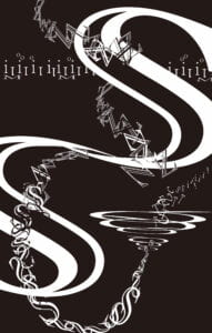
As a big fan of the movie La La Land, I am also in deep love with its charming music. A Lovely Night, a brisk serenade, is one of them. River, dress, light, whistle, dancing in the dark…with these words swirling in my mind, I started to sketch. My first step was to make a black background to create a dreamy vibe, letting the white letters dance their way on the canvas. By stretching two big s letters in the middle and blending multiple smaller z and s letters together, I made two flowy strings tangled in a gentle way, just like a tango. The expanded o letters and background lines were designed to show the impressive and dynamic instruments, which added a lot of colors to the song.

Along with my own ideas and comprehension of the music, I applied the principle of Gestalt theory to my project. For instance, the symmetrical s letters imply similarity, while the thinner string is an example of proximity. Furthermore, for the principle of closer, by making some of the z letters empty in the filling while making others bold, I tried to create light and shade, thus making the string three-dimensional. These attempts were mostly inspired by the One Black Square Project, which led me to think about the relationships between elements thoroughly.
Process
As I mentioned above, I put a lot of effort into the thinner string in order to portray the ever-changing emotions of the music, which I believe was a significant step. However, I sort of neglected the visual effects of the two big s letters, as Inmi pointed out in the mid-critique. Through talking through it with her, I figured that the bold letters were overpowering the other elements on the canvas, in other words, too eye-catching. And they could easily interrupt the audience from perceiving the smaller letters. Therefore, I made them much thinner and fill tiny m letters in the middle, thus balancing the power of the two strings.
Conclusion

To wrap up, my process was relatively smooth this time, probably because of my previous experience in the One Black Square project and my familiarity with the song. If given more time, I would reconsider the filling of the big s letters since I’m still not sure whether it is a wise choice. Overall, the process of completing the sound visualization project was quite enjoyable, helping me see through music and topography from a new perspective.
