

╔ ╗
╚ ╝
A) Concept:
The memory, or group of memories I have chosen for this assignment are when I cook with family. Specifically, during holidays when my extended family comes together to prepare food for everyone. I distinctly remember feeling very much at home when hearing the bustling kitchen. People catching up to each other in Mien, giving instructions in English, hearing the rhythmic pounding of the mortar and pestle, the sizzle of a frying pan or the rumbling of a boiling pot. Although some people could see a busy kitchen as overwhelming, it always served as a comfort for me. So, in this project, my aim was to explore how to create a busy, but also homely and cozy atmosphere.
B) Process:
Firstly, I knew I would need various kitchen sounds. I tried to gather several files with different frequencies and timbre to add diversity into my soundscape. Since my concept is centered around a busy kitchen some of the files are just different variations of the same action. This way I could gather as many noises as I could without spending too much time doing it. I recorded everything on the Tascam camcorder in my home kitchen. I made sure to only record when the house was empty, but sometimes people yelling outside would interfere. Luckily some of the verbal aspects were intelligible so I was able to keep them is as background noise to help further the busy kitchen feel. Although a big part of my memories is the interaction between people, mainly through speaking, I worked around this by recording people making conversation and laughing to provide as more background ambiance.
During my editing process, even though my core concept was a busy kitchen, I didn’t want to immediately shove numerous noises at the listener, so I started my audio slowly. I faded the background voices in first, then added the lighting of a gas stove, this way it indicates to the listener that the audio is beginning, and I can let it build up naturally. As I added new sounds, made sure to maintain realistic panning, the stove noises were always on the left, while the cutting boards stayed on the right. The sink I placed in the middle, and the clinking of dishes I kept varied. Some of the sounds pan from one ear to the other, which tells the listener that people are moving around. I also found that navigating so many similarly length files was very difficult. It was hard to keep track of which tracks I had already used and edited versus the ones that remained the same. For future projects with various files, I would make sure to name them before importing.
C) Conclusion:
Upon presenting to the class, I found that it was difficult to hear the audio well in the classroom. This caused the intention and concept of the piece to become unclear. Moving forward, I will remember to test the sound without earbuds in, as the sound output is quite different. I also found that a positive and unchanging emotion like domesticity is hard to emulate through a soundscape, so I think if I were to redo the project, I would use a more dynamic feeling to show in my piece.
1. What are the precise rules of each of the obstructions?
2. How does Jorgen cope with the obstructions?
He works creatively with the first obstruction, giving himself three days he successfully remakes the film with artistry. The second obstruction he tries to work around the obstruction slightly, much to Lars’ charign. In the third obstruction Jorgen decides to redo the second, and thus learns from his first mistakes to recreate another successful film. He had rather chose a prompt with a framework to guide him instead of one with so much freedom his creativity wouldn’t be focused. The fourth obstruction was difficult for Leth by himself, so he called in a specialist to help him also work around the obstruction. In the fifth obstruction, Jorgen has no choice but to oblige to the rules of their deal and ‘creates’ a film unlike his usual quality.
3. What is the effect on the movies he produces?
Because the obstructions were created in order to bring about Leth’s failure, Leth was able to experiment and improvise in ways he never would have been able to otherwise. These experiences were like exercises for his creativity, in which he was constantly working at it to overcome each obstacle. This resulted in a series of remakes that were inherently artistic original in creation.
4. Other thoughts crossing your mind while watching
I thought this film was confusing at first, but as the story went on, I found I liked the concept and message a lot. Its very thought provoking and limit-stretching in my opinion. There’s a lot that can be said in the way the two people foil each other narratively and how that reflects creativity and it’s flaws.
1. What is the significance of the authenticity and representation of the truth in the media that you consume on a daily basis? What is the role of a live broadcast?
The type of media that I consume on a daily basis is inherently manipulative. The presentation of information can easily be altered or misleading to support one narrative, and the algorithm that feeds me these media pieces could potentially give me a false sense of reality. Especially with modern social media and how the mass public have access to all sorts of information that is filtered and sorted by singular corporations. Live broadcasts give the public a sense of security. As live-streaming is unfiltered and unedited, it can show a more authentic version of an event. But once again, live broadcasts are not immune to manipulation. The intent of the camera man matters in how the information is given to the viewers, the way the stream is presented or even the platform it is being broadcast on can change the way it is viewed. From my experience and knowledge, it is impossible to label any piece of media as authentic, as anything translated from real life to the digital world can be considered an alteration to reality.
The memory I want to focus on for my memory soundscape project is cooking with family. Food has always been a big part of my life, and it’s also my favorite way to connect with my culture. My family would often have big gatherings where my aunts would prepare lots of food together in the host’s kitchen, so I want to emulate this kind of scene. The type of feelings that I want to convey with this are domestic and heartwarming. Since cooking itself is a homely activity, I plan to use lots of generic kitchen sounds, like chopping, water boiling, sink running, etc. Since I also want to convey a domestic environment, I also want to include sounds of many different people as a family, like kids running around, people communicating in the kitchen, laughing, etc. I think with a mix of human and kitchen ambience, I can successfully produce a domestic and heartwarming feeling through this memory.
╔ ╗
╚ ╝
A) Title:
Yearning
Project by Aspen Saechao
B) Concept:
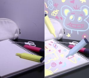
My overarching concept for the diptych assignment was nostalgia. I think nostalgia is a complex, multi-layered feeling, so I broke it down into two parts: past and present. With this, I decided to use the original photo to show the present and the edited to show the past. The original was made to show how the world is bleak in the present and contrast against the playfulness of the edited photo. The combination of these two ideas would help create the idea of nostalgia which is inherently bittersweet and contradictory itself.
C) Process:
For the photography portion, I wanted the setting to feel like a child’s desk with materials strewn around haphazardly This resulted in a few composition experiments. They’re all mostly the same because I wanted to focus on arranging the colored highlighters so that the viewer’s gaze is directed around the picture with the larger white items as resting points. The location I chose for the photos was a black table and white wall to compliment the primary triadic colors with the other white objects. The lighting for this was based in harsh white lighting, to replicate the overhead lights you would usually see in schools. For this I kept my ISO mid-ranged because I did want a contrast of shadows, but not so much that the light loses its effect.
In the digital portion, I needed to change the atmosphere of the picture. I already knew that I wanted to draw childlike doodles on the empty white spaces, but the lighting was a little too dramatic and moody for that to start. So to begin, I focused on burning the edges of all the shadows in the photo to lighten the overall brightness. Then, I decided to make the highlighters float, which added a fantastical feeling to the childlike scene. I did this by selecting the highlighter and changing the hue. Here I took advantage of the blue highlighter not being in the original photo and added it to the edited one. This allows me to reinforce the idea of the present not being the same as childhood, as the palette for the edited photo has the primary colors, while the first, does not.
When I printed my two photos, the coloration was tinted redder, which threw off my original ideas for the color palette. However, I decided not to fix it in the end, because it reminded me of the phrase ‘rose tinted lenses’ which often refers to people looking back at their memories with a positive outlook, even when that wasn’t actually the case.
D) Conclusion:
Overall, I think my images do represent what I was aiming to do, especially with the contrast of moods. If I had more time though, I think I would try to bring out the interaction of the two photos so it’s more obvious what I want to convey. I think it makes sense when I explain my process and intentions, but it’s also important for the photos to be able to speak for themselves. Right now it’s not very obvious that one represents the present and one the past, so I would aim to expand on this.
╔ ╗
╚ ╝
A) Credits:
Project by Aspen Saechao
ᴺᴼᵂ ᴾᴸᴬʸᴵᴺᴳ : 夜に駆ける (Racing Into the Night) by Yoasobi
1:55 ───|────── 4:41
ᴠᴏʟᴜᴍᴇ : ▮▮▮▮▮▮▯▯▯
B) Concept and Design:
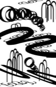
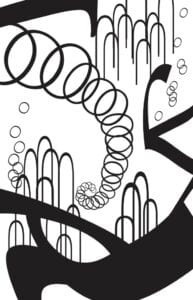
The initial idea for what I wanted my design to convey was a long, winding buildup, which was the overall feeling I felt from the song itself. To achieve this, I tried to pick letters that had a lot of curves. I didn’t want sharp turns likw A’s or T’s because I was going for almost like a spiraling sensation. The mood of the instrumentals as well, were light and bubbly, which would suit rounded typeface better than angled ones. These specifications allowed me to narrow the letter choices, and I ended up with ‘W’, ‘O’, ‘U’, and ‘S’ as my type palette.
I noticed that I didn’t use much size variation in original ways, in my one black square project, so I wanted to stretch these letters to my advantage in this assignment. I also felt that proximity was a strong suit in my black square compositions, so I wanted to bring that same concept over to this project. Along with similarity, I tried to go for unified elements for each letter that I planned to use, hence the bunched ‘U’, ‘S’, and ‘O’s. With these goals planned out, I started piecing parts of the composition together.
C) Process:
My first draft included a large ‘w’ that I wanted to use to use as the central figure piece, and patterned sections of repeating letters surrounding it. I duplicated the ‘U’, ‘S’ to connect and overlay each other to create the similarity and proximity effect. The ‘O’ was arranged into tunnel like figures that helped convey the spiraling buildup. Since I was looking for rounded typeface, the font I used initially was ‘Brush Script’ because it produced very curvy ‘W’s. After the mini critique, I realized this font didn’t suit my song well. Racing into the Night is a very light, long winded sounding song that I found fits a thinner font instead of the heavy bold of ‘Brush Script’. This prompted me to change my font to a serif instead, which gave me much thinner letters. I also noticed that my composition focused on proximity a little too much, to where my attention to the rule of thirds turned my design into three separated parts. To fix this, I only used one ‘O’ spiral and put it in the top two thirds of the composition to lead the viewer throughout, thus connecting the whole piece. Since the font was changed, I also used the ends of three ‘w’s to create a large dynamic shape that helps weigh the composition at the base of the work. I also added one at the top to provide balance, otherwise I think I would’ve had the same issue with the ‘separate parts’. I also decided that the ‘s’ in the original draft wouldn’t serve much purpose in the new one, so I opted for a bubbling effect with more ‘o’s instead. This fit with the song’s tone much better as well.
D) Conclusion:
In the end, I think my final draft was definitely much more developed than the first. I was able to create more depth and cohesiveness while maintaining the original elements from my conceptual plans. In the future, though, I think I would expand on my ideas and make my composition more intricate. I think I would be able to add more variety given more time in order to fully develop my intentions.
1. What is the overall concept for the Diptych? What are you trying to convey?
I want to convey the idea of nostalgia through depictions of general childhood experiences. I’m gong to mainly focus on the feelings you experience when looking back on memories and the associated feeling of displacement.
2. For the Diptych project, one cannot exist without the other. i.e. The existence of both images complete the project. One is only a partial information. What kind of conversation do the two images create and assist each other to convey the concept together?
I want the two images to compare the differences in past vs present and the feelings being contrasted, which is what sums up the concept of nostalgia.
3. What image(s) do you plan to take photos of?
The objects that I am using for the photos are a sheet paper, scissors, and three highlighters. Each highlighter is a primary color, while the scissors and paper are plain white. This is to limit the palette to a primary triadic combination, which would produce a childlike atmosphere. Since I also want to focus on displacement, the color white serves as a blank void that symbolizes
4. How do you plan to manipulate the image(s) using Photoshop?
The first photo will represent the past, while the second photo represents the present, so I’m mostly planning to use photoshop to change the mood of the second piece. I’m thinking of doing this by altering the colors or perspective of the photos. I want the two pictures to be similar, but edited to be slightly different to emphasize that disconnect between past and present.
1. What does Ritchin mean with the “fluidity of the digital”? Give an example of digital imaging/digital photography that exemplifies this.
Ritchin says that the ‘fidelity of the mechanical age’ is being replaced with the fluidity of the digital. I think this refers to how easily it is to change and edit photos with our current technology. Photoshop, for example, is the most commonly used application to edit media. It has the power to change anything from the entire atmosphere of a chosen picture to even tiny minuscule details of someone’s facial hair. This in contrast to how technology was before, photography was a constant. Once a photo was taken it would be uneditable. I think when Ritchin says ‘fluidity’ he means the degree to which anything within a digital imaging can be changed.
2. Reflect on the extent to which photography is capable of capturing reality; and compare it to other media (technology) (e.g. text, video, virtual reality, books).
Photographs are able to capture a moment exactly as it was, at the time of the picture. There is no other technology that can accurately reproduce a genuine scene except for photography. A description or story might be able to encapsulate a general idea, but no matter how many details you add, it could never reach the reliability of a photograph. In a similar sense, a more cinematic depiction may represent what had been felt better, but the level of precision for real details would be missed. This is not to say that photography is superior to any other medium or vice versa, of course, but it is most definitely tailored to the specific purpose of capturing a moment in time.
However, this only applies if the artist is taking candid photos. In our modern age, most photos are staged or altered using other applications., thus rendering the previous statements redundant. I think that the extent to which photography is capable of capturing reality depends on the photographer’s intentions. Photography is able to show the real world to an authentic extent, but only if you allow it to.
╔ ╗ ╚ ╝
╚ ╝
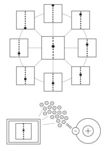
The technology we are trying to convey to the aliens are GIFs, which is a file in which multiple images are placed in order to create a short looping animation. To do this we decided to orient the images on the plaque in such a way that they could be read in any direction, and we did this because the heptapods have radial symmetry and multiple eyes throughout their body. We wanted the image to convey that it is a small looping animation and to do this we used dots to show motions. We used a ball falling since gravity, while it varies in intensity across the universe, is everywhere. Because of this, falling is a principle of physics that all beings should be able to understand.
The first thing we did was break the animation into multiple frames and then connect them to the central image using lines. We considered using arrows to depict direction, but we felt that it was very human oriented, so we opted for using dots instead. To depict motion, we showed the ball taking the place of the dots as it falls. We then put dots in between each frame to indicate that they are connected and feed into one another. Since the Heptapods read everything at once it was important for them to be able to take in the whole image at once, in order for them to discern what the meaning of the image was. It is for this reason that we did not put anything in a straight line because the anatomy of their bodies does not enable them to be able to easily read in a linear fashion like humans do. We also wanted to display that this technology is electronic, so we decided to depict a screen with the GIF on it. To show that the screen utilized electricity to operate. We depicted a hydrogen atom because it is the simplest and the most common atom throughout the universe with only one proton and one electron. They would almost certainly be familiar with this atom especially if they are as advanced as they seem in the reading. We zoomed in on the electron in order to emphasize its importance then we showed the electrons being fed into the computer to depict power being put into a screen. We used electrons because they are negatively charged and the natural electricity in the universe comes from negative ions. Therefore it is likely they would be able to understand that we power our devices by taking advantage of the energy of negatively charged ions, because they would have experienced similar electrical phenomena in space.