Photo Diptych

Anita Luo, Molecular Voyage, 2023, Photograph

Keywords: Consumerism, Mitosis, Watercraft, Birth of Inventions, Uncertainty, Voyage, packaging: Consumed in Consumerism, commute, materialistic lifestyle, Sigmund Freud: ego and id

Anita Luo, Machinery, 2023, Photograph

Proposal

Duality is a fact of life. When one considers cosmology and the way of life, one finds that there are always two sides to the coin—one side cannot exist without the other or harmony is broken. What can we find in this balance? I intend to depict this duality of our lives through a conversation of two images—a diptych. I hope that through the relationship between these two images, I can construct my own conceptual space and draw connections to reality. Using photography, I intend not to stop time but to track it; not to fragment space but to enlarge it; and not to tell an unmediated truth but to engage in a dialectic with others (Ritchin xx, 125).

Brainstorming

Inspiration & Conceptual Integration

What is the overall concept of the Diptych? What are you trying to convey?

We are consumed by consumerism. Through this photo diptych, I intend to develop my contact sheet exercise further to convey the emergence of the existence of consumerism. I would like the audience to ponder the impact of materialism and how it governs our day-to-day lives. The diptych should evoke emotions within the viewers and cause them to reflect on their own experiences with buying products or services. I do not intend to mock the materialistic lifestyle that many people adopt; I intend to give my observations and visually illustrate them through digital photography.

For the Diptych project, one cannot exist without the other. i.e. The existence of both images complete the project. One is only a partial information. What kind of conversation do the two images create and assist each other to convey the concept together? 

In the first image, I would like to shoot an external view of the water bottles. For the second image, I would like to shoot an internal view of a water bottle. By using the same object, there is a connection drawn between the two images —there is a similarity in the color blue. Furthermore, the first image introduces the second. Additionally, the second image acts as a lens for the first image. I intend to incorporate the theory by Sigmund Freud, which the surrealists adopted, about our “ego” and “id” which refers to our conscious and subconscious mind. The external view of the water bottle will be our conscious mind whereas the internal view will be our subconscious. Thus, the audience becomes a mediator who tries to resolve the tension between the two images—our conscious and unconscious minds.

What image(s) do you plan to take photos of? How do you plan to manipulate the image(s) using Photoshop?

I plan to take photos of water bottles. Furthermore, for my second image, I would like to capture the inside of a water bottle to encapsulate the concept of packaging and how this packaging has in a sense packaged us and consumed us. 

Adobe Photoshop practice

Practice 

Process

Step 1: Contact Sheet

To take more microscopic photos of the water bottles I used a phone. 

Source: Own Image

For better viewing click here: Anita Luo ContactSheet 2 

Step 2: Choosing pictures with the best compositions

I initially wanted to use a photograph from my contact sheet exercise. However, I unexpectedly took very interesting angles of the water bottle that had better elements. For example, “IMG_2814” looked like a microscopic view of the splitting of a cell in mitosis. Thus, I was inspired to incorporate more scientific elements into my project.

Step 3: Using Adobe Photoshop

I utilized levels, curves, brightness/contrast, and unsharp masks to touch up all the images.

Source: Own Image
Source: Own Image

I tested different blending modes to overlap images to create more atmospheric quality for my second image. I also added handles from a metro train by removing its background.

Source: Own Image
Source: Own Image

Adaptation Mapping

  1. One of the challenges of capturing small subjects like the inside of the bottle was finding the most suitable equipment to take photographs. Due to its accessibility and my familiarity with it, I decided to use my sister’s iPhone Pro Max 14 to take the photos despite the fact that quality is not guaranteed. However, due to technology’s continuous advancements, I believe that the iPhone Pro Max 14’s quality could be comparable to a camera.
  2. I decided to use a composition that was completely different from my initial intentions which were the composition taken in my contact sheet exercise.

Audience Reception

My classmate Shuyu said that she liked my inclusion of keywords to guide the viewers to comprehend the intentions and messages of my work. Furthermore, she enjoyed my take on consumerism by visually presenting the material subject, the water bottle, to suggest a materialistic lifestyle.

Rationale

Duality can be illustrated by using Sigmund’s theory of the Ego and Id. Molecular Voyage delves into the human mind and reconstructs it with material to highlight the consuming lifestyle of materialism and consumerism. We are consumed in consumerism and packaged into this multiplying notion. We are on this uncertain journey of invention and we need to consider its implications and our future. 

Sources

Ritchin, Fred. In Our Own Image: The Coming Revolution in Photography. Aperture.

Pioneer Plaque

Source: Own image

Team members: Kaidi Wang, Calvin Wang, Anita Luo

Proposal

Ted Chiang’s Story of Your Life prompted me to wonder what other modes and methods of communication we can use and how effective these are when faced with the challenge of communicating with extraterrestrial beings or atypical entities. By creating my own version of the Pioneer Plaque, I intend to gain the skills of creating a visual representation that considers the influences of anatomy and cognitive processes of the viewers. 

A system that has influenced human culture to a large extent is the moon. Although the sun’s rhythm set the daily pace, early humans utilized the moon as a way to keep time beyond a single day and night. The moon was one of humankind’s first timepieces — even before the first written language and civilization. The moon’s phase changes became a reliable marker of time.

Source: https://www.britannica.com/science/lunar-phases
 

Brainstorming 

With my team members, we created a mind map to lay out the basic framework and requirements in our plaque. The main sections that we will include in our diagram are the moon phases, the moon’s orbit, the Earth’s 5 atmospheres, and the concept of time.

Source: Own image

Inspiration & Conceptual Integration

In history, Pioneers 10 and 11 — NASA space probes — carried small metal plaques identifying their time and place of origin for any other spacefarers that might find them in the future. These metal plaques were called the Pioneer Plaque. Keeping in mind of the Heptapods’ anatomy and cognitive processes in Ted Chiang’s Story of Your Life,  my team members and I formulated a diagram that is in the same style as the Pioneer Plaque that looked at the notion of cycles and time in a non-linear perspective. 


Source: https://en.wikipedia.org/wiki/Pioneer_plaque

We intend to use the Earth’s atmosphere so that we can place a satellite in the exosphere.

Source: https://www.worldatlas.com/articles/what-are-the-5-layers-of-the-earth-s-atmosphere.html

We intend to use the satellite in the exosphere as a way to show the size of humans in relation to the moon, sun, atmosphere, etc.

Source: https://www.wikiwand.com/en/Persona_%28satellite%29

Process

Step 1: First sketch

My team members and I briefly worked on a sketch during class time to get a general idea of where our project was heading.

Source: Own Image

Step 2: Second sketch

We then considered the more specific details that needed to be included such as the concept of time and proportion. For example, we wanted to use dotted lines for the orbit to show a directional force or movement to the heptapod because they perceive things holistically. Additionally, we wanted to use the atmosphere as a way to measure how a human would fit in the diagram.

Source: Own Image

Step 3: First draft

With a few adjustments, we created our first draft that incorporated all the elements that we discussed before.

Source: Own image

For better viewing please click here: First draft

Step 4: Second draft

After reviewing the plaque together as a group we found a few mistakes or minor issues such as the grey color of the second half of the Earth and slant sunray lines.

Source: Own image

For better viewing, click here: Second draft

Step 5: Final adjustments

With the consultation of our professor, we found that the solid shading in the diagram was not aligned with the project’s requirements and thus we worked on our final adjustments.

Source: Own image

Audience Reception

[In Progress]

Rationale

In this Pioneer Plaque, our aim is to introduce the heptapods to the concepts of Moon phases, Earth’s orbit and atmosphere, and the notion of time. Given the unique physiology of the heptapods, with their seven eyes and tentacles, they do not perceive information in a linear, directional manner — as we do with a conventional “front”. Instead, they process information holistically. To accommodate their physical structure, we present information on these various concepts within a single image.

The first category pertains to Earth’s moon phases. Scientists have categorized these phases as the first quarter moon, waxing crescent moon, new moon, waning crescent moon, last quarter moon, waning gibbous moon, full moon, and waxing gibbous moon. These phases are depicted on the outer circumference of the plaque.

Each phase possesses a distinct appearance, and they are separated by intervals of 3.75 tick marks, which serve as temporal markers for the heptapods. Since each transition from one moon phase to the next occurs approximately every 3.75 days, a complete lunar cycle spans an entire month.

Heptapod language and cognitive processes are non-linear and holistic, enabling them to perceive time differently and communicate in a manner that incorporates past, present, and future simultaneously. This non-linear perception of time and thought is a central aspect of their culture and language, playing a significant role in our narrative. In our pioneer plaque, we seek to convey the idea that, for us, time is continuous and cyclical, as represented by the flowing lines connecting the rings. Unlike their non-linear perception, we experience time as an ever-revolving cycle that repeats with each lunar phase.

Furthermore, we provide more detailed information with the dotted lines encircling the moon phases. The white segments represent daytime, while the dark areas signify nighttime. To ensure clarity for the aliens, we’ve included lines and arrows pointing toward the Earth at the center. 

As we move inward to the depiction of Earth at the center of the moon phases, we’ve added five circular lines, representing the layers of Earth’s atmosphere: the troposphere, stratosphere, mesosphere, thermosphere, and exosphere. The satellite orbits around the exosphere, which we’ve emphasized on the outermost layer.

To facilitate the heptapods’ understanding of the creators of this artifact, we’ve expanded and zoomed in on the bottom right-hand corner of our Pioneer Plaque. Here, we’ve included an enlarged image of the satellite alongside a human figure for scale. This conveys a sense of the size of the creatures inhabiting Earth.

Additionally, we wish to convey Earth’s position in the solar system, with two planets located in front of it and the Sun at the center. We’ve represented Mercury and Venus with two solid circles, with the smaller and closer circle signifying Mercury and the slightly larger, more distant one representing Venus. Earth follows Venus in this arrangement.

The final concept we aim to communicate to the heptapods is the significance of sunlight. Sunlight, traveling at the speed of light, illuminates all the planets orbiting around it. The fragmented lines emanating from the small dark point in the upper right corner symbolize the Sun emitting light. This serves to help the Heptapods understand that the Sun’s light plays a crucial role in influencing the moon phases on Earth, as it is only through the Sun that the Moon can cast shadows, giving rise to the cycle of day and night.

Story of Your Life by Ted Chiang

Initial Reading Response

Although Louise has knowledge of the future, she does not resist and fulfills her life prophecy. This highlights the importance of “performance” that the novel mentions (34). For humans, the actualization of events is what actually makes life worth living. Knowledge alone is dull; it only becomes meaningful when you live through it — only when you feel the emotions and experiences in the present do you truly feel alive and embrace your full humanness. We all know that we will die one day but we aim to live life to the fullest! Because of this message, I think Ted Chiang is an outstanding writer who has the strong ability to elicit emotions within the viewers and meaningful insight into how we live our lives with others.

I believe that this novel is a very good insight into our course, Communication Lab, because it raises questions on how we interact with our environment and why we interact the way that we do — influences of anatomy and cognitive processes. Through reading this novel, we as students are prompted to wonder what other modes and methods of communication we can use and how effective these are. 

What is happening in the story?

Dr. Louise Banks is a linguist. She tells her unborn daughter the story of how she was conceived. Aliens begin orbiting Earth and sending communications devices called “looking glasses”(4). Colonel Weber plays a recording of the aliens to Louise but she would like to interact with the “native speaker[s]” in person (3). The U.S. military recruits Louise to learn the aliens’ language in collaboration with Dr. Gary Donnelly, who is supposed to be learning the aliens’ physics. Through their “looking glass,” Louise and Gary meet two aliens, called “heptapods”(5). They have a radially symmetrical appearance: they have arms and eyes placed symmetrically around their torso, an orifice on the underside of their bodies, and bony ridges. Heptapod A, the alien’s spoken language, has fluid word order and center clauses. Heptapod B, the alien’s writing system, has semagrams that combine in any order and are semasiographic. Humans experience time linearly but the heptapods experience time simultaneously — teleology. Eventually, the heptapods leave Earth without explanation. Due to Heptapod B, Louise can tell the future. At the end of the story, Louise agrees to have a child with Gary, remembering both happy and upsetting moments in her family but unsure of how she will feel about these things when they come to pass.

What is the story about?

The story explores the idea of communication, different forms of communication, and what influences these forms. The story highlights the role that anatomy plays in species to formulate a language or communication system. Furthermore, it also begs the question of how these systems can influence our day-to-day lives. For example, if one learns Heptapod B, do they have the capacity to exercise free will?

Louise insists on ‘meeting’ the aliens to learn about them. Why?

Only by meeting the aliens can Louise fully engage with the aliens. In order to learn their language and communication system, it is necessary to communicate with the authentic “native speakers” — the aliens (3).

In which ways does their language (spoken & written) differ from our human languages (in this case, English…)?

Spoken: Fluid word order and center clauses. English has word order such as subject and predicate.

Written: Semagrams that combine in any order and are semasiographic. English has a linear system and is glatographic. 

Something else to note is, for the hepatpods, the spoken and written system play different cultural and cognitive roles.

Thinking about the connection between their (heptapods) writing system and their body structure.

The heptapods have “no distinct joints” so they move in a fluid manner. Furthermore, they have a radially symmetrical appearance: their arms and eyes are placed symmetrically around their torso. Thus, their language is fluid — having no word order — and does not have orientation because their body lacks form and orientation itself. 

Describe the process of learning their language.

Louise first used her own frame of reference to understand their language by noting gestures and speech patterns, Louise also attempted to reproduce the heptapods’ speech with her own voice which was unsuccessful. On the other hand, Gary acts out basic physical movements accompanied by the English word for each movement then the heptapods mimic: Raspberry mimics Gary’s movements and Flapper displays the heptapods’ written word for each movement.

How can physical differences in our anatomy dictate modes of communication? (in the story and in our lives)

Anatomy can play a big role in the way we communicate with others. In the novel, Louise is incapable of producing the sounds that the heptapods make because she does not have the organs to do so. The heptapods “[did not] sound like they’re using a larynx to make those sounds”(3). Similarly, a person who is deaf will need other forms of communication such as sign language. 

Why are some concepts seemingly more intuitive to the aliens than others?

Whereas humans find linear cause-and-effect concepts more intuitive, heptapods find teleological concepts like action and calculus more intuitive because they think in a non-linear way where the “effect”t of something is known before the “cause”.

What happens when the scientists try to explain a physics principle to the aliens? 

The aliens understand the physics principle almost instantaneously because of the Fermat’s principle as this concept is more intuitive to them.

Is there any better way of explaining human-originated technologies?

We can use the Pioneer Plaque as an example of how we could explain human-made technologies to aliens. Based on the written system adopted by the aliens, we could incorporate graphic elements into our explanation as well as consider the holistic explanation of the technology in the graphics.


Notes

Sound Visualization


Anita Luo, Sample X, 2023, Print

Click here for better viewing: Sound visualization

Music

Animal by AURORA

Proposal

It is a widely accepted truth that there is a paradox of humanity — we have the capacity to be both good and evil. AURORA’s Animal explores human’s inherent animalistic nature to kill and destroy. Is this in our DNA? Through typography and Gestalt Theory, I’d like to formulate a graphic representation of both the music and the deeper questions of our intrinsic qualities as humans.

Brainstorming

Firstly, I created a mind map for the song. I wrote down whatever impressions I had in mind in hopes of finding connections and meaning.


Inspiration & Conceptual Integration

Concept Brainstorm

Right-click the image below and click on the option “Open image in new tab” for better viewing.

Mindmap of my concept behind “Sample X”

DNA Profile

I was inspired to use DNA profiles as a reference when creating my composition because it relates to the theme of our inherent qualities as humans. Furthermore, I believe science is a strong example of humankind’s hunger for knowledge and the dangers of it — humanity’s natural destruction. Genetic fingerprinting uses Polymerase Chain Reaction (PCR) to amplify a specific sequence of DNA so that it can be studied and compared with other samples. DNA profiling is the process where a specific DNA pattern, called a DNA profile, is obtained from a person or sample of bodily tissue. Most of our DNA is identical to other people’s DNA. However, specific regions vary highly between people. Below is an image of a typical DNA profile:

Multilocus DNA Fingerprint from a large family probed with the oligonucleotide (GTG)5 ( Courtesy of Peter Nürnberg, Cologne Center for Genomics, Germany ).
Source: https://www.researchgate.net/figure/Multilocus-DNA-Fingerprint-from-a-large-family-probed-with-the-oligonucleotide-GTG-5_fig2_258640567

Music Software and Synth Pad

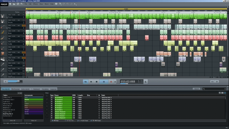
I also found a connection between the DNA profile and music software due to their similar visual appearance — repeated blocks in different sequences throughout the picture plane.

Source: https://thrivemyway.com/audio-editing-software/

The same can be said for synth pads. 

Source: https://reverb.com/uk/item/66183055-synthstrom-deluge

Lastly, I chose to use the font “Myriad Pro” because it would be more relatable to the audience — evoking a positive audience reception — and it is modern — which relates to the idea of new scientific technology like genetic fingerprinting.

Contextual Research on Media and Composition

I found Richard Skelton’s Visual Poetry enticing because of his use of repeated letter shapes to create rhythm and organic subject matter. The work is about the resurgence of concrete poetry and the influences of digital text and the internet. Due to the irregularity of the placement of the letters, there is a unique texture displayed in this work. I would like to incorporate the same effect in my composition. Furthermore, there is a symmetrical balance within the work which gives the piece a sense of comfort to the viewers.

Source: https://www.wallpaper.com/lifestyle/just-our-type-a-new-book-traces-concrete-poetry-in-the-digital-age

Process

Step 1: Basic framework

Using the image below as a reference, I first used various letters to create the basic shape of the DNA profile which I then manipulated.

Source: https://www.researchgate.net/figure/Example-of-minisatellite-DNA-profiles-of-Hae-III-digested-kakapo-DNA-hybridised-to-336_fig2_225202124
Source: Own image

Step 2: Duplicating

After removing the reference I found that the composition looked empty. Thus, I highlighted and copied certain sections of the text and pasted them in various locations to darken the overall tone of the composition. As a result, there was more nuance within the artwork. The repetition of the texts created the illusion of repeated shapes which created a sense of rhythm and familiarity within the composition. I believe that this design element, rhythm, can also be related to the musical rhythm of AURORA’s song. Furthermore, the repetition of shapes suggests the idea of cycles which is prevalent in nature and animals — once again relating back to the idea of inherent essence. Additionally, I also added more letters at the bottom, to show the presence of the deep and full synthesized bassline in the song, while maintaining lines within to show the sheer electronic ambiance present in the song. This line is achieved through the Gestalt theory of proximity and continuity. Lastly, I ensured that there was a sequence in the composition through the shapes because I wanted to depict the regular tempo of the song.

I also enlarged my compositions and cropped the right columns because I found the composition too busy. The label lines on the left and bottom were also adjusted after the size change.

Source: Own image

Step 2: Final adjustments

There were a lot of open gaps within my composition so I added more repetition at the top. I strategically placed them in a way to create the sense of the degradation of the shapes because AURORA’s song has a feeling of bittersweetness evoked by the strings — probably because of the aspect of killing. I also aimed to incorporate movement by focusing on making a heavy base in each shape — this created the impression that they were falling which is almost like a game of Tetris or falling blocks. The electronic beeping sounds within the song also give me the impression of falling blocks.

I also utilized full stops and apostrophes to add more details to the background because I found the composition dull. This also mimics the markings that arise when printing from a real printing machine. I also decided to use more “x” and y” letters to reference the X and Y chromosomes in DNA.

While saving the work I ran into a system issue which resulted in the duplication of certain letters. However, I found this accident useful because it added dimension and depth to my artwork. The duplicated letters are smaller which creates a directional force towards the center of the composition.

Source: Own image

Audience Reception

During our class critique, I was able to show that I drew inspiration from DNA profiles. However, I do believe that without prior knowledge certain audience members would not find this reference. On the other hand, there are many other perceptions that can be drawn from this composition — one could see music software, synth pads, hair strands, the city, etc.

My composition is not very abstract which contrasts with my peers greatly. However, I took the risk of creating a very rational piece because I find music like AURORA’s very systematic. The repetitive melody and basslines suggest order. Furthermore, science itself has a lot of structure — DNA itself has structure. Thus, I wanted to approach this project in a more logical manner to represent the song and my concept more holistically. Nevertheless, due to the amalgamation of references and concepts, my composition is still abstract in some way in my opinion.

Another critique worth mentioning is my sister’s insight as a non-artist. She finds my work very scientific and at first glance, it is hard to tell whether it is an expression or just an infographic. My composition’s weakness lies in it’s orderly arrangement which can look dull and static to my audience. However, the concept — our inherent qualities as humans — behind my work demands careful consideration. Thus, I did not want to make it look unduly abstract where meaning could be lost or taken lightly. A scientific diagram usually shows results from experiments which are very important evidence to prove a hypothesis and make conclusions.

Rationale

Although most of our DNA is identical to other people’s DNA, there are still specific regions that vary highly between people. Similarly, we as humans all have the capacity to do evil but we all vary significantly in terms of our experiences, upbringing, and background that influence our individual actions. AURORA’s song has a systematic structure. However, there still lies some variety of melodies and additional instrumental elements. Are we intrinsically the same? Maybe, but we all contribute to society differently — the way pitch, rhythm, and timbre influence the feeling of a song — and we all have something unique about us inherently. Even amidst this logical graphic presentation and structured song, there is still life to be found — possibilities.

type + space + meaning

Anita Luo, What do you see?, 2023, Digital media

For better viewing, please open the PDF below:

Anita Luo type + space + meaning class exercise

Proposal

How do we perceive the world around us? Through the Gestalt Theory, I’d like to explore how we perceive words and how that is connected with what we see visually. A person can feel emotions and memories from words but what happens when the words start to become obscured? Can we still rely on our conditioned understanding of the word? I hope to uncover what elements can influence the viewers to feel movement and meaning through typography. I also intend to explore how the eyes can open our minds to unimagined possibilities.

Brainstorming

Firstly, I created a mind-map of each assigned word. I wrote down whatever impressions I had in mind of each word in hopes of finding connections and meaning.

Source: Own image
Source: Own image
Source: Own image


Inspiration & Conceptual Integration

I was inspired to use optical illusion in order to add movement to my work. Below are a few references that I drew inspiration from. 

Jai Deco Geometric Pattern Tile 0104
Source: https://www.pinterest.com/pin/jai-deco-geometric-pattern-tile-0104–824721750526589497/

Jai Deco Geometric Pattern Tile 0104

Deco’s work creates a diminishing or shrinking effect through his use of shapes that create directional lines toward the center. I believe this could be a way in which I could incorporate movement to illustrate the word “contracting” as it essentially means “to become smaller”.

Source: https://www.indiatimes.com/trending/wtf/optical-illusion-makes-the-room-around-you-shrink-574005.html

Despite its effect of making our eyes see the room around us shrink, I found this optical illusion unique in that it looks like it is expanding when you look at it directly. Thus, I intended to use this as a reference for my “expansion” composition. 

For the word “effervescent”. I was inspired by Isa-L’s works

Source: https://www.artmajeur.com/isa-l/zh/artworks/13192958/n-20-83-oxygene

Isa-L’s “N° 20.83 OXYGÈNE” has a repetition of circles or “air bubbles” coming from the center coming outwards, which give the work a sense of movement and a burst of energy. This is a perfect depiction of what “effervescent” means and I hope to draw some ideas from her artwork.

Process

First plan

I initially wanted to incorporate elements of optical illusion to take my work a step further to advance the viewers’ reception to it.

Source: Own image

Satisfied with my first plan, I attempted to create my first draft.

First draft

Source: Own image

For better viewing, please open the PDF below:

type + space + meaning class exercise_Grid

Unfortunately, I overestimated my ability to cut the text. Due to my lack of Adobe Illustrator competence, I did not know how to cut text in the way I desired. As a result, my first draft was time-consuming. Furthermore, in many cases, I resorted to using shapes to cover certain areas of text instead of utilizing Adobe’s effective and efficient tools. Therefore. I revised and re-evaluated my first composition plan.

Second and final draft

Source: Own image

For better viewing, please open the PDF below:

Anita Luo type + space + meaning class exercise

In order to create unity between the 6 separate compositions, I decided to use the same font “Myriad Pro”. The unity is crucial because I want to showcase the 6 words in one whole. This will, therefore, draw a positive reception from the viewers because it will be more accessible.

Contraction

Source: Own image


A contraction can refer to the process of becoming smaller. However, contraction is also when the muscles of the uterus tighten up before birth. Thus through my composition, I hope to depict the idea of a tunnel, more specifically a mother’s birth canal, and illustrate the birth of life. The radial balance gives the piece a mystical appeal where one can feel a sense of hope. Like a sun, the radial composition suggests a brighter future. 

Gestalt Theory: Continuity is evident in the composition; the texts are within imaginary lines all around the central point in a radial manner. Furthermore, the individual letters also create circles due to their alignment. Because of this use of continuity, it produces imagined lines that create both unity and radial balance. 

Expansion

Source: Own image

In order to create contrasting but also complementary pairs of compositions, “expansion” is created in the same manner as “contractions” in terms of its radial balance.  In “Contraction”, the letters are read most easily on the left where the letters gradually decrease in size. This is a way in which I aim to guide the viewers on how to read and analyze my work.  Thus, in this composition, I used the same technique where “EXPANSION” has to be read from where the letters start small. Expansion, to any artist or writer, means to explore the effects of certain areas. Therefore, this composition aims to suggest a sense of exploration, distance, and possibilities.  I intentionally placed certain letters out of the border to some degree in order to suggest an imaginary space that the viewers can envision in their minds. The playful orientations of each letter also give the work a sense of livelihood and the hunger for pursuit by humankind.   

Gestalt Theory: The elements of Gestalt Theory are not felt strongly in this composition. However, one can argue that proximity, the proximity between the letters, was used that allow the viewers to read the word “expansion” more easily.

Sever

Source: Own image

Inspired by my classmates’ use of “V” as scissors, I created this composition with the intention of visually depicting the action of dividing an object by cutting. I leave room for the imagination of the viewers by placing the letter “V” out of the picture plane slightly. It allows the viewer to imagine the rest of a scissor or even a hand. Secondly, I used different orientations, text strokes, and color variations to simulate movement — the “Se” and “er” are moving apart from each other. This also creates rhythm due to the repetition of “se” and “er”. 

Gestalt Theory: Proximity is taken advantage of to create movement in this composition due to the gradual separation of the word “Sever”.

Unite

Source: Own image

To counteract “Sever” and pair the two words,  I created this composition with a strong use of diagonal lines. My aim was to connect each letter of “unite” so that it would form one whole. This bonded idea contrasts with “Sever” which is highlighted by the connectivity of the letters. Something interesting about this composition is that if one looks at it long enough, everything becomes a collection of lines and shapes. This can be related to the word “unite” because unity is essentially only made up of parts. 

Gestalt Theory: Figure and ground can be seen in this composition because depending on what the viewer focuses on, one might see letters or one might see white shapes — specifically the  U’s that form long white figures. 

Effervescent

Source: Own image

My inspiration for the word “effervescent” is an image of a sizzling pill. The bubble and excitement of such an imagery is depicted in this composition through the use of diverse lines,  from the letters, to create an element of variety and sporadic energy. Each letter, which acts as little bubbles of air, is integral in the making of this kinetic composition. A criticism of the work is the inability to find the word “effervescent”. However, when one is excited does one not forget about everything? 

Gestalt Theory: The use of proximity allows the viewers to group certain information together to create a sense of depth and shade to the piece — such as the shadow of the pill.

Stagnant

Source: Own image

In contrast to “Effervescent”, the letters of the word “stagnant” are placed in an orderly horizontal orientation. This orientation emphasizes no movement, no change, and no flow — horizontal lines show rest. The unity of the composition, through the repetition of the letters in the same sequence, illustrates a motionless state. Thus, this composition was successful because it showcases the meaning of the word and pairs well with its partner “effervescent”. 

Gestalt Theory: Closure is a strong element in this composition because, despite the lack of borders, the word “stagnant” in the center can still be read by the viewers. 

Rationale

How do we perceive the world around us? Through the Gestalt Theory, I have come to realize that many of the things we see, do, and read have intricate connections to each other. When words or things become obscured it becomes human nature to get in tune with one’s emotions to cope with uncertainty. Things have intrinsic and inherent qualities that can never be taken away from them. Thus no matter where words are, we can always find a way to understand the deeper meaning of something mysterious, because inherently we, humans and things, are connected in some way in this wider world.