Week 8: Encoding Space

Source: Own Image

How to be Invisible– Anita Luo

Playthrough:

1. PROPOSAL

In this week’s assignment, I will construct a navigable visualization of space in Unity through the collection of datasets with automated techniques. Through this assignment, I will consider the different ways in which digital space and machine sensibilities manifest in physical space as suggested by James Bridle in his talk about “The New Aesthetic.” I intend to use techniques such as sound, photography, video, photogrammetry, and possibly vibration to encode a space that effectively allows players to interpret/understand these signals (decode). The final form of the data will be abstracted to a set of values through compression or conversions such as test patterns. As a result, the player becomes informed not only about the interaction between the digital and physical space but also how machine-readable data is an ongoing invisible process in our everyday lives—and how we can still have human autonomy over this process.  

2. BRAINSTORMING 

Source: Own Image

3. INSPIRATION & CONCEPTUAL INTEGRATION

Concept #1: Invisible Images and “Invisuality”

Visual culture has changed to a form unsusceptible to the human eye. This “invisible visuality” has many implications such as reinforcing forms of power that extend inequalities. It prompts us to scrutinize the proliferation of surveillance technologies that “actively intervene in everyday life” (Paglen 27). Trevor Paglen highlights the ethical consequence of pervasive invisible images that are constantly watching us (24). Artificial neural networks cannot create their own classes: they relate the data they are fed to data that they have been trained on. As a result, the inputted training data reveal the “historical, geographical, racial, and socio-economic positions of their trainers” or in other words, their developers (Paglen 27). These datasets are one of the sources of the algorithmic bias that Bridle notes in his talk. As Trevor Paglen notes in this article, digital and other kinds of technological images have become less about representations,  and more of activations and operations. As noted in the new aesthetic blog, “[p]ictures (like everything else) are relationships, not objects.” When considering what they deploy, what they influence, and what they make reimagined, images become a powerful tool. Paglen argues that the invention of machine-readable images can threaten human autonomy significantly which also introduces the media theory term known as invisuality. “Invisuality” refers to the algorithmic analysis of the vast banks of images that are collated by online platforms. In class, we learned that our reality is increasingly structured to fit into machine-readable models for performance and compatibility. 

image
Source: https://new-aesthetic.tumblr.com/

Concept #2: How not to be seen: A fucking didactic educational.MOV File

I intend to not only explore the invisible algorithmic analytical process of the space around machines, but I would also like to consider how humans can regain their sense of agency and privacy by analyzing Hito Steyerl’s video about the politics of visibility and how people can stay invisible in the increasing surveillance of the digital age. Steyerl’s tutorial allows people to combat the “extra layer of vision” of machines embedded in Nikon cameras that Bridle mentions.

Lesson I: How to Make Something Invisible for a Camera

  • To hide
  • To remove
  • To go offscreen
  • To disappear; “resolution determines visibility” which calibrates the world into a picture

Lesson II: How to Be Invisible in Plain Sight

  • Pretend you are not there
  • Hide in plain sight
  • To scroll
  • To wipe
  • To erase
  • To shrink
  • To take a picture

Lesson III: How to Become Invisible by Becoming a Picture

  • To camouflage
  • To conceal
  • To cloak
  • To mask
  • To be painted
  • To disguise
  • To mimic
  • To key
  • “to become invisible, one has to become smaller or equal to one pixel

Lesson IV: How to Be Invisible by Disappearing

  • living in a gated community
  • living in a military zone
  • being in an airport
  • factory or museum
  • being fitted with an invisibility cloak
  • being a superhero
  • being a female and over 50
  • surfing the dark web
  • being a dead pixel
  • being a WiFi signal moving through human bodies
  • being a disappeared person as an enemy of the state

“Are people hidden by too many images? Do they go hide amongst other images? Do they become images?” (Steyerl according to Day and Lury, 2016).

Concept #3: Sound Visualization
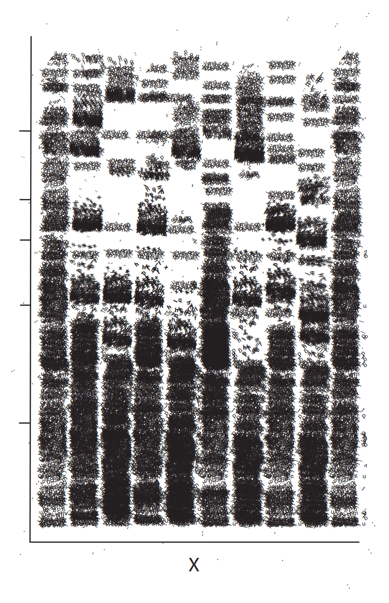
Anita Luo, Sample X, 2023, Print

Click here for better viewing: Sound visualization

The idea of Test Pattern as a system that converts different types of data (text, sounds, photos, and movies) into barcode patterns and binary patterns of 0s and 1s reminded me of my Communication Lab assignment on sound visualization. I translated sound data into a visual representation that incorporated aspects of the DNA profile, music editing panels, and the barcode. The piece was inspired by Richard Skelton’s Visual Poetry which uses repeated letter shapes to create rhythm and an organic subject matter. The work is about the resurgence of concrete poetry and the influences of digital text and the internet.
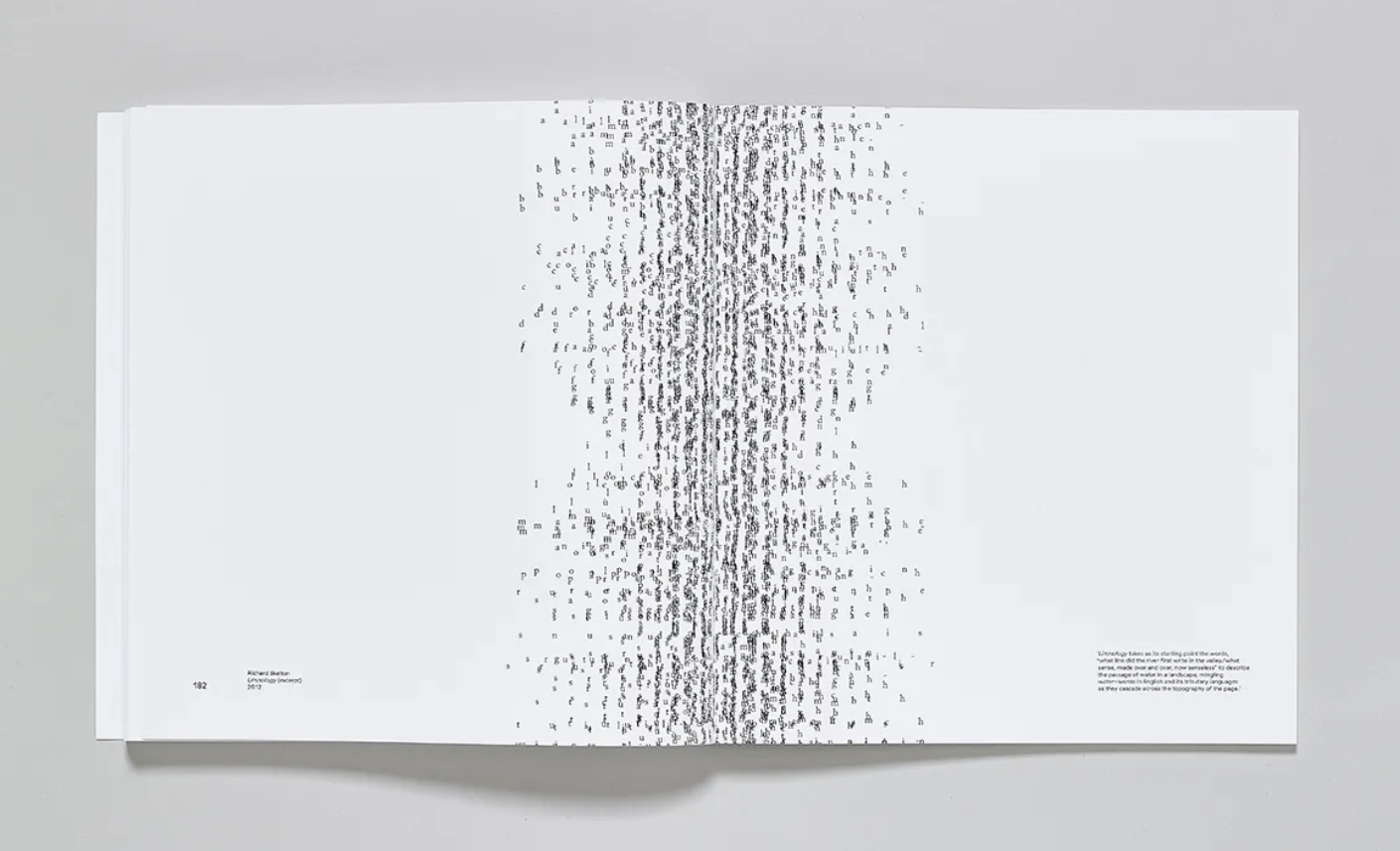
Source: https://www.wallpaper.com/lifestyle/just-our-type-a-new-book-traces-concrete-poetry-in-the-digital-age

4. PROCESS 

1) Fieldwork 

a) Through brainstorming, I planned to use the metro station as my choice of space. The migration and movement of the people will be the dataset which will be encoded in the space through the flow and rate of the people moving. Videos will be the technique with which I collect data to analyze and abstract.

b) The following video shows the congestion of people inside the circle and the low rate at which they walk compared to those entering and exiting.

c) In the following video, the people can be regarded as data points within the metro system that inform the system of their whereabouts once they scan their transport QR code into the machine.

2) Reconstruction

a) I placed cubes around a cylinder so that the cubes were placed in a perfect circle. Pairs of cubes act as the entry/exit points in the metro station. Once all the cubes were placed I removed the cylinder. I made a new metallic material for the cubes. Grabbing a photograph of a marble texture, I placed the image in the plane and adjusted the texture properties.

Source: Own Image

b) I added a larger cylinder as the walls of the metro station. I also added a new material on both sides of the object so that the inside of the object can act as walls.

Source: Own Image

c) I added fences between the entry/exit points from the Unity Asset Store  and combined them with the new metallic material.

Source: Own Image

d) After adding lights and a supporting beam, I placed surveillance cameras on the Unity Asset Store on all sides. This step is to strengthen the concept of surveillance and invisuality to make the plater feel at unease. The movement of the citizens are constantly being tracked by embedded machines and I wish to use the cameras as the literal translation of this process.

Source: Own Image

e) I added Chromatic Aberration, Film Grain, and Vignette through Post Processing to enhance the effect of surveillance by mimicking what a camera would see.

Source: Own Image

f) I wanted to have holes in the center of the floor plane so that there would be elevators or stairs for a better representation of the metro station. However, the texture of the floor plane using ProBuilder indicated some complications. As a result, I used ProBuilder to create my triggers instead.

g) My initial idea is to use the Boolean tool to cut a custom shape of a “donut” or hollow sphere that covers all the entry/exit points as triggers. However, due to the “distorted” shape of the sphere, I was unable to make a round and effective shape for the trigger. There were holes in the new objects after subtraction. Furthermore, even after adding the trigger event script and enabling the mesh collider, the trigger did not work. Can triggers work for ProBuilder objects?

Source: Own Image
Source: Own Image
Source: Own Image
Source: Own Image
Source: Own Image
Source: Own Image

h) Because the ProBuilder trigger did not work, I created multiple box colliders.

Source: Own Image

i) I edited a scanner beep sound from Pixabay with noise reduction and added the audio into my Unity scene. I used a simple trigger: when the player moves to a box collider the beep sound will be activated.

Source: Own Image
Source: Own Image

j) I added a Shanghai metro map to suggest the location further and to show the grand system in which this dataset is part of.

Source: Own Image

k) I added particle systems for the migration and movement data from the collection. The entry points will have particles flowing in while the exit points have particles flowing out. During the class check-in, it was suggested to color code the particles to show which data came in and which went out which I thought would have enhanced the concept of the data further. I also adjusted the size of the particles so that it pulsed.

Source: Own Image
Source: Own Image

l) Besides the particles that flow in and out, I also added a particle system that was stationary to show the stationary or congested people I saw in the metro. Furthermore, these data also represent the larger scope of data within the metro throughout the city that is tracked within the “machine-readable” space.

Source: Own Image

m) I used animations to create particles that moved around the internal space for more diverse movements of particles.

Source: Own Image

n) I also added an additional trigger event in which the camera switches to a different angle when the player passes the first entry point to suggest that the camera is watching them.

Source: Own Image

5. AUDIENCE RECEPTION & 6. CONCLUSIONS

The New Aesthetic” broadened my perspective of my physical space by expanding my consciousness to include the digital space. By acting as a machine essentially, I became more aware about the ways in which data is collected by the machines that are embedded and intervene in our daily lives. I used video analysis to encode a Unity space that allowed players to decode the original data. The final form of the data included an abstract representation of population tracking from entry/exit points and the ecosystem existing within the metro system. QR codes show the dangers of the extra layer of vision that many algorithmic operations hide behind. Through this assignment, I wanted to explore the ideas of invisuality, and ways to be invisible in the digital age. On the other hand, I had many ideas that I did not get to implement. For example, to explore the lesson of how not to be seen about being off screen, I wanted to added a subsidiary camera view in which the data is scene but disappears outside the subsidiary frame. Furthermore, the importance of resolution can be depicted by having far data that are smaller than a pixel to disappear. These are ideas that are worth noting to learn from.

7. APPENDIX

8. REFERENCES

Bridle, James. “Web Directions Sydney 2011 Final.” Vimeo, 2 Dec. 2011, vimeo.com/32976928. Accessed 02 Nov. 2024.

“The New Aesthetic.” Tumblr, new-aesthetic.tumblr.com/. Accessed 02 Nov. 2024.

Paglen, Trevor. “Invisible images: Your pictures are looking at you.” Architectural Design, vol. 89, no. 1, Jan. 2019, pp. 22–27, https://doi.org/10.1002/ad.2383.

Steyerl, Hito. “How Not to Be Seen: A Fucking Didactic Educational.” Artforum, 20 Apr. 2015, www.artforum.com/video/hito-steyerl-how-not-to-be-seen-a-fucking-didactic-educational-mov-file-2013-165845/. Accessed 02 Nov. 2024.


Week 7: Non-human Perspective

Source: Own Image

Source: Own Image

Pop!– Anita Luo

Playthrough:

1. PROPOSAL

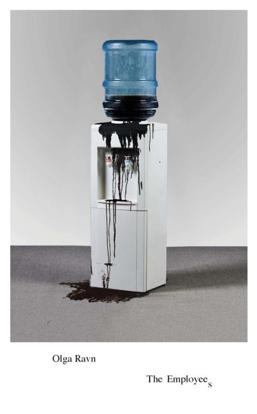
In Olga Ravn’s The Employees, the characters are either human or humanoids. They blur the line between what it means to be alive or dead through their sentimental and descriptive statements. Through this week’s assignment, I intend to build a Unity scene that incorporates the theory of embodied cognition and the careful consideration of a non-human perspective. In this process, I hope to develop a deeper consciousness of how forms/bodies sense and react to their environment and how their sensorimotor abilities are embedded in a larger context. If animals have differences in sensing their environments, what sensing differences do objects have? In terms of the technical aspect, I would like to challenge myself with a more extensive sound designing phase to explore what unique sounds I can produce. I would also like to include animations, post-processing, and triggers.

2. BRAINSTORMING 

I wanted to construct a scene that not only exhibited the perspective of a non-living object but also the system in which it is found to draw meaningful concepts. A system in Shanghai that I am intrigued about is the designer toy culture, most notably found in the Chinese toy company POP MART. I sketched the ways in which I would use audio, visual, and spatial aspects to illustrate my idea.

Visual and Space:

Source: Own Image

Audio (keeping in mind the 3 layers of audio being the soundscape, auditory landmarks and auditory signals):

Source: Own Image

Reference:

3. INSPIRATION & CONCEPTUAL INTEGRATION

Concept #1: “The Employees” by Olga Ravn

As Ravn’s characters attempt to describe the nature of the objects in the world of the novel, the characteristics and relationships between the objects are revealed. At times the objects are found to be humming, at others it is “[a]s if they don’t actually exist on their own, but only in the idea of each other.” The notion that objects “reiterate” each other will be established through the repetition of forms within the virtual space and the unity of movements

cover image of the book The Employees
Source: https://www.ndbooks.com/book/the-employees/

Concept #2: POP MART

The best example of objects that lack a sense of individuality and are seen as a collective is the toys in POP MART. Taking the perspective of a single toy, their intrinsic value seems lacking amidst the proliferation of overconsumption where the presence of the collective is much more significant than one toy; the toys can be easily replaced by another. The toys may feel inferior, or replaceable. Furthermore, the perspective of a small object is worth exploring and replicating. Lowering the pitch of larger entities to construct the perspective of a small object would be effective.

Through trigger events, I would like the player to move between different spotlights in the “diorama” to imitate manufacturing and lack of grounding. When the player reaches one spot, a new spot is open and when the player leaves their old spot they will realize that they have already been replaced by another toy.

4. PROCESS 

1) Research

I visited, observed, and researched more about the toys in POP MART by documenting photos, listening to the sounds, and noting their interaction and relationship with their environment. (I also bought some.)

Source: Own Image
Source: Own Image

2) Audio editing

a) I decided to use raw audio from the previous week’s assignments because I wanted to focus on the audio designing phase this week. Using Adobe Audition, I experimented with different effects. 

b) I adjusted the pitch for the public background noise to suggest the presence of giant entities. 

Source: Own Image

c) I used more “exaggerated” FFT filters such as the “C Major Triad” and “Only the Subwoofer” to create alien audio. I also attempted to adjust the graph manually to get a better grasp of the mechanism of this effect tool.

Source: Own Image

3) Reconstruction

a) Following the tutorial below, I made a cube with a glass material. This will be the walls of the “diorama.”

Source: Own Image

b) I searched for free assets and found this website where I downloaded the material for the walls of the diorama. The style of the graphics was very similar to the ones I saw in POP MART. I used the image with simple gradation as the material for the ground. I also took a photograph of the wooden door in my dorms as the material of the table in the Unity scene.

Source: Own Image

c) I constructed the different leveled platforms using cubes.

Source: Own Image

d) I adjusted the material’s metallic and smoothness settings.

Source: Own Image

e) I used the background image with the most detail as the main background.

Source: Own Image

f) I added a red cube at the top corner of the background to replicate the logo in POP MART’s “dioramas.”

g) I then added the text “POP!” through TextMesh Pro.

Source: Own Image

h) I added spotlights in 9 positions where the toys will be placed. 

Source: Own Image

i) I added a player capsule to the scene for playtesting and later acting as the non-human object.

Source: Own Image

j) I experimented with the skybox and environmental lighting settings to change the undertone of the scene and to make the scene look more realistic.

Source: Own Image

k) I found a Unity character asset that looked like a POP MART toy as the toy in my reconstruction. I had to manually edit the surface inputs and shader of these assets. 

Source: Own Image
Source: Own Image

l) I placed these characters in the scene in each spotlight making sure they are evenly distributed.

Source: Own Image
Source: Own Image
Source: Own Image

m) I had a brief overview of the in-built animations from this Unity asset by looking at the “Animator” panel. While playtesting, I found that the random movements and synchronization of the toys aligned well with the concept of the project so I did not make any additional changes after placing the toys in the scene. However, I would like to grasp a better understanding of why the toys are animated the way they are, what is triggering them to move in the same or different ways, etc.

Source: Own Image

n) I initially wanted to place the camera over the shoulder of the player to show that they are a toy. However, later when playtesting triggers, I found the camera to be very disorientating. thus, I placed the camera in the position where the head would be later in the process.

Source: Own Image
Source: Own Image

o) After learning different functions of Post Processing, I created a global volume where I added bloom effects and chromatic aberration. These effects, I found, enhanced the aspect of desire within the context of consumerism of designer toys.

Source: Own Image

p) The depth of field for the toy is probably different from that of a human, thus I also adjusted the depth of field in the global volume.

Source: Own Image

q) To lower the depth of vision further I also added fog so that the toy would not be able to see the horizon.

Source: Own Image

4) Sound

a) Taking the suggestion of the professor, instead of using CineMachine to create custom-shaped zones of sound, I adjusted the 3D sound setting of the game object to snap the volume without gradual volume changes.

Source: Own Image

b) Instead of using CineMachine to create a separate outdoor sound zone, I put in a game object and will adjust its activeness using trigger scripts. Therefore, when the player enters the glass case, the background sound will be deactivated.

Source: Own Image
 

5) Trigger

a) At first I wanted the two spots where the player moves between to be in the middle of the top row and left of the bottom row. However, I realized while playtesting that this route is not that easy to see for the player to know where to go next. Thus I changed the trigger events to occur at the bottom row only.

Source: Own Image

b) Through multiple playtesting, I tried to find the perfect size of the box collider as the trigger for when the players move. The trigger events that I want to add are complex to some degree so the most appropriate size of the trigger is necessary.

Source: Own Image

c) Finally I made the final changes to the trigger events. When a player lands on a spotlight, the spotlight disappears which reduces the level of value/importance of the player. Simultaneously, an earcon will play to inform the player that they have landed on a desirable spot that will trigger an event. When the player moves away from their initial position, they will find that a new toy has been replaced. Thus, they are prompted to find a new spot. This pattern repeats.

Source: Own Image

5. AUDIENCE RECEPTION & 6. CONCLUSIONS

Through this project, I experienced going to a site and collecting information to construct a scene that embodies a perspective other than my own. As a result, I was prompted to consider the cultural and social context of designer toys in POP MART that exemplifies overconsumption and materialism. The player can be easily replaced by another object similar to their own which brings up questions about the player’s value and sense of self. Thus, the lack of spiritual residue of the toys presents a diorama of meaningless “stuff.” During the classroom check-in, my classmates complimented me on the appealing visuals of the scene which enhanced the feelings of superficiality within the space. The earcon also effectively informed the player that moving into the spotlight was encouraged. However, my classmates were still confused about what non-human entity they embodied. Therefore, a possible solution to this issue is to adjust the camera root position either inside the hoodie so that there camera is framed by the toy’s garment or to try a higher angle behind the player. However, there is a lack of first-person perspective and immersion in the latter method. Furthermore, I believe adding footsteps with a higher pitch can suggest further that the player is very lightweight as a toy. Additionally, more discernable dialogue for the larger entities (humans) mentioning certain terms about the shop, the designer toys, or purchasing the toys would provide more context to the player. 

There is always a critique of consumerism by comparing commercial products to commodities that lack intrinsic value. However, I wanted to change my perspective to consider how the commercial objects feel in this spectacle. 

7. APPENDIX

Source: Own Image
Source: Own Image
Source: Own Image

8. REFERENCES

Ravn, Olga. The Employees: A workplace novel of the 22nd century. 2018.

Week 6: Secret Sound Creatures

Source: Own Image

Playthrough:

Echosystem – Anita Luo

Download Unity Package here!

1. PROPOSAL

In this week’s assignment, I am prompted to use microphones and audio filtering/manipulation skills to discover sounds in an object/site. These sounds will become creatures that live in the speculative environment that will be reconstructed in Unity. In the process of making the scene, I will deeply reflect on how the “species” of a soundscape creates its “acoustic niche” through attentive listening. Furthermore, I will note down, as Krause puts it, the density (the total number of vocal organisms) and diversity (the total number of different vocal species) of a soundscape ecosystem and its different ecological levels (biophony, geophony, and anthrophony) (28). By immersing myself in a certain object/site, I hope to think and value sounds more constructively and have a deeper intent on how sounds are placed and support each other in a space.

2. BRAINSTORMING

I intend to create a conceptual space of a water bottle as my chosen object/site. I believe that Unity opens much more opportunities for expression and documentation of space. Thus, to challenge the extent to which I can utilize a virtual space to illustrate a soundscape creatively, I planned how I would convey the sounds inside a bottle and what sounds of real-world sites I could translate into this conceptual space.

Source: Own Image

3. INSPIRATION & CONCEPTUAL INTEGRATION

Concept #1: Microscopic View of a Water Bottle

I would like to expand on my previous work called Molecular Voyage (it is still hanging outside the 3rd Floor IMA studio if you would like to check it out!) which I have also written a documentation blog on. By comparing a water bottle to a metro train I want to communicate the message that the continuation of our materialistic life has an uncertain destination. In my opinion, the manufacturing and selling of bottled water is the epitome of consumerism and waste culture. How can I convey this concept through a virtual space?

Anita Luo, Molecular Voyage, 2023, Photograph

I intend not to stop time but to track it; not to fragment space but to enlarge it; and not to tell an unmediated truth but to engage in a dialectic with others (Ritchin xx, 125).

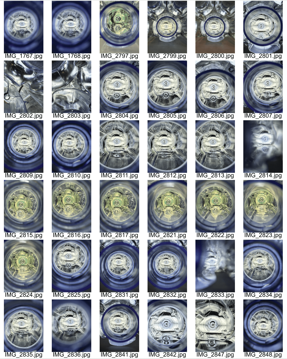
Below is the contact sheet I made during the making of my diptych.

Source: Own Image

Keywords: Consumerism, Mitosis, Watercraft, Birth of Inventions, Uncertainty, Voyage, packaging: Consumed in Consumerism, commute, materialistic lifestyle

Concept #2: Coke Cans 

More info soon.

4. PROCESS 

1) Fieldwork

a) Using a contact mic, Tascam microphone, filtering, and listening through the microphone, I experimented with different mic placements and ways of interacting with the water bottle. Firstly, I tried to capture the sound of water trickling along the sides of the bottle by pouring water from one bottle to the other.

Source: Own Image

b) I rubbed two bottle caps to create a zipper sound which made me envision an anxious hyperactive creature or a creature that is threatening.

Source: Own Image

c) I also blew through a straw to create bubble sounds which I imagined a creature that moves in a repetitive and “bubbly” manner. Other sounds I induced included tapping on the plastic bottle, blowing through the bottle hole, and recording ambiance from a computer engine (which I will edit later).

Source: Own Image

d) Once I collected my raw audio, I edited it through Audacity. For every sound, I used “Noise Reduction” to remove the background noise by first getting a noise profile and filtering out the noise.

Source: Own Image
Source: Own Image

e) When I want a certain sound to loop I would manually isolate the sound and add some “silence” at the end so that when the audio loops there is space between the sounds.

Source: Own Image
Source: Own Image

f) I wanted to create an ambiance sound within the bottle to replicate the vibrating gas that you hear when you put your ear against the hole of the water bottle. To do so, I used a “Low-Pass Filter” and “Reverb.”

Source: Own Image
Source: Own Image

g) I also experimented with filter curves to treble boost certain audios.

Source: Own Image

For the bubble sound, I changed the pitch higher as it sounded more realistic to do so.

Source: Own Image

h) Additionally, I experimented with the “High-Pass Filter” to see if the audio would sound lighter.

Source: Own Image

2) Reconstruction

a) I first constructed the bottle cap by taking photographs and importing them to Unity.

Source: Own Image
Source: Own Image

b) Using cubes I built the cap in Unity.

Source: Own Image

c) Using water blocks from the Unity Asset Store, I placed water as the floor of my scene. All assets used will be linked at the end of this section.

Source: Own Image

d) I experimented with different shaders of water.

Source: Own Image
Source: Own Image

e) I used potion objects from the Unity Asset Store for the body of the water bottle.

Source: Own Image

f) For the packaging of the water bottle I used quads on three sides of the water bottle.

Source: Own Image

g) I imported photographs that I took of the packaging into Unity and on to the three quads. Orientation had to be adjusted individually for each photograph.

Source: Own Image
Source: Own Image
Source: Own Image
Source: Own Image
Source: Own Image
Source: Own Image

h) I experimented with lighting settings and the skybox to make the scene more appealing and immersive. The undertone I wanted in the scene was purple.

Source: Own Image

I) Using assets from the Unity Asset Store, I imported creatures like crabs and squid to align with the theme of water. If I had experience with Blender, I would like to have made my own creatures with more alien features.

Source: Own Image

j) I also tested out the animations available in each package through the “Animator” function. The animations matched the mood of the sounds assigned to each creature.

Source: Own Image

k) I added bathroom reverb zones inside the water bottle so that there is a clear distinction between the external and internal space of the object when listening to sound.

Source: Own Image

l) I used the script provided by the professor in week 2 to make the crab look at the player for the whole duration. The zipper sound that I assigned to the creature is in some way intimidating so I wanted to enhance that feeling by making the crab glare at the player.

Source: Own Image

m) Lastly, I attached audio sources to their respective creatures.

Source: Own Image

I ensured that “Loop” was checked, the spatial blend was 3D and adjusted the volume rolloff to “Linear Rolloff.”

Source: Own Image
Source: Own Image
Source: Own Image
Source: Own Image
Source: Own Image

Unity Asset Store Resources

Water: https://assetstore.unity.com/packages/2d/textures-materials/water/simple-water-shader-urp-191449

Water bottle and skybox: https://assetstore.unity.com/packages/3d/props/potions-115115

Crab: https://assetstore.unity.com/packages/3d/characters/creatures/big-bat-carb-115954

Other creatures: https://assetstore.unity.com/packages/3d/characters/animals/quirky-series-free-animals-pack-178235

5. AUDIENCE RECEPTION & 6. CONCLUSIONS

Using a water bottle as my chosen object and resonant body, I discovered the many ways in which our environment and even its mundane objects within it can carry a diversity of sounds and transduced sounds. I hope that through this assignment the audience is able to appreciate and be more conscious of the little things in life and how they can bring about unique qualities. In the future, I would like to extend my scope by paying more attention to soundscape ecology in terms of identifying and investigating the biophony, geophony, and anthrophony layers of a specific site. My intention to focus on biophonies specifically is also “to reconnect to the potent sonic elixirs found in our remaining wild soundscapes…to think of and value natural sound in constructive ways” (Krause 38). Furthermore, I would like to use Adobe Audition, with its more versatile features, to experiment with adjusting sounds to make alien audio sources discernible from each other. During the class check-in, my partner could only separate a few audio sources from each other due to the similarity between all the audio. I hope to tackle this problem in the next activity where I will edit sounds of distinct timbres that also fit into their own acoustic niche.

7. APPENDIX

None.

8. REFERENCES

Krause, Bernie. Wild Soundscapes Ch. 2, 14 Feb. 2020, https://doi.org/10.12987/9780300221114.

Ritchin, Fred. In Our Own Image: The Coming Revolution in Photography. Aperture.

Week 5: Audio Wayfinding

Mgla – Anita Luo and Beatrice Zhang

Download final Unity Package here!

Download old version here

Playthrough:

Map:

Source: Own Image

1. PROPOSAL

Through the sensory experience of Proteus, we are instructed to construct a virtual course that must be navigated using only sound through the use of a combination of icons (earcons), beacons, and soundscapes to allow a player to locate waypoints. Through this activity, we explore how sounds, as carriers of information, help an individual navigate through a physical or virtual space. 

The scenario to be constructed in Unity:

You’re a delivery driver sent to the planet Mgla carrying a mysterious package. The planet is covered in a layer of fog so dense that you can barely read the address on the box.

The inept drop-ship operator set you 5 ticks (~1km) away from your destination, so you’ll have to walk the rest of the way. To make matters worse, your locator earpiece only has a range of 1 tick (200m), so you need to navigate to landmarks along the way instead of going directly to the goal.

Visibility is nonexistent, but there is a rich soundscape and plenty of distinct sounds that you can use to figure out where you are. Undeterred by the fog, and with your locator earpiece and the ambient sounds to guide you, you embark to deliver the package.

In this activity, we are prompted to set at least 4 waypoints between the start and end of the mission on the planet Mgla. To guide the player to these waypoints, we will implement the 3 layers in the auditory scene including the soundscape (as seen in Week 4’s activity), auditory landmarks (guiding beacons), and auditory signals (icons and earcons). Inspired by Proteus, we also want to see how groups of sounds in one area can change the mood of the space for the player to make sense of where they are and at what waypoint they are.

2. BRAINSTORMING

Proteus had area-specific sounds which made sense of the space for the player. Unfortunately, we are not afforded the use of visual representations for the player to connect the sounds to the environment. However, we believe with timing/delay, loudness, and timbre, the player can collect audio information to understand where they are within a virtual space.

Source: Own Image

We aim to combine the scenario and space so that there is a narrative for the player to follow. This includes the delivery driver calling for assistance and the person on the other side of the call explaining the mysterious but thrilling wonders of the planet Mgla. As the person on call leaves, the delivery driver is left with their own devices to figure out where they are. Mgla is characterized by abrupt topography (land features being closely situated) which render the journey open to surprises and unique easter eggs around the corner! At the end of the journey the player realizes that although the distance of the destination was 5 ticks, they had made a big U-turn—making their displacement a tick away from their starting point!

Through this sketch, we also noted the list of sounds we plan to use:

  • car engine
  • phone ring
  • phone hang up
  • footstep sound
  • sprinting sound
  • wind
  • water droplets
  • crickets
  • birds
  • water ripples
  • fire cracking
  • forest wind
  • cars
  • doorbell
  • speaking?
  • earcons such as error sound

3. INSPIRATION & CONCEPTUAL INTEGRATION

Concept #1: The “auditory scene”

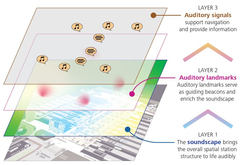
Source: https://www.mijksenaar.com/mobility/creating-a-wayfinding-soundscape-in-our-lab/

According to the theory, a well-organized auditory scene consists of 3 layers – the soundscape that brings the overall spacial station structure to life audibly, the auditory landmarks serving as guiding beacons and enriching the soundscape, and the auditory signals that support navigation and provide information. We applied these three layers to constructing our auditory scenes: we intend to assign the three layers for each waypoint.

Concept #2: Stardew Valley

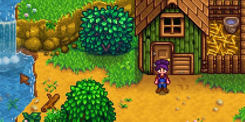
Stardew Valley is a virtual farming game that features diverse living settings and scenes from different parts of the worldview. The audio effect varies according to the waypoints, through which the player is guided to complete the tasks assigned at various sites. The footsteps and every tiny sound effect triggered feel real thanks to the well-modified reverb effects, inspiring us to continue applying the appropriate sound editing techniques.

The Best Tips And Tricks For Playing The Stardew Valley 1.6 Update
Source: https://www.thegamer.com/stardew-valley-1-6-update-tips-tricks/

We are also inspired by the game Proteus in terms of how it constructs area sounds characteristic of some specific scenes. In the instruction video on YouTube about creating an ambient zone, the author makes an entity of the forest by circling the audio around the rim of the forest. Our forest scene is inspired by this, and we want to further conceptualize the scene by adding reverb effects and multiple layers of sounds.

4. PROCESS 

1) Audio Preparation

Because this activity focuses on audio wayfinding and playtesting, we utilized copyright-free sound effects from https://pixabay.com/ to save time on the recording stage. We were time-efficient in finding the audio we needed because of effective planning beforehand so we had a premade list of sounds.

Source: Own Image

Folder with all downloaded audio!

2) Set Up

a) We first set up a low-visibility scene using this template scene which consists of a white skybox with white Fog. 

Source: Own Image

b) We then added footstep and, this time, sprinting sounds by adding footstep and sprinting audio sources. The same tutorial was used as the last assignment. The footstep audio tempo is increased to create the sprinting audio through the use of Audacity. Thus, when the “shift” key is pressed the sprinting sound is enabled. Due to time constraints, we decided to test different types of surfaces and the use of velocity for footstep sounds (feedback from the professor) in the next assignment. Because there is minimum visibility, we believe that there is not a strong need to tackle this aspect for this specific assignment. Jumping is also not a major feature of the overall experience for the wayfinding activity so we also did not address the jumping limitations of the script.

Lookback: During playtesting in class, I realized that my classmate used the arrow keys instead of WASD. Thus, the player moved but without the footstep sounds. I did not consider this possibility. Thus, I think for future projects, it is important to have different people try playtesting to notice these possible challenges. As a solution, I would attempt to use velocity as the professor has suggested in future projects. This will be an effective solution to avoid similar situations in the future.

3) Virtual Space Design

a) We first used 3D primitive shapes to create the 6 main landscapes which include the car, cave, lake, campfire, forest, and house. We followed our sketch during the brainstorming phase which helped us organize the landscapes at an appropriate distance.

Cave:

Source: Own Image

Lake:

Source: Own Image

Trees:

Source: Own Image

Birds eye view:

Source: Own Image

Challenge: Although this project mainly focused on sound for navigation, playtesting multiple times informed me that little object obstruction could increase the chances for the player to get lost. Thus, we added more trees around the “obstacle.” To ensure that the player does not skip a waypoint, we also added box colliders to avoid the player moving across the lake directly.

Source: Own Image

4) Audio Design

a) Car

Source: Own Image

We used cubes to create the basic shape of a car. We then added the car engine audio as a game object with a 3D spatial blend so that the player knows that they are moving away from the car as they enter the cave. The outside area also has sounds of crickets to communicate the information that it is nighttime and the delivery driver is outside in an open area. The cave’s wind and water droplets audio will act as a guiding beacon for the player to move towards the new area. 

Challenge: Through playtesting in class, we found that the player was unsure about whether to approach the cave or the car due to a conflict in dominance. To inform the player that they should follow guiding beacons of sound and that they have a mission as a delivery driver, we used the suggestions from the class. We initially wanted to create different scenes so that the first scene acted as the instructions communicating the scenario that the player was in. However, due to time, we were unable to execute this well. Our second idea was to have a call voiceover where the character, the player, asks for help to navigate on the planet Mgla. However, due to time constraints, we were also unable to do this. With feedback from both the professor and classmates, we used ElevenLabs’ text-to-speech function to illustrate the scene. Unfortunately, we ran into a problem with access so we used the audio we were able to generate to create a phone call in Audacity. We also incorporate phone call and phone beeping sound effects from PixaBay to complete this step.

Source: Own Image
Source: Own Image
Source: Own Image

b) Cave (1st Waypoint)

Source: Own Image

The cave has a rich soundscape of wind, water droplets, cave ambiance, and reverb zones. As the player moves towards the other end of the cave, the sounds of water ripples from the lake are evident which draws the player. This signifies a new setting and mood of tranquility that juxtaposes the ominous one from the cave. When the player moves out of the cave, a trigger of a success earcon is played to signal to the player that they are on the right path and passed the first waypoint. 

Source: Own Image
Source: Own Image

Challenge: Unfortunately, we ran into a problem with putting the trigger scripts offered in class into the project. We tried to fix the problem by going through the script. However, we did not understand what the error message meant.

Source: Own Image

When editing the script, there were also no evident errors found.

Source: Own Image

After meeting with the professor, we found that we had two scripts in our assets which resulted in this challenge. After understanding the issue and how to solve this, we added all the audio triggers that we had planned to embed in this space.

c) Lake (2nd Waypoint)

Source: Own Image

As the player passes the first waypoint trigger, the audio game object of nature by the lake such as frogs becomes active. This audio comes from the corner of the lake which draws the player to move to the second waypoint as a new audio landmark.

Once the player moves out of the cave, there is no more reverb zone which changes the timbre of the footsteps—creating a different feeling of space for the player. The soundscape of the lake is ornamented by the subtle ripples of the lake water and the night ambiance.

When the player reaches the source of the audio beacon, the sound stops and the completion earcon plays to signal the second waypoint has been reached.

As the player turns around the corner of the lake, an owl sound will guide the player to the next waypoint. Animation is used to simulate a moving owl.

Source: Own Image

d) Campfire (3rd Waypoint)

Source: Own Image

The crackles of the campfire act as the auditory landmark of the new waypoint which is enhanced by soundscapes of crickets and night ambience. A reward audio cue will indicate that the player has reached the 3rd waypoint. Simultaneously, a new sound of owls will be heard in the direction of the forest.

e) Forest (4th Waypoint)

Source: Own Image
Source: Own Image

Birds will be a guiding beacon to the next area which is the forest. We added forest reverb in this zone. This created a closed but intimate space for the viewers to experience another type of mood and setting. The distance sound of cars draws the player to the last waypoint: the final destination. During the trip to the road, we wanted it to bring about a sense of melancholy to the players as they experience the presence of tension between nature and urbanization. The sensory experience is heightened by the echoes of the footsteps in the reverb which also mimics the sound of blood pumping in the ears.

Source: Own Image

f) Final Destination (5th Waypoint)

To signal the end of the journey, we wanted to use the sound of the doorbell which is triggered when the player stands in front of the door of the house.

We also added the sound of the character calling out to the owner of the package. The reply will come from an unfamiliar and strange voice which concludes the peculiarity of the planet Mgla.

5) Triggers

Source: Own Image
Source: Own Image

We would like to explore more of these features in the future!

Source: Own Image

5. AUDIENCE RECEPTION & 6. CONCLUSIONS

During the user-testing session held in class, the player initially encountered an issue where they got stuck in the wall of the cave. This unexpected glitch halted their progress for a moment, but with our guidance and instructions, they were able to navigate out of the wall and continue the gameplay. Once they moved forward, the playthrough was largely smooth, although there were still some technical challenges, particularly with the proper triggering of waypoints. These issues caused minor delays but did not significantly detract from the overall experience.

Feedback from both the audience and the instructor was constructive. They appreciated the design and concept of the game, and overall impressions were positive, though they highlighted the importance of refining the waypoint triggers to ensure a more seamless experience. Additionally, we were given valuable insights on how to improve the game’s functionality. Specifically, after the class, we were informed by the instructor that having two scripts with identical content could lead to serious errors during the compilation process. This could cause conflicts and prevent the game from running as intended.

To address this, we were advised to streamline our script organization by either combining overlapping scripts or ensuring that each script serves a distinct purpose. This will help us avoid any potential conflicts and ensure that the game compiles and runs smoothly. Moving forward, we plan to restructure the scripting to prevent these errors, while continuing to refine the game based on user feedback.

7. APPENDIX

Source: Own Image
Source: Own Image
Source: Own Image
Source: Own Image
Source: Own Image
Source: Own Image
Source: Own Image

8. REFERENCES

None.

Week 4: Soundscapes: Inside/Outside

Depths (with Sound) – Anita Luo

Download Unity package here!

 Playthrough of the final scene:

“Sound map” of the scene:

Source: Own Image

1. PROPOSAL

I am prompted to create a conceptual “soundscape” through fieldwork and reconstruction of inside and outside sound. I intend to experiment with “hi-fi” and “lo-fi” systems, mentioned in R. Murray Schafer’s “Music of the Environment,” within a single space to see how I can create meaning and effect through their contrasting perspectives for the audience. By removing sounds from their “natural sockets” and relocating them into the space of my unity project, I would like to build a soundscape of “moving and stationary sound events.” In an attempt to illustrate transient memory in Depths, I also wish to take advantage of silence in some way within the virtual time and space.

2. BRAINSTORMING

In my sketch, I wanted to categorize what sounds would be considered outside or inside and how that would be intertwined with the concept of hi-fi and lo-fi systems. As a result, I wanted to create a reverb zone within the convenience store that would act as the silent space within my project and exhibit a lo-fi sound system. Integrating my concept, this space of stillness acts as the momentary recall and isolation of the space in my head. Everything outside the store is at a standstill too; the external world outside my head pauses as I focus my attention on the store. 

Additionally, I also considered the gameplay of Promesa and intended to add footsteps as the audience moves through the space to enhance their sense of particularity and immersion. 

Source: Own Image

3. INSPIRATION & CONCEPTUAL INTEGRATION

Concept #1: SOMA Underwater Soundscape

The sound design in Soma effectively captures the underwater environment with its echo effects that adapt to the room size and spontaneous sounds that elicit agitation toward the unknown. I think that using similar sound effects could enhance my soundscape in the project.

Concept #2: Silence in John Cages’ 4’33”

I am inspired by how the prevalence of silence in 4’33” encourages the contemplation of our surroundings by enclosing the environmental and involuntary sounds, The audience is put into a moment of attention and feels a sense of immersion and particularity.

4. PROCESS

1) Field Work

a) For this project, I used a Tascam recorder and phone to record the environment. I spent some time sitting and listening in the convenience store, the reference space in this project, for a few minutes to note what discrete and indistinct sounds I heard. At times there was only the sound of the fridge which sounded like an air conditioner. Its dominance in the space overpowers any small sounds present—in the context of recalling memories, one might lose these minuscule details. When walking out of the convenience store, the external space turns into a lo-fi soundscape where constant information becomes noise. Thus, I wanted to record sounds that could emulate this dichotomy between the inside and outside soundscape.

b) For the bus that passes the convenience store, I used my phone to record. The quality of the phone is not as high as the Tascam recorder however it picked up all the dominant sounds of the space in the bus.

c) I also recorded the inside of a cafe to capture the sound of people talking. However, because I used a phone to record, the quality of the recording was not satisfactory to edit and embed in my scene further along the process.

d) Using a shotgun recorder I also captured the soundscape of an area near a street to capture the discrete sounds of cars, wind, trees, and environmental ambiance. 

Source: Own Image

e) I made an individual recording of the air conditioner to isolate the sound for better editing later so that I can have a more realistic audio source in the scene.

Source: Own Image

f) Using my hand, I knocked on a thick book to simulate the sound of footsteps. 

Click here for raw audio folder!

*includes audio not mentioned and used

2) Audio Editing

a) I used Audacity, the only editing software available to me at the time, to edit the audio that I recorded. There are many limitations to this editing software and would have preferred to use Adobe Audition. However, for the objective of this project, I believe that the software’s functions would produce satisfactory outcomes. 

b) Firstly, I edited the audio of “Outside.wav” by following this tutorial on how to create an underwater effect for audio in Audacity. To make a muffled effect, I selected the “Low-Pass Filter” and adjusted the “Roll-off” to 24dB. Additionally, I added some reverb to highlight the room size of the space—that the external world is boundless with incessant income of information. I exported the audio and named it “Outside water.wav.”

Source: Own Image


c) For the footsteps I used “Noise Reduction” to remove background noise and isolated two knocks for the footsteps.

Click here for edited audio folder!

3) Reconstruction

a) I incorporate the audio into the week 3 assignment. I considered how the time and location of these audio sources would affect the mood and feeling of the space. By initially categorizing sound as either outside and inside; lo-fi and hi-fi; and external and internal. This distinction offers a juxtaposition between the overwhelming ominous environment outside the convenience store and an isolated still environment inside. 

b) I added the bus sound and animated it to simulate the movement of the bus. In this way, I utilized moving sound which helped inform the audience of the space.

Source: Own Image

c) To create this distinction between the two spaces, I followed the tutorial below to create a custom-shaped sound zone where the audience hears the outside water audio before they arrive at the convenience store. 

Source: Own Image
Source: Own Image

d) I followed the tutorial below to add the footstep audio to the player capsule so that when the WASD keys are pressed the footstep audio will play. Unfortunately, there are some flaws in the script. Firstly, the script does not account for when the player jumps which means the footstep sound will play even in midair. If I had time I would have added booleans where if “onground” is false the audio will not play. Secondly, I would also add sprinting sounds. However, I did not think of this during the recording step.  Thirdly, I would like to change the footstep sound depending on the material of the ground. I wanted to do this initially. However, I did not have time to find good tutorials on how to do this.

Source: Own Image
Source: Own Image

e) Lastly, I followed the tutorial below to create reverb zones. The reverb zone in the middle is the bathroom reverb which will highlight by echoing the sound produced in this space. In this way, I enhance the hi-fi characteristic of the space. The reverb zone surrounding this space is underwater reverb which added a good effect to the already edited audio of the outside audio.

Source: Own Image
Source: Own Image

f) I added more colliders and also made adjustments to the player capsule—slowing the speed of both the walk and sprint.

Source: Own Image
Source: Own Image

5. AUDIENCE RECEPTION & 6. CONCLUSIONS

Through this project, I became more intentional in where I allocated sound in a space. I understood what my space entailed, its narrative and mood and to express these aspects more effectively the audio played a crucial role. Some techniques I used include reverb zones, animation, distinction, lack of distinction, and 3D sound design. In terms of areas to improve, I would like to tackle the limitations of the script for the footsteps—which was also mentioned during class. I would like to take jumping, sprinting and ground material into account.  The sense of solitude and player-particularity within this space is enhanced by the segregation of noise and silence. This silence is barricaded by a transparent fence enclosing a hi-fi soundscape and the noise is free to run outside. As a result, as the person bearing the memories, I feel the need to stay within the convenience store to appreciate and remember the past—sometimes escaping reality. 

7. APPENDIX

First playthrough without footsteps:

Second playthrough without slow walk:

8. REFERENCES

Schafer, R. M. (1973). The music of the environment. Universal Edition.


Week 3: Personal Space

Depths – Anita Luo


 Playthrough of my Scene

Source: Own Image
Source: Own Image
Source: Own Image
Source: Own Image

UNITY PACKAGE: https://drive.google.com/file/d/1WT6yhWFmKYnfGK_paBgC5rr26PAaw3FF/view?usp=sharing 

Original space:

Source: Own Image

1. PROPOSAL

I was prompted to consider how the artist of Promesa created narrative and mood in various locations through lighting, materials, camera movement, composition, and other elements of spatial and visual design. I found a place in a convenience store that made me feel deja vu and partially evoked a sense of a lucid dream. 

2. BRAINSTORMING

Firstly, I played Promesa to take note of the various techniques by which the game conveyed nostalgia. I noted the following:

  • The details of objects and textures became more vivid as time became more recent for the narrator.
  • The color is monotonous and cohesive when the narrator is little. This illustrates a sense of loss or innocence in the details of the scene. 
  • The scale of objects in memories was not always accurate; this might be due to importance or attention.
  • There are abstract scenes that may have functioned as a representation of the narrator’s emotions at that point in their life.
  • The fragmentation of memories is enhanced by disappearing or transparent objects.
  • The white mist of certain scenes suggests a sense of mystery while framing one specific space.
  • The sound of footsteps puts the player into the shoes of the narrator which strengthens the player’s immersion and connection to the game.

3. INSPIRATION & CONCEPTUAL INTEGRATION

Concept #1: Rising sea levels

Source: https://www.pokemopolis.com/episodes/dp/515.htm

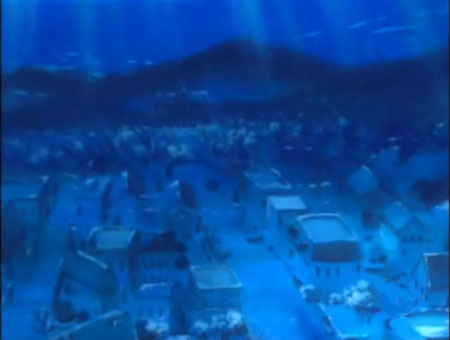
After using photogrammetry to create an object of the space in the convenience store, I noticed that there were many areas of error despite taking 50+ photos of the space. As a result, I decided to take advantage of this setback by incorporating the theme of decay. Later while exploring and editing the space, the blue undertone I came across reminded me of an episode of Pokémon called “Sandshrew’s Locker” in which Ash and his friend explored a drowned city. The surreal feeling evoked by such a space was something that I wanted to incorporate. Furthermore, the action of drowning can be a metaphor for my memories that slowly wither through the passage of time.

4. PROCESS

Using Polycam, I scanned the area in the convenience store that I wanted. I downloaded the glb file, converted it to fbx and imported it into Unity.

Source: Own Image

The texture did not come with the object as expected. Thus, I extracted the texture in “Material.” I also adjusted the scale of the object in the project panel.

Once I added the texture and material I tried adjusting the color of the lighting for experimentation. I found that the blue created an appealing atmosphere which led me to approach the space in an underwater manner.I added a spotlight and experimented with different focal points to my scene. I found the low-intensity light over the entire scene worked well in making my scene look like it was underwater.I played around with the position of the spotlight. The direction of the light made more sense coming from the outside of the window shedding light into the convenience store. Furthermore, the shadows of the object created made the tones of the scene more interesting.

To create a foggy and refraction effect like the player is underwater, I followed a video called Unity URP – Underwater Effect Renderer Feature to create an underwater render effect.

I followed the video Unity URP – Simple Caustics Effect Tutorial to create a caustic effect on the floor. This effect would effectively communicate to the player that we are underwater. Furthermore, I learned how to utilize shader graphs.

I created a URP decal projector component for an empty object.

I experimented with different colors of the caustic effect and lig to see which one was more natural and coherent with the environment.

I one again explored different settings and positions of spotlights and environmental lighting.

I imported a pre-made aluminum can from the Unity Asset Store so I can make it float in the environment and enhance the underwater effect.

Source: https://assetstore.unity.com/packages/3d/props/exterior/aluminum-can-standard-210802

Lastly, I adjusted the first-person controller settings so that the payer moves, rotates, and jumps at a lower speed to indicate the density of water.

5. AUDIENCE RECEPTION & 6. CONCLUSIONS

In this Unity scene, I aimed to evoke a sense of deja vu in which there is an interplay between decay and preservation in the depths of the ocean. In class, I received feedback that the underwater setting amplified this duality due to its association with shipwrecks. The sense of familiarity in a certain area sometimes is accompanied by feelings of loss where one feels an essence of what has been but the memory is assembled by fragmented or floating memories. Whenever I see corners of the convenience stores I can feel myself reaching deep into my memories to recollect why I feel intimacy with these places. I recollect the days when I sat near the windows of these convenience stores, maybe drinking a soda can or eating ice cream, while watching the sunset until it was the cool dawn. Thankfully, it was pointed out in class that my intention of changing the scale of the space was apparent as the player was a lot smaller than the space—which was a suggestion that the player is playing as a child in this space. At the same time, there is a sense of loneliness when I realize that I am experiencing these emotions alone in my head and the only thing keeping these memories alive is myself. Thus, in this void, I feel a deep appreciation for the little things of the past that are kept at a standstill between longing and tension.

7. APPENDIX

Video of the entire space:

Source: Own Image

Week 2: Site Specific Photocollage

Commodity – Anita Luo & Beatrice Zhang 

Source: Own Image
Source: Own Image
Source: Own Image

1. PROPOSAL

We are prompted to create a reinterpretation of a space that embodies the “spectacle” in Society of the Spectacle by Guy Debord. With our documentation of the space, we can illustrate Debord’s social phenomena through the elements of art (line, color, shape, form, value, space, texture) to create a digital sculpture in Unity.

2. BRAINSTORMING

After doing an independent reading of Chapter 1 of Debord’s Society of the Spectacle, we shared a mind map of our understanding, ideas, and questions about the “spectacle” and the concept of “Separation Perfected.” Through this session of comprehension, knowledge-sharing, and examination, themes of autonomy, objectification, and representation were prominent. We chose our location based on these themes.

Source: Own Image


Main concepts from quotes:

  • “social relation among people mediated by images
  • autonomous images” and the “autonomous movement of the non-living
  • “technologies based in isolation” like “automobile to television” which has “constant reinforcement of…isolation of ‘lonely crowds‘”
  • “separate pseudo-world that can be looked at

3. INSPIRATION & CONCEPTUAL INTEGRATION

Concept #1: Nam June Paik

Nam June Paik - Dadaikseon (The more, the better) | G A R N E T | Flickr
Source: https://www.flickr.com/photos/youraccount/7177851500

Nam June Paik – Dadaikseon (The more, the better)

Artist Nam June Paik explored how moving images and technology would become inherently embedded into the daily lives of humans through video art. While the artist conveyed the possibility of human connectivity, we wanted to adopt his use of television as a means to communicate the isolation a viewer may feel from autonomous moving images. In this way, we deviate from his artwork to critique the “spectacle.”

Concept #2: Robotic and autonomous

Can't Help Myself (Sun Yuan and Peng Yu) - Wikipedia
Source: https://en.wikipedia.org/wiki/Can%27t_Help_Myself_%28Sun_Yuan_and_Peng_Yu%29

Sun Yuan and Peng Yu – Can’t Help Myself

We were inspired by the artwork’s intention to convey the repetitive and automated reality. Similarly, everything that we experience in our lives translates into fragmented arrangements of images and representations. As a result, we experience a “separate pseudo-world that can be looked at.” Ultimately, this perspective can be dehumanizing and depressing.

4. PROCESS

  1. Using our mind map, we extracted some keywords to choose the space we wanted to document. We decided to explore a commercial setting that exhibited the concerns of capitalism and commodities. Thus, we went to Taikooli, a shopping mall characterized by lights, products, and luxury.
  2. In Taikooli, we sought to find any space that brought about isolation to someone who would view it. A common motif in the shopping mall was shelves with objects placed at equal distances from each other. They could become fragmented arrangements of images in the consumer’s daily lives or become a representation of the consumer’s experience. Photos can be found under “7. APPENDIX.” 
  3. Thus, we started to sketch ideas of different methods we could convey the ideas of having something but not being. In this ideation phase, we incorporated additions, subtractions, alterations, and combinations of our various ideas.

    Source: Own Image
  4. We further ideated ways to incorporate the documentation and our sketches in a more coherent and effective manner. Thus, we sketched our final idea which consisted of having televisions displaying experiences or memories on their screen that are placed on display shelves.

    Source: Own Image
  5. We added free unity assets of a television and shelf from the Unity Asset Store.
    Source: https://assetstore.unity.com/packages/3d/props/furniture/low-poly-metal-rack-213045

    Source: https://assetstore.unity.com/packages/3d/props/interior/soviet-television-electron-718-125030
  6. We opened a new 3D project on Unity and created a room for the sculpture.

    Source: Own Image
  7. We encountered a few problems. For example, we had the default magenta texture over all our objects. However, after watching this video, we were able to fix it! The other problem we encountered was being unable to import assets. Ultimately, we decided to use the textures from these assets and used our own 3D objects. 
  8. By creating empty parents and grouping, duplicating the televisions was a relatively easy task.  

    Source: Own Image
  9. We then inserted quads with a video each. The videos taken in Taikoolii were edited using CapCut as its filter function was fast and accessible The same filter is used to create unity within the sculpture.
    Source: Own Image

    The edited videos can be found below:


  10. We then adjusted the texture of the wall, floor, and ceiling to black. This enhances the isolation and creates a focal point in the sculpture. 
  11. We lit the sculpture using a spotlight. Unfortunately, we could not make the videos emissive despite searching a lot of tutorials. The overlay of our software looked different from the ones in the tutorial. However, we would like to figure this out in the future.
  12. We intended to embed scripts to create some animation. However, it did not add to the sculpture’s purpose so we discarded this idea.
  13. We adjusted the lighting settings and rendering to make our sculpture immersive through lighting, texture, and color. Through the repetition of the television form and negative space, the sculpture evokes a sense of an impersonal relation or detachment for the viewer from the content of the television. 
  14. Due to time constraints. we were unable to add the shopping cart from our sketch.

5. AUDIENCE RECEPTION & 6. CONCLUSIONS

In the Zoom class, we remotely shared our project and at the same time explained our concepts and creation process. One positive feedback is the specificity of the space – it is condensed into sculpture existing within a focused area, which fixes the audience’s attention to what we have created. Televisions are smart choices to embody the alienation in a commercialized society where people pay for experience and objects but lose their subjectivity as beings. On the other hand, we also received comments about our choice to use televisions as our subject matter. We are prompted to consider its implications on a deeper level. When making choices in a project we should consider why we make certain decisions, how effective they are, and whether there are alternative ways we could approach a concept. We think one of our main reasons for using the television is because the traditional function and understanding of it is to be looked at to receive information. Its one-way channel from the screen to the viewer highlights this human disconnectivity. In this aspect, we could not think of any other subject matter more suitable for this. However, in a modern context, we could find a subject that is more relatable to draw the audience and illustrate our message more effectively. Additionally, we also received feedback that the viewer can interpret the sculpture as surveillance cameras. As a result, we are also considering ways in which we can take advantage of this aspect—maybe surveillance can be a means to extend the critique of the spectacle. However, we believe that we could have avoided this issue if we added the shopping cart to the sculpture. Ultimately, through the repetitive and geometric form of the sculpture, we want to communicate the messages that the boxing, repackaging, condensing, concentration, and separation in the arrangement of society undermine the fluidity and flexibility of our experiences as living beings.

7. APPENDIX

Videos: IMG_9009 IMG_9013 IMG_8998 IMG_8997

8. REFERENCES

Debord, Guy. “Separation Perfected.” Society of the Spectacle, Black and Red, Detroit, 1977.


Week 1: Spatial design exercise

Source: Own Image

Views:

1. PROPOSAL

Considering the “things” regarding Space, Form, Parti, Paths, Views, and Composition in Matthew Frederick’s book “101 Things I Learned in Architecture School,” this exercise requires me to design a virtual space. Simultaneously, I need to consider how the “things” are similar or different from the environment approaches often used in level design. I am prompted to think about the specific intent and potential narrative of the virtual space I will create. What am I trying to express with this space?

2. BRAINSTORMING

An idea that I have been very interested in recently is diaspora as a Chinese South African.

Source: Own Image

Main concepts:

  • Chinese South African Identity
  • “Floating”
  • Identity and identity-inflected space
  • Cultural Politics
  • Empowering Act of Occupation
  • COVID-19?

3. INSPIRATION & CONCEPTUAL INTEGRATION

Concept #1: The Disrupted Home

Source: L’eau Design

Source: L’eau Design

Concept #2: COVID-19 

COVID-19 and ART

Source: https://www.eshre.eu/covid19 

4. PROCESS

1. I first sketched my idea for a space that is organized around the idea of diaspora and the concepts that come with it. 

Source: Own Image

2. Using only Unity’s default 3D Game Objects (primitives) and the first-person character controller, I try to recreate my sketched idea. While working, I would occasionally drop into play mode to see how it feels to move through the space.

After testing out the mechanics of Unity, I first used cubes to create the wall of the house. Due to the limited available objects we have, I modified the house form my sketch.

After completing the house, I created an empty parent called “House” to combine all the cubes.

I adjusted the positions of the house so that it would float.

Naming every object was very helpful while navigating my project.

I started making the spheres in my sketch. However, I decided to adjust the spheres into hybrid forms to contrast the house and floating elements.

A view of my project after following my sketch:

First-person starting point:

3. Lastly, I made adjustments to the sketch based on my playtesting.

For example, I noticed that some of the floating objects were too large for the player to navigate in so I minimized the scale for them.

I also noticed that I needed to place more objects to enhance the feeling of rootlessness.

Lastly, an error occurred where the camera of the player was skewed. However, I kept this to suggest an imbalance in my space.

“Things” I added:

  • Positive and negative space
  • Dwelling in a positive space
  • Thoughtful making of space
  • Contrasting elements
  • Denial and Reward
  • Underlying ideas

5. AUDIENCE RECEPTION & 6. CONCLUSIONS

Through my sharing in class, I received feedback that there is a good narrative in the juxtaposition of the floating unstable objects and the grounded player. The idea of being in the space despite a lack of roots and the feeling of hysteria is thus communicated more effectively. There is also a clear path seen in the space from the floating objects, an ascendance, which offers dynamic in my work.

7. APPENDIX


8. REFERENCES

Frederick, Matthew. 101 Things I Learned in Architecture School. MIT Press, 2007.