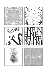
Anita Luo, What do you see?, 2023, Digital media
For better viewing, please open the PDF below:
Anita Luo type + space + meaning class exercise
Proposal
How do we perceive the world around us? Through the Gestalt Theory, I’d like to explore how we perceive words and how that is connected with what we see visually. A person can feel emotions and memories from words but what happens when the words start to become obscured? Can we still rely on our conditioned understanding of the word? I hope to uncover what elements can influence the viewers to feel movement and meaning through typography. I also intend to explore how the eyes can open our minds to unimagined possibilities.
Brainstorming
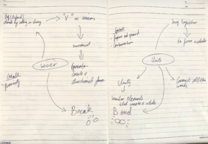
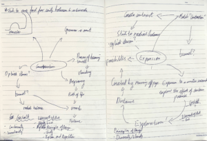
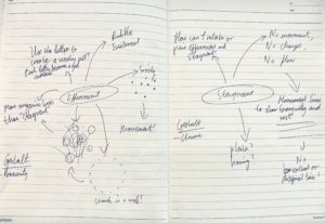
Firstly, I created a mind-map of each assigned word. I wrote down whatever impressions I had in mind of each word in hopes of finding connections and meaning.
Inspiration & Conceptual Integration
I was inspired to use optical illusion in order to add movement to my work. Below are a few references that I drew inspiration from.

Jai Deco Geometric Pattern Tile 0104
Deco’s work creates a diminishing or shrinking effect through his use of shapes that create directional lines toward the center. I believe this could be a way in which I could incorporate movement to illustrate the word “contracting” as it essentially means “to become smaller”.
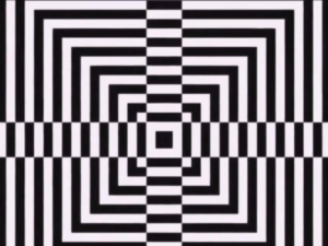
Despite its effect of making our eyes see the room around us shrink, I found this optical illusion unique in that it looks like it is expanding when you look at it directly. Thus, I intended to use this as a reference for my “expansion” composition.
For the word “effervescent”. I was inspired by Isa-L’s works.
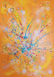
Isa-L’s “N° 20.83 OXYGÈNE” has a repetition of circles or “air bubbles” coming from the center coming outwards, which give the work a sense of movement and a burst of energy. This is a perfect depiction of what “effervescent” means and I hope to draw some ideas from her artwork.
Process
First plan
I initially wanted to incorporate elements of optical illusion to take my work a step further to advance the viewers’ reception to it.
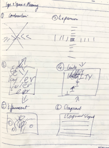
Satisfied with my first plan, I attempted to create my first draft.
First draft
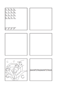
For better viewing, please open the PDF below:
type + space + meaning class exercise_Grid
Unfortunately, I overestimated my ability to cut the text. Due to my lack of Adobe Illustrator competence, I did not know how to cut text in the way I desired. As a result, my first draft was time-consuming. Furthermore, in many cases, I resorted to using shapes to cover certain areas of text instead of utilizing Adobe’s effective and efficient tools. Therefore. I revised and re-evaluated my first composition plan.
Second and final draft

For better viewing, please open the PDF below:
Anita Luo type + space + meaning class exercise
In order to create unity between the 6 separate compositions, I decided to use the same font “Myriad Pro”. The unity is crucial because I want to showcase the 6 words in one whole. This will, therefore, draw a positive reception from the viewers because it will be more accessible.
Contraction
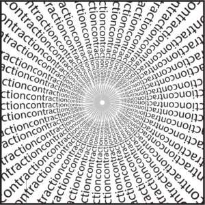
A contraction can refer to the process of becoming smaller. However, contraction is also when the muscles of the uterus tighten up before birth. Thus through my composition, I hope to depict the idea of a tunnel, more specifically a mother’s birth canal, and illustrate the birth of life. The radial balance gives the piece a mystical appeal where one can feel a sense of hope. Like a sun, the radial composition suggests a brighter future.
Gestalt Theory: Continuity is evident in the composition; the texts are within imaginary lines all around the central point in a radial manner. Furthermore, the individual letters also create circles due to their alignment. Because of this use of continuity, it produces imagined lines that create both unity and radial balance.
Expansion
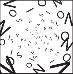
In order to create contrasting but also complementary pairs of compositions, “expansion” is created in the same manner as “contractions” in terms of its radial balance. In “Contraction”, the letters are read most easily on the left where the letters gradually decrease in size. This is a way in which I aim to guide the viewers on how to read and analyze my work. Thus, in this composition, I used the same technique where “EXPANSION” has to be read from where the letters start small. Expansion, to any artist or writer, means to explore the effects of certain areas. Therefore, this composition aims to suggest a sense of exploration, distance, and possibilities. I intentionally placed certain letters out of the border to some degree in order to suggest an imaginary space that the viewers can envision in their minds. The playful orientations of each letter also give the work a sense of livelihood and the hunger for pursuit by humankind.
Gestalt Theory: The elements of Gestalt Theory are not felt strongly in this composition. However, one can argue that proximity, the proximity between the letters, was used that allow the viewers to read the word “expansion” more easily.
Sever
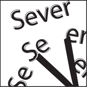
Inspired by my classmates’ use of “V” as scissors, I created this composition with the intention of visually depicting the action of dividing an object by cutting. I leave room for the imagination of the viewers by placing the letter “V” out of the picture plane slightly. It allows the viewer to imagine the rest of a scissor or even a hand. Secondly, I used different orientations, text strokes, and color variations to simulate movement — the “Se” and “er” are moving apart from each other. This also creates rhythm due to the repetition of “se” and “er”.
Gestalt Theory: Proximity is taken advantage of to create movement in this composition due to the gradual separation of the word “Sever”.
Unite
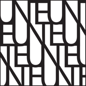
To counteract “Sever” and pair the two words, I created this composition with a strong use of diagonal lines. My aim was to connect each letter of “unite” so that it would form one whole. This bonded idea contrasts with “Sever” which is highlighted by the connectivity of the letters. Something interesting about this composition is that if one looks at it long enough, everything becomes a collection of lines and shapes. This can be related to the word “unite” because unity is essentially only made up of parts.
Gestalt Theory: Figure and ground can be seen in this composition because depending on what the viewer focuses on, one might see letters or one might see white shapes — specifically the U’s that form long white figures.
Effervescent
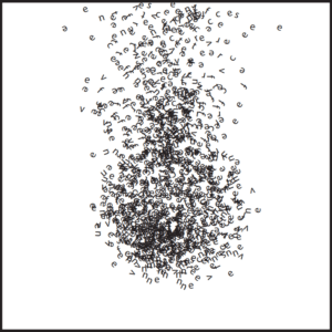
My inspiration for the word “effervescent” is an image of a sizzling pill. The bubble and excitement of such an imagery is depicted in this composition through the use of diverse lines, from the letters, to create an element of variety and sporadic energy. Each letter, which acts as little bubbles of air, is integral in the making of this kinetic composition. A criticism of the work is the inability to find the word “effervescent”. However, when one is excited does one not forget about everything?
Gestalt Theory: The use of proximity allows the viewers to group certain information together to create a sense of depth and shade to the piece — such as the shadow of the pill.
Stagnant
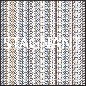
In contrast to “Effervescent”, the letters of the word “stagnant” are placed in an orderly horizontal orientation. This orientation emphasizes no movement, no change, and no flow — horizontal lines show rest. The unity of the composition, through the repetition of the letters in the same sequence, illustrates a motionless state. Thus, this composition was successful because it showcases the meaning of the word and pairs well with its partner “effervescent”.
Gestalt Theory: Closure is a strong element in this composition because, despite the lack of borders, the word “stagnant” in the center can still be read by the viewers.
Rationale
How do we perceive the world around us? Through the Gestalt Theory, I have come to realize that many of the things we see, do, and read have intricate connections to each other. When words or things become obscured it becomes human nature to get in tune with one’s emotions to cope with uncertainty. Things have intrinsic and inherent qualities that can never be taken away from them. Thus no matter where words are, we can always find a way to understand the deeper meaning of something mysterious, because inherently we, humans and things, are connected in some way in this wider world.
Hi, this is a comment.
To get started with moderating, editing, and deleting comments, please visit the Comments screen in the dashboard.
Commenter avatars come from Gravatar.