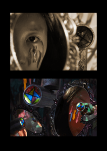
Diptych Documentation

KALEIDOSCOPE WORLD
Amy (Yinuo) Chen
Concept
Inspiration for the concept
The main concept of my diptych design is a transition from the black-and-white world to a colorful world. I got my inspiration from one scene that appears in The Wizard of Oz, in the beginning of the movie, the whole scene is made in a black-and-white color mode to show the complex but single daily life of the heroine. And in a specific scene, the heroine accidentally opens a door that leads to a fantasy world. In that world everything is colorful, and the heroine spend a wonderful time in that world.
The colorful world is a great example of the “secondary world” that is brought by the author of The Lord of The Rings — John Tolkien. In his opinion, God created the “primary world”, which is the world we live in. The world of fairy tales, on the other hand, is the “secondary world” created by man. According to Tolkein, fairy tales, a literary form based on the secondary world, have four functions: fantasy, recovery, escape, and consolation. And I was mainly inspired by the two functions that are mentioned by Tolkein, which are “escape” and “recovery”.
In my understanding, fairy tales are a place full of imagination and magic. People can go to the world of fairy tales that are created by novelists, and they can also go to the worlds that are created by themselves. Not only do children can enjoy fairy tales, but adults also can. Sometimes, the adults’ wishes to go to this secondary world are triggered not only by the frustration in reality and the want to escape but also by their hope to be able to find some solace in the world of fairy tales.
“Fairy tales inspire people to escape to another dimension of life, a fantasy dimension that transcends what things actually are, beyond the overly mechanized modern life. To enter the “second world” is a benign escape, an escape born of the desire for a home where the human mind and imagination are cared for, where we are guaranteed harmony with our humanity and with other beings in nature.” —Tolkein
Inspiration for the design
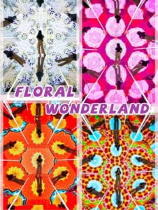
One of the most important elements of my design is the use of the Kaleidoscope. When I was browsing online, an interactive exhibition attracted my eyes. The exhibition is called Floral Wonderland. The exhibition is held by a Japanese photographer, who is named 卷川实花 Ninagawa Mika. One of the most famous sites of this exhibition is the kaleidoscope tunnel. When walking in this tunnel, it feels like people are falling into another world–the world of the kaleidoscope.
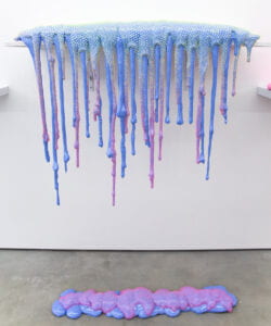
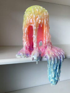
The inspiration for dripping pigments comes from an artist named Dam Lam.
Dan Lam is an American sculptor of Vietnamese ancestry, best known for her “drippy” sculptures and use of vibrant color.
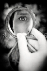
The third element of my design is the mirrors. I got the inspiration of shooting the eyes that are reflected in the mirror from an image I found on Pinterest. When I first saw this image, I felt like it is a fantastic element to appear in my photograph.
So in my design, I want to show that even in a stressful life, which is the black-and-white world, we still have hope and pure land which is a colorful world that is hidden inside of our minds. When we pick up the kaleidoscope and walk slowly along the long tunnel inside, we can reach the colorful fantasy world in our hearts. Mirrors can reflect the outer appearance of us, and, they can reflect our inner mind of us.
Process
Photographing
Before taking the photos, I decided to order the props that are needed in my photos–the mirror with a handle to hold it, the two kaleidoscopes, and something that can imitate the dripping pigments and can also be used on a human’s face. However, due to the pandemic, most of the online and offline stores were closed and the delivery system was broken. One day before the deadline for handing in the photographs, I successfully received my kaleidoscopes and my mirror, but I cannot find anything that can represent the pigments. After several tries, I decided to use nail oil and I painted them on a piece of white paper and cut them into dripping shapes. In the night, I asked my best friend to become the model and I set up a scene in my dorm room. I found a clean white wall inside the room and used a projector to project the pattern inside the kaleidoscope I shot onto the wall as a background, and then took the photos.

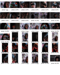
As shown in my contact sheet, I tried many different angles when shooting the kaleidoscopes, the mirrors, and the eyes of my model. The overall lighting is in cold tones, so I put a small warm yellow lighting near the face of my model. However, after I exported the pictures from the camera—which is another day, I found that the lighting didn’t show up at all! So I could just adjust the tone a little bit manually to show the contrast of the lighting inside the mirror and outside the mirror.
Editing
For the editing part, it is the most struggle part.
I only desaturate the first image.
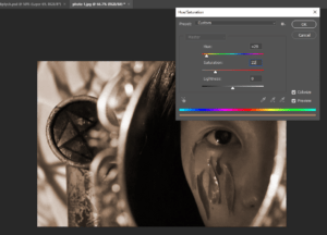
The first version of my design is like this(I first draft the collage on my phone):
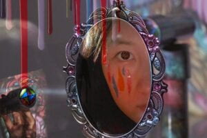
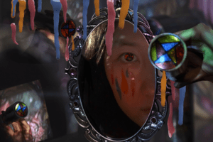
However, if you compared the second image to the first, you will find that they are too similar. So I just overturned the previous design and started again:
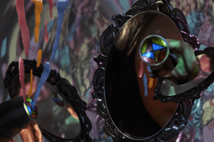
In this version, I tried to add different elements that I took into the collage photo and try to arrange these elements in different ways. But then I feel that the whole picture is too fancy because of too many colors both in the background and in the front, but the content is still very monotonous, and there are not enough layers to enrich the content of the image. So then I decided to add more elements and try to create different layers:
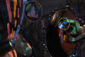
⬇️
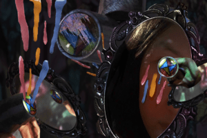
In the third version, I added more elements including the fireworks and the castle to represent the fantasy world. But, it leads to the result that the whole picture is so full that people don’t know where to start viewing this photo and don’t know what the focus of this photo is. So, finally, by reducing the elements that might seem too standing out or too strong, I came up with this last version:
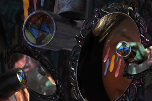
Conclusion
For this project, I really enjoy figuring out the concept of what I am going to present. When I find the three elements that I am really interested in, I feel very excited that I am going to place them in one image. Since I have a great interest in photographing, that night when I set up a tiny studio in my dorm and shot my photo with my model, I am filled with expectations. However, the creation of the second image is terrifying and it let me feel disappointed. To be fair, when creating the collage image, I am gradually getting familiar with various functions in photoshop. I am taking advantage of editing the layers and editing the colors.
But due to the fact that I have little experience creating these art pieces, it becomes relatively hard for me to figure out how to manage my elements together and put them in their best positions. Composition is always the most difficult thing for me. If I have more time, I want to figure out how to improve my composition that can clearly emphasize the main element in my image and make connections between all three elements.
Attachments:
