Sound Visualization Documentation
Amy(Yinuo) Chen
Puff by 8 Immortals Restaurant
Forewords
The first time I heard this song was watching “Myth of Love” in the cinema, and when I heard the melody of this song, I was deeply attracted. The female singer’s hoarse yet magnetic voice, rock and languid style, and fantasy lyrics attracted me. So when deciding which song to use as inspiration for this design project, I chose this song that has rich layers.
Because the song has so many unique characteristics, I took several aspects of the song that inspired my design to complete the piece, including the female singer’s voice, the first feeling I got from listening to the song, and my interpretation of the meaning of the song as it appears in the film.
Concept and Design
Female singer’s voice
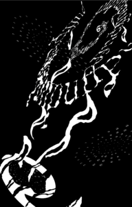
The singer’s voice is husky, revealing a hint of sensuality and seduction in her careless tone. This reminds me of a picture of a red-lipped woman in a long skirt and high heels leaning against the bar in a dimly lit bar, smoking. Smoke rises, her face is hidden, giving me a beautiful but dangerous feeling. To express this feeling, I decided to create a font that looks like smoke.
My first feeling
The pitch of the whole song is on the high side, so while I was listening to it, I first felt like I was floating in the air, and the next moment I might be drawn out into the universe, wandering in the darkness. Therefore, I decided to make the background black to show a dangerous but intriguing feeling. In addition, I decided to add the element of a vortex (or black hole) as a major part of my canvas.
Another comment I have about this song is that it is sticky because the female singer slightly stretches out the last word of each verse. Also, to echo the lyrics “sugar is melting” in the song, I tried to create some dripping liquid. The water droplets were twisted and transformed to create a sticky feeling. To create these sticky drops, I twisted the letter “o” since the origin of the shape “o” looks like water drops. So, in order to make them more sticky, I twist them and rotate them.
The meaning of this song in the movie
In the film, the song appears in the episode where the friendship between the two heroes breaks down due to friction over various disagreements. In order to demonstrate this conflict between the two main characters, I also want to create a sense of brokenness. In my poster, the “e” at the left bottom corner is broken by several lines, which presents a sense of brokenness.
Composition
The practice of One Black Square helps me to better understand the Gestalt Theory and helps me to generate different principles together. After creating the One Black Square project and after listening to the feedback provided by my instructors, I realize the importance of the combination of different principles. For instance, the combination of closure and similarity can create a beautiful vortex in my poster. In the right top corner, the vortex is composed of several lines of sentences. Even the components are mainly lines, but the change of size and the rotation make it looks like a vortex. Similarly, the other two vertexes are composed of a lot of small “e”s, by changing the size, the similarity creates two platforms that serve for the existence of the different vertexes.
Also, I use the “yin” and “yang” when presenting the twisted letter “o”. The bigger and white ones are used to represent the dripping sticky liquid in the middle of the poster, while the smaller and black ones are used to represent the seams due to tearing. For proximity, I intentionally reduced the number of shifting “o”s above the poster and increased the number of “o”s below the poster to create a lighter top and heavier bottom.’
Another point that I use proximity in my poster is that I use different sizes of the letter “e” in different parts of the poster. The “e”s are used to create faces, not only are there small and dense “e”s forming a single plane but there is also a huge “e” forming another plane alone. The tiny “e”s are close to each other while the large one is distant from the others.
For the figure and ground, I use black as the background to present an image of a mystery-and-deep black night sky. And the figures are in the opposite white color to create a sense of dizziness.
The most important thing that I learned through the One Black Square project is how to use the space outside the canvas. When I use this space, it will make my design look more dynamic and more imaginable. In this poster, I try to use the space outside the canvas by placing the biggest vertex in the right top corner, the shape of the spinning out may evoke the idea that there is a larger space outside that canvas to accommodate the vortex. At the same time, the two vortexes in the background, which are not the same size and angle as the vortex, give the impression that the canvas extends radially inward, giving the impression that they will be sucked away by the infinite space inside the canvas.
Process
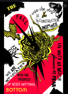
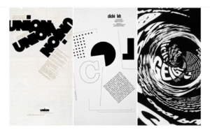
First Stage: Get inspiration from artists’ works
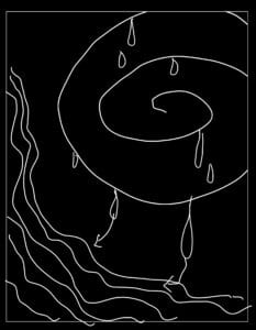
Second Stage: Draw graphs

Third Stage: Prepare the drafts
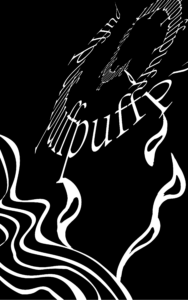
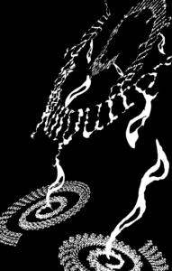
Fourth Stage: Improve the layers and the composition
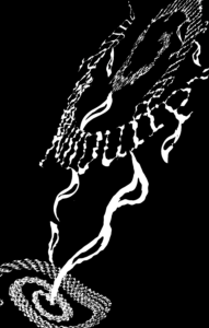
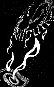

This stage is the last stage of my project but it is also the most difficult one. After I talked to professor Zhang about the previous drafts, I realized that if I had only created the left image, then the background and the figure will be separated clearly into two parts, which is a big problem. At the same time, in my design, there are few platforms(or faces) and a lot of lines and points. As a result, to make my design more diverse and to make my work more layered, I tried several more times to create the plane in various ways and I finally got the last piece.
Conclusion
If I have more time, I will think of a better way to locate the elements in my canvas. More importantly, I will find a better way to create layers to replace the “e” platforms since it still looks separated from the other elements. I will try more fonts and do more adjustments to let the distant vertexes echo with the front layer, which is the biggest vertex. Finally, I want to find a way to create a better balance between the top right corner and the left bottom corner.
Off-topic
This is the first time that I learn to use Illustrator. So when digging out what functions I can use in my poster and what functions can best present my idea really takes a lot of time and a lot of work. However, through this project, I start to get familiar with the software and also get a deeper understanding of how to change my mood when listening to the music into visual artworks, which is quite interesting and meaningful😊
