Review of Diptych Project
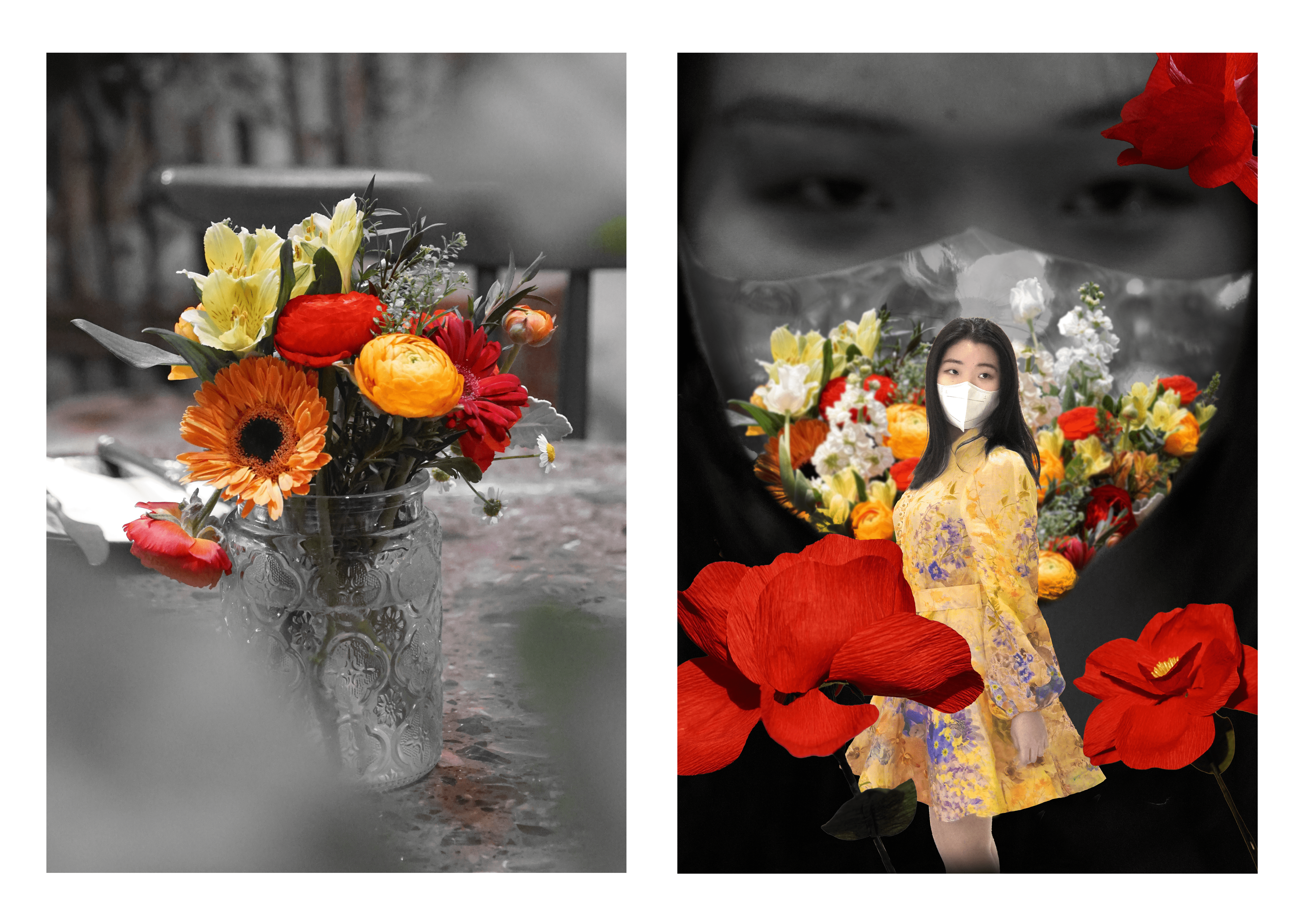
Rachel Duan Spring under the pandemic
I. Concept
As the title of this work, these two pictures are used to show how pandemics influence the spring. Spring should be a beautiful season full of vitality. However, under COVID-19, people need to wear masks and be limited in their homes, having no chance to admire the beautiful spring scene.
Using the contrast of color and black-and-white, the two pictures show the contradiction between spring and pandemic. In the first picture, although the flowers are blooming, the environment has no color, thus the colorful flowers show its loneliness. But in another aspect, this flower can show its color even the background is dark, also show its strength and toughness. So in the second picture, I use a girl with a colorful mask for the background, adding to the feeling of contradiction between dark and colorful. In front of the background, a girl is wearing in colorful dress, showing her determination to not be afraid of the pandemic. Even wearing masks, we can still make our lives colorful. The dark leaves sheltering the flowers in the first picture changed into beautiful red flowers in the same picture position, showing how the girl’s positive emotion makes the flowers bloom.
II. Process
(1) The process in staging and photographing part I.
After coming up with this topic, I spent time finding the contradiction between colorful things and white masks. I also spot a lot of things in no relation just to improve my photographing skills. Thanks to Professor Ian’s suggestions on Chinese ancient arts, I paid attention to the pictures’ composition, and thus I could consciously make my first picture with three leaves in front, and make it more filled with stories.
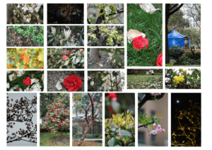
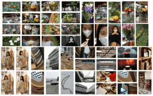
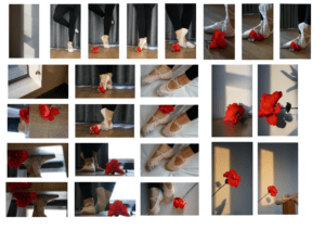
(I create the contact sheet for three times)
(2) The process in creating part II image.
It took me a while to decide the composition of the background. At first, I only decided there should be half of the girl’s face in the background, and another half should be the colorful side. But after considering there should be a connection between the two pictures, I decide to make the whole background a dark style, and the girl will replace the position of the vase and flowers in the first picture. The other parts were decided smoothly, but for the mask part, I hesitate for a long time.
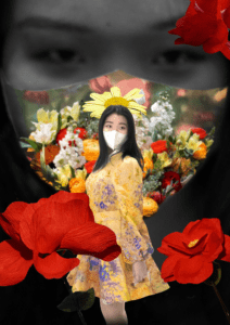
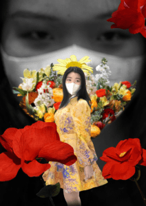
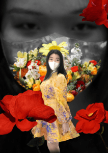
(Three versions that I hesitate on)
(Plus: I delete the yellow flower on the top of the girl’s head later, for it’s too weird)
I asked for others’ ideas, some think that the original white mask wasn’t that natural to see, and I think if the mask is full of color, then the colorful things will take up too many spaces. At last, I decided to use the third version, which is the final one.
D. Conclusion
All in all, I’m satisfied with my work. It is full of art, and it also perfectly express the thing I want to. However, if have more time, I would like to collect more source material, and use them to show the beautiful memories before the pandemic years in the front, which will make more sense in the picture (According to Julie Tian’s suggestions). Also, after Professor Ian pointed out, I found that the red flowers can make interesting symbols and if I can create connections between two pictures depending on that, it would be more interesting. That’s the thing I found that I can improve on.
At last, thanks to Professor Ian who provided me with a lot of ideas, and my model Anna Xie, who spend a week accompanying me to finish the photography part. Also thanks to my camera and my computer. Without your perfect work, I cannot finish my art piece. I’m looking forward to exploring photoshop more, and using it to create more art!
