Tag: vii

The Legacy of Ron Haviv’s Photographs


In regards to David Reiff’s quote about Ron Haviv’s photographs, thus far I’ve found that statement to be relatively true. In researching different ways Haviv’s images from Blood and Honey have been written about and interpreted, I’ve come across mostly the same opinions and uses of the photographs. I have not found the photographs to be taken out of context, and most of the responses I’ve read use the images to supplement arguments regarding the war crimes committed during the Bosnian Genocide. I looked at articles written in The New York Times, The Huffington Post, Aljazeera, The Globe and Mail, and BBC News, as well as from Human Rights Watch, Crimes of War, and Balkan Transitional Justice.

I was intrigued by how many of these articles included Haviv’s personal story. A few different articles were as much invested in him as a photographer and how he was given access to take such stories, as they were in the events that took place and the crimes that were committed. I think this is because of Haviv’s unique position to and relationship with Arkan. For example, the article in The New York Times, from 2013, and the one in Canada’s The Globe and Mail, from 2015, both were focused on Haviv, how he was able to take these photographs, and what he wanted to accomplish with them. Centering on Haviv’s own statements, I found many of the writers emphasized how these photographs were testaments to and undeniable proof of the atrocious acts of violence committed in Bosnia. There seems to be much acknowledgment that the photographs did not initiate the change Haviv had hoped for, but still stand as important recordings of the war.

There is also a focus on how Arkan’s men have escaped punishment and justice. Both the article in Balkan Transition Justice, and AlJazeera, both from 2014, addressed how Arkan’s Tigers have not been held accountable or prosecuted for their crimes. His photographs, specifically the one of the paramilitary member kicking the dying civilian, are used as visual evidence to support the claims against Arkan’s Tigers and ask how its possible these men have not been prosecuted.

There was one essay, from 2015 in Human Rights Quarterly, which took a different perspective on the images. The authors, Martin Lukk and Keith Doubt, posed questions regarding if the presence of Haviv’s camera actually provoked Arkan’s behavior. They ask “Was Haviv’s camera a mirror through which Arkan was able to promote his terrifying images to the world and his victims’ community? Was Haviv an unwitting accomplice to Arkan’s massacre of unarmed civilians?” I think the questions posed in this essay are incredibly important to keep in mind when thinking about Haviv’s work because he was invited to photograph by Arkan. Did the camera affect Arkan’s desire to be seen and did he act upon that desire? Also, how did the camera influence the victims? Were they given false hope that the camera could prevent their death or torture? Because these images did not achieve the political change Haviv had hoped they would, I would be interested to hear from the victims of these atrocities, as well as their families, about how they value these images. Do these images function as tools to show how people, and witnesses, must be held accountable and acts like this cannot go unnoticed? Or are they reminders that the world watched as atrocities and massacres unfolded and yet did nothing about it?


SOURCES:

http://lens.blogs.nytimes.com/2013/04/02/photography-in-the-docket-as-evidence/

http://www.theglobeandmail.com/news/national/capturing-a-war-crime/article25016202/

http://www.balkaninsight.com/en/article/arkan-s-paramilitaries-tigers-who-escaped-justice

http://news.bbc.co.uk/2/hi/europe/1347218.stm

http://www.aljazeera.com/humanrights/2014/12/arkan-balkan-tigers-escape-accountability-2014127122222470909.html

http://www.crimesofwar.org/a-z-guide/paramilitaries/

http://muse.jhu.edu/journals/human_rights_quarterly/v037/37.3.lukk.html


Close Image Analysis – Ron Haviv

Great photojournalism is honest. Rather than present a biased view of conflict, the most effective images choose to show essential truths that ultimately aspire to inform and promote ways to end the conflict at hand. One photographer who has consistently produced meaningful and wide-reaching work is Ron Haviv, who has photographed over 25 conflicts over the span of his career. One of his most renowned works of photojournalism is his coverage of the Balkan Wars, which produced many images that not only showed the atrocities endured by civilian victims, but also used as evidence to indict paramilitary leaders after the fact. One of the many great images from his work in the Balkan Wars is of a Serbian man attempting to put out a fire in his home in the suburb Grabvica outside Sarajevo, Bosnia and Herzegovina.

Haviv’s image contains both strong content and aesthetics that makes it effective. What is physically shown in the frame is rather straightforward: a man is tossing water out of his window at the adjacent room in an attempt to stop a large fire. We see the decrepit windows above and below the subject, which tell us that the building has already been ransacked. The muted beige color of the surrounding windows amplifies the saturated colors of the man, the green bucket, and the burning fire. The bright colors of these subjects in contrast with the scale of the surrounding frame contributes to the dramatic tone of the image. In addition, the shutter speed was rather high when the image was taken, completely freezing the water in midair and making the overall frame more jarring. The caption reveals that Serb arsonists have lit this man’s house on fire to force him out of the city in opposition to the Muslim led Bosnian government. Overall, the image tells us exactly who is being affected by the conflict at hand: innocent civilians.

The simplicity of the content of Haviv’s image lends itself to interpretation. One apparent theme within the photograph is futility, not just of the man’s action, but in relation to the Balkan conflict. The focus on a single subject and action within the frame suggests a call to consider the imagery’s symbolism in context of the Balkan Wars. The opposition to the powerful paramilitary groups within the former Yugoslavian region by the UN was entirely outnumbered and unsuccessful, attempting to stop the violence and terrorism might as well be akin to tossing a small bucket of water at a raging fire.

Interpretations of images and the like thereof are an integral part of photojournalism and the effect of images on the overall perception of a conflict. In her book Shooting War, Susan Moeller speaks to this phenomenon, stating that images of conflict “foster certain physical and emotional stereotypes about each war” and subsequently create a “unique history of each conflict.” This was especially apparent in the Balkan Wars, where many powerful and influential images were sometimes taken out of context and used maliciously. Haviv’s famous image of a Serbian paramilitary member of the “Tigers” kicking a dying Muslim woman with a cigarette in hand is one example. While the image was used by Arkan himself to spread fear, it was eventually used as evidence to indict him. However, Moeller’s point rings true, the images that come from war deeply affect individual perception of the conflict, and this does beg questions of the ramifications for conflict photojournalists and their responsibilities in capturing. Yet, Ron Haviv’s image in discussion seemingly rejects any notion of misinterpretation. The photograph is brutally honest, it presents a desperate situation through striking visuals, and the viewer cannot help but empathize with the man and subsequently bringing into consideration the innocent civilian lives being affected by the conflict (perhaps the largest overarching theme of Haviv’s body of work). Regardless if the man becomes a symbol or not, there is no information within the photograph or overly stylized visuals that distract from the true purpose of the image: to show the truth and affect useful change in whatever way possible.

-Tristan Oliveira

Screen Shot 2016-02-28 at 4.13.04 PM

Screen Shot 2016-02-28 at 4.13.12 PM

VII & It’s Photographers

Like some posts previous to mine, I had a hard time examining the VII website without automatically contrasting it in my mind with Magnum (which I suppose is normal seeing that Magnum is succeeded and rivaled by VII). The first, most obvious difference is that VII is “current” or “hip”. This was evident to me when reading the press release –the use of bold color, current fonts, and strong graphics contrasted greatly to Magnum’s website, which is a touch plain by comparison. While Magnum has history on it’s side, VII has the new era. For them, this is the norm, not an adjustment. In one of the interviews, Ashley Woods puts a lot of emphasis of them as an “online” agency where the archive and work of all the photographers will be online and available to editors instantly – a relatively novel innovation which is important for the immediacy of photojournalism.

They’ve included a map to show where each of the photographers are in the world, as Magnum did. This speaks to the larger framework of how versatile and widespread such a small organization can be. It also shows how important it is to them, still in the current day, to cover all parts of the globe. Even though they put so much emphasis on being everywhere at once, VII has kept their organization deliberately small and it is probably much easier to manage that way since it is a cooperative.

One thing I noticed about VII as a group is they put a lot of significance on wanting to educate others. One of the five main tabs of the website is education. They offer various workshops all over the world as well as internships and mentor programs. While workshops aren’t free or cheap, these world-renowned photographers still take the time to spread their knowledge.

I like that their new photographers photograph mainly things they know/ places they grew up in. I think there is a large disconnect often times between the journalist or photojournalist and the things he/she is trying to convey. It is easier to present on something that you not only know well but have a personal connection to. It is one thing to sympathize with a community and quite another to be part of it. Danny Wilcox Frazier focuses on photographing in America, showing the devastating effects of an ever-shifting economy.

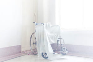
The second photographer, Sarkar Protick, I’ve picked to walk about was born and is based in Bangladesh. He himself is a photographer, teacher, and lecturer – a testament to VII’s commitment to education. Protick’s photos spoke to me because of his strong personal aesthetic and how beautifully dreamy yet haunting his photos are. Like Pinkhassov, from my last post, I was in awe from how carefully he rendered his photos, how lighting played such a big role in his photography. I now follow him on Instagram, and this aesthetic followed him even onto social media. He is very blunt and to the point in his captions, often just writing what he is portraying like “tea, no milk” or “picture of Jesus hangs in a drawing room”. While his captions are straight forward, his photos are not.

Bright room with wheelchair covered in white cloth

It was in the afternoon.I was sitting on my grandpa’s couch. The door was slightly open and I saw light coming through, washed out between the white door and white walls. All of a sudden it all started making sense. I could relate what I was seeing with what I felt. John and Prova, my grandparents. While growing up, I found much love and care from them. They were young and strong. As time went by it shaped everything in it’s own way. Bodies took different forms and relations went distant. Grandma’s hair turned gray, the walls started peeling off and the objects were all that remained. Everything was contained into one single room. They always loved the fact that I take pictures of them, because then I spend more time with them and they don’t feel lonely anymore. After Prova passed away, I try to visit more so John can talk. He tells me stories of their early life, and how they met. There are so many stories. Here, life is silent, suspended. Everything is on a wait. A wait for something that I don’t completely understand

television with blank white screen

It was in the afternoon.I was sitting on my grandpa’s couch. The door was slightly open and I saw light coming through, washed out between the white door and white walls. All of a sudden it all started making sense. I could relate what I was seeing with what I felt.

His series “what remains” portrays his grandparents and their home in a state of perpetual wait and suspense. The photos are very light in color, featuring a dreamy, foggy overlay and a multitude of pastel shades. However, the photos are still very vibrant and well lit. This kind of effect is very hard to achieve and speaks to his mastery. More so than just being beautiful, he explores an intimate relation with his grandparents with these photos from who feels distant yet utterly close to.

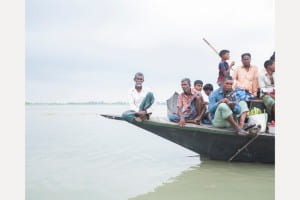
While this series is more of a personal piece, his work is also political. His series “Land in which We can trust” portrays a people who are forced to live in constant fear of their land literally going under water. Some of the work, like his other photogtaphs, can just be considered art because of how beautiful and gentle they are. However, a photo like this one of the men on the boat displacing from their homes, shows a different tone.

Many people on a simple boat

The islanders returning from their races on the continent. The Jamuna river can reach 17km wide during the rainy season. In the region of “tanks”, the voracious river absorbs everything, islands and houses, forcing people into exile. At the current rate of global warming, the country will lose up to 17% of its territory by 2050 and will have between 13 and 40 million climate displaced.

The pastel dreamy sea and sky don’t have a cloud or ripple in sight. The men on the boat could look like they’re just fishing or taking a trip. The haunting thing about this image is the man all the way to the left of the boat, in the center of the composition. He looks at you straight at the camera with a hard expression, but looks like he’s almost looking through you. Like nothing in front of him matters anymore. He looks determined, yet defeated.


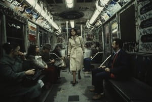
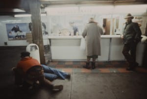
Christopher Morris is the second photographer who I truly enjoyed (who, funny enough, won the Robert Cappa medal). The pieces that stood out to me belonged to his unpublished series on the New York subway system – shot in 1981. He shot it with ektachrome film and a magenta filter. The photos truly show the grunge of the time. Now living in New York and constantly hearing about “the way New York used to be” it was wild for me to see first hand how much really did change in a mere 30 years. Even the graffiti was somehow dirtier. The website describes the project in better words that I ever could “Morris captured the mix of grime, decay and erratic movement that epitomize a moment in New York’s history memorialized in popular culture as a dark, dire metropolis. With New York’s subterranean transportation as his backdrop, Morris contrasts rebellious graffiti with blase attitudes and counter-culture performances with seas of expressionless commuters to show rare moments of intimacy amid a gritty, hard-edged urban metropolis”. This speaks to my earlier point – I connect with this precisely because I do live here and do know so much about it. If I saw these photos of a metro in California or Montreal I would not have the same reaction to them.


New York City subway covered in graffiti in the 1980'sNew York City subway station in the 1980's


The photos themselves are striking and beautiful and I think speak to the kind of aesthetic that film produces. Organic in a way – less perfect, less staged. I like that these photos are not perfectly lit or color corrected. I sometimes forget that even though VII is a newer agency, a lot of their members are older and didn’t grow up in the digital age so their earlier work is shot on film. The rest of Christopher Morris’s work is good as well but this is what stood out to me.


VII Response: Gilbertson & Dimmock

VII is a much newer, more modern agency compared to Magnum – the work on the site is all from within this century, while Magnum’s archives span nearly an entire century of work. Thus, VII’s collection is smaller and contains lots of categories that feel relevant to the news cycle I’ve grown up with: the Iraq War, the Refugee Crisis, the 2004 Olympics, Obama’s inaugurations, the 2010 Haiti Earthquake, and even the Iowa Caucus from last week. Everything seems very up-to-date, current, and like a true encapsulation of the past fifteen years of worldly events.

The site itself is similar to Magnum’s with its sleekness, and it takes a red and (mainly) white theme (as opposed to the black and white themed Magnum site). On that topic, most of the VII pictures are in color; the black and white photographs are certainly a minority in the collection. I have to say this surprised me – sure, much of Magnum is not in color because it comes from a time when color was not an option, but the modern black and white photos on the Magnum site seem artistic, intentional, and appropriate. The black and white VII photos, at least for me in the little amount I’ve spent with this content, seem a little forced and unnatural. Perhaps it is simply that they stick out on the more colorful VII archive.

Another big characteristic that I noticed of the VII website is the heavy amount of text. Captions, descriptions, bios, and other pages of the site are much wordier than the Magnum website. It seems to be more common for modern websites to have less text, especially one dedicated to a photography archive, but VII has a lot of words on its pages. Many of the photographers’ work that I was looking at was very specific and pertained to very focused times or events, so the detail certainly helped to provide background and context.

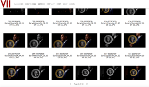
I approached the site with the search function and just started looking up significant events and people from the past decade or so, like the ones I named above. This allowed me to get a feel for the site and the types of photographs that were contained in the archive. Many of the pictures were unique and striking, while this also served as a reminder that VII photographers do not live in a world with limited film:Search results for "Obama" on the VII website

The pool of VII photographers is much smaller than that of Magnum, which obviously makes sense, but still surprised me a little – there may not be many people, but they have a massive, impressive body of work to show for themselves. To focus in on two photographers, I set out to find women. I first selected Ashley Gilbertson, looked through many photos of Iraq from 2003-2005, veterans programs, and families of soldiers. I then read through Gilbertson’s bio and learned he is in fact a man, but I was too struck with his work to move onto another person. Gilbertson spent a long time photographing refugees in the early 2000s, then ended up in Iraq for the middle of the decade, and moved on to working on the effects of war (veterans, suicides, families, brain damage) – his career has taken a very natural direction. He has received numerous awards for his work, being honored with the Robert Capa Gold Metal, an Ellie Award, and an Emmy nomination for some of his multimedia work in most recent years.

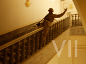
Soldier in combat gearing sliding down marble staircase

A U.S. Marine slides down the marble bannister in Saddam’s palace in Tikrit, Iraq, April 14, 2003.

I was drawn to one striking characteristic of Gilbertson’s work: he’s captured very heavy, intense scenes, but sprinkled throughout images of war and illness and destruction are photos that appear overwhelmingly joyful:

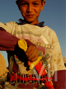
This is a photo of a Marine in Saddam Hussein’s palace in 2003, and below is an Iraqi child playing with some fake weaponry.

Iraqi child with fake knife.

Gilbertson has a remarkable ability to capture something positive in the face of a lot of negativity and violence. Without the context provided in the captions, it’d be hard to guess these images are both from a heated Iraq in 2003.

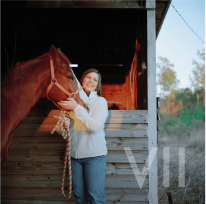
After covering the Iraq war, Gilbertson moved onto veterans affairs and the personal effects of war on involved individuals. A lot of these images, such as stressed Veterans’ Suicide Prevention Hotline employees taking desperate phone calls, are filled with hard, raw emotion and pain. Gilbertson again, though, captures beauty and happiness through all of the terrible circumstances. For instance, I was really drawn to a series of photos involving this woman, specifically this image:

War photographer struggling with PTSD. Woman stands with horse in front of barn

This is an Iraq war photographer who came home from war, suffered from PTSD, struggled with contemplations of suicide, and now has a hard time day-to-day with life. Directly from Gilbertson’s caption, “Today, to prevent overwhelming feelings, she smokes a pipe in the woods near her home and rides horses.” This has the looks of a stock photo of “happy woman with horse,” which is yet another instance of Gilbertson’s ability to contrast light and darkness, both literally and figuratively.

I moved on to Jessica Dimmock, confirmed she is a female photographer, and started looking through her work. She’s photographed a wide swath of people and events, made a music video for Moby’s “Wait For Me,” and served as photographer and videographer for the HBO mini-series The Weight of the Nation. Her folders of work range from Hurricane Sandy relief, Gossip Girls stars, and Hillary Clinton to photos of paparazzi, families with autistic children, and factory workers in Vietnam. She’s done it all.

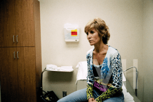
I was particularly struck by her low-resolution photo series about the faces of uninsured Americans. There are a lot of photos of this one woman, Sandy Flanigan, and her struggle with not being able to afford cancer treatment.

Woman in doctor's office

Faces of uninsured Americans: Sandy Flanigan.

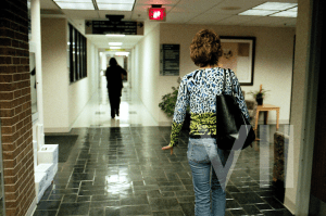
When she was diagnosed with leukemia and given six months to live in 1999, her health insurance premium skyrocketed and she had to drop her coverage. This photo is from 2007, where she is still alive but struggling to find care for a tumor that has been growing for months. This next photo is after her hospital visit, where she was examined and then charged exorbitant amounts for tests and pharmaceuticals, leaving her family helpless, stressed, and in debt.

Woman leaving an expensive appointment.

We hear about uninsured Americans constantly in the news and in politics, but rarely do we get faces assigned to statistics and numbers. A politician may tell a story about “someone they met” along the campaign trail who was without coverage, but this is different. Dimmock, though, has captured the pain and struggle of the day-to-day life of an uninsured woman so well in this series. In the second photo, even though we cannot see her face, Sandy’s stride and hand gesture tell us everything her face is saying – she is concerned about living, about the toll her sickness is physically placing on her, and the financial toll it is taking on her family. She needs help, and she cannot get it. Along with all of the VII photographers, Dimmock gives a face to this pain and a voice to the helpless.

VII Website and Photographers

I found myself struggling to not compare VII to Magnum while exploring their website. I have been familiar with Magnum for a long time, but my first knowledge of VII came from this course. I was initially impressed with how interested VII is in concrete change and solutions. Though I think documentary photographers can easily have a hand in change, simply from bringing eyes and attention to social issues, VII gives the impression that they are concerned with taking this to a deeper level and playing a role in solution making. This comes across through their Association and Partnerships.

In my overview of VII’s different photographers and projects I was surprised to see how much personal work was exhibited on the site. I was expecting mostly editorial work, but I came across many personal projects as well. I think this shows an interest in their photographers as artists that work beyond the realm of photojournalism. I was also impressed by how many multi-media projects VII has and supports. There is a large selection of films on their website, many of which contain both still and moving images within them. I get the impression that while a passion for photography is of course a huge part of VII, at the heart of the agency there is a more general and fundamental core desire to understand and better the lives of people around the world in whatever means possible.

One photographer I was drawn to is Sarker Potrick. Potrick is a member of VII based in Bangladesh. He became interested in photography during his graduate studies and is both a full time photographer and teacher. When I was looking at the “Photographers” page on the site his featured photograph caught my eye. The photograph was from his project What Remains which is a collection if photographs of his grandparents. I really like his introduction to the project in which he writes “I was sitting on my grandpa’s couch. The door was slightly open and I saw light coming through, washed out between the white door and white walls. All of a sudden it all started making sense. I could relate what I was seeing with what I felt.” I appreciated this last sentence because over the past year I have been struggling to take photographs that feel like an internal reflection. It is clear that this is the aesthetic motivation for Potrick’s What Remains. The images of his grandparents are very white-washed; they have a light blue hue and feel very minimal.

It was in the afternoon.I was sitting on my grandpa’s couch. The door was slightly open and I saw light coming through, washed out between the white door and white walls. All of a sudden it all started making sense. I could relate what I was seeing with what I felt. John and Prova, my grandparents. While growing up, I found much love and care from them. They were young and strong. As time went by it shaped everything in it’s own way. Bodies took different forms and relations went distant. Grandma’s hair turned gray, the walls started peeling off and the objects were all that remained. Everything was contained into one single room. They always loved the fact that I take pictures of them, because then I spend more time with them and they don’t feel lonely anymore. After Prova passed away, I try to visit more so John can talk. He tells me stories of their early life, and how they met. There are so many stories. Here, life is silent, suspended. Everything is on a wait. A wait for something that I don’t completely understan

What Remains – Sarker Potrick

This image for example, taken of one of his grandparents in the bathroom, feels very bare and quiet. He frames the image so that the frame is mostly made up of white walls. This is very similar to the other photographs in the project—they have minimal and bare compositions that make the space a sort of unspecific transitional location, reminiscent of a doctor’s waiting room. The palette of the images translates a very quiet, simple life isolated from the outside world, in a sort of limbo. Along with the title of the project, this relays a feeling of time passing and comes across as a very genuine attempt to visually capture the sentiments of being so entwined with old age, and as Potrick writes himself, a life occupied by waiting.

What draws me to Potrick’s images is his use of color. I normally tend towards liking black and white images more than color ones because I often either find color images to have too harsh of an aesthetic for my taste or they feel very digitalized and filter-y. However, I like the very soft and faded feeling of Potrick’s color. In his project Of River of Lost Lands, there is a similar aesthetic to What Remains in that many of the images seem slightly overexposed, making them appear gentle on the eyes. In Of River of Lost Lands Potrick photographed villages around the Padma river in Bangladesh and explored the people’s relationship to the river that both gives and takes away life.

Of River and Lost Lands - Sarker Potrick

Of River and Lost Lands – Sarker Potrick

That idea is seen in his photograph of a river scene in which a fallen building, mostly submerged in the water, rests in front of a moving boat. The fog makes the river and air one texture and color. This gives the whole image a very calm and quiet feeling. The image expresses the duality of the river—in it exists both destruction and activity. The soft tones of the images takes away any sense of violence from the destruction caused by the river. The color also highlights the murkiness of the water, emphasizing the mystifying quality of the river.

Another photographer who interests me from VII is Ed Kashi. I was drawn to his portfolio because I recognized a few of his editorial stories. Kashi is based in New York and focuses his work on social and political issues. A project of his that I am interested in is It’ll Be Better Next Year. For this project Kashi spent almost two weeks in Cimarron County in Oklahoma photographing a community of farmers whose lives have been severely effected by drought. The area was “the epicenter of the 1930s Dust Bowl” and his photographs are reminiscent of images taken by FSA photographers during the Great Depression.

Scott Murdock walks in a dust storm on drought stricken lands on his farm near Felt, Oklahoma. - Ed Kashi

Scott Murdock walks in a dust storm on drought stricken lands on his farm near Felt, Oklahoma. – Ed Kashi

Arthur Rothstein - Fleeing a Dust Storm, Cimarron Country Oklahoma, 1936

Arthur Rothstein – Fleeing a Dust Storm, Cimarron Country Oklahoma, 1936


For example, this image reminds me, and I’m sure must  be in reference to, Arthur Rothstein’s image Fleeing a Dust Storm. Its pretty incredible to compare the two and how drastically similar the landscape appears. This project interests me because I think farming like this is often thought of as something of the past. I found the images in which Kashi allowed modernity to be seen more powerful than the ones that felt timeless, such as the one above.

Casey Murdock, 43, drives alongside his horse to his farm in Felt, Oklahoma. - Ed Kashi

Casey Murdock, 43, drives alongside his horse to his farm in Felt, Oklahoma. – Ed Kashi

For example I was really struck by this image of Casey Murdock driving along side his horse. The blur at the bottom of the image paired with the frozen movement of the horse and car immediately caught my eye and attention. The truck brings the image into the present and allows the struggles the farmers are currently facing to be understood as present struggles—not ones we only think of in the past. It made me wonder about what these images would be like if they were in color. Perhaps color would increase the sense of modernity and give them a life separate from FSA images. This is of course all based on my bias of being very familiar with FSA images and also having grown up in cities making farming and ranching seem like either an abstract concept, or something of the past. While, as I expressed earlier, I am normally drawn to black and white images, I think this project could possibly benefit from color.