This might be an obvious, but Magnum photographers have such diverse bodies of work. Some, like Michael Christopher Brown, take photos in a very clean and to the point way – the action is very strong and clearly the purpose of the photograph. Others choose a rather artistic approach, straying away from what I used to conceive as the “traditional” photojournalism style. The most simple of differences between photos harkens back to the heated discussions these men would give into. It is clear they all have different ideas of how to approach the situations they are in. It made sense to me how they would bicker about the aesthetics and morals of art. There also seems to be a sense of community despite how different they all are. This is seen in the yearly meetings as well as things like a map showing where they all are or the theme page where they all show their different styles and works that happen to be centered on a theme. It is interesting to see how despite their different styles, backgrounds, ideals, geographic locations, it all boils down to some very central and specific themes that cut across all boundaries.
I did, however, find myself wishing that I knew more about the stories and the events being depicted in the photos on the website. Some had brief captions or descriptions but none went into the depth that I was seeking. That seems like something that would be important to them as an organization so it struck me as odd.
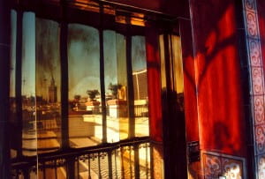
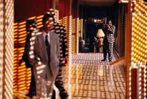
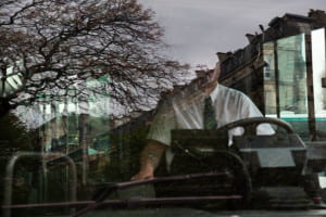
The first thing that truly struck me from the Magnum website was the work of Geurgui Pinkhassov. I looked at a couple of portfolios before I looked at his that very commercial and fashion heavy. The ones I had looked at during class were quite story based. Pinkhassov’s work struck me because I could tell I was looking at something quite complex, something that has a story, but his work is strikingly beautiful. He uses an intense amount of shadow play and pairs it with quite dim lighting, but his work is in a rather electric color.
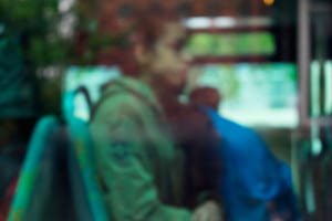
These are only two examples of his work – the first of businessmen in Tokyo and the second of a hotel balcony in Spain. Both use the space brilliantly and leave me wanting to know more about the scene. I find myself wishing Pinkhassov would tell me a story about his trips here, about how and why he acquired these shots. I feel as though I am contently surrounded by what I would consider quite mediocre photography of girls in cute outfits in front of buildings or brooding guys smoking a cigarette with their coffee. This is the first time photography truly inspired me and really made me appreciate a body of work as a whole.
After looking at his selected portfolio, I ventured into his other work. It’s interesting to see that his style pretty much stayed tried and true throughout his life and throughout the different genres he photographs. His reportage work has a certain artistic quality to it which I feel sometimes is lacking in traditional photojournalism. His fashion photography lacks that stark, posed vibe and is replaced by soft lighting and movement. Even his commercial work stays true to his aesthetic. RATP hired him to do a series on urban mobility and even then, his work struck me as authentically “him”. What a versatile man. Here’s two more images of his commercial work because he’s fantastic.
For my second photographer, I looked through the women of the organization, since they are such a minority – Carolyn Drake stuck out to me. A lot of her photos appealed to me visually and a lot of them included the captions I had yearned for earlier. The ones that stuck out for me the most, however, were the photographs she would take and then draw over. One example is this one of a man in China – the inscription reads “faithfulness. Life is only one time. Everyone has to remember their faith.” The juxtaposition of the handwriting on a photograph stands out to me. While what she is doing is not exactly a novel idea, I do not see many people turning their photography into art (in the traditional sense). The lighting of the photo combined with the metallic lettering gives him a beyond natural presence in the room.
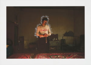
China. Xinjiang Uyghur Autonomous Region. Hotan. 2011. After sacrificing a camel with his ten siblings for Kurban. Translation of the inscription: Faithfulness. Life is only one time. Everyone has to remember their faith.
The second photo I chose is of Cagan Sekercioglu releasing a bird he banded. While I’m not quite sure of the significance of such a photo or what it’s depicting, the image drew me in. The concentration yet gentleness and concern in Cagan’s face is truly a fleeting moment that is hard to capture. She strikes me as someone who has many different styles and can adapt well to the situation in which she is put. The photos I chose are also very personal, as if the people in them invited her into their personal head space and literal space in order to allow her to fully and authentically capture the moment.
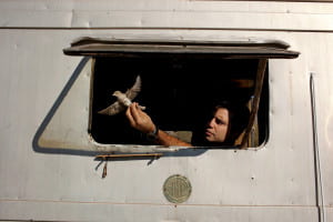
Turkey. Kars. Aras. 2011. Cagan Sekercioglu prepares to release a Red-backed Shrike after banding it at a bird banding station he set up in Aras, a small village near Turkey’s closely monitored border with Armenia.
It is interesting to me that I chose photos with all color because I am usually drawn to the stark contrast of black and white. I think this shows the mastery of the Magnum photographers because I think it is easy to make something look quite commercial, plain, or flat if it is shot in color.
Recent Comments