Spring 2016
Category: VII Website Response (Page 1 of 2)
I’ve always treated photography as “capturing a moment.” In addition, I’ve felt that photography has lost this aspect as of late. With camera phones taking exceptional pictures, and with digital SLRs becoming more ubiquitous and cheap, I’ve felt that photography has declined in some small way.
I’d have to say that viewing the VII website helped restore my faith in some way. Of course I seem pessimistic because I am biased towards a certain type of photography. Yet, VII photographers seem to be excellent at “capturing a moment” — the idea of freezing a moment of time in one frame, to convey an emotion or message. What is beautiful about the VII photos is that they speak for themselves. There might be some degree of artistic interpretation, but the idea seems to be about sharing stories and broadening the minds of viewers.
My other impression of VII photos is that they are very frank. “This is what life is,” is what the photos seem to say. I appreciate that, because they aren’t highly stylized. By that, I mean they aren’t heavily photoshopped to the point where they are considered digital art/digital painting. Of course, filters and effects can help adjust the mood or bring out certain tones, but it never seems overly done to the point where the photographer/editor created an entirely new photo.
I also appreciate VII’s commitment to sharing stories from people around the world, from all walks of life, instead of adhering to some corporate agenda. Of course, every company must have their own issues internally, but externally the collective seems like an honest effort to create discussions on happenings around the world.
One of the photographic works on the VII website that stunned me was by Sim Chi Yin. Titled, “Dying to Breathe,” Sim Chi Yin. Chi Yin, in my opinion, captures the raw heartache associated to illness; the numbing “knowingness” of an impending death; and how knowing you will die has already killed you, in some way. She follows the family of Mr. He Quanggui, 40 years-old. He’s been with his wife, Mi Shixiu, 36, for nearly 19 years. They have an 18 year-old son.
He Quanggui used to be a gold miner. The extreme conditions of his job lead him to develop silicosis. He can now barely breathe and uses a machine to help pump oxygen into his lungs. He consistently collapses, suffers from life-threatening illnesses, and attempts suicide. Fortunately, his family is there for him every step of the way.
The first photo from the collection that strikes me the most is of He Quanggui struggling to climb the stairs to see his doctor. We find out by the later photos that his lungs will need to be drained, but for now, this first photo simply captures He’s daily struggle. It’s not that he cannot walk up the stairs or is short of breath–he is severely handicapped from his disease. We can see by how he grips the railing, hunched over, almost collapsing. People near him can stand upright, yet he cannot. The photography frames He in a very simplistic way, again demonstrating the “frankness” that is pervasive throughout other VII photographer’s works. This is He, and this is his struggle.
The second photo that, quite honestly, wrenched my heart was He sitting with his wife, son, and father. His father had also worked in the mines, but fortunately he does not suffer from silicosis. The caption of the photo lets us know that He collapsed for the second time that morning. His wife holds him and cries; his son sits next to him; his father bends his head down in seriousness. This photo beautifully captures the severity of He’s disease and the effects it has on family. We can see that the end of the road is near for He, yet he is still alive. Therefore, he is suffering greatly.
The next photographer whose work I was struck by is that of Maciek Nabrdalik. Nabrdalik’s photo series, “Refugee Crisis,” is an ongoing work following refugees from the Middle East. We see them arriving on boats, traveling down empty roads, and sleeping on the ground. To summarize, they have nowhere to go, yet they are in dire need of a newer, safer home. Hence, the “crisis.”
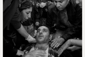
One photo I found interested was of a man waking up after passing out. He is surrounded by several people. It is unclear whether or not he knows these people, or if they just helping him. His eyes are crossed, and the frame hugs tightly around his body. Typically I am not a fan of close cropping, yet this helps capture what it must be like to be surrounded by several people trying to bring you back to consciousness.
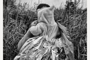
Another photo I wanted to point out was one of a father holding his baby, wrapped in a thermal blanket. Why is this important? Well, this is what they have to keep them warm–a thin foil-like layer. Of course, it will do it’s job, but is is enough? This photo is also “matter-of-fact,” but, it also inspires several questions. Where will they go? What will they do? What do they have? The refugee crisis is something we hear about every day, but not necessarily something us Americans deal with on a daily basis. Though, in other countries, natives encounter refugees every day. It is simply a part of life. Furthermore, this is a refugee’s life, one of nomadicity.
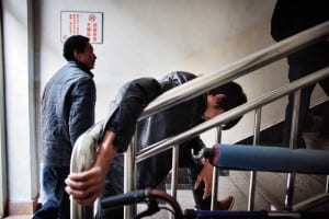
“Arriving at a hospital seven hours’ drive from his remote village in the mountains, former gold miner Mr He Quangui struggles at the foot of a flight of stairs to get to the room where he will be warded. He is almost totally out of breath. An air bubble had burst in his lung cavity, putting pressure on his lungs, the doctors told him. The doctor who received him took one look at the chest x-rays he brought with him and said ‘It’s a miracle you made it here.'”
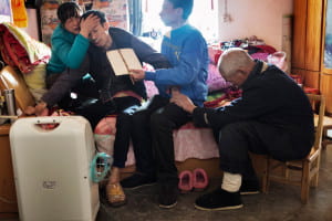
“Collapsing a second time in the same day, shortly after trying to take a pee on a commode, He Quangui is struggling to breathe, his son He Jingbo fanning him with a piece of cardboard while his wife Mi Shixiu and father He Decheng hold him, crying. He eventually recovers his breath. But in the wee hours of the next morning, he tried to kill himself to end the suffering.”
VII is reinvention. What I see on the loading page of the VII website are images that are bright, energetic, but most of all, driven by political themes in the modern world. Searching through the years of work of their photographers, it’s no secret that VII is a physical embodiment of the major political and social events of the 21st century. I did not see images that were conventional and felt as if each photographer and project was pushing new ground, aided by the fact that many of the images are digital, after all, it was meant to compete with Getty and Corbis. Out of some of the least conventional photojournalism I have seen to date, two photographers that stood out and encapsulated the impression that VII left upon me were Alexandra Boulat and Maika Elan.
Maika Elan is a vietnamese photographer who was a sociology student at the University of Hanoi until she took up photography and, at a rapid pace, ascended to a professional level. In 2010 she started documentary photography after spending years as a fashion photographer and by 2013 was a member of the VII Mentor Program. A large amount of her work for VII is from Malaysia and Vietnam, documenting rituals, LGBT couples, family, and friends.
Upon first glance of Elan’s photographs, I was surprised when I saw double-exposed images. I have never seen any photojournalistic project that has utilized this technique, it largely remains confined to more aesthetic and concept-based photography. Her project Here Comes Thaipusam was one that left a lasting impression on my visual senses. In this project, Elan documents the Thaipusam ritual in Kuala Lampur, a ritual that dates back centuries. Before going on assignment, Elan exposed her film to frames of a Western fashion magazine she was reading. As a result, each of the images of this long standing ritual are contrasted with images of the magazine, providing a juxtaposition of tradition and religion to sex and product driven advertising. In one image, she superimposes a high-fashion model woman with one breast exposed onto an image of a large crowd of Thaipusam celebrants on their way to Batu Cave, the starting place of the religious ceremony. The colors are muted, and the dominant hue is blue, causing the viewer to feel colder, which accentuates the distance between the two images now morphed into one. The contrast between the two photos is heavy handed, mostly because we are aware of the fact that Thaipusam is a religious and traditional festival and feel out of place staring at an advertisement that as a citizen of the Western world, we see almost every day. It begs the question, has the Western world’s ritual become shopping or worship of products? In a second image, she contrasts an image of Malaysian men praying and marching in the ritual to another high-fashion image of a woman modeling what seems to be an expensive pair of shoes and yellow pants. There is a large juxtaposition in this image of color, the yellow pants of a high-fashion female model matching with the yellow accents of the dress of the men in the ritual. In these two entirely different worlds, the form, shape, and stance of people remains the same. It invokes a sense of universality, maybe we cannot relate entirely to the religious or spiritual ritual, but we certainly can draw a physical comparison and maybe that is a start to understanding cultures and places entirely foreign to our own.
Alexandra Boulat, one of the founding members of VII, was originally from Paris and first studied art history and graphic art at the École des Beaux-Arts before starting photographing, represented originally by her mother’s agency, Cosmos, and Sipa press for a decade. In 2001 she founded VII along with several peers and spent most of her photographic career focused on warzones in former Yugoslavia, Iraq, Israel, and Palestine, although her work does not stop at war-related images and includes a wealth of social and economic issues of the late 20th, and early 21st century. She is one of the most renowned photojournalists in modern times and has received a myriad of the highest prestige of awards for photography including the ICP Infinity Award, Eisenstat Award, and the Perpignan, Visa d’Or pour I’Image.
Alexandra Boulat’s photographs utilize heightened realism to it’s fullest potential, keeping her images often times brutally realistic and either jarringly still or blurred while in motion. I was drawn to her first project in Gaza, which contains an image of a man being pushed on an ambulance stretcher through what appears to be a hospital. The photograph is blurred from the forward pushing motion of the emergency responder. There are only two visible faces, the urgent expression of the EMT, and the shocked and concerned face of an onlooker staring at the injured man. The photo carries an immense amount of weight with it, we see several cameras around this man and the EMT struggling to push through. Despite the intensity of the situation, there remains a savior, committed to keeping this man alive. The viewer sees the power of the human will in one fleeting moment, we feel propelled by the pure raw energy of the man pushing the injured man to safety. In a second image, three men are gathered near a young child in a hospital bed. One man, who may be the father of the young child, looks at the camera with great concern, the child, still innocent, also looks at the camera. Off to the right, two other men have bowed their heads in prayer. The image of a child in a hospital bed with a cast on his leg draws strong emotion, as many photo’s of children tend to do. However, Boulat is saying more than just about who gets hurt in war, she is also exploring the purpose of prayer and religion. These men may have almost seen this young child die, and for that reason they remain somber, in prayer, perhaps hoping their situation will change. The image asks the viewer to look beyond just the physical manifestations of war, but also the social and mental ramifications as well. As long as bombs continue to be dropped, people will continue to pray, a hopeless gesture, but one that is all one can do in a violently hopeless scenario.
– Tristan Oliveira
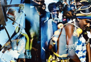
A group of men walking and praying on their way to Batu Cave in Kuala Lumpur, Malaysia on Feb. 1 2012, is overlaid by images of fashion models from a beauty magazine. Thaipusam is known as a very enigmatic festival, mysterious and frenzied. In the words of Maika Elan, “Thaipusam looked like a pilgrimage of a bygone era.” As an avid reader of magazines, Elan wondered how photographs of the traditional culture and people of Thaipusam would look exposed in contrast to media images of modern popular culture. As an experiment, before first visiting Batu Caves in Malaysia where the festival took place, she exposed a few rolls of film with images from the magazines she read. At the Thaipusam Festival, the film was re-exposed over the initial fashion magazine images.
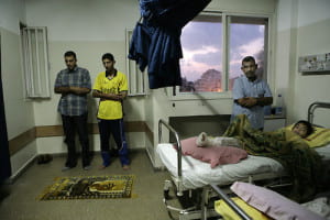
Prayer time at the Al-Shifa Hospital on the bloodiest day of the Israeli incursion (21 were killed and more than 50 injured) in the northern Gaza Strip, Palestine, July 6, 2006. The Israeli military operation, dubbed “Summer Rain,” is aimed at winning the freedom of a captured Israeli soldier and lifting the threat of near-daily Palestinian rocket-fire on southern Israel.
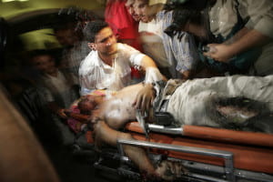
An injured Palestinian from the Hajjaj family arrives at the Al-Shifa Hospital in Gaza City, Palestine, July 8, 2006. Three members of the family were killed, including a six-year-old girl, in an attack on their home in Karni, east of Gaza City in the Palestinian territories. The Israeli military operation, dubbed “Summer Rain,” is aimed at winning the freedom of a captured Israeli soldier and lifting the threat of near-daily Palestinian rocket-fire on southern Israel.
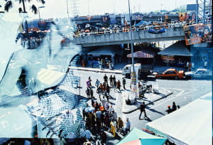
People gather outside of Batu Cave where the Thaipusam festival is held in Kuala Lumpur, Malaysia on Feb. 1, 2012, and is overlaid by an image of a fashion model from a beauty magazine. Thaipusam is known as a very enigmatic festival, mysterious and frenzied. In the words of Maika Elan, “Thaipusam looked like a pilgrimage of a bygone era.” As an avid reader of magazines, Elan wondered how photographs of the traditional culture and people of Thaipusam would look exposed in contrast to media images of modern popular culture. As an experiment, before first visiting Batu Caves in Malaysia where the festival took place, she exposed a few rolls of film with images from the magazines she read. At the Thaipusam Festival, the film was re-exposed over the initial fashion magazine images.
Like some posts previous to mine, I had a hard time examining the VII website without automatically contrasting it in my mind with Magnum (which I suppose is normal seeing that Magnum is succeeded and rivaled by VII). The first, most obvious difference is that VII is “current” or “hip”. This was evident to me when reading the press release –the use of bold color, current fonts, and strong graphics contrasted greatly to Magnum’s website, which is a touch plain by comparison. While Magnum has history on it’s side, VII has the new era. For them, this is the norm, not an adjustment. In one of the interviews, Ashley Woods puts a lot of emphasis of them as an “online” agency where the archive and work of all the photographers will be online and available to editors instantly – a relatively novel innovation which is important for the immediacy of photojournalism.
They’ve included a map to show where each of the photographers are in the world, as Magnum did. This speaks to the larger framework of how versatile and widespread such a small organization can be. It also shows how important it is to them, still in the current day, to cover all parts of the globe. Even though they put so much emphasis on being everywhere at once, VII has kept their organization deliberately small and it is probably much easier to manage that way since it is a cooperative.
One thing I noticed about VII as a group is they put a lot of significance on wanting to educate others. One of the five main tabs of the website is education. They offer various workshops all over the world as well as internships and mentor programs. While workshops aren’t free or cheap, these world-renowned photographers still take the time to spread their knowledge.
I like that their new photographers photograph mainly things they know/ places they grew up in. I think there is a large disconnect often times between the journalist or photojournalist and the things he/she is trying to convey. It is easier to present on something that you not only know well but have a personal connection to. It is one thing to sympathize with a community and quite another to be part of it. Danny Wilcox Frazier focuses on photographing in America, showing the devastating effects of an ever-shifting economy.
The second photographer, Sarkar Protick, I’ve picked to walk about was born and is based in Bangladesh. He himself is a photographer, teacher, and lecturer – a testament to VII’s commitment to education. Protick’s photos spoke to me because of his strong personal aesthetic and how beautifully dreamy yet haunting his photos are. Like Pinkhassov, from my last post, I was in awe from how carefully he rendered his photos, how lighting played such a big role in his photography. I now follow him on Instagram, and this aesthetic followed him even onto social media. He is very blunt and to the point in his captions, often just writing what he is portraying like “tea, no milk” or “picture of Jesus hangs in a drawing room”. While his captions are straight forward, his photos are not.
It was in the afternoon.I was sitting on my grandpa’s couch. The door was slightly open and I saw light coming through, washed out between the white door and white walls. All of a sudden it all started making sense. I could relate what I was seeing with what I felt. John and Prova, my grandparents. While growing up, I found much love and care from them. They were young and strong. As time went by it shaped everything in it’s own way. Bodies took different forms and relations went distant. Grandma’s hair turned gray, the walls started peeling off and the objects were all that remained. Everything was contained into one single room. They always loved the fact that I take pictures of them, because then I spend more time with them and they don’t feel lonely anymore. After Prova passed away, I try to visit more so John can talk. He tells me stories of their early life, and how they met. There are so many stories. Here, life is silent, suspended. Everything is on a wait. A wait for something that I don’t completely understand
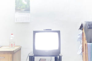
It was in the afternoon.I was sitting on my grandpa’s couch. The door was slightly open and I saw light coming through, washed out between the white door and white walls. All of a sudden it all started making sense. I could relate what I was seeing with what I felt.
His series “what remains” portrays his grandparents and their home in a state of perpetual wait and suspense. The photos are very light in color, featuring a dreamy, foggy overlay and a multitude of pastel shades. However, the photos are still very vibrant and well lit. This kind of effect is very hard to achieve and speaks to his mastery. More so than just being beautiful, he explores an intimate relation with his grandparents with these photos from who feels distant yet utterly close to.
While this series is more of a personal piece, his work is also political. His series “Land in which We can trust” portrays a people who are forced to live in constant fear of their land literally going under water. Some of the work, like his other photogtaphs, can just be considered art because of how beautiful and gentle they are. However, a photo like this one of the men on the boat displacing from their homes, shows a different tone.
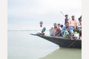
The islanders returning from their races on the continent. The Jamuna river can reach 17km wide during the rainy season. In the region of “tanks”, the voracious river absorbs everything, islands and houses, forcing people into exile. At the current rate of global warming, the country will lose up to 17% of its territory by 2050 and will have between 13 and 40 million climate displaced.
The pastel dreamy sea and sky don’t have a cloud or ripple in sight. The men on the boat could look like they’re just fishing or taking a trip. The haunting thing about this image is the man all the way to the left of the boat, in the center of the composition. He looks at you straight at the camera with a hard expression, but looks like he’s almost looking through you. Like nothing in front of him matters anymore. He looks determined, yet defeated.
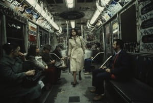
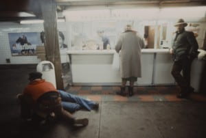
Christopher Morris is the second photographer who I truly enjoyed (who, funny enough, won the Robert Cappa medal). The pieces that stood out to me belonged to his unpublished series on the New York subway system – shot in 1981. He shot it with ektachrome film and a magenta filter. The photos truly show the grunge of the time. Now living in New York and constantly hearing about “the way New York used to be” it was wild for me to see first hand how much really did change in a mere 30 years. Even the graffiti was somehow dirtier. The website describes the project in better words that I ever could “Morris captured the mix of grime, decay and erratic movement that epitomize a moment in New York’s history memorialized in popular culture as a dark, dire metropolis. With New York’s subterranean transportation as his backdrop, Morris contrasts rebellious graffiti with blase attitudes and counter-culture performances with seas of expressionless commuters to show rare moments of intimacy amid a gritty, hard-edged urban metropolis”. This speaks to my earlier point – I connect with this precisely because I do live here and do know so much about it. If I saw these photos of a metro in California or Montreal I would not have the same reaction to them.
The photos themselves are striking and beautiful and I think speak to the kind of aesthetic that film produces. Organic in a way – less perfect, less staged. I like that these photos are not perfectly lit or color corrected. I sometimes forget that even though VII is a newer agency, a lot of their members are older and didn’t grow up in the digital age so their earlier work is shot on film. The rest of Christopher Morris’s work is good as well but this is what stood out to me.
VII is a much newer, more modern agency compared to Magnum – the work on the site is all from within this century, while Magnum’s archives span nearly an entire century of work. Thus, VII’s collection is smaller and contains lots of categories that feel relevant to the news cycle I’ve grown up with: the Iraq War, the Refugee Crisis, the 2004 Olympics, Obama’s inaugurations, the 2010 Haiti Earthquake, and even the Iowa Caucus from last week. Everything seems very up-to-date, current, and like a true encapsulation of the past fifteen years of worldly events.
The site itself is similar to Magnum’s with its sleekness, and it takes a red and (mainly) white theme (as opposed to the black and white themed Magnum site). On that topic, most of the VII pictures are in color; the black and white photographs are certainly a minority in the collection. I have to say this surprised me – sure, much of Magnum is not in color because it comes from a time when color was not an option, but the modern black and white photos on the Magnum site seem artistic, intentional, and appropriate. The black and white VII photos, at least for me in the little amount I’ve spent with this content, seem a little forced and unnatural. Perhaps it is simply that they stick out on the more colorful VII archive.
Another big characteristic that I noticed of the VII website is the heavy amount of text. Captions, descriptions, bios, and other pages of the site are much wordier than the Magnum website. It seems to be more common for modern websites to have less text, especially one dedicated to a photography archive, but VII has a lot of words on its pages. Many of the photographers’ work that I was looking at was very specific and pertained to very focused times or events, so the detail certainly helped to provide background and context.
I approached the site with the search function and just started looking up significant events and people from the past decade or so, like the ones I named above. This allowed me to get a feel for the site and the types of photographs that were contained in the archive. Many of the pictures were unique and striking, while this also served as a reminder that VII photographers do not live in a world with limited film: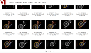
The pool of VII photographers is much smaller than that of Magnum, which obviously makes sense, but still surprised me a little – there may not be many people, but they have a massive, impressive body of work to show for themselves. To focus in on two photographers, I set out to find women. I first selected Ashley Gilbertson, looked through many photos of Iraq from 2003-2005, veterans programs, and families of soldiers. I then read through Gilbertson’s bio and learned he is in fact a man, but I was too struck with his work to move onto another person. Gilbertson spent a long time photographing refugees in the early 2000s, then ended up in Iraq for the middle of the decade, and moved on to working on the effects of war (veterans, suicides, families, brain damage) – his career has taken a very natural direction. He has received numerous awards for his work, being honored with the Robert Capa Gold Metal, an Ellie Award, and an Emmy nomination for some of his multimedia work in most recent years.
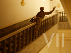
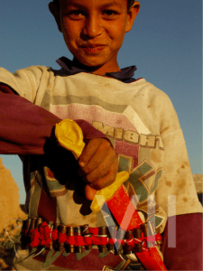
I was drawn to one striking characteristic of Gilbertson’s work: he’s captured very heavy, intense scenes, but sprinkled throughout images of war and illness and destruction are photos that appear overwhelmingly joyful:
This is a photo of a Marine in Saddam Hussein’s palace in 2003, and below is an Iraqi child playing with some fake weaponry.
Gilbertson has a remarkable ability to capture something positive in the face of a lot of negativity and violence. Without the context provided in the captions, it’d be hard to guess these images are both from a heated Iraq in 2003.
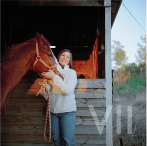
After covering the Iraq war, Gilbertson moved onto veterans affairs and the personal effects of war on involved individuals. A lot of these images, such as stressed Veterans’ Suicide Prevention Hotline employees taking desperate phone calls, are filled with hard, raw emotion and pain. Gilbertson again, though, captures beauty and happiness through all of the terrible circumstances. For instance, I was really drawn to a series of photos involving this woman, specifically this image:
This is an Iraq war photographer who came home from war, suffered from PTSD, struggled with contemplations of suicide, and now has a hard time day-to-day with life. Directly from Gilbertson’s caption, “Today, to prevent overwhelming feelings, she smokes a pipe in the woods near her home and rides horses.” This has the looks of a stock photo of “happy woman with horse,” which is yet another instance of Gilbertson’s ability to contrast light and darkness, both literally and figuratively.
I moved on to Jessica Dimmock, confirmed she is a female photographer, and started looking through her work. She’s photographed a wide swath of people and events, made a music video for Moby’s “Wait For Me,” and served as photographer and videographer for the HBO mini-series The Weight of the Nation. Her folders of work range from Hurricane Sandy relief, Gossip Girls stars, and Hillary Clinton to photos of paparazzi, families with autistic children, and factory workers in Vietnam. She’s done it all.
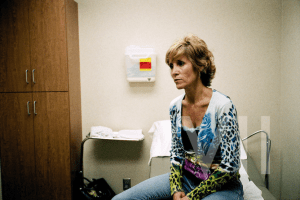
I was particularly struck by her low-resolution photo series about the faces of uninsured Americans. There are a lot of photos of this one woman, Sandy Flanigan, and her struggle with not being able to afford cancer treatment.
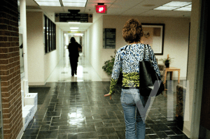
When she was diagnosed with leukemia and given six months to live in 1999, her health insurance premium skyrocketed and she had to drop her coverage. This photo is from 2007, where she is still alive but struggling to find care for a tumor that has been growing for months. This next photo is after her hospital visit, where she was examined and then charged exorbitant amounts for tests and pharmaceuticals, leaving her family helpless, stressed, and in debt.
We hear about uninsured Americans constantly in the news and in politics, but rarely do we get faces assigned to statistics and numbers. A politician may tell a story about “someone they met” along the campaign trail who was without coverage, but this is different. Dimmock, though, has captured the pain and struggle of the day-to-day life of an uninsured woman so well in this series. In the second photo, even though we cannot see her face, Sandy’s stride and hand gesture tell us everything her face is saying – she is concerned about living, about the toll her sickness is physically placing on her, and the financial toll it is taking on her family. She needs help, and she cannot get it. Along with all of the VII photographers, Dimmock gives a face to this pain and a voice to the helpless.
The photographers at the Vii collective represent a multitude of backgrounds, and similarly, they are stationed around the world from Chile, to Cameroon, to Bangladesh. Since Vii was established in 2001, their photos are shot primarily in digital format, as opposed to Magnum’s use of film throughout much of the collective’s industry. To that, Vii presents photos in both black and white and in color. Vii covers current events like “Iowa: Republicans”, by Danny Wilcox Frazier, but also focuses on “visual storytelling” of cultural focus through pieces like “A Detroit Requiem”, also documented by Frazier. The small size of Vii makes for a more exclusive feel within the group itself, but I find it interesting that the collective also advertises their multitude of partnerships, alongside workshops that are open to the public.
The two photographers I chose to focus on are Danny Wilcox Frazier, and Sim Chi Yin. As Wilcox Frazier is based in Iowa, I found the contrast between him and Beijing-based Chi Yin to be interesting. Despite being stationed on opposite sides of the world, both photographers portray political photographs in their own right, and both capture the everyday lives of ordinary people, often times in poverty-stricken areas. I found Wilcox Frazier to be unique in that he’s based in the Midwest, rather than a large city. Similarly, Chi Yin is one of the only women in the Vii collective, making both photographers unique from a “typical” male, city-based photographer that we so often see in both Vii and Magnum.
The first photo by Wilcox Frazier is from his series, “A Detroit Requiem”. The series depicts the East Side in “America’s poorest largest city”, with photos of decay, murder, and poverty-stricken communities. The photo itself depicts Da’Rius Brown, a toddler, running “through garbage in the driveway of an abandoned house that sits next to his home”. The boy is almost naked—he wears just a diaper. The photo is shot in black and white and assumedly in digital format, but the entirety of the composition is blurry and depicts movement. For me, the photo resonated with the work of Robert Capa on D-day and during the Spanish Civil War. Wilcox Frazier’s series does depict a “warzone” in a way. With high murder rates and abandoned property with debris, Da’Rius is running through and toward danger whether he wants to or not. To that, life still continues for the people who live in this area of Detroit. The fact that Da’Rius is wearing only a diaper speaks to his vulnerable state. Similarly, his parents are not in the photo, which yields to a certain feeling of chaos and freedom that speaks to the larger themes of Detroit.

Da’Rius Brown runs through garbage in the driveway of an abandoned house that sits next to his home on the East Side of Detroit, Michigan. Da’Rius has lost two uncles, De’Erion Sherrors and Chaise Sherrors, both shot to death on Detroit’s East Side.
The second photo I chose from Wilcox Frazier is from his series titled, “Iowa Political Circus”—a series in which he follows various US presidential candidates’ campaigns around Iowa in the days leading up to the caucus. The photo depicts a café in Iowa City, Iowa captioned, “Supporters and voters listen as New Jersey Governor Chris Christie speaks at the Hamburg Inn No. 2”. The photo depicts a crowd of predominantly white men gathered in the Hamburg Inn facing leftward, but Chris Christie is noticeably not in the composition. The photo becomes political only in context. Normally, the viewer would merely see this photo as just a crowded café, but in this case, Wilcox Frazier’s caption gives the photo context since its purpose is not self-explainable on its own. When the caption provides the viewer with knowledge that the people depicted in the photo are listening to Chris Christie, an opinion is automatically formed. To that, the viewer perceives the photo based on their own view, despite the photo being objective and lacking a central focus. To the uninformed viewer, the people in the photo are merely present (the black and white image doesn’t allow any particular person to stand out), but the caption itself gives the viewer insight into these peoples’ ideologies, which yields to judgment.

Supporters and voters listen as New Jersey Governor Chris Christie speaks at the Hamburg Inn No. 2 in Iowa City, Iowa.
The first photo I chose from Sim Chi Yin is from her series titled, “The Water Seller”. The series is set in a quickly-developing Myanmar, but Chi Yin follows the lives of water-sellers who rely on Myanmar’s lack of bottled water to make a profit. The color photo that I chose depicts Chit Min Oo, a water-seller, drawing a “tattoo” on his arm in ballpoint pen. The photo states that Min Oo “can often be found either smoking cigarettes or doodling. He has a reputation for being good at doodling on the train, other water-sellers often ask him to tattoo them with his ballpoint pen”. The design of the tattoo itself could be influenced by Western culture and the idea of globalization that is contributing to Myanmar’s development, but it certainly serves as a contrast to the normally grueling workday that water-sellers endure. This photo gives character to Min Oo, who may only be viewed in a one-dimensional way by the (likely Western) viewer. The photo also speaks to the idea of an innate human nature to find free time and enjoy leisurely activities—this is common among everyone, and the viewer can resonate with this photo in some sense.
The second photo I chose from Chi Yin is from her series titled, “The Great Divide”. The series exposes the huge gap between rich and poor in Beijing—an issue caused by a lack of socioeconomic mobility within the city. The photo is captioned, “A worker talks on the phone in front of an advertisement for luxury goods”, and depicts a modestly dressed man on a (non-smartphone) cell phone leaning on a cart in front of a photo of an Omega watch. Compositionally, he is at the bottom of the image and the ad of the luxury watch towers over him, larger than life. At the same time, the worker and his cart take up almost exactly half of the photo, allowing the viewer to note his presence and the watch equally. There is no middle-ground in the photo, which can point to the idea that Chi Yin is trying to portray within the series—the disparity between rich in poor creates a huge gap in Chinese culture. To that, the worker depicted in the photo will likely never be able to afford the Omega watch behind him.
The VII photo website was aesthetically pleasing on top with their latest projects featured in a clean way allowing the images to speak for themselves. However as you scrolled down you reached the main home page with a map featured in the center. While it was creative to show where all of the VII photographers are around the world, the map is dull and outdated and not at all aesthetically pleasing in contrast with the top of the page. Moreover, I found the website more difficult to use than that of Magnum. When you want to look at a photographer’s work, there is no dropdown menu or list provided. Rather a mosaic of photos where you must hover and find the portfolio link versus having the photo hyperlinked to the photographer’s page. Also I found it ironic that the website of a photo cooperative website did not have a tab dedicated to their photographers in the header of the website. Additionally, the website is not mobile friendly which I found out when I had tried to navigate it on my iPhone. In this day and age, and after reading the articles regarding VII and their plans to update their cooperative in every way possible, it was disappointing to visit such a lackluster site.
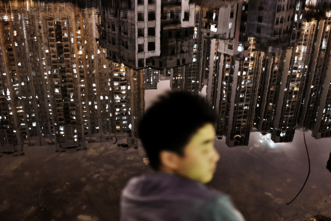
The first photographer that drew me in was Sim Chi Yin who is based in Beijing. The first photo that immediately struck me was the first photo featured in Sim Chi Yin’s portfolio slideshow. In this photo the face of a young man is blurred out and instead the focus of the shot is the reflecting city lights on the water to which he is sitting on the shore of. You can see the dilapidation of the city in its reflection yet the skyline is still breathtaking.
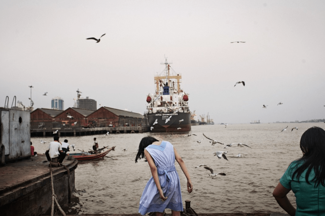
Another photo that I loved was of the harbor yard with seagulls flying all around and a young woman in a blue dress in the center. Once again the city’s run down appearance is evident, this time through outdated boats, musty buildings and a bleak gray sky. I feel this photo encapsulates the decisive moment to which Henri Cartie-Bresson speaks of. The seagulls appear so perfectly placed it as if they are photoshopped and the woman’s head has dropped at just the right angle that it adds to the bleakness that the sky and the harbor yard already speak to.
In both photos the persons featured were not the subjects, their surroundings were. I am not sure what this specific assignment was for but I can assume that these two photos were shot for the same project as they were located in sequence with each other and they have very similar themes. For example both of these photos were shot in a landscape format, they both depicted daily life in some Asian city (perhaps Beijing) and the person was minuscule if not irrelevant to the photo’s surroundings. An afterthought. This last theme speaks to the anonymity a city provides and this anonymity was depicted through the photographs by the fact that neither the man nor the woman’s faces were clearly seen.
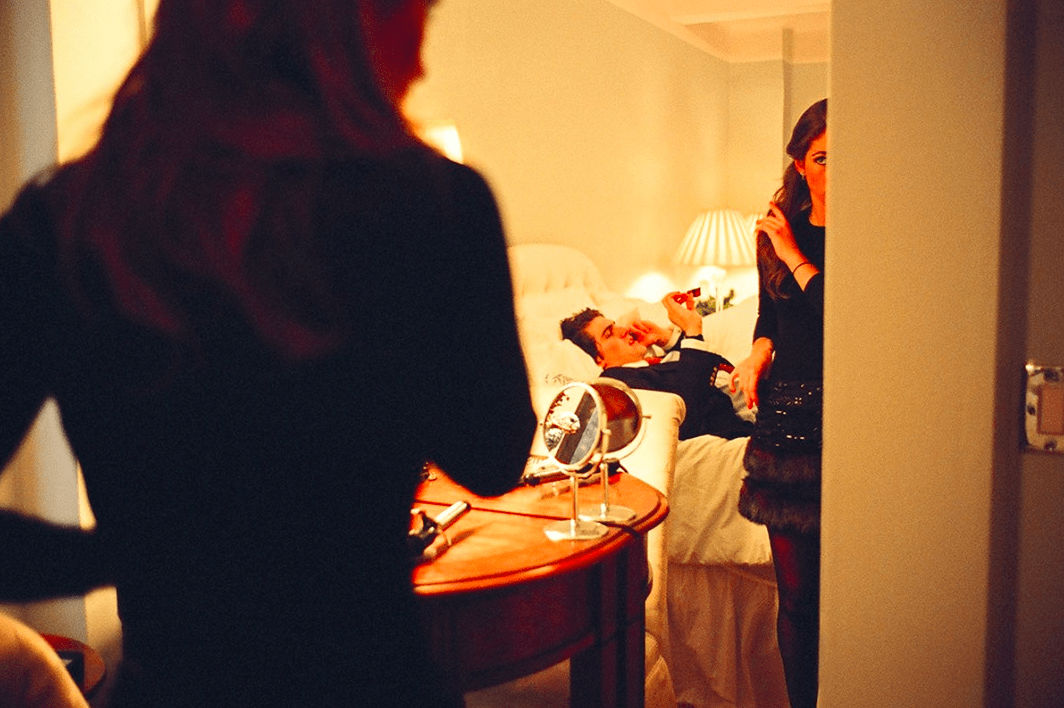
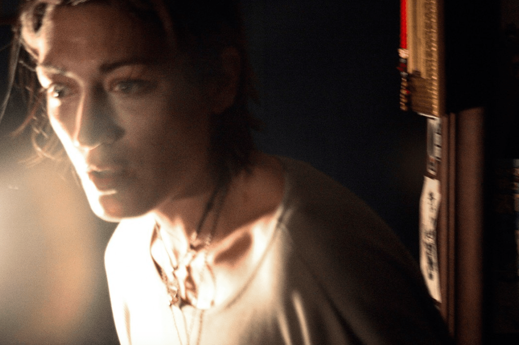
The work of Jessica Dimmock was the second photographer’s work who drew me in. I did love Dimmock’s street style shot of the Chanel bag and Louboutin shoes however the two photos that struck me were the picture of the couple in a room getting ready for what appears to be a fancy night and the woman captured in a raw moment of vulnerability.
The picture of the couple in what one can assume is a hotel room resonated with me as it reminded of my parents getting ready as well as of me and several of my ex-boyfriends. As cliche as this shot may be, I feel that many people can identify with it. This photo encapsulates a societal norm that women care what they look like when they are going out, especially if it is an upscale occasion, and men could care less. This photo shows how the man is ready and probably has been for some time thus why he is laying down and chatting on the phone. The woman is still getting ready, fiddling with her hair and putting on the last finishing touches. While nothing is particularly groundbreaking in terms of lighting or composition or subject matter, this photo struck with me because I simply liked it. While I do not like the stereotypes this photo perpetuates, I cannot say that I’ve never been this woman. I’ve seen this scene play out many times in my life and it’s the familiarity of this photo that resonated with me the most.
Once again the decisive moment was captured. The photo itself is almost entirely out of focus which alludes to the woman being scared, as if she is running from something. Scared of what we don’t know, we can only imagine. It’s in this unknown, that the source of the horror is in our imagination, that scares the viewer the most. Her expression leads us to think the worst about what could be haunting this woman. For this reason I view this photo as the decisive moment, as the exact moment when her fear is at its climax. However I think one could argue that this is not the decisive moment due to the lack of explanation surrounding her horror and what is causing it. The vulnerability of this woman transcends gender and allows any viewer to identify with her.
Modern. Sleek. New. Those are the first three words that popped into my head when I first entered the VII website. It was easy to tell this collective gathered a much younger generation of photographers in comparison to Magnum; the web design was more advanced , there was a live twitter feed, they had a real time map, etc. In comparison to the solemn (and almost less ostentatious) Magnum, VII belts out its humanitarian objective–quite literally. In their logo at the top right of their website, VII labels themselves as “A GROUP OF ENGAGED & COMMITTED PHOTOGRAPHERS CONCERNED WITH THE WORLD AND THE LIVES OF OTHERS” in caps lock.
But beyond the initial grandiose, VII’s core objective cannot be ignored. They are a group that truly brings attention to issues that don’t get the attention they deserve. Tech savvy and modern, VII effectively takes advantage of the visual resources of the 21st century in order to fulfill their humanitarian objectives.
As a testament to their savvy, technological creativity, VII provides an option to view the photographers by photo. While looking through the photos, I was drawn to the photographs of Sarker Protick and Ed Kashi.
I was immediately drawn to Sarker Protick’s work because of an aesthetic attraction to the simplicity and pastel colors of his work. The bright, very pale and cool qualities are captivating. Rather than having a muted feel, Protick’s work holds a mesmerizing quality–mystical and full of magic.
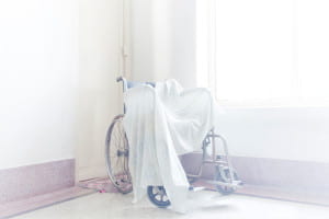
This is most evident in the photos below; one is of an older man and one is of a wheelchair.


In both photos, it is hard not to get lost in the sea of white. The soft light seems to exude beyond the photograph and place you right into the scene of the photo. Rather than eliciting curiosity, the photos keep you afloat in their endless gossamer of enchantment.
Particularly in the photo of the man, once you get past the overpowering light, you begin to notice the details: the grey hat, the door to the right, the white fabric around his neck, the powder on his body, his solemn face. The longer you look the more evident–and almost darker–these details become. Soon, you are more than just drawn to the aesthetic qualities of the photograph, you find yourself coloring the story that the photograph longs to tell.
The photo of the wheelchair contains a bit more color–particularly a light pink-purplish hue that I believe really completes the photo. Without that slight color, I think I would’ve correlated this photo to a sterile hospital setting. But instead, its rosy quality elicits a peacefulness in death–a symbol of a life well lived and a life well parted.
The second photographer I chose was Ed Kashi. The photo that represented him in VII’s catalog of photographers caught my attention because I thought it perfectly embodied what Henri Cartier-Bresson would call “the decisive moment.” 
The perfect jump, the perfect ratio–either Kashi was extremely lucky or this photo shows his utmost talent in capturing the decisive moment. In the midst of turmoil, a young child leaps across a pile of burning materials, symbolizing hope and victory, especially within the younger generation. The child’s lifted right arm adds to this hopeful message and ironically portrays innocence in the midst of corruption and terror.
The second photo of Kashi’s I chose is below.

When looking at this photo, I find myself holding my breath. As if I am there and if I made a sound I would disrupt the moment, the solemn silence. What really amazes me is how he managed to capture this extremely sensitive photo; each facial expression portrays a sadness that you can almost hear–particularly the facial expression of the man of the far right who is comforting the man to his left. The reality and rawness of this photo is what makes it so great.
One more thing I must note about this photo is how translucent the women in the hospital bed looks. Like a ghost, she seems to fade as if to physically portray the loss of those who surround her in the hospital room.
It’s difficult to think about the VII website without thinking about it in contrast to Magnum’s. Something about VII just seems way more 21st century. This is obviously partly because their entire existence has been in the 21st century, unlike Magnum which has been around since the late 40’s. I think what is interesting when thinking about the two agencies is how both of them were founded in moments where new photographic technology was changing the way people took and thought about photography and in the wake of paradigm shift political events . Magnum was founded soon after smaller cameras and faster film became available and in the post World War II years. Similarly, VII was founded in the beginning of the digital age, coinciding with the 9/11 attacks and the War on Terror . It makes me wonder how the technological advances and political events have affected the overall aesthetic and philosophies of VII and how that compares to Magnum. I wonder how a photographer would choose to be part of Magnum or VII if they were given that choice. I don’t really have an answer to these questions yet but I do have a few observations. It seems that there is a lot less black and white than on Magnum’s site among the more modern photos. Perhaps this is because VII was born within the digital age, there isn’t as much weight attached to pre-color photography. There also seems to be a lot less traditional war photography on the VII site. Perhaps strategically, it seems like they are mostly promoting political stores from current U.S. presidential race.
Speaking of the presidential race, one of the first stories that stood out to me was a series by Ron Haviv called “Weekend at the Republicans”. Ron Haviv is an Emmy nominated New York based photographer and one of the founders of VII. “Weekend at the Republicans” documents the recent Republican Leadership Summit in New Hampshire. I think what is so interesting about these photos is that Haviv photographs this politicians in very unconventional ways. Often his photos, rather than being standard political portraits that give the viewer the sense of the politicians power, Haviv often focuses on smaller details of the politicians. For example, in one, captioned, Clockwise Senator Ted Cruz , Governor Mike Huckabee, US Senator Rand Paul, Governor Jeb Bush,Governor Rick Perry, Carly Fiorina speak at Republican Summit,

Clockwise Senator Ted Cruz , Governor Mike Huckabee, US Senator Rand Paul, Governor Jeb Bush,Governor Rick Perry, Carly Fiorina speak at Republican Summit.
Haviv creates a portrait of these politicians from behind, through the American flags they are speaking in front of. Instead of the politicians faces, you see their feet, visible through the bottom of the flags or their shadows. Even the choice of whose feet Haviv chose to show is really interesting. For example, the first set of feet turn out to be the feet of Ted Cruz, who is wearing black dress pants and ornate cowboy boots. Below his are the feet of Carly Fiorina, who is wearing black and white high heels and a blue knee length skirt. Rand Paul is wearing blue jeans and brown worn in boots. Here, I think Haviv is trying to point out how tactical the clothing of these candidates are by obscuring the candidates faces and upper bodies. Each politician has clearly thought about their footwear, and trying to win over a certain segment of the American public through their appearance. Another interesting photo from this story shows Governor Mike Huckabee being photographed on a mobile phone.
I think it is really interesting to create a portrait of a person through the camera of someone else, and perhaps shows the spectacle and massive media event that America’s presidential race has become.
Another story I found interesting was Franco Pagetti story “The Cuban Paradox”. Pagetti is an Italian photographer who has been working as a news photographer since 1994. I spent a week in Havana in January so I was curious to see how a VII photographer would portray the city. I think many photographers fall into the trap of portraying the city as a kind of “time capsule” of the fifties without digging much deeper into the culture of the country and the city. However, I think, in the wake of Cuba’s rekindled relationship with the United States, Pagetti does a good job of not falling into the “time capsule” trope and instead, tries to capture the excitement many Cubans are feeling about the future. For example, even in his photographs of vintage American cars, he includes in the caption that the engine is actually from a hyundai and that the car has Japanese and Korean parts, despite the fact that the body of the car is American.

An old American car being used as a taxi. The bodywork is vintage but inside it hides a 2008 Hyundai diesel engine and other Korean and Japanese parts. Havana, Cuba. April 2015.
In another photograph, he shows people on their cell phones and tablets using wireless access to talk to their friends and family outside of Cuba. I think these things are important, because it combats the dominant idea that Cuba is stuck in the past which is largely perpetuated by photographers.

Along the Prado and 23 Street, people use a wireless internet connection to speak with friends and relatives who live outside the country. Havana, Cuba. August 8, 2015.
Although wifi may be restricted and car parts too expensive for the average Cuban to buy, I think it’s important to remember that Cuba isn’t as isolated and antiquated as people often think it is. I think this is what Pagetti means by titling the story “The Cuban Paradox”.
I found myself struggling to not compare VII to Magnum while exploring their website. I have been familiar with Magnum for a long time, but my first knowledge of VII came from this course. I was initially impressed with how interested VII is in concrete change and solutions. Though I think documentary photographers can easily have a hand in change, simply from bringing eyes and attention to social issues, VII gives the impression that they are concerned with taking this to a deeper level and playing a role in solution making. This comes across through their Association and Partnerships.
In my overview of VII’s different photographers and projects I was surprised to see how much personal work was exhibited on the site. I was expecting mostly editorial work, but I came across many personal projects as well. I think this shows an interest in their photographers as artists that work beyond the realm of photojournalism. I was also impressed by how many multi-media projects VII has and supports. There is a large selection of films on their website, many of which contain both still and moving images within them. I get the impression that while a passion for photography is of course a huge part of VII, at the heart of the agency there is a more general and fundamental core desire to understand and better the lives of people around the world in whatever means possible.
One photographer I was drawn to is Sarker Potrick. Potrick is a member of VII based in Bangladesh. He became interested in photography during his graduate studies and is both a full time photographer and teacher. When I was looking at the “Photographers” page on the site his featured photograph caught my eye. The photograph was from his project What Remains which is a collection if photographs of his grandparents. I really like his introduction to the project in which he writes “I was sitting on my grandpa’s couch. The door was slightly open and I saw light coming through, washed out between the white door and white walls. All of a sudden it all started making sense. I could relate what I was seeing with what I felt.” I appreciated this last sentence because over the past year I have been struggling to take photographs that feel like an internal reflection. It is clear that this is the aesthetic motivation for Potrick’s What Remains. The images of his grandparents are very white-washed; they have a light blue hue and feel very minimal.
This image for example, taken of one of his grandparents in the bathroom, feels very bare and quiet. He frames the image so that the frame is mostly made up of white walls. This is very similar to the other photographs in the project—they have minimal and bare compositions that make the space a sort of unspecific transitional location, reminiscent of a doctor’s waiting room. The palette of the images translates a very quiet, simple life isolated from the outside world, in a sort of limbo. Along with the title of the project, this relays a feeling of time passing and comes across as a very genuine attempt to visually capture the sentiments of being so entwined with old age, and as Potrick writes himself, a life occupied by waiting.
What draws me to Potrick’s images is his use of color. I normally tend towards liking black and white images more than color ones because I often either find color images to have too harsh of an aesthetic for my taste or they feel very digitalized and filter-y. However, I like the very soft and faded feeling of Potrick’s color. In his project Of River of Lost Lands, there is a similar aesthetic to What Remains in that many of the images seem slightly overexposed, making them appear gentle on the eyes. In Of River of Lost Lands Potrick photographed villages around the Padma river in Bangladesh and explored the people’s relationship to the river that both gives and takes away life.
That idea is seen in his photograph of a river scene in which a fallen building, mostly submerged in the water, rests in front of a moving boat. The fog makes the river and air one texture and color. This gives the whole image a very calm and quiet feeling. The image expresses the duality of the river—in it exists both destruction and activity. The soft tones of the images takes away any sense of violence from the destruction caused by the river. The color also highlights the murkiness of the water, emphasizing the mystifying quality of the river.
Another photographer who interests me from VII is Ed Kashi. I was drawn to his portfolio because I recognized a few of his editorial stories. Kashi is based in New York and focuses his work on social and political issues. A project of his that I am interested in is It’ll Be Better Next Year. For this project Kashi spent almost two weeks in Cimarron County in Oklahoma photographing a community of farmers whose lives have been severely effected by drought. The area was “the epicenter of the 1930s Dust Bowl” and his photographs are reminiscent of images taken by FSA photographers during the Great Depression.

Scott Murdock walks in a dust storm on drought stricken lands on his farm near Felt, Oklahoma. – Ed Kashi
For example, this image reminds me, and I’m sure must be in reference to, Arthur Rothstein’s image Fleeing a Dust Storm. Its pretty incredible to compare the two and how drastically similar the landscape appears. This project interests me because I think farming like this is often thought of as something of the past. I found the images in which Kashi allowed modernity to be seen more powerful than the ones that felt timeless, such as the one above.
For example I was really struck by this image of Casey Murdock driving along side his horse. The blur at the bottom of the image paired with the frozen movement of the horse and car immediately caught my eye and attention. The truck brings the image into the present and allows the struggles the farmers are currently facing to be understood as present struggles—not ones we only think of in the past. It made me wonder about what these images would be like if they were in color. Perhaps color would increase the sense of modernity and give them a life separate from FSA images. This is of course all based on my bias of being very familiar with FSA images and also having grown up in cities making farming and ranching seem like either an abstract concept, or something of the past. While, as I expressed earlier, I am normally drawn to black and white images, I think this project could possibly benefit from color.
© 2024 Photography Through the Lens of Magnum and VII
Theme by Anders Noren — Up ↑




Recent Comments