Spring 2016
Category: McCurry Response (Page 1 of 2)
Previous to seeing the exhibit, I had exposure to Steve McCurry’s work through the Internet. Quite frankly, I’m not drawn to his style. With a lot of his images on a screen, the colors are saturated, high contrast, and seem quite one-dimensional. The stark contrast and vivid bright colors seem like he uploaded the photos into Photoshop and played with the levels.
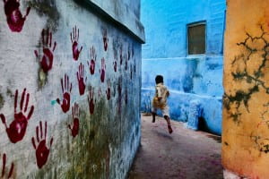
One example of this, in a photo I do not find to be successful, is the photo of a “Boy in Mid-flight”. The little boy is captured in “the decisive moment” as he flies through the passageway. For me, the colors don’t seem natural – distorted in a way, like when you put too many effects onto an image. It distracts from the imagery and there is too much visual information that nothing truly stands out.
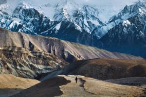
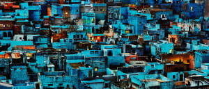
However, in the case of his landscape photography, I found that looking at them in the exhibit at such a grandiose scale was empowering and engulfing. In the examples of “Blue City” and “Man Walks in the Himalayas”, the scene was so captivating and beautiful that I found myself wondering if this was truly how it looked or he had edited the photos to make them more impactful, perhaps by layering images or tinkering with colors in certain areas.
Either way, I was overwhelmed by how beautiful and masterful these landscape photos were. I literally had to get up close and personal to the photograph in order to check if it was a painting or not. The color makes the places seem otherworldly, ethereal, and gives it an overall positive vibe. In fact, most of his images seemed to focus on positive and communal aspects of India, which is quite the shift from some of the darker imagery we’ve been exploring (figuratively and literally).
I was not sure of the statement he was making by the end of the exhibit in the slightest. I did not feel as though there was a coherent theme or story he was trying to tell. Since he broke the exhibit into clusters depending on the cities the photographs were taken in, there is clearly an importance that had to do with the geographic location. However, I was unsure if he wanted to distinguish between each of the cities or create a cohesive narrative throughout. A blurb on the wall reads that the photographs “represent glimpses of everyday life in urban and rural areas, historical sites, splendid landscapes, and portraits of people McCurry encountered”. I personally feel as though this is too broad of an undertaking and should be focused in order to make more of a point or create a cohesive narrative. On the website description, they say that these images “express McCurry’s commitment to capturing unexpected moments.” I feel as McCurry captures moments in India’s history and makes them unexpected by how lively and colorful they are.
I have gathered that McCurry’s fascination with India has led him to many excursions and explorations of the areas over a long range of time. From very surface level research, I have found that McCurry’s had been going to India for over 30 years. I feel as though his works on India are a personal exploration on things that have stuck with him throughout his years of travels and interactions. In this case, he blurs the line between “journaling” in a way and photojournalism. I found this quite similar to Gilles Peress and his works in Telex Iran. Obviously, Peress spent much less time in Iran, only totaling around 5 weeks, than McCurry in India. However, Peress’s work is very much his trying to work through the conflict in Iran in a very personal way, shown from the confusion in the photographs to even the seemingly mundane telex communications. Both works don’t have a cohesive narrative or story they’re trying to tell, per se, but exploring the photographer’s experiences. McCurry’s approach is definitely less jumbled and confused. It is coming from a long time of working through what it means to be in India while Peress is only scraping the surface of coming to understand the dynamic of Iran.
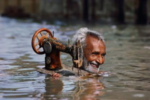
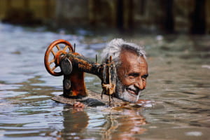
Peress’s work is clearly reflective of the fighting and chaos of the time rather than portraying the physical place and culture. Even pictures of the strife in India that McCurry displayed in the show were bright and made you almost forget that this was a terrible time in the history. For example, the photo of the tailor carrying his sewing machine through monsoon waters. The man smiles and treads through water with his ruined sewing machine. Monsoons are terribly destructive to the people in India, but McCurry focuses instead of celebration and passion. Peress, on the other hand, highlights conflict and seeks to explore and make sense of destruction. His photos leave you with a sense of despair and confusion.
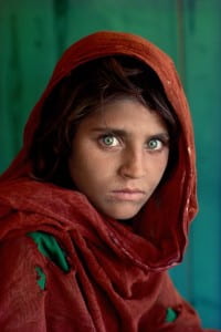
When going to the Rubin Museum to see Steve McCurry’s exhibition, I was very excited. I discovered this photographer randomly about two years ago when I started developing a passion for photography. I was staying in Sevilla for about a week and decided to take a one day trip to Sienna. As I was walking through the streets of Sienna, I came across a poster advertising his exhibition on the Plazza Central. And, of course, the image that was on the poster is what drew my attention: it was the portrait of the young Afghan girl, which I had seen many times on the cover of National Geographic.
And, frankly I did not know any of McCurry’s other pieces except for this extremely famous one. So, I decided to go inside and take a look at the exhibition. I ended up falling in love with McCurry’s style especially his very sophisticated and unique touch when shooting portraits. And, I equally appreciated his portraits at the Rubin museum. I find them absolutely stunning and very truthful to the Indian culture he is depicting. However, I was weirdly disappointed by his exhibition at the Rubin. Of course, I already had seen some of his photos at the museum in Sienna. However, I discovered some new ones at the Rubin. But his style, with very saturated images, just seems very linear; almost plain.. After studying photographers like Ashley Gilbertson who’s art is so diverse, I was very disappointed by McCurry’s commerciality. Ash depicted one conflict in so many different ways: not only up front with the soldiers in the midst of action through Whiskey Tango Foxtrot, but also back home through his Bedrooms Of The Fallen. And, I think that it requires the photographer to have a lot of talent and courage to present such diverse pieces. After seeing this, McCurry’s art just seems very easy in a way that it is so logical and predictable. It follows a very linear thread. I expected to maybe be surprised at the Rubin, even though I recognized and appreciated the beauty of the images.
Also, the fact that the images were printed so huge added to my disappointment. If I saw McCurry’s images in a magazine, they would probably not impact me as much as they did at the Rubin or in Sienna. On another hand, Ash’s photos impacted me immensely even though I was holding them in my hands. The staging and scale that McCurry chose is again maybe a little bit easy. It is very impressive, especially the first time that you see them, but I don’t think that they would not be as powerful in a small format. But, I am going to contradict myself here by saying that portrait of the Afghan girl on the cover of the National Geographic left a huge impact on me even though it was printed on a magazine format. I found it interesting to see the differences between the two exhibitions. In Sienna, some small prints were covering the walls of a huge round room. It was very impressive and overwhelming at first as a general feeling, but then when I walked out of this room I realized that I actually did not remember the images exposed. I actually only remember two of them, that really impacted me, and they both involved a child.
I am also oddly conflicted when calling McCurry a photojournalist. His images portray a culture in a very beautiful way, however what do we learn? What events do they report? Although I know that it is incorrect, I tend to want to call his pictures art photography more than photojournalism.
In an interview, McCurry said that he was brought to India because “it was a place (he) had never been before and wanted to explore”. This is very interesting to me as it seems like the purpose of this trip was kind of selfish in a way. He wanted to experience something, a new culture in order to create a story, which would ultimately be his story of India. Ron Haviv said in one of his essays that to him photojournalism was absolutely not about him but about the people he photographed. So, does McCurry go against Haviv’s idea? I am not entirely sure. It is ambiguous as McCurry also says that before going to India he was mainly shooting black and white photgraphy. However, in India, he discovered that most of the culture and the Hindu religion revolved around color. Therefore, he shot his album in color in order to be truthful to the culture and the people of India. McCurry changed his ways in order to respect his subjects.
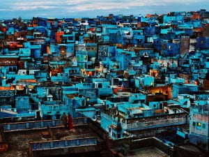
McCurry also explains how he fell in love with the Kashmir region and the Indian culture. Therefore, it makes sense that he wanted to represent it as a beautiful ensemble. Here again, we have this idea of ‘his vision’ of India. How accurate is it? The colors are vibrant and so over saturated that sometimes it seems like the scene is unreal. For example, how accurate is the image of the Blue City?
Is it normal that I doubt the legitimacy of a photojournalist’s work? I think that means that part of his job as a photojournalist is not completed correctly in my eyes. However, the image is esthetically stunning but again leads me to think that it is more art photography than photojournalism.
But, some other images from McCurry’s India portfolio brought back that real India that I was looking for. He shows the level of poverty and the harsh living conditions that people suffer from, but still, he makes every shot esthetically pleasing. I understand that as a photographer, esthetic is extremely important as you want people to look at your photo. As Ron Haviv said when he shot the photo of a young girl walking through the desert after being exiled from her village and forcefully married to an older man, “the most important thing is that the photo is pleasing to the eye”. If it is, then people will stop, look at the image, read the caption and therefore learn about the story behind the shot and about the human rights’ cause that is highlighted and that needs to be talked about. Beauty in a way is used by photojournalists as a mean to raise awareness and educate the population.
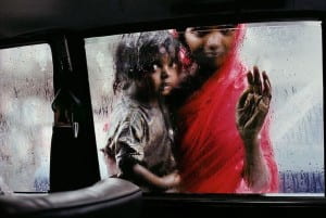
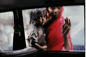
I remember first seeing this image while scrolling through the Magnum website at the beginning of the semester. It instantly struck me, for multiple reasons. First, as I have written many times, I am very drawn to cinematic, filmic images. The rich colors, shallow depth of field, and relatively low contrast makes this photo look like it could be a still from a movie. I can imagine the story of a father leaving his young wife and child in a taxi to go off on a quest of some sort. And I can also image that McCurry experienced a similar situation; he was in a car, maybe a taxi, and and this woman and her child in some way desired to be inside with him
But regardless of the actual details of the story behind the photo, the photo speaks for itself, with the both physical as well as more metaphorical separation and yearning that it depicts. McCurry, and his camera, were able to look out from the comfort of the inside of the car. Outside, the woman and her child stand in the rain, separated from the the inside by the glass of the window. In the same way, these possibly lower socioeconomic Indian citizens are separated from McCurry, a relatively wealthy white man, by both a physical piece of glass, but also a social and economic divide.
The two subjects of the photo are hauntingly beautiful, and McCurry expertly captures their looks as well as their emotions. I am reminded of probably McCurry’s most famous photo, the portrait of an Afghan girl with striking green eyes.
I greatly enjoy both of these photos, but in a way, both seem to delve into the realm of what some photographers refer to as poverty porn; images that beautifully capture impoverished peoples, yet are devoid of any true meaning or understanding of the people’s actual lives.
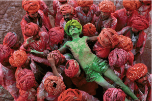
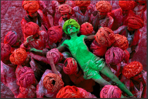
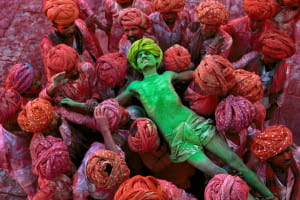
Where McCurry was able to capture sorrow and yearning in the photo I described above, he was able to capture joy and devotion to tradition in this one. The man in the middle, covered from head to toe in green powder, is completely at peace, overjoyed and overwhelmed by emotion, as he participates in the Hindu celebration of color, Holi. Everyone in the photo is simultaneously extremely serious and extremely lighthearted; they are passionate about the events they are taking part in, yet at the same time, they are all having a really good time. They are devoted to this tradition, in the best possible way.
Upon first glance, this photo is somewhat abstract. The whole photo appears to be a mass of red, with a strip of green in the middle. Shot from above, the red turbans of the men appear as just round red blobs. Closer inspection might deceive the viewer into thinking the photo was altered in Photoshop; all of the men around the edges of the photo are completely red, while the man in the center is completely green.
This photo provides a stark contrast to the one above. Where the image of the mother and daughter outside the car window might have showed the hardships and separation of a foreign culture. This photo of the colorful men does the opposite; it shows a group of foreign people that are extremely happy and rich in tradition.
It is interesting to compare McCurry’s photos in India to the work of Martin Parr, specifically his Reporters Without Boarders series.
Of course, the most obvious difference between the two groups of photos are the actual photographic styles. McCurry employs, as I mentioned above, a much more film-like style; the contrast is relatively low, and the blacks are slightly crushed. He uses natural (or what is made to look like natural) lighting. The colors of his photos are rich, but not overly saturated, with a tendency towards a focus on the red and greens in the images. For the most part, he goes for very classical compositions, almost never completely centering his subjects.
It is hard to actually express this notion in words, but McCurry takes what could be describes as highly “professional,” artful images. They look like they were taken with expensive equipment, by a highly skilled photographer. In contrast, Parr embraces a lo-fi, cheap camera aesthetic.
He shoots with a flash, making his subjects very bright. Because of the flash, objects in the frame cast harsh shadows. Parr’s photos have much higher contrast and saturation, and just look much more stylistically “cheap.” He also uses stylistically wrong composition, centering his subjects. But this intentional; it creates a feeling of discomfort or uneasiness in his work.
But despite these differences, both photographers are doing similar work in their series. Both have gone to a relatively unique cultures, and just photographed the daily occurrences, in an attempt to get an overall mood for the location. Yet the other key difference between the two projects is their tone, and their treatments of the subject themselves. McCurry takes grand, cinematic shots, that seems to convey a sense of respect and awe for his subjects. Parr, on the other hand, is borderline making fun of his own subjects. He captures them in a sort grotesque, almost mean way, making the people he photographs into spectacles for others to look down upon.
The only word to describe Steve McCurry’s work on display at the Rubin Museum is dramatic. Perhaps there are those that would disagree with me, but I cannot help but notice the “punchiness” of his photos. His photos are aesthetically gorgeous; his cropping and framing are always on point. What is more wondrous, however, is his use of color. You can see in some of his photos where he saturated the overall color in order to highlight the colors of India (see photo below).
We can see in this photo how he most certainly played with he colors of this photograph. The “tell” is in the lady, who looks like she’s been subject to a lasso tool on photoshop:
Some may argue against his editing approach. If you are displaying a work about a group of people, should you be editing or should you keep something fairly “natural”? Of course, RAW images do need slight adjustments, yet when is editing “too much”? Or, does editing help extenuate a message, that the people of India are colorful and diverse.
Regardless, it is an undeniable fact that Steven McCurry knows how to use color well. We can debate the use of his editing, but it is pictures like these that prove McCurry grasps the importance of color:
Here is a perfect example. McCurry took this during the Holi festival, where people throw sachets of color powder as a celebrate activity. Someone might argue, “But Taylor, Holi is inherently colorful!” Just because Holi is a holiday filled with rainbows does not meant that a photographer’s photo of the day will inherently be “great” just because there is color bursting everywhere. Here, McCurry creates a great visual story by introducing a quasi-dichotomy into the narrative of this image. The stark contrast between the bright green and the rich red is more powerful than if McCurry shot an image of all the different colors sachets used during Holi (red, orange, yellow green, blue, purple, etc.). Having a rainbow image would be beautiful, but almost too overwhelming: focusing on just red and green helps the viewer understand that the time is very colorful, while also allowing him/her to see the expression on the green man’s face (happiness).
The image of the woman holding a child in the rain is also another image where McCurry demonstrates his understanding of color. Why most of the image uses an analogous color scheme, McCurry introduces a pop of bright red. While the idea is slightly reminiscent of the cheesy Bed Bath & Beyond black and grey photos of London (with the old red phone booth being the only subject that’s in color), McCurry manages to use the red in a seamless manner.
The strategic use of red in this image helps draw the viewer in; to stun us first, and to have us ask questions later. Questions, such as, why is the woman peering into the (apparent) taxi? Is she looking to see if someone is not inside, so she can use it? Why did she not bring an umbrella out with her that day?
As a whole, McCurry’s use of color in his works shows the vitality of the area, and how vast/diverse the nation can be. India is quite a large space that is filled with different castes, traditions, cuisines, and expressions. His colors also demonstrate the beauty that can be found in any pocket of life; for example, we can find beauty in the simplicity of a woman holding her child, perhaps calling a taxi. What I love about this work is that it shows just how unique photography can be, and how each photographer can have their own “signature.” McCurry’s works (think: his image of the Afghan girl) typically rely on the visual voice of the people, while also utilizing color to push the narrative. In comparison to another photographic work we discussed, Ashley Gilbertson’s Bedrooms of the Fallen, we can see where the author’s “touch” comes into play.
While McCurry’s piece focus on the vitality of the people, Gilbertson’s focuses on the absence of the subject. One can debate that Gilbertson’s images of the bedrooms reveal the complexity of the lives of each fallen soldier, what truly matters is that they are gone. Their bedrooms remain, but they have disappeared.
Unlike McCurry’s vibrant images, Gilbertson uses a minimalist approach to tell his story. Thought the entire piece, he chooses to keep his work black and white. The absence of color can symbolize a multitude of things: the absence of the soldier in his/her family’s life, the absence of metaphorical “color” from the families’ lives, and the idea of the room being a “snapshot” in history.
What is important to note between McCurry or Gilbertson is that the use or absence of color can affect the interpretation and the resonance of the work. Both India and Bedrooms of the Fallen are strong visual stories, yet their use of colors and hues is completely different. As photographers ourselves, we must remember how every little detail (not just color, but even cropping) in our images can affect the story and the impact on the viewer. As Picasso once said, “When I haven’t used any blue, I use red.”
I was really impressed with Steve McCurry’s work. To me, McCurry is a really good example of how color can be really effective in photo journalism. His photographs are so colorful and so well composed that it seems impossible that they could be real. It’s almost funny to me that photojournalists resisted using color for so long because it was not “serious” when here, McCurry uses color so well. It is even more interesting because I found out, when watching a video McCurry did for the museum, that before going to India he primarily worked in black and white, but he felt that he could not tell the story of India without showing in color. I cannot help but agree with him. Although these photos would probably still be great in black and white, because he is such a great photographer, they are greatly enhanced by their use of color. I think a lot of photographers find color difficult, because when trying to make a photograph cohesive, color can make it even harder. However, I feel that McCurry is telling a story that is as much about color as it is about the people or the places he photographed. He says that so much of Indian culture is about color, and that he is glad he ultimately made the transition from black and white to color because ultimately the world we live in is in color. Thats intresting to me, because the first word I came up with to describe his photographs was otherworldly or maybe even cinematic. They almost seem to perfectly colorful, and too perfectly composed to not be set up. For example, one of my favorite photos shows a man at the Holi festival. He is he covered in green powder, and everyone surrounding him is covered in red powder. Those are pretty much the only two colors in the entire photo. At least for my understanding (which is pretty limited), the festival uses a lot more colors than that, so it seems really amazing to me that he was able to capture this photo. To me, it really seems like scene out of a movie. It seems like McCurry’s work, at least in this serious, is about setting the scene, more than it is about getting as much information in the phot as possible.
Another thing I think is interesting to think about is McCurry’s position as an outsider in a new culture. I think I’m always a little sceptical of when an American or European man goes to an “Eastern” land to attempt to depict their culture. I wonder how much of their work is just reproducing stereotypes about the culture they already have in their work. So I think going into the exhibit, I was really skeptical. However, I didn’t get that feeling at all from McCurry’s work. It’s difficult for me to actually put a finger on why, other than the fact that the people he photographs seem extremely comfortable with him, and often seem proud, happy, or defiant, which is contrast to the photographs we usually see of India, which seem to only focus on the squalor of slums and malnourished children. That isn’t to say that photographs depicting those things are unimportant or invaliding in anyway, but I really appreciate how you can really see that McCurry loves India in these photos, and is really fascinated by their culture.
When one thinks of photojournalism, optimism usually isn’t a prevalent thought. When we think of images produced from photo collectives and world-renowned photojournalists, they heavily involve conflict and humanitarian causes, and their aesthetics promote showing a realist interpretation to aid in people empathizing with the cause at hand. However, photographer Steve McCurry’s work in India during the 1980s and throughout his career did not carry this same brutal severity, rather his images leave an impressionable feeling of optimism on the viewer, one that successfully celebrates the human experience through cultural practice and observation. Two images that exemplify this aesthetically and contextually are Dust Storm (1983) and Tailor Carries His Sewing Machine through Monsoon Waters (1983).
Dust Storm (1983) depicts female figures huddled together amidst a monsoon. The composition of the image is strikingly centered, the portrait style frame presses colorful silhouettes of the group of women against an ominous background. The saturated colors of their clothes contrasted with the bland surrounding environment creates a cinematic viewing experience. One cannot help but feel a great sense of community within the image, the circumstance is dramatically depicted as a moment where “life and death seem to hang in a precarious balance” (caption). The women’s powerful presence in the frame exemplifies the culture McCurry had placed himself in, throughout the exhibit he consistently mentioned and depicted moments and places of community gathering and support, such as Richshaw Wallahs, Hindu Pilgrims Visit Shrines and Ghats along the River Ganges, and his many images of the Holi Festival. His use of prominently vibrant colors and symmetrical/geometric compositions to create visually stunning frames allows him to depict strong narratives within his work.
Tailor Carries His Sewing Machine through Monsoon Waters (1983) shows a man walking through neck-high water in the flooded streets of Porbandar, Gujarat, India. He is smiling holding his sewing machine on his shoulder, looking ahead and seemingly unphased by the monsoon waters around him. The image’s dominant color is brown, the water is murky and the sewing machine is rusted, which juxtaposes with the man’s carefree expression and soft greying hair. Rather than contrasting colors in this image, McCurry uses a shorter color spectrum, making the viewer feel as if they are wading through the dark water themselves. Despite the arduous situation shown in the image, it still retains humor. If there is any single frame in the exhibit that might result in a giggle, it is this one. It has largely to do to the caption, which states that the man received another sewing machine after this photograph ran as the cover of National Geographic. While some may argue that the image over stylizes and makes humorous a very serious occurrence, it leaves a positive impression on the viewer, we know the man was rewarded, in a sense, for his difficult journey. It still, however, begs a serious question of the conditions the man is working in, and what would have happened if this photograph did not end up on the cover of a popular magazine.
McCurry’s photographs are bright, colorful, energetic, and for the most part, happy or deeply contemplative. They also read very clearly as narrative works, some of which distinctly from left to right, such as Three Men, Steam Engine Passes in Front of Taj Mahal, and Men in Prayer (all 1983). Through his strong style and voice, McCurry creates a powerful viewing experience that ultimately results in some form of empathy for the subjects he is presenting. His images do have a distractingly beautiful quality to them, however, the viewer is still quite aware of either the drastic circumstances of the natural disasters or the honesty of emotion within his portrait/group subject images. On the other hand of the photographic spectrum, Alexandra Boulat’s works place a large emphasis on drama and engagement, she thrusts her viewers right in the middle of conflict action. Her images also have a similar narrative style to them like McCurry, such as Prayer time at the Al-Shifa Hospital (2006). While each photographer has broadly different subject matter, tone, and context, they each use strong visual language to draw a viewer in and implore them to understand the tone, mood, or even message that they are presenting. Boulat’s subjects and depictions are entirely more brutal and shocking than McCurry’s, yet she still uses a similar aesthetic and narrative approach to achieve a captivating image.
I’ll be perfectly honest: I have never attended a photography show before, so I did not know what to expect when I arrived at the Rubin Museum. I suppose I was initially struck with how few photos there were; once I walked through the exhibit, I wanted to see so much more of his work. The photos that were there, though, were incredibly engaging. They were grand not only in scale, but also in the sheer amount of content they contained – most of the pictures contained multiple people or scenes and there was just so much to process as I stood before them. This never made the images feel busy, though; rather, they were awe-inspiringly full of life.
Overall, the best word I can use to describe the show as a whole is vibrant. All of the photos were overwhelmingly colorful. There were bursting pops of color everywhere, whether it was a girl’s clothing, powder from a Holi festival, a painted wall, or a man’s bright beard. The color was intense, and it led me to wonder how much McCurry had enhanced his photos. Never in my life have I seen such bold colors simply existing in nature – does this mean McCurry heightened the intensity of his colors, or should I take this fact as proof that his photography captures something extremely foreign to my personal life experience? I think it may be a little of both.
The colors were not the only factor contributing to the vibrancy of McCurry’s work. The images had an explicitly happy, positive, and hopeful tone. The bright colors aided in conveying this tone, but additionally, a lot of the subjects were smiling, dancing, bounding, or plainly looking content and peaceful. McCurry was not showing hardship. He was not photographing pain or struggle. This could not be more evident than in this photograph, showing an old man with a destroyed sewing machine making his way out of a flood from a monsoon. His sewing machine, perhaps his most significant possession, is completely ruined, and he is up to his neck in water, yet he has an enormous grin on his face. The man looks utterly blissful in spite of his present situation.
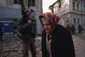
This image reminded me of one of Haviv’s shots from Blood and Honey which I can only describe as its photographic opposite. They are similar on the surface, but are polar opposites in terms of the mood they covey. Both photos depict an elderly person traveling away from something – the man, probably heading to dry land, and the woman, possibly leaving her home to find a safe refuge. The two people actually look fairly similar – gray hair and worn, wrinkled faces shape their persona. Their lives are seemingly being ruined in the moment the respective photographs were taken – the man is desperately clinging to his broken sewing machine, probably the source of his income, and the woman’s city is overrun with soldiers and war.
As similar as these two photographs physically look, the underlying aura of each is drastically different. The man and his sewing machine look hopeful and truly cheerful – but the woman in Bosnia is devastating to look at. These two opposing moods are representative of the greater works in which they are contained. Blood and Honey is not a positive work; it shows pain, war, and human desolation. Haviv’s photo of the old woman is entirely emblematic of the horror of the story he is trying to tell. McCurry’s photography of India is light and fairly cheery, and the sewing machine man embodies that spirit fully.
In addition to the positivity and vibrance of McCurry’s collection, there is another quality to his work that is more difficult to describe – the photos feel very majestic and nearly other-worldly. To put that in extreme terms, the bright colors and fanciful spirit of the images make them seem like they exist as paintings of a fantasy world. This is evidenced in a large way in McCurry’s image entitled “Blue City.”
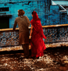
This photograph captures the city of Jodhpur, India in all of its bright glory. The buildings, sky, and truly everything about this image are as blue as imaginable. When I first came to this image in the museum, I genuinely stopped and looked at it from every angle possible because I was convinced it was a painting. After research, I learned that this magical blue city certainly does exist – but there are other small details that really struck me that make this photograph so unbelievable. The microscopic yet clear detail is so impressive – I was struck by two separate people standing in their doorways, looking as though they were placed there with the stroke of a paintbrush.
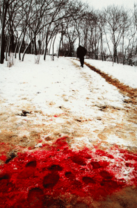
At first glance, bold color is the only thing the viewer sees when looking at this one of McCurry’s photos. This reminded me of a boldly colored photograph of Haviv’s, his near-perfectly composed shot of blood in snow:
Like McCurry’s blue city photo, initially the only visible feature of this image is the deep, dark red pool of blood. It is shocking and striking. However, upon deep investigation of the image, small details like the people in the doorways of McCurry’s photo are evident. Within the pool of blood, there appear to be at least two distinct sets of footprints. There is a white piece of paper with (as far as I can tell) a black number three printed on it. How many people were involved in producing this red snow? What other clues did they leave behind? The small, mysterious details in both McCurry’s and Haviv’s photo are incredibly enticing – they leave me in awe and with many, many questions.
Steve McCurry’s photographs of India are unbelievably vibrant and truly magical. They provide a remarkably bright look into alluring aspects of Indian culture, and the photos are a reflection of McCurry’s love for the very culture he captured. Although the underlying tone is drastically more cheery, his photos are easily comparable, at least aesthetically, to some of Haviv darkest work. This is a testament to the incredibly striking quality of the photos – regardless of whether the tone is positive or negative, it is conveyed powerfully and beautifully.
Steve McCurry’s exhibition exuded powerful color throughout. His photos were so saturated with color that up close they resembled paintings. His portraits are also very unique, every set of eyes piercing and glistening with a melancholy but beautiful gaze.
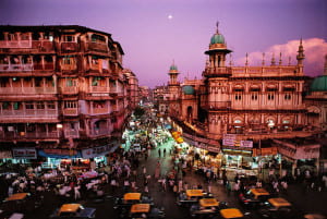
Firstly, I wanted to discuss his scenic photography that resembled painted landscapes: Moonrise over Mumbai and Blue City. What I think added to the “painting” effect of these photos was the glossy finish of the canvas these photos must have been matted on.
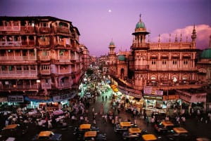
Moonrise over Mumbai depicted a purple sky with pink and orange hues on the building and cab roofs. What struck me the most was the lines on the building on the right. The thick moldings outlining the windows and turret are so intensely highlighted as a detail in this shot it is almost as if they were painted with a thick brushstroke.
Blue City resembles a painted landscape even more so then Moonrise over Mumbai. Firstly, the geometry of this hilltop city is so intricate and complex you wonder how, realistically, it exists. The decay of the white and blue brick throughout the image is almost so perfectly geometric it cannot be real. Moreover the red and orange hues scattered throughout the image that juxtapose the dominating turquoise hue look as if they were added in after the fact in photoshop. Finally the couple in the bottom left look very pixelized, as does the sky. As a whole, Blue City is breathtaking and captivating to any viewer but when looked at in detail you question the aesthetics and their validity.
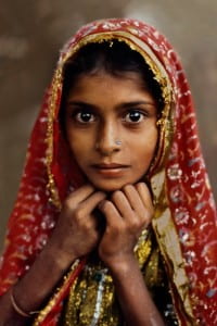
Secondly, I wanted to discuss his portraits. While the various portrait images also resembled paintings — due to their similarly saturated hues and blurred, glossy backgrounds — what demands the viewer’s attention are the subject’s eyes.
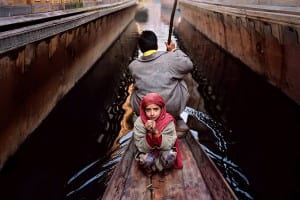
Nomad Girl is a beautiful portrait of a beautiful young girl. The portrait within this exhibition severely juxtaposes other photographs that capture poverty or tragedy. Here one can only assume this girl has at least some money in order to afford her stunning hijab of delicate gold-like and red fabrics. Her delicate frame and large eyes suggest that she is young. Her eyes captivated me because regardless of how young she may actually be, I can only imagine how much she has seen in her lifetime that has aged her in terms of maturity. The only detail that makes me doubt she is from a more affluent class is the dirt on her right arm. This portrait particularly reminded me of another Steve McCurry portrait: the world famous portrait of the Afghan girl. While the two girls’ hijabs greatly differed their eyes were both piercing and their youth was juxtaposed with the tragedy they are surrounded by. You can’t help but notice McCurry’s distinctive portrait style.
What interested me most about Steve McCurry’s show at the Rubin Museum of Art was his ability to provide an extensive portrait of place. McCurry photographed a variety of people, events, and sites in India, while also ranging from more formal portraits to street shots. Color is an incredibly important tool to him—I felt he used it in a way to express the emotions and energy of his subjects, whether they were people or places. While he is clearly interested in photographing people, I was most impressed by his engagement with India as its own subject. The photographs I was most drawn to were devoid of individuals, but rather spoke to the manifestation of past, present and future in cities.
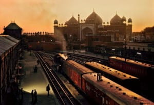
His images Agra Fort Train Station at Dusk, with Jama Masjid, the Great Mosque of Shah Jahan, in the Distance and Moonrise over Mumbai, both show a unique relationship between modernity and tradition. Having travelled to India a few times myself, this a theme that has always fascinated me. McCurry does a beautiful job of representing the interaction of historic architecture and modern technology.
In Agra Fort Train Station he photographs the train station in the foreground with the mosque in the background. The highlights on the train create a somewhat theatrical lighting, emphasizing the significance and power of the train, while the beautiful architecture rests gently in the distance. By photographing the station at sunset, and when it is relatively empty, McCurry suggests a peaceful, tranquil quality to the relationship between past and present. The smoke of the train stands out against the dark tracks, but as it rises it dissipates and dissolves into the orange sky, suggesting some sort of harmony. It feels odd to be looking at the industrial landscape of the train station so close to such a sacred site. However, McCurry makes it appear natural with his deep depth of field and the sweeping orange and yellow tones.
Similarly, in Moonrise over Mumbai, McCurry photographs a historic neighborhood while showing the chaos of cars, people, shops, and light. There is an interesting relationship between the top of the buildings, lit by the setting sun and rising moon, and the neon lights flooding onto the street from shops and stands. For me, the neon lights function similarly to the train in Agra Fort Train Station, they represent modernity and in this image, a growing sense of consumerism. The buildings stand crisply in focus while the blurred cars rush beneath them. The bottom of the frame feels incredibly crowded in comparison to the top. This seems to me to represent the way in which India is made up of different histories, traditions, and times living and remaining on top of one another.
I find there to be an interesting comparison between McCurry’s work in India and Susan Meiselas’ photographs from Nicaragua. With Meiselas’ work, though it is very much centered on a specific place, I find it to be more of a portrait of people and events rather than Nicaragua itself. Though those people and events of course make up the history of Nicaragua, and specifically the revolution, each of Meiselas’ images feel a bit more small scale—all very particular moments. This in turn creates a sense that I am receiving bits and pieces, or an understanding of a place at a very particular time. This functions very well for Meiselas’ series because it is a portrait of a revolution, rather than an elongated period of time like McCurry’s photographs from India. It is interesting to analyze how these two series feel different. McCurry’s work feels separate from a temporal context. Perhaps this is because of India’s aesthetic, or because of the way he juxtaposes modernity and antiquity.
The comparison of Meiselas and McCurry’s use of color is also interesting. Both chose to take color photographs because they felt color better matched the energy of their respective locations. However, the color palettes of their images are vastly different. Meiselas’ color feels faded in comparison to McCurry’s. This is interesting, and somewhat surprising, because when looking at her book I remember thinking the color was incredibly vivid. McCurry’s photographs are highly saturated and incredibly vibrant. His use of colors feels a bit more intentional—some of the images felt like they were taken because of the color. With Meiselas’ images, though often the colors are also vibrant, I rarely feel that the color makes the photograph. Color rather functions as a complement to her composition. This feels much subtler than McCurry’s use of color.
McCurry’s images feel very monumentalized. The photographs are not only printed largely in the show, but he also tends to aggrandize his subject. Through his color, lighting, and composition, his images feel dramatic. For example his photograph of the man in green powder from the Holi Festival in Rajasthan as well as the image of the father and daughter rowing down a canal, both have an incredible intensity to them because the subjects feel so singled out and glorified.
This created a highly symbolic nature to his images—his subjects feel more like allegorical figures than individuals. The monumentalizing adds to the sense that he is creating a large, extensive portrait of India that transcends beyond specific people, places, or moments.
© 2024 Photography Through the Lens of Magnum and VII
Theme by Anders Noren — Up ↑







Recent Comments