Category: Magnum Website Response (Page 1 of 2)

Magnum Website Response, Caroline Martel

Honestly, I was very worried when I first started digging into Magnum’s website, as I am not a big tech person. But surprisingly, I found it very easy to navigate through. It is indeed surprising to me as I could only start to imagine the overwhelming amount of content that the company presents compacted in one single website. However, the website’s different sections are very clearly divided between the editorial, photographers, cultural, commercial, community and store.

The presentation and design of the website is also very pleasing to the eye. It clearly embodies Magnum’s philosophy: organized, professional and tasteful.

Created in 1947 by Capa, Cartier-Bresson, Rodgers and Shim; Magnum was founded on very friendly bases around these photographers’ common love for photography and wish to bring testimonies on our world. These founders had very different styles and techniques with their work, which is clearly reflected by the incredible stylistic diversity on Magnum’s website.

The first thing that really stroke me as I was scrolling through Magnum’s website is how incredibly global the its coverage is. Having photographers on the ground dispersed all over the globe gives the cooperative a huge advantage compared to other types of organizations that would have to fly their photographers where the action is happening. Just by glancing at the “Latest stories” page, I can see that there are 14 in Europe, 10 in America, 7 in Latin America, 6 in Asia, 6 in the Middle East, 4 in Africa, 3 in North America and 1 in Oceania. I am stunned. One thing that inevitably comes to mind when looking at those statistics is the question of funding. How does Magnum afford to have so many different photographers all over the world covering such a diverse range of topics (i.e. armed conflict, politics, daily life, food population, religion, transport). Magnum’s presence is worldwide, as the map of  the “Magnum whereabouts” shows.

The statistics given on Magnum’s website are very interesting and some are surprising to me. For example, in the latest stories, only 46 have been shot in black an white when 132 were shot in color. Are the new generations growing up in a digital world becoming more sensitive to pictures in color than a black and white one?

There are only 61 photographers in Magnum, a surprisingly small number considering the immense worldwide coverage that Magnum offers. It is pleasing to see that Magnum stayed the small, elitist and friendly cooperative that it was at its creation.

I especially liked the “Archive Calendar” as it presents the key dates in history. We can see a true evolution in the history of photography. These two pages were, in a way, a summary of Magnum’s website as a whole. It shows clearly that photographers have different ways of approaching the different themes. We might seem more engaged and brought into certain types of themes. For example, when looking at portraits, there is a type of intimacy and comfort that the viewer builds that might not be present in a photo of an armed conflict. But point of views and angles chosen to present are not only based on the theme it s celebrating but also very unique to each photographer. Some clearly prefer giving more of an outsider’s point of view than others. I also found it very interesting, even surprising, that Magnum’s website would present their photographers’ commercial work. I see it as a way of encouraging their commercial work for financial reasons.

One photographer’s work especially caught Moises Saman’s my attention: the one of Moises Saman. Born in Peru, Saman grew up in Spain where he currently lives. He graduated in 1998 from California State University where he developed an interest for photography. His first real project abroad hands-on was in Kosovo, photographing the effects of the last Balkan war. During 7 years, Saman was a photographer for Newsday in New York where he covered the 9/11 attacks. In 2007, Moises becomes a freelance photographers and his work is published in The New York Times, Newsweek or even Time magazine. His famous coverage of the Iraqi conflict will be published in the latter. Moises was invited to join Magnum in 2010 and became a full member in 2014.

While studying Saman’s portfolio, I found that there is such an interesting contrast between his different photos while still following a common thread. He photographs action shots, presenting a lot of movement and chaos. Some of them are extremely dramatic.

For example, this picture taken in 2003 of an American soldier screaming in Bagdad shows a state of unimaginable panic. Saman gets very close to the action as we can see in this image, he was right next to an explosion. I think that he might have wanted to transmit that personal involvement by making this picture very engaging to the viewer.
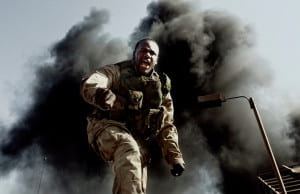
 

soldier in gear with cloud of black smoke behind him

IRAQ. Baghdad, Iraq. May 1, 2003. An American soldier screams at a gathering crowd at the scene of an explosion at an illegal petrol station in central Baghdad.


He uses the same technique in this other photo taken in Afghanistan in March 2010. These Afghan soldiers are rushing to the helicopter, carrying a wounded soldier. The movement is obvious in this photo: the soldiers running, screaming, the helicopter’s movement. But it is the contrast that the wounded’s soldier’s expression brings that is truly stunning. The focus is on him, and he seems so peaceful, the light embraces him perfectly. That expression just adds a whole other dimension to the photo itself.
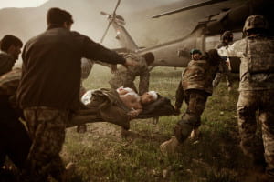
 

Injured soldier on stretcher being carried to helicopter by other soldiers

AFGHANISTAN. Kunar Province. March 2010. Afghan soldiers carry a wounded comrade into an American medevac helicopter after a Taliban ambush near the village of Tsunek, Kunar Province.


But Saman’s work doesn’t only cover the action of the armed conflict. He gives us also very powerful images of the direct disastrous effect that this violence has on the civilians. Those pictures present an incredible emptiness. Very sad, some of them show an immense serenity that stroke me. I thought this idea was embodied perfectly in his picture above.
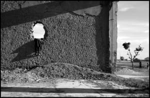
Little boy leaning into a large hole in a wall.

AFGHANISTAN. Gardez. May 2005. An Afghan boy plays in the ruins of a former government building detsroyed during the civil war of the 1990’s in Afghanistan.


in 2005, Saman took this picture of a young Afghan playing in the ruins of Gardez, destroyed by the civil war. The serenity, not only brought by the black and white but also by the composition is mesmerizing. The emptiness that Saman shows in his pictures of civilians is overwhelming.
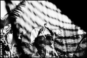
Women in open space with sunlight hitting them

DEMOCRATIC REPUBLIC OF CONGO.Goma, DRC. September 2009.Congolese women living at the Buhimba camp for Internally displaced people outside Goma.
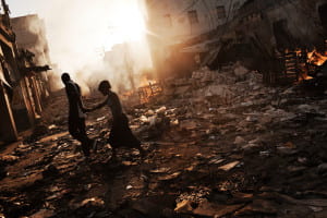
Man and woman walking through rubble lined street.

HAITI. Port-au-Prince. January 18, 2010. A couple walks hand in hand through a devastated area in downtown Port-au-Prince, one of the hardest hit areas by the January 12th earthquake.


The other photographer who’s art especially stroke me is Antoine D’Agata. Originally from France he left to New York in 1990 where he studied photography, instructed by notably Larry Clark and Nan Goldin. His first books of photographs, De Mala Muerte and Mala Noche, were published in 1998. The Galerie Vu then started distributing his work. He then won the Niépce Prize for young photographers in 2001 for his work Hometown and published more work, such as Vortex, Insomnia, 1001 Nuits, Stigma and Manifeste. He joined Magnum in 2004 and has ever since been traveling the world.

“Its not how a photographer looks at the world that is important. It’s their intimate relationship with it.”

This quote really touched me in a way that he admits being involved in his art personally, when as some photographers just act as witnesses or messengers of the action. But D’Agata’s art is so personal and real that it is very perturbing. I really liked his collection “Hometown”. Every photo is unique and beautifully perturbing. The crudity of what he is showing is immense and the fact that he is just giving it to us without any sugar coating is incredibly different from what we would be used to see.

D’Agate shows us the beauty behind the aspects of human beings that we don’t normally want to see. And he just shoves it in our face in a very brutal way. It is very effective.

Here are some of my favorite shots from “Hometown”:

Woman's back

FRANCE.

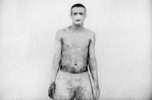
Man in his underwear against a plain white wall

FRANCE.

Woman with blonde hair in between the legs of another woman

FRANCE.

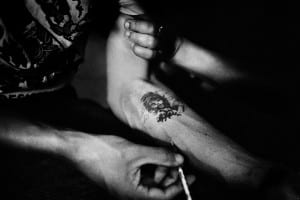
Arm with tattoo receiving a needle

FRANCE.

Cristina Wedekind – Magnum Response

While scrolling through the Magnum Website and observing various pictures, portfolios, and relevant historical data, there were a few themes that stuck out most to me. As well as two artist collections that captivated me.

One of the founders of Magnum, Cartier-Bresson, has a quote in the ‘about me’ section of the site that emphasizes that Magnum operates as a collective with a curious AND respectful attempt to expose what is happening in the world. Another theme that seems to be an integral part of Magnum’s projected image was the diverse range of images framed through multiple mentalities given the diversity of the members and collections within the collective. The Magnum founders and the Magnum collective today, seem intent on allowing their various, iconic, and well-done photos to speak for themselves and act as a documented moment and representation of a greater event.

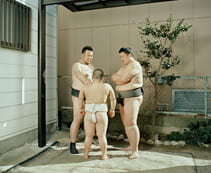
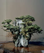
All of the photographers and their work shown on the page is a testament to the diversity that Magnum prides of itself. Two stuck out particularly to me for personal and relative reasons. The first of which was Max Pinckers and his collaborative collection titles “Two Kinds of Memory and Memory Itself.” In the project description on the website, it seems that Pickers attempted to portray, through his documentations, specific stereotypes that Western cultures seem to associate with Japan in an alternative and aesthetic manner. By listing descriptions of specific images, Picker’s framing of the summary of the project led me to notice the (perhaps staged) image of Sumo wrestlers and the image of the “perfectly manicured” bonsai tree the most. However, I love Japan and seeing images of the country through the eyes of Pinckers was an awesome aesthetic and moving experience.

Men in traditional Japanese loincloths standing in circle Small bonsai trees on a rock as centerpiece of table

(I have no idea why these images are so small— sorry!)

The second photographer that stuck out to me the most was Matt Black and his project “The Geography of Poverty.” Black created a chart with demographics and statistics of the poverty levels within our very own United States. The reason this project caught my eye at first was the fact that Black started his project in my home state of California and then spread across the rest of the U.S.A.

I especially enjoyed the relationship between visual and quantitative data that Black was able to portray effectively through his collection. All of the images are aesthetically pleasing and photographed in black and white, adding to the somber idea of beautiful yet decrepit scenes.

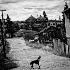
One image that stuck out in particular to me was the image taken in Walkerville, MT in 2015. The population in this town is “675 and 39.4% live below the poverty level.” This photograph arrested me as I felt I had been transferred to an old Western ghost town complete with a lone dog and what appears to be an even dirt road littered with crumbling houses and overgrown shrubbery. However, Black was able to make something traditionally seen as a dilapidated town and frame/ capture the scene in a manner, which highlights its unique beauty.

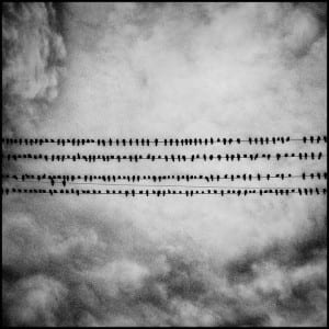
birds on telephone wire

USA. Tulare, California. 2014. Birds. Tulare has a population of 59,278 and 21.4% live below the poverty level.

The second image, which is still a part of the same collection, was taking by Black in 2014 in Tulare, California. This town has a “population of 59,278 and 21.4% live below the poverty level.” This image stuck out to me due to the pleasing aesthetic of symmetry. I also continue to wonder why Black chose to include such an image in this collection.

dog on empty street surrounded by dilapidated homes

USA. Walkerville, MT. 2015. Walkerville has a population of 675 and 39.4% live below the poverty level.

Magnum Site Response, Searles

Magnum’s website gives the company an air of class and prestige. There are few frills or cute design tricks; rather, amazing images are presented cleanly and in a well-organized way. I like that you could sort images not just by photographer, but also by category and continent. I also like the sheer volume of viewable content available to website visitors. The other pieces of the site, including the blog, interactive map, store, make the overall experience for the most part helpful and engaging.

The site successfully makes Magnum feel historically rich, but it also shows flaws with this style of self-portrayal. The sight doesn’t exactly have a “young” vibe, and loses in some way because of it. They actual viewer for the images its clunky, and the overall design of the site feels generic to the point that it is somewhat boring. Despite this, it gets its main job done. It puts the work of Magnum photographers on center stage


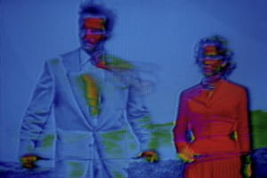
I am fascinated by the work of Belgian photographer Harry Gruyaert. I was at first drawn to his photos—specifically the series “TV SHOTS”—because they confused and intrigued me. The series’ images, which Grayert created by photographing the screen of a damaged television, are distorted and neon-colored. These 1972, highly stylized photos predate Photoshop by almost twenty years, yet they possess a strangely off-putting, modern feeling, combining a familiar, retro corniness with a vague, unsettling undertone. One of the photos I am most drawn to from the series, titled “Soup Opera. Couple,” shows a man and a woman, both staring purposefully off to their right. The frame is filled mostly with the blue of the background and the man’s jacket, but is contrasted with the bright red of the woman’s dress. There is little detail on the two’s faces, which are both covered with unnatural, bright colors. The whole image has an odd, computerized emotion of sadness: something dramatic must be going on in the soap opera, but the details are too warped and destroyed to figure out what exactly.
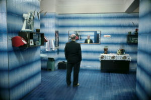
I was also very interested in Gruyere’s photo, “Russia. Moscow,” from 1989. Taken as part of Gruyaert’s travels throughout Europe and North Africa in the 1980s and 90s, the image depicts a balding, suit-clad man staring pensively into a wide mirror in what appears to be a blue tile-walled bathroom. The stylized lighting, nearly monochrome subject matter, and use of creepily cinematic mood makes this photo reminiscent of the work of photographer Gregory Crewdson. More than almost all of other Magnum photographers, Gruyaert seems to straddle the line between what is true journalistic photography and what fine art photography. But while the true artist Crewdson’s photos are highly constructed scenes, those of photojournalist Gruyaert depict real things. The shot “Russia. Moscow” looks like it could be a still from a movie—it suggests a story and leaves you wondering. Yet, the image shows a real place in a real moment in time.

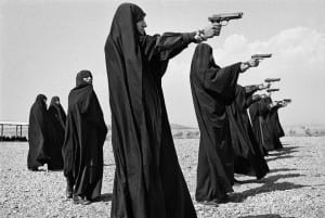
I was also very interested in the work of French photographer Jean Gaumy. Gaumy too seems to be as much concerned about a photo’s look as he is its content. His compositions are so geometric and aesthetically pleasing, yet they feel so natural; they achieve the Henri Cartier-Bresson decisive moment effect, capturing the perfect balance to make the photograph the best it could possibly be, both visually and meaningfully. I am drawn to Gaumy’s 1986 photograph “Veiled women practice shooting on the outskirts of the city.” It is essentially just several women practicing their aim, but their matching black robes, their line formation, and the baronesses of their surrounding landscape makes this photo very well put together. The women in the photo are part of a female Iranian militia in the 80s, who fought in the Iran-Iraq war, so what makes this photo so powerful to me is its complete merging of beautiful imagery and historical record keeping.

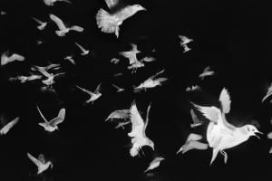
I also enjoy the 1984 photograph “ Seagulls flying past the French trawler ‘Koros’.” Similarly to Gruyaert’s soap opera TV photo, this photo draws you in with the very ordinary—birds—being presented in a subtly off-putting, almost creepy way. Either something was done in post processing, or Gruyere used some kind of flash while shooting the birds in the dark, but the black background of the birds is strange and unnatural. Gruyere took this photo as part of a series on a fishing boat in Ireland, and like a lot of his work, these photos are classic examples of “the decisive moment.” The birds in “Koros” fill the frame so evenly and geometrically, with the size of the birds trailing off from the larges one in the bottom right corner. Like almost all of the photos that seem to interest me, this photo is cinematic, and seems to suggest a story. The birds are flying somewhere or away from something, and the beautiful way in which Gaumy shot them makes you want to know the answers.

Man in blue and woman in red distorted by blue filter

G.B. & FRANCE. 1972. TV SHOTS Soap Opera. Couple

man in blue room standing in front of a mirror

SOVIET UNION. Russia. Moscow. 1989.

Women in veils pointing guns to the right

IRAN. Tehran. 1986. Veiled women practice shooting on the outskirts of the city.

White birds flying against black background

Seagulls flying past the French trawler “Koros”.

Magnum Website Response

The Magnum collective overall represents a vast variety of photos which differ not only in style, but content. Magnum’s front-page photo collections demonstrate the collective’s ability to be in touch with current events, exemplified through pieces like, “Syrian Refugees in the US”, “Kurdish Offensive in Sinjar”, and “Paris attacks”. At the same time, Magnum also seems to be interested in smaller scale occurrences that still resonate with relevant themes like portfolios covering a “Gay Synagogue in New York”, and “Unselfies”, a series which photographer Alex Soth takes the conventional selfie and distorts his own face. Thematically, Magnum covers a diverse range of topics, from the serious issues of global warming, child labor, September 11th, to topics like The Laugh, Creative Spirit, or extreme sports. All of these photos are compiled by a diverse group of contributors currently stationed around the world, from John Vink, based in Cambodia, to Michael Subotzky, based in South Africa, to Alec Soth, based in Minnesota. To that, most current photos featured on the website are in color, as opposed to the black and white “standard” that Magnum’s founders accepted.

Regarding the two photographers in focus, I chose Henri Cartier-Bresson, and Michael Christopher Brown. I was interested in viewing the work of Cartier-Bresson since he’s one of the founding members of Magnum, additionally because he mentioned that he disliked the use of color film. I thought that it would be interesting to see his use of light and contrast in his photos in order to make a good composition. In my opinion, it is harder to create a more compelling photo in black and white since grey-tones can often blend together and lose contrast, creating an uninteresting photo. In contrast, the second photographer I chose to focus on is Michael Christopher Brown, since his work is more current and he produces work in color. His series, “Honduras, Deported from the US” was featured in the “Latest Stories” section of the website and I was interested in his use of saturated color pictures, as well as his portrayal of the topic itself.

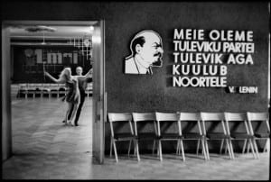
The first photo by Cartier-Bresson is from his Soviet Union portfolio. The photo was taken in Talinn, Estonia in 1973, and the image is captioned, “Cellulos industry. Training for dance championship.” The composition of the photo presents two focuses—a couple ballroom dancing behind a doorway in the left-third of the photo, and a quote from Vladimir Lenin facing toward the viewer which takes up the right two-thirds of the composition. This quote, which partially translates to, “We are the future of the party” serves as communist propaganda. Similarly, it is set alongside a series of empty chairs, which hints at a more common portrayal of the USSR from a Western perspective. Western media portrayal of Cold War-era USSR is one that reflects a bleak lifestyle under an oppressive regime. To that, glimmers of everyday life were not the primary focus of the Western media. While quality of life was arguably poor, Cartier-Bresson’s photo depicts a glimpse into the leisure-aspect of this era, a notion that is often looked over.

Couple dancing in a ballroom.

SOVIET UNION. Estonia. Tallinn. 1973. Cellulos industry. Training for dance championship.

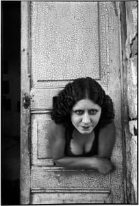
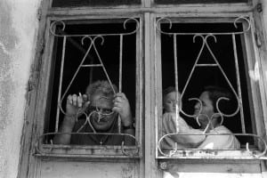
Cartier-Bresson’s second photo in focus is from his Mexico portfolio, taken in Mexico City 1934. Its caption states, “Prostituées. Calle Cuauhtemoctzin”. The photo depicts a portrait of a prostitute in Mexico City leaning out of a cutout doorway. The older building with its cracked-paint doorway can be juxtaposed to the young woman, whose eyes lie just above and to the right of Cartier-Bresson. The subject of the photo itself is interesting in that she is clearly a young woman, but her pursed lips and and almost furrowed brows indicate hardship. Similarly, there is a darkness under the woman’s eyes that age her. At the same time, her hair is made-up and she wears a “revealing” top, which indicates that she is soliciting customers. Cartier-Bresson creates a composition that lets the viewer draw their eyes toward the woman’s face, as opposed to her other features. Cartier-Bresson chose to capture everyday life, but his choice to photograph a prostitute is unconventional, and serves as a somewhat unspoken approach to the on-goings of a city.

Woman in front of door

MEXICO. Mexico City. Prostituées. Calle Cuauhtemoctzin. 1934.

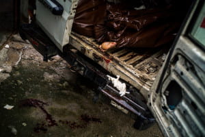
The first piece I chose from Michael Christopher Brown is from his featured portfolio, “Honduras, Deported From the US”. The photo was taken in San Pedro Sula in 2015, and is captioned, “Plagued by gang violence, the city has had the highest murder rate in the world for the last four years.” The photo itself depicts a body wrapped in plastic inside of a bloody van. The photo’s colors are very saturated, and the vignette around the borders of the composition draw the eye straight toward the center, where a bloody foot sticks out of a body bag. The use of color as opposed to black and white makes the photo more powerful, since blood is present. Brown’s photo series follows the life of a man who was deported from the US as he returns back to Honduras. To that, while Brown’s photo in focus does not depict the deported man himself, it is telling to the dangerous lifestyle that he faces as a result of being deported. While the photo is not opinionated, its imagery helps the viewer to not only empathize with the deported man, but to form an opinion on deportation itself. Deportation in the US is often times viewed as an implication-free act, but Brown’s photo shines a light on to the issue.

Body bags in van. One bag has a foot exposed.

HONDURAS. San Pedro Sula. 2015. Plagued by gang violence, the city has had the highest murder rate in the world for the last four years.

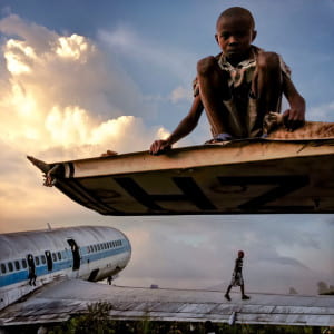
Lastly, the second piece from Michael Christopher Brown drew me in because of its composition. The photo was taken in Goma, Congo on December 14, 2012. It is captioned, “Abandoned planes are a common site at airports in Africa”. The photo functions on two different levels. First, it is a portrait of a young boy who sits a top of a rusted plane part. The warm colors draw him forward in the composition, so the eye is guided there at first. Secondly, below the boy is an abandoned airplane. Upon further inspection, children hang from the plane’s windows and another boy walks alongside the wing. The sky takes up another portion of the photo, and since its composition fits inside a square, every portion of the photo has something going on. Brown’s use of color allows the eye to travel almost in a circular motion around the photo, starting from the top boy, to the clouds, to the plane. With that said, Brown notes that “One is generally prohibited from photographing this airport but […] nobody was guarding this section of the airport. Children guided [him] through the planes”. The photo is beautiful in itself, but knowing the context is important simply due to the danger that was associated with the makings of this picture.

children playing on abandoned airplanes

CONGO. Goma. December 14, 2012. Abandoned planes are a common site at airports in Africa. At Goma Airport, in the Democratic Republic of Congo, planes left due to wars and volcanic eruptions over the past two decades have become a playground for street children, some of whom sell the parts which are made into stoves and other items to be sold on the streets of Goma.
One is generally prohibited from photographing this airport but in mid-December, 2012, after the M23 rebel force which occupied Goma left and before the FARDC (military of the D.R.C.) returned to the city, a security vacuum meant that nobody was guarding this section of the airport. Children guided me through the planes, which were later discussed by my Congolese fixer:
“In January of 2002, the volcano (Nyiragongo, just outside Goma) exploded and the lava blocked the planes. I helped move this plane after I and many of my friends living near the airport lost our homes to lava, on the first day of the eruption. On the second day, we saw the lava moving towards the planes. I and others were just watching the lava flow getting closer to the planes and we decided to move one of them, this newer one. There were at least a hundred people there pushing the plane for about 300 meters. A friend mine, who was there and whose house was also destroyed, had a childhood dream to be a pilot. But his parents were too poor and all the schools were expensive, so he could not hold onto that dream. He forgot about it, but then on that day, when we needed to move the plane, he told me to help him inside so he might steer it! We all pushed the plane as my friend waved his arm out the window, in the cockpit. We then climbed in the plane and saw the lava flowing down the volcano and into town.”

Magnum Site: First Impressions

The vastness of the collection on Magnum’s website is overwhelming – similar to the content itself, the sheer volume is impressive, diverse, and spans a wide range of times and places. The site is so clean, neat, and simple, and I think this design is the best way to view this type of photography; there are no distractions, no colors on the borders of the pages, and very few words. The photographs are allowed the space and freedom to speak for themselves, and they most certainly do.

I approached the collection by looking at the “Whereabout Map” section of the site and delving into different parts of the world. Most of the major countries are represented with dozens of photographers who have shot there – hundreds upon thousands of documented moments from all of the significant events of the past century and a half. I started in Europe, poked around in the Middle East, and then transitioned over to Cambodia, looking at poverty, war, religion, art, community, tragedy, and strength along the way. I then chose my two photographers at random from the list (by completely just judging their names and making associations in my head). I picked Bruce Davidson because his name seemed familiar, American, and that maybe I could relate to his photos. I chose Lu Nan because I am interested in the history of Asia and figured I would see something less familiar, but definitely distinct and fascinating.

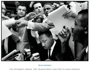
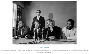
Bruce Davidson is in fact an American photographer, born in 1933. He has been fascinated with photography since the age of ten, and was an active, accomplished photographer throughout high school and college. After serving in the military, he came back to the US and joined Magnum in 1958. He is perhaps best-known for his impressive first-hand documentation of the Civil Rights Movement in the 1960s, for which he received a Guggenheim fellowship, an NEA grant, and an extensive exhibit at MOMA. This project contains some fairly iconic images of Martin Luther King Jr., including the following that I found very familiar:

Dr. martin luther king jr. surrounded by reporters

Dr. martin luther king jr. sitting at a table with microphones in front of him

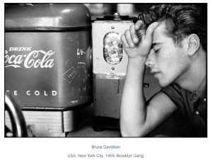
It was a different project of Davidson’s that I found most compelling, though. In 1959, he published a photo essay entitled Brooklyn Gang. I was drawn to the raw simplicity of the photos – all black and white, naturally, and all seemingly candid. They are small snapshots of banal moments in a group of teenagers’ lives: walking down the street, buying a soda, laying on the beach, sitting in the back of a car. And though they are taken from a different era, they seemed so overwhelmingly familiar and comfortable. This first photo in particular captures that feeling for me:

Man at lunch counter

It is impossible for this photograph to be any more quintessential-1950s-white-American-teen. The Coke, the penny candy, the scrawny yet tough character, the way his sleeve is rolled up far too high on his arm, the slicked back hair – this might as well be a screengrab out of an episode of Happy Days. And nearly all of the pictures look like this, like the way we’ve all agreed upon defining the 50s from hindsight. Yet it’s all very real in these photographs; these teens have been documented in such a way that their lives resonate in a very true fashion with me today.

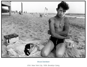
Young man at the beach sitting in the sand

This second photo of Davidson’s intrigued me because it left me with a lot of questions. Whereas many of the other photos in this series seem candid and casual, this one stands out because the subject is facing the camera directly. The posture and the angle we see is very open and vulnerable – it welcomes the viewer in, and opens the door to many questions: Is he alone on the beach, or are his companions just not in this shot? What is he carrying in his luggage? Exactly how old is he? What do his tattoos mean? Does he know that cat? This picture really captured my attention and drew me in, like all of Davidson’s extensive, impressive work.

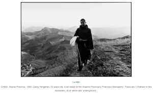
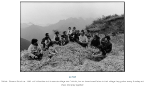
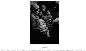
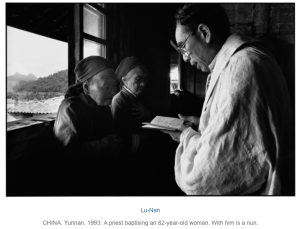
Next I moved on to Lu Nan. His work instantly instantly grabbed my focus, so I tried to learn about his life, and I found that to be a mysteriously hard task. It turns out, the 47-year-old Chinese photographer (the only Chinese photographer in Magnum, ever) is a notorious recluse and cryptic person. Not much is known about his life, and he will occasionally inexplicably disappear for years at a time. Nan’s work, regardless of the details of his personal life, is painful, beautiful, spiritual, and enlightening. I was especially drawn to his series On the Road, the Catholic Church in China. This project documents the underground goings-on of the illegal Catholic community in secular China in the early 1990s. My initial expectation going into Nan’s work was that it would be very foreign and unfamiliar to me – however, my Catholic upbringing made the images of Catholicism in this distant country very familiar. These two photographs were particularly resonate:
Young man in long robes walking along mountain pathGroup of people sitting in a circle

They capture images that are so commonplace in my mind – a member of the Franciscan order and a group of people gathered in prayer. But the background and undertones of the images are what make these shots so powerful, unique, and different, at least for me – the picturesque mountains so casually and elegantly providing the backdrop for the photos and the very real sense that the religious actions being taken are highly dangerous. The main picture in focus in the foreground with an exotic background mimics the very nature of that which is depicted (in my mind): something clear up front, with something very unknown in back.

The following two photos from the Catholic photo essay additionally left me awestruck:People surrounding mother and baby

Man speaking to older women in front of a large window

Both capture the moment of baptism, initiation into the Catholic Church. The top pictures shows an 8-day-old baby being baptized, and the caption reveals that it is illegal for a person under the age of 18 years to be baptized. The bottom picture shows an 82-year-old woman being baptized. Both depict an overwhelming sense of strong faith, and, furthermore, a dedication to a religion that is so difficult to dedicate oneself to in China at this time. A lot of Nan’s work depicts heart-wrenching, sad realities in China, but I found that above all else, a true sense of community and commitment is evident in the people shown in his work.

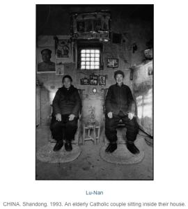
Finally, I enjoyed this picture of Nan’s, because it reminds me of Carl and Ellie in the movie Up.

Elderly couple sitting in front of wall with photos

Magnum Website Response

Overall, I think the Magnum website is well designed and easy to navigate. I think one of the most interesting aspects of the site is that they promote not only the work their photographers produce for Magnum but their commercial work as well.  For example, as I was browsing through the “latest stories” section of the website, I noticed a series by Alec Soth called Unselfies. The description reads “Soth Alec Soth recently explored the notion of the “selfie” by creating a series of “unselfies” for The New York Times Magazine”. The photos are, I assume, of Soth himself, but with his face distorted in some way. These photos stood out for me because they seemed so “un-magnum” as they are probably better defined as art photography rather than photojournalism. To me,this is a representation of how Magnum aims to promote the works of their photographers rather than the agency itself. Is it also show how the agency has adapted to the modern day. In the past, many of the Magnum photographers were repelled by the idea of doing commercial work. Toda

Man with face covered by smoke

USA. 2015. Unselfie.y however, doing commercial work is essential to the survival to magnum photographers.

I also really like the themes tab of the website. This part of the website organizes photos from many different photographers in categories as different as “Cuba”, “water” and “the laugh”.

Man with face distorted by mask

USA. 2015. Unselfie.

I like this because it allows the viewer to see a wide range of photographers work in a manageable way as well as see how different photographers approach similar subject matter. Overall, it seems that the most universal aspect of this varied group of photographers is a serious towards their subject matter and a desire to do so in an aesthetically pleasing way.

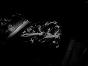
View of crowd reaching for car from window

GREECE. Lesbos. 2015. Refugees and migrants arriving on Lesbos island are transferred to Moria refugee camp to registration from authorities before they can move on.

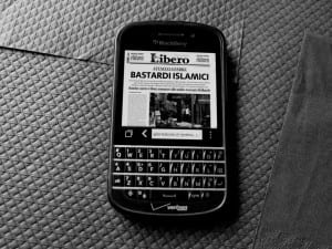
News article on phone screen reading "Bastardi Islamici"

FRANCE. Paris. November 14, 2015. The day after the terror attacks.

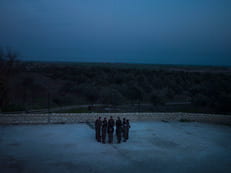
Group of people from a distance standing in a circle

YPJ members during their daily training in their base in Serikani.

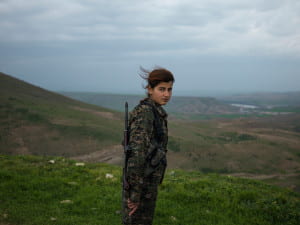
Woman in army gear in front of mountain overlook

SYRIA. Semalka Border. Rojava. Torin Khairegi, 18, in Zinar base.
“I joined YPJ about seven months ago, because I was looking for something meaningful in my life and my leader [Ocalan] showed me the way and my role in the society. We live in a world where women are dominated by men. We are here to take control of our own future. We are not merely fighting with arms; we fight with our thoughts. Ocalan’s ideology is always in our hearts and minds and it is with his thought that we become so empowered that we can even become better soldiers than men. When I am at the frontline, the thought of all the cruelty and injustice against women enrages me so much that I become extra-powerful in combat. I injured an ISIS jihadi in Kobane. When he was wounded, all his friends left him behind and ran away. Later I went there and buried his body. I now feel that I am very powerful and can defend my home, my friends, my country, and myself. Many of us have been matryred and I see no path other than the continuation of their path.”

One photographer whose work was really interesting to me was the work of Alex Majoli. Majoli is an italian photographer born in 1971 who began his career documenting the wars in Yugoslavia, Kosovo and Albania. He published his first book 1991 which was a collection of photographs taken during the closing of an insane asylum on the island of Leros in Greece. Majoli because a full member of Magnum in 2001. What caught my attention was a project he did recently on the Refugee Crisis in Lesbos, Greece. All of the photographs in the series are taken in low contrast black and white giving the photographs a very cinematic effect. One photo I really like shows migrants arriving on the island from a viewpoint of a car window. The migrants are reaching for something in the distance but you cannot tell what it is. The photo is beautifully composed and because the inside of the car is exposed in such a way that you can’t make out many of the details the viewer’s eye immediately goes to refugees. I also really like a series of photographs he took the day after the recent terrorist attacks in Paris. One of my favorite photographs is of a news article with a headline in a italian that translates to “Islamic Bastards” on a blackberry screen. I think this photograph is interesting because it reflects the way most people, even those in Paris probably learned about the attacks – on their mobile phone, and the headline is in some ways more effective in showing the tension in Europe in the aftermath of the attacks than other photos in the series of people consoling each other and going about their daily lives as usual.

I was also really drawn to the work of Newsha Tavakolian who is an Iranian photographer born in 1981. She is a self taught photographer who was working professionally for the Iranian press at the age of 16. She became a Magnum nominee last year. She recently did a series called The Women Taking the Battle to ISIS. One photo I really liked shows member of the YPJ (Kurdish Women’s protection unit) on base during training. The photo is taken far away and shows the women standing in the circle. What I like about the photo is that because of the way it is composed, there is something very mysterious about it. It makes you wonder what the women are up to and what they are discussing.

Also as part of the series,  Tavakolian took several more formal portraits with the women in the unit. These photos have extremely long captions like this one which reads SYRIA. Semalka Border. Rojava. Torin Khairegi, 18, in Zinar base.

“I joined YPJ about seven months ago, because I was looking for something meaningful in my life and my leader [Ocalan] showed me the way and my role in the society. We live in a world where women are dominated by men. We are here to take control of our own future. We are not merely fighting with arms; we fight with our thoughts. Ocalan’s ideology is always in our hearts and minds and it is with his thought that we become so empowered that we can even become better soldiers than men. When I am at the frontline, the thought of all the cruelty and injustice against women enrages me so much that I become extra-powerful in combat. I injured an ISIS jihadi in Kobane. When he was wounded, all his friends left him behind and ran away. Later I went there and buried his body. I now feel that I am very powerful and can defend my home, my friends, my country, and myself. Many of us have been matryred and I see no path other than the continuation of their path.” I really like this because it gives more context to the photos, as well as displays magnum’s desire to have more control than many news photographers about how their work is used and misused.  


Masters of Magnum

This might be an obvious, but Magnum photographers have such diverse bodies of work. Some, like Michael Christopher Brown, take photos in a very clean and to the point way – the action is very strong and clearly the purpose of the photograph. Others choose a rather artistic approach, straying away from what I used to conceive as the “traditional” photojournalism style. The most simple of differences between photos harkens back to the heated discussions these men would give into. It is clear they all have different ideas of how to approach the situations they are in. It made sense to me how they would bicker about the aesthetics and morals of art. There also seems to be a sense of community despite how different they all are. This is seen in the yearly meetings as well as things like a map showing where they all are or the theme page where they all show their different styles and works that happen to be centered on a theme. It is interesting to see how despite their different styles, backgrounds, ideals, geographic locations, it all boils down to some very central and specific themes that cut across all boundaries.

I did, however, find myself wishing that I knew more about the stories and the events being depicted in the photos on the website. Some had brief captions or descriptions but none went into the depth that I was seeking. That seems like something that would be important to them as an organization so it struck me as odd.

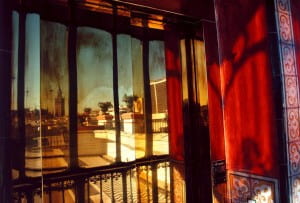
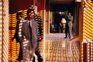
The first thing that truly struck me from the Magnum website was the work of Geurgui Pinkhassov. I looked at a couple of portfolios before I looked at his that very commercial and fashion heavy. The ones I had looked at during class were quite story based. Pinkhassov’s work struck me because I could tell I was looking at something quite complex, something that has a story, but his work is strikingly beautiful. He uses an intense amount of shadow play and pairs it with quite dim lighting, but his work is in a rather electric color.

Balcony with light shining through stained glass

SPAIN. Andalusia. Sevilla. 1993.
Balcony of a hotel.

Hotel hallway with sunlight streaming through window creating pattern on wall

JAPAN. Tokyo. 1996. Hotel in Akasaka area.

These are only two examples of his work – the first of businessmen in Tokyo and the second of a hotel balcony in Spain. Both use the space brilliantly and leave me wanting to know more about the scene. I find myself wishing Pinkhassov would tell me a story about his trips here, about how and why he acquired these shots. I feel as though I am contently surrounded by what I would consider quite mediocre photography of girls in cute outfits in front of buildings or brooding guys smoking a cigarette with their coffee. This is the first time photography truly inspired me and really made me appreciate a body of work as a whole.

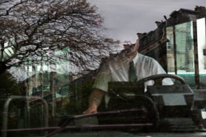
After looking at his selected portfolio, I ventured into his other work. It’s interesting to see that his style pretty much stayed tried and true throughout his life and throughout the different genres he photographs. His reportage work has a certain artistic quality to it which I feel sometimes is lacking in traditional photojournalism. His fashion photography lacks that stark, posed vibe and is replaced by soft lighting and movement. Even his commercial work stays true to his aesthetic. RATP hired him to do a series on urban mobility and even then, his work struck me as authentically “him”. What a versatile man. Here’s two more images of his commercial work because he’s fantastic.

Driver in bus window overlaid by reflection of trees and surrounding buildings

FRANCE. Paris. 2014.

Woman sitting on bus viewed through blue tinted window

FRANCE. Paris. 2014.

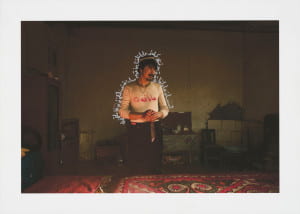
For my second photographer, I looked through the women of the organization, since they are such a minority – Carolyn Drake stuck out to me. A lot of her photos appealed to me visually and a lot of them included the captions I had yearned for earlier. The ones that stuck out for me the most, however, were the photographs she would take and then draw over. One example is this one of a man in China – the inscription reads “faithfulness. Life is only one time. Everyone has to remember their faith.” The juxtaposition of the handwriting on a photograph stands out to me. While what she is doing is not exactly a novel idea, I do not see many people turning their photography into art (in the traditional sense). The lighting of the photo combined with the metallic lettering gives him a beyond natural presence in the room.

Man in darkened room surrounded by blue aura.

China. Xinjiang Uyghur Autonomous Region. Hotan. 2011. After sacrificing a camel with his ten siblings for Kurban. Translation of the inscription: “Faithfulness. Life is only one time. Everyone has to remember their faith.”

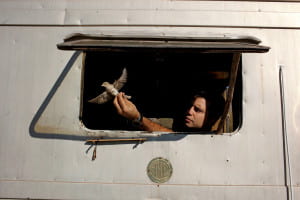
The second photo I chose is of Cagan Sekercioglu releasing a bird he banded. While I’m not quite sure of the significance of such a photo or what it’s depicting, the image drew me in. The concentration yet gentleness and concern in Cagan’s face is truly a fleeting moment that is hard to capture. She strikes me as someone who has many different styles and can adapt well to the situation in which she is put. The photos I chose are also very personal, as if the people in them invited her into their personal head space and literal space in order to allow her to fully and authentically capture the moment. 

Person holding bird out of window

Turkey. Kars. Aras. 2011. Cagan Sekercioglu prepares to release a Red-backed Shrike after banding it at a bird banding station he set up in Aras, a small village near Turkey’s closely monitored border with Armenia.

It is interesting to me that I chose photos with all color because I am usually drawn to the stark contrast of black and white. I think this shows the mastery of the Magnum photographers because I think it is easy to make something look quite commercial, plain, or flat if it is shot in color. 

Magnum Website and Photographers

Trying to articulate a concise response to the Magnum website is difficult because of the massive amount of work these photographers have produced. The collective is clearly incredibly successful and influential. It seems Magnum is most focused on supporting their photographers. This comes across in the way that the site displays not only journalistic photo-essays, but commercial work as well. The website provides each photographer with ample space to show a variety of projects. This highlights the diversity of work that Magnum photographers are producing—both in content and in form. Looking at the multi-photographer portfolios and stories, its clear Magnum photographers are incredibly skilled and have a range of styles and aesthetics. I was disappointed by how the collective is predominantly made up of white men, and mostly Europeans and North Americans. However, perhaps that will change in the future, or is in the process of changing, seeing as many of the female photographers are relatively young and new to the agency.

Something striking about the work displayed on the site is that most of it seems to exist in a space somewhere between art and journalism—or perhaps, as both. Much of the work in the editorial stories seems concerned with the importance of both what the story is and how it is being told. Most of the photographs I saw were both stylistically interesting to look at while also being informative and adding to a sense of the story, place, or people within the image. I get the sense that Magnum photographers are highly aware of their balance between art and journalism, and how that affects the significance of their work. In the site’s basic description of the agency it says, “With powerful individual vision, Magnum photographers chronicle the world and interpret its peoples, events, issues, and personalities.” I find this statement to be incredibly important; specifically by recognizing the “individual vision” of its photographers and their acts of interpretation, Magnum is not attempting to claim any singular truth through the photographs, but rather, speak to the complexity of photographic objectivity and highlight how these specific individuals are seeing and experiencing the world.

One of the photographers whose work interests me is Alessandra Sanguinetti. She was born in New York in 1968 and grew up and lived in Argentina from 1970 to 2003. She is a recipient of the Guggenheim Foundation fellowship and joined Magnum in 2007. Most of her work is done is color, asides from one portfolio entitled Sweet Expectations. I was drawn to her work because of how intimate her images are. In the first project I looked at, The Adventures of Guille and Belinda and the Enigmatic Meaning of their Dreams, Sanguinetti photographed two sisters, Guille and Belinda, who live in the farmlands near Buenos Aires. She met them while working on a different project, but eventually began photographing them and creating a separate portfolio of work that is both a documentation of their lives and a collaboration with them to delve into, what Sanguinetti calls, their “imaginary spaces.”

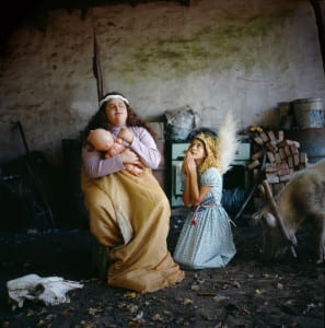
There is a very cinematic quality to her photographs, both in the images where the girls dress up and play out fantasies or dreams as well as the more day-to-day moments. I think this reflects the imaginative nature of childhood. In The Madonna, and many of the other photographs of the girls, Sanguinetti photographs the girls from either eye level or looking up at them. This increases my feelings of intimacy with the subjects and aggrandizes their presence. In The Madonna, Sanguinetti shows the girls in their costumes posing in some sort of open-structure. By photographing them with contextual detail, like the dirt floor, the pig, the chopped wood, and buckets, Sanguinetti balances Guille and Belinda’s imagination and reality. She allows us to see into both their physical and psychical world.

two young girls posed as virgin mary with child and angel.

ARGENTINA. Buenos Aires. 2001. The Madonna.

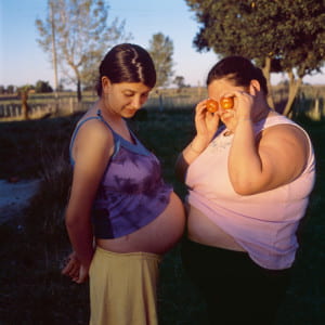
Sanguinetti continued to photograph the girls as the got older, but maintained a similar aesthetic. Though the images became less about the girls’ dreams, they retain a quiet and delicate feeling. Her photograph Tomatoes is an example of this. She uses soft light, and though the girls have entered into adulthood (Guille is pregnant) the photograph perpetuates the playful, dreamy impression of the earlier childhood images.

Two women with stomachs touching

Alessandra Sanguinetti. ARGENTINA. Buenos Aires. 2007. Tomatoes.

Another photographer whose work interests me is Raghu Rai. He is an Indian photographer, born in 1942, and was nominated by Henri Cartier-Bresson to join Magnum in 1977. Through their textured high-contrast appearance, Rai’s photographs remind me of Cartier-Bresson’s work in India. Its seems he must have been influenced by Cartier-Bresson. Prior to joining Magnum, Rai photographed for various Indian newspapers, and then continued to produce most of his work for the agency in India. His projects range from street scenes to images of weddings to a documentary project on a chemical disaster. He photographs both in black and white and color. I am interested in how he plays with movement and the crowded spaces of India.

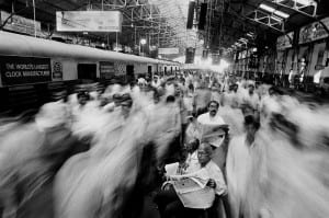
Some of his images I recognize, such as Local commuters at Church Gate railway station. Mumbai. 1995.

two men read the newspaper in transit station as commuters move around them

Raghu Rai. Local commuters at Church Gate railway station. Mumbai. 1995.

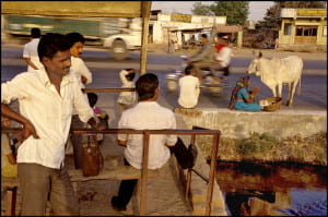
In this image he uses a long exposure so that that the men sitting still reading the newspaper are in focus, while the rushing commuters surrounding them are captured as blurs. This image strongly relays a feeling of business and chaos, and yet there is something oddly peaceful about the calm, quiet space the three men exist in within the middle of the frame. Similarly, in At a bus stop, Ahmedabad 1994 Rai captures a street scene in which the people in the foreground are still and in focus while the moving truck and motorcycle in the background blur by. Rai captures the coexistence of these dichotomies. The movement of the background makes the image more aesthetically interesting than had he used a quick exposure to freeze the moving vehicles. I enjoy his street photography; there is subtlety to the images that allow me to feel like I am within the scene without being obtrusive.

Men standing in town wearing dark pants and white shirts.

Raghu Rai. At a bus stop, Ahmedabad 1994


A Story of Aesthetics

The Magnum website proved to be as beautiful and easily navigable as the photography on the site. From the simple font and design to the way the posts were separated into blocks, the Magnum website and the photographs draw you in. Although very uninformed about the technicalities of photography and what goes into making a shot aesthetically pleasing, I think that there is not one photo on this site that you could not deem beautiful or captivating. Ironically, although I am not sure that is the right word to use, even the photos of war and pain and corruption were captured in the most attractive, most vibrant, most pleasing ways. But especially through these almost inhumane documentations of horror, I personally was able draw a better focus on the very blurry line between photography and photojournalism.  Photojournalism is unforgiving. It captures raw truth. And beyond being merely visually pleasing, the work of these photographers tell a tale of relevance and gravity far better than CNN, The New York Times, The Atlantic, NPR. Rather than reading or listening to the news, the photography stays still as you find yourself paused in time, across the globe, in the midst of a crisis, a riot, a  singular moment. However, not every photograph captured a pivotal, societal event or crisis; many were documentations of an era–the fashion, the people, the culture–which hold relevant meaning and a story to tell as well. Through these static snapshots, the Magnum Collective does not merely document human history but urges the viewers to never forget, to stay empathetic and to never remain still.

The two photographers that I chose to look at were two female photographers: Eve Arnold and Alessandra Sanguinetti. In the process of choosing photographers I decided I wanted to give my attention to the very small female population in Magnum. I first chose Arnold, who had a quote that caught my attention in her profile: If a photographer cares about the people before the lens and is compassionate, much is given. It is the photographer, not the camera, that is the instrument.” This bolstered my perception of Magnum photographers as the warriors of our world, those who venture out in search of stories in need of being told. Almost evangelically, their photographs spread the gospel of remaining informed and not remaining still. To me, the particular Arnold photograph that embodies this is a gorgeous image of a young Chinese girl and a tired white horse on a beautiful green field lightly sprinkled with white and yellow flowers. Not only is this photo visually beautiful, it is beautifully intriguing. The caption, “CHINA. Inner Mongolia. Horse training for the militia. 1979” completely contradicts the serenity and beauty the photo holds and pulls the viewer into its story. Is this young girl dressed in bright pink really training a horse for war? Was she doing in voluntarily, against her own will? How old is she really? What are her own perceptions of the war? In this moment of utter peace, could there actually be a different story? There is no way not to get lost in the mystery and intrigue. Initially left with but a short caption, the viewer finds himself immersed in a story that urges him to discover more. 

Young woman laying in field with horse

The second photo that really drew me in was a black and white shot of Marlene Dietrich. The photograph is haunting; Dietrich is sitting in a distressed pose, her elbow on her thigh and hand on her cheek–in almost a “The Thinker”-esque pose. On the table in front seems to be a mug and a used tissue. The depth of the distress tugs at your heart, makes you want to comfort the damsel–that is, until you read the caption. The caption describes “Dietrich at the recording studios of COLUMBIA RECORDS, who were releasing most of her songs she had performed for the troops during World War II, including LILI MARLENE, Miss Otis Regrets. She was 51 years old and starting a come-back in show business. It was a wet and cold November night and work could only begin at midnight, at the advise [sic] of Marlene’s astrologer. November 1952.” The caption transform the photo into one of more exhaustion, a worn-out feeling. I could hear her almost sighing, “Why am I here?” The photograph and the caption work to give the viewer a piece of Dietrich’s personality–a mix of haughty stardom but also a worried, superstitious and desperate ex-star.

Woman at table looking away from camera

Whether it be in color or not, have a long caption or not, both of these photographs invite you into their story. In both, Arnold truly captured moments that long to find a viewer who will listen to and search for its story.

Visual storytelling cannot solely be attributed to Arnold. Quite honestly, I believe it is embedded in the essence of photojournalism. Through Book 1 of her photo journal “The Adventures of Guille and Belinda…” Alessandra Sanguinetti, the second photographer I chose, captures snapshots of two girls’ lives. Of the two photos that especially stood out to me, the one of Guille standing next to a large hydrangea bush with her face hidden among the leaves. It wasn’t particularly the odd situation at hand that really drew me in; it was the colors–the faded blues, the subtle pinks, the deep greens. With the stunning color scheme and the peculiar, silly, very animated pose, the photo is just fun–and fun to look at. All of them are actually. All the photos in this particular photo story captivate you with color and scenes of companionship and femininity within the confines of a square. My second favorite photo was also in the same photo journal. It shows Guille and Belina, two girls of opposite body figures, floating with their eyes closed in a beautiful blue body of water. They hold flowers in their hands which really reminded me of the painting Ophelia by Sir John Everett Millais. Once again, this odd scene paired with the beautiful colors make the photo impossible to not look at and just enjoy. The story Sanguinetti tells through her photographs is one that evokes a happy feeling, a story of innocence and the beauty of youth. Her images are purely lovely and portrays her two characters into a lovable pair, much like Wallace and Gromit.

Woman smelling flowers in large bush       Two young women laying river with flowers in their hands


“Dramatic Imagery” – Magnum Website Response

Scrolling through the Magnum Photos website, I was struck by the sheer number of photographs that were stunningly brilliant. Normally when viewing a photography gallery or portfolio, there are a couple images that catch my eye and I leave with only a few images in mind. However, on the Magnum website, I could not find one image that I didn’t particularly take interest in, or considered unworthy of its revered status. While every photographer is capturing images of similar subject matters, either of political or historical significance, no two photos are even remotely similar, each collection and portfolio is incredibly diverse. What I can deduce from browsing through each photographer is that they are perhaps hired by Magnum because of their innate ability to capture dramatic moments, each containing a sense of heightened realism that invites the viewer to find every detail in the frame, providing layers of stories and emotions. Two photographers that caught my attention were Hiroji Kubota and Nikos Economopoulos, both of whom have captured images that are incredibly moving and that I found to have particular aspects to their photography that were notable.

Hiroji Kubota is a Japanese photographer whose work is largely concentrated in Japan, China, Taiwan, and North Korea, but has also worked in United States, most notably photographing the Civil Rights Movement in the 1960s and the March on Washington. He attended Waseda University and studied political science, and shortly after his graduation in 1962 he enrolled in the University of Chicago, where he met several Magnum photographers and started working as a freelancer. He was then discovered and became a Magnum member in 1965. He is the winner of numerous prestigious photographic awards including the Nendo Sho and the Mainichi Art Prize.

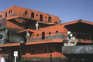
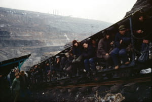
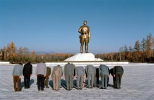
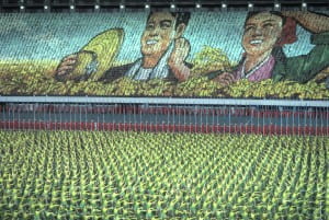
An aspect of Kubota’s works that I believe makes his style unique is his capturing of detail, often times in large groups or gatherings. For instance, in two images he shows female ship labors and male coal miners. In the photograph of the women, there is only one pair of eyes that can be seen under the protective masks that each worker is wearing as they clean an old ship, the temperature feels hot and uncomfortable. In the coal mine photograph, a long line of male workers sit inside railroad cars, cramped and tired, perhaps on their lunch break or at the end of a long day.  Both photographs, through different details, accomplish the same reaction: empathy with the workers and feelings of stress and tiredness. In his works taken in North Korea, his use of groups and scale often times imply a theme of sameness. He shows young girls at a dance class, young boys on a trolly ride, wealthy townsmen in a barber shop and government officials all bowing down to a statue of Kim II Sung. In each of these images, the subjects share an overwhelming cohesiveness, whether it be in dress, expression, or movement/positions, and this is enhanced by his frequent use of color film. What ultimately draws me to Kubota’s work is his uncanny ability to place himself in front of many people and manage to capture details that would seem otherwise impossible or too fleeting to spot.

Nikos Economopoulos is a Magnum photographer originally from Greece whose work is most apparent in his homeland of Greece as well as the Balkans. Originally a student of law, Economopoulos did not begin taking photographs till he was 25 years old, a late start for a career that usually begins at a young age. He was inspired by Cartier-Bresson and chose his first subject matter as the divide he saw between Greeks and Turks. He became affiliated with Magnum in 1990 and was in-house by 1994. He is also the winner of many prestigious awards including the Mother Jones Award for Documentary Photography, and currently resides in Athens where many of his works are on permanent display in Centre Méditerranéen de la Photographie and Benaki Museum in Corsica and Athens, respectively.

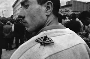
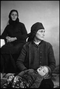
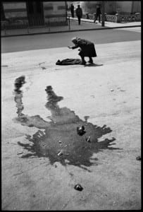
If there is one Magnum photographer who utilizes drama to it’s fullest potential, it just may be Economopoulos. His images appear as if they could have been staged, evoking emotions and visuals that are both surreal and visceral. His use of only black and white also enhances his dramatic style, allowing shadows and bright spots to be accentuated and noticed more than if they were in color. His portraits are what first caught my eye when browsing his works. In every photo he takes of another person or multiple subjects, there is something within the frame that is deeply intriguing. It may be a small detail such as the shape of their mouth, the motion of their hand, or the wrinkles in their skin. Some aspects are much more pronounced, such as a large wine stain around a cracked bottle on the street, with a woman attempting to find her balance, or an honest, contemplative, and concerned expression on a mother’s face as she looks at her child. Economopoulos’ most intriguing photograph to me was his image of a man at a political rally, with a butterfly on his shoulder. His expression is honest, and intense, and one can’t help but hope the butterfly landed there for a reason, just for a quick moment, perhaps encouraging/supporting the protestor, or giving him some good luck. Economopoulos’ photographs seem to have a life and story behind them and are in constant motion, with every frame I felt as if I was watching a stylized film, and this resulted in me being more interested with each image I saw.

– Tristan Oliveira

People looking through decorated windows

Turkey, Imvros island, Agridia village.
©Nikos Economopoulos-Magnum

Man with butterfly on his shoulder

Turkey, Yozgat.

Two women in traditional dress looking away from camera

ALBANIA. Mirdita region. Perlat village. The DONDA family “forgave” the blood and has reconciliated with the SULEYMANIS. But the women still mourn the recent deads. 1998.

Woman leaning over a body.

ROMANIA. Alcoholic woman at Baia-Mare. 1990.

Structure with people on patrol

Men sitting on structure outside

CHINA. Fushun. Liaoning Province. 1981. Strip coal mine.

Group of people bowing at gold statue

Mural showing a man and a woman surrounded by flowers

« Older posts