What interested me most about Steve McCurry’s show at the Rubin Museum of Art was his ability to provide an extensive portrait of place. McCurry photographed a variety of people, events, and sites in India, while also ranging from more formal portraits to street shots. Color is an incredibly important tool to him—I felt he used it in a way to express the emotions and energy of his subjects, whether they were people or places. While he is clearly interested in photographing people, I was most impressed by his engagement with India as its own subject. The photographs I was most drawn to were devoid of individuals, but rather spoke to the manifestation of past, present and future in cities.
His images Agra Fort Train Station at Dusk, with Jama Masjid, the Great Mosque of Shah Jahan, in the Distance and Moonrise over Mumbai, both show a unique relationship between modernity and tradition. Having travelled to India a few times myself, this a theme that has always fascinated me. McCurry does a beautiful job of representing the interaction of historic architecture and modern technology.
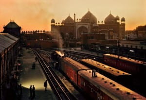
Agra Fort Train Station at Dusk, with Jama Masjid, the Great Mosque of Shah Jahan, in the Distance
In Agra Fort Train Station he photographs the train station in the foreground with the mosque in the background. The highlights on the train create a somewhat theatrical lighting, emphasizing the significance and power of the train, while the beautiful architecture rests gently in the distance. By photographing the station at sunset, and when it is relatively empty, McCurry suggests a peaceful, tranquil quality to the relationship between past and present. The smoke of the train stands out against the dark tracks, but as it rises it dissipates and dissolves into the orange sky, suggesting some sort of harmony. It feels odd to be looking at the industrial landscape of the train station so close to such a sacred site. However, McCurry makes it appear natural with his deep depth of field and the sweeping orange and yellow tones.
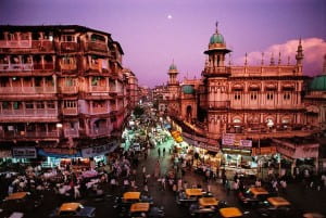
Moonrise over Mumbai
Similarly, in Moonrise over Mumbai, McCurry photographs a historic neighborhood while showing the chaos of cars, people, shops, and light. There is an interesting relationship between the top of the buildings, lit by the setting sun and rising moon, and the neon lights flooding onto the street from shops and stands. For me, the neon lights function similarly to the train in Agra Fort Train Station, they represent modernity and in this image, a growing sense of consumerism. The buildings stand crisply in focus while the blurred cars rush beneath them. The bottom of the frame feels incredibly crowded in comparison to the top. This seems to me to represent the way in which India is made up of different histories, traditions, and times living and remaining on top of one another.
I find there to be an interesting comparison between McCurry’s work in India and Susan Meiselas’ photographs from Nicaragua. With Meiselas’ work, though it is very much centered on a specific place, I find it to be more of a portrait of people and events rather than Nicaragua itself. Though those people and events of course make up the history of Nicaragua, and specifically the revolution, each of Meiselas’ images feel a bit more small scale—all very particular moments. This in turn creates a sense that I am receiving bits and pieces, or an understanding of a place at a very particular time. This functions very well for Meiselas’ series because it is a portrait of a revolution, rather than an elongated period of time like McCurry’s photographs from India. It is interesting to analyze how these two series feel different. McCurry’s work feels separate from a temporal context. Perhaps this is because of India’s aesthetic, or because of the way he juxtaposes modernity and antiquity.
The comparison of Meiselas and McCurry’s use of color is also interesting. Both chose to take color photographs because they felt color better matched the energy of their respective locations. However, the color palettes of their images are vastly different. Meiselas’ color feels faded in comparison to McCurry’s. This is interesting, and somewhat surprising, because when looking at her book I remember thinking the color was incredibly vivid. McCurry’s photographs are highly saturated and incredibly vibrant. His use of colors feels a bit more intentional—some of the images felt like they were taken because of the color. With Meiselas’ images, though often the colors are also vibrant, I rarely feel that the color makes the photograph. Color rather functions as a complement to her composition. This feels much subtler than McCurry’s use of color.
McCurry’s images feel very monumentalized. The photographs are not only printed largely in the show, but he also tends to aggrandize his subject. Through his color, lighting, and composition, his images feel dramatic. For example his photograph of the man in green powder from the Holi Festival in Rajasthan as well as the image of the father and daughter rowing down a canal, both have an incredible intensity to them because the subjects feel so singled out and glorified.
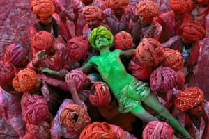
Holi Festival (1996), Rajasthan, India.
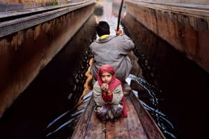
Father and Daughter on Boat 1996
This created a highly symbolic nature to his images—his subjects feel more like allegorical figures than individuals. The monumentalizing adds to the sense that he is creating a large, extensive portrait of India that transcends beyond specific people, places, or moments.


Recent Comments