Spring 2016
Author: gb1494
Every photo we looked at this semester— whether individual or part of a collection, whether featuring a single subject or multiple, whether a portrait or a landscape — was never just a photo. There is context, history, social justice issues, political correctness issues, etc. Two themes that emerged throughout this class were: the idea of the photo as a window into a deeper issue and the idea of the eyes as a window into the heart and soul of the narrative.
Ron Haviv’s photo of a man surrendering, Steve McCurry’s portraits — both in the exhibit at the Rubin Museum or the infamous nat-geo portrait we all recognized — Susan Meiselas’s photo of a wife carrying her dead husband’s body, if you look at each respective photo they are the window into the deeper issues each photographer explored and hoped to expose. Moreover the subjects eyes took you into the heart and soul of the issues exposed, as well as acted as a window into their hearts undoubtedly striking empathy into the viewer.
Photography is a powerful medium, more so today than ever before. While photography may be a saturated market, any person who picks up a camera then assumes responsibility for telling a story justly, a story with grit and heart and soul. I feel that every photographer we learned about this semester achieved this goal and I admire more than ever the talent and passion of photographers and their influence on changing the world.
Steve McCurry’s exhibition exuded powerful color throughout. His photos were so saturated with color that up close they resembled paintings. His portraits are also very unique, every set of eyes piercing and glistening with a melancholy but beautiful gaze.
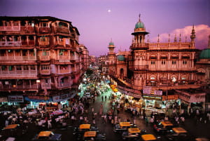
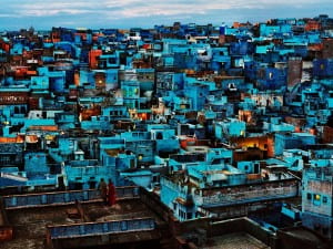
Firstly, I wanted to discuss his scenic photography that resembled painted landscapes: Moonrise over Mumbai and Blue City. What I think added to the “painting” effect of these photos was the glossy finish of the canvas these photos must have been matted on.
Moonrise over Mumbai depicted a purple sky with pink and orange hues on the building and cab roofs. What struck me the most was the lines on the building on the right. The thick moldings outlining the windows and turret are so intensely highlighted as a detail in this shot it is almost as if they were painted with a thick brushstroke.
Blue City resembles a painted landscape even more so then Moonrise over Mumbai. Firstly, the geometry of this hilltop city is so intricate and complex you wonder how, realistically, it exists. The decay of the white and blue brick throughout the image is almost so perfectly geometric it cannot be real. Moreover the red and orange hues scattered throughout the image that juxtapose the dominating turquoise hue look as if they were added in after the fact in photoshop. Finally the couple in the bottom left look very pixelized, as does the sky. As a whole, Blue City is breathtaking and captivating to any viewer but when looked at in detail you question the aesthetics and their validity.
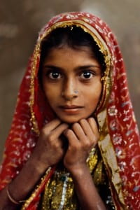
Secondly, I wanted to discuss his portraits. While the various portrait images also resembled paintings — due to their similarly saturated hues and blurred, glossy backgrounds — what demands the viewer’s attention are the subject’s eyes.
Nomad Girl is a beautiful portrait of a beautiful young girl. The portrait within this exhibition severely juxtaposes other photographs that capture poverty or tragedy. Here one can only assume this girl has at least some money in order to afford her stunning hijab of delicate gold-like and red fabrics. Her delicate frame and large eyes suggest that she is young. Her eyes captivated me because regardless of how young she may actually be, I can only imagine how much she has seen in her lifetime that has aged her in terms of maturity. The only detail that makes me doubt she is from a more affluent class is the dirt on her right arm. This portrait particularly reminded me of another Steve McCurry portrait: the world famous portrait of the Afghan girl. While the two girls’ hijabs greatly differed their eyes were both piercing and their youth was juxtaposed with the tragedy they are surrounded by. You can’t help but notice McCurry’s distinctive portrait style.
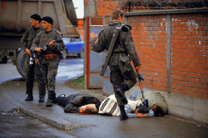
Many people have commented on the above image: everyone from Susan Sontag to BBC News and New York Times reporters to Joshua Lipton of the Columbia Journalism Review. The role of the photojournalist is always a point of contention hotly debated by novelists, journalists and scholars alike. After a lot of research, I was unable to find non-American/European sources of commentary.
Susan Sontag was troubled by the aesthetics and almost glorified implications the medium of photography can have on pain. While I would argue that this photo of the Serbian paramilitary member kicking the body of the dying civilian is by no means beautiful it is aesthetically stunning. The color is rich, from the blue car in the back to the brick wall, and the soldier’s action is captured in “the decisive moment” we have discussed this semester. However I do not think that the aesthetics of this photo detracts from the horror this photo captured. One article that I found interesting — which integrated both Sontag’s On The Pain of Others and this specific photo — was “The Other Eye of the Beholder” by Alexander Nehamas in 2003 for The American Prospect. Nehamas argued “Photography is not the only visual medium to go hand in hand with death. Death has been the constant companion of all visual representation since its very beginnings. […] A photograph is “a record of the real.” A photograph demands the pain to be felt. Whether people act on that pain, however, is up to the viewer
Many of the reporters commented on the evidence angle of the Haviv photo perhaps because they too are journalists and understand the plight of documenting rather than interviewing. The LA Times reporter, David Reff, said in a 2001 article “It is almost unimaginable that there could be more than one appropriate interpretation of a Ron Haviv picture.” From BBC to the LA Times it was agreed that this photo perfectly depicted the face of ethnic cleansing and the atrocities going on in Bosnia during this time.
It is evident this photo has been shown in a vast array of news publications, journalistic reviews and was used as evidence in a court of law (which according to The New York Times is rare for photographers to agree to). I feel that the meaning of this image today is still that of a symbol representing ethnic cleansing.
If I were studying the legacy of this image I would speak to the United Nations about it. Haviv was quoted in articles by The New York Times, The Globe and Mail and BBC News that his photos are evidence, evidence for the world governments and the world citizens. “Nobody should be able to say they didn’t know what was happening. What we do as photographers is to attempt to create a body of evidence to hold people accountable” Haviv told The New York Times. I would pose this question to the UN: how many photos of ethnic cleansing, mass genocides and war crimes will you need until this terror comes to an end?
Photojournalists such as Haviv risk their lives to report world news and for us to do nothing in terms of peace or policy making is a disservice to both the photojournalist and more so, our world.
Sources: (all hyperlinked throughout minus the ProQuest database source)
http://www.theglobeandmail.com/news/national/capturing-a-war-crime/article25016202/
http://news.bbc.co.uk/2/hi/europe/1347218.stm
http://articles.latimes.com/2001/jan/21/books/bk-14875/2
http://lens.blogs.nytimes.com/2013/04/02/photography-in-the-docket-as-evidence/?_r=0
http://prospect.org/article/other-eye-beholder
http://search.proquest.com/pqcentral/docview/230360791/74834B4D519F43D7PQ/1?accountid=12768
The VII photo website was aesthetically pleasing on top with their latest projects featured in a clean way allowing the images to speak for themselves. However as you scrolled down you reached the main home page with a map featured in the center. While it was creative to show where all of the VII photographers are around the world, the map is dull and outdated and not at all aesthetically pleasing in contrast with the top of the page. Moreover, I found the website more difficult to use than that of Magnum. When you want to look at a photographer’s work, there is no dropdown menu or list provided. Rather a mosaic of photos where you must hover and find the portfolio link versus having the photo hyperlinked to the photographer’s page. Also I found it ironic that the website of a photo cooperative website did not have a tab dedicated to their photographers in the header of the website. Additionally, the website is not mobile friendly which I found out when I had tried to navigate it on my iPhone. In this day and age, and after reading the articles regarding VII and their plans to update their cooperative in every way possible, it was disappointing to visit such a lackluster site.
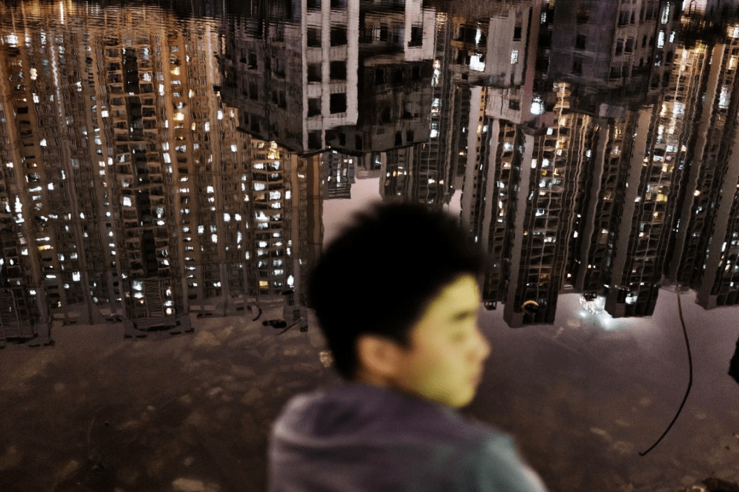
The first photographer that drew me in was Sim Chi Yin who is based in Beijing. The first photo that immediately struck me was the first photo featured in Sim Chi Yin’s portfolio slideshow. In this photo the face of a young man is blurred out and instead the focus of the shot is the reflecting city lights on the water to which he is sitting on the shore of. You can see the dilapidation of the city in its reflection yet the skyline is still breathtaking.
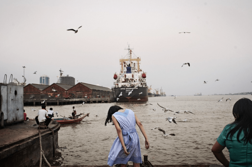
Another photo that I loved was of the harbor yard with seagulls flying all around and a young woman in a blue dress in the center. Once again the city’s run down appearance is evident, this time through outdated boats, musty buildings and a bleak gray sky. I feel this photo encapsulates the decisive moment to which Henri Cartie-Bresson speaks of. The seagulls appear so perfectly placed it as if they are photoshopped and the woman’s head has dropped at just the right angle that it adds to the bleakness that the sky and the harbor yard already speak to.
In both photos the persons featured were not the subjects, their surroundings were. I am not sure what this specific assignment was for but I can assume that these two photos were shot for the same project as they were located in sequence with each other and they have very similar themes. For example both of these photos were shot in a landscape format, they both depicted daily life in some Asian city (perhaps Beijing) and the person was minuscule if not irrelevant to the photo’s surroundings. An afterthought. This last theme speaks to the anonymity a city provides and this anonymity was depicted through the photographs by the fact that neither the man nor the woman’s faces were clearly seen.
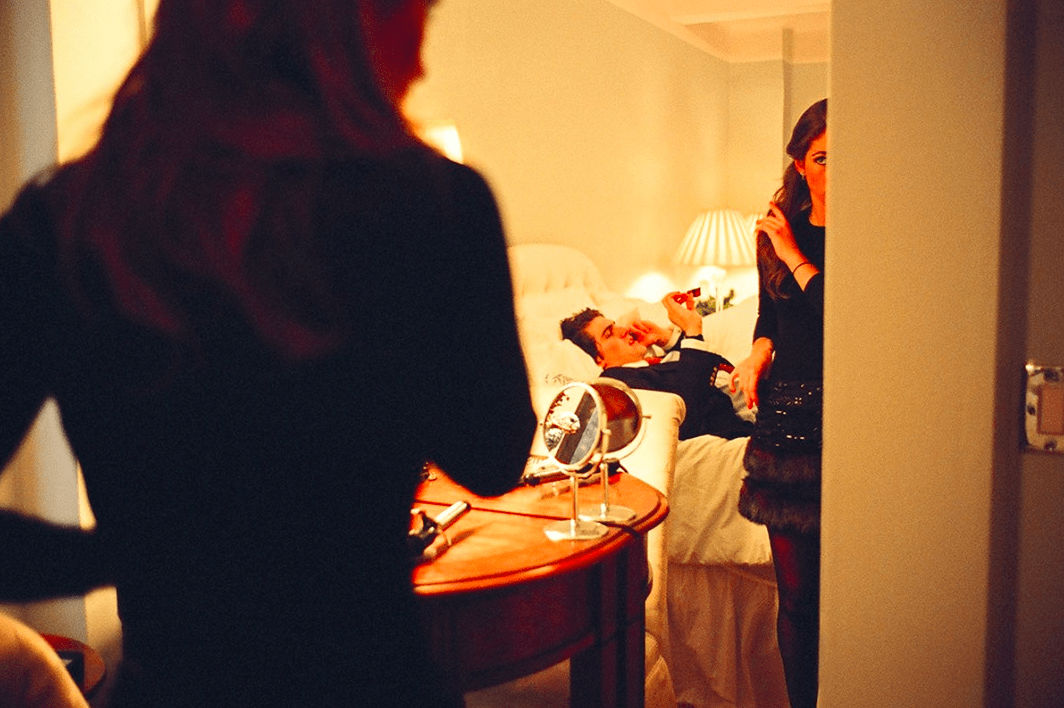
The work of Jessica Dimmock was the second photographer’s work who drew me in. I did love Dimmock’s street style shot of the Chanel bag and Louboutin shoes however the two photos that struck me were the picture of the couple in a room getting ready for what appears to be a fancy night and the woman captured in a raw moment of vulnerability.
The picture of the couple in what one can assume is a hotel room resonated with me as it reminded of my parents getting ready as well as of me and several of my ex-boyfriends. As cliche as this shot may be, I feel that many people can identify with it. This photo encapsulates a societal norm that women care what they look like when they are going out, especially if it is an upscale occasion, and men could care less. This photo shows how the man is ready and probably has been for some time thus why he is laying down and chatting on the phone. The woman is still getting ready, fiddling with her hair and putting on the last finishing touches. While nothing is particularly groundbreaking in terms of lighting or composition or subject matter, this photo struck with me because I simply liked it. While I do not like the stereotypes this photo perpetuates, I cannot say that I’ve never been this woman. I’ve seen this scene play out many times in my life and it’s the familiarity of this photo that resonated with me the most.
Once again the decisive moment was captured. The photo itself is almost entirely out of focus which alludes to the woman being scared, as if she is running from something. Scared of what we don’t know, we can only imagine. It’s in this unknown, that the source of the horror is in our imagination, that scares the viewer the most. Her expression leads us to think the worst about what could be haunting this woman. For this reason I view this photo as the decisive moment, as the exact moment when her fear is at its climax. However I think one could argue that this is not the decisive moment due to the lack of explanation surrounding her horror and what is causing it. The vulnerability of this woman transcends gender and allows any viewer to identify with her.
I’m a sophomore in Gallatin concentrating in Journalism, Fashion and Social Entrepreneurship. The goal is to work as a communications manager/ liaison for a company such as TOMS that has a social justice foundation. I am the Fashion Editor for NYU’s student newspaper: Washington Square News. I also intern for a start up called bSmart Guide that I’m completely obsessed with. When I’m not at the paper or interning I can most likely be found in Think Coffee. I love podcasts, TED talks, my family and stalking the Man Repeller blog.
After looking through the Magnum website I discovered that the Magnum collective has an incredibly wide range of talented photographers. From fashion and celebrities to wars and landscapes Magnum photos displayed all aspects of life: the creativity, the joy, the sorrow, the love. What I found most captivating was the fact that a majority of the photos were shot in black and white. I feel like it gave the photos more depth and more room for interpretation. The color, while stunning in some photographs, was distracting in others.
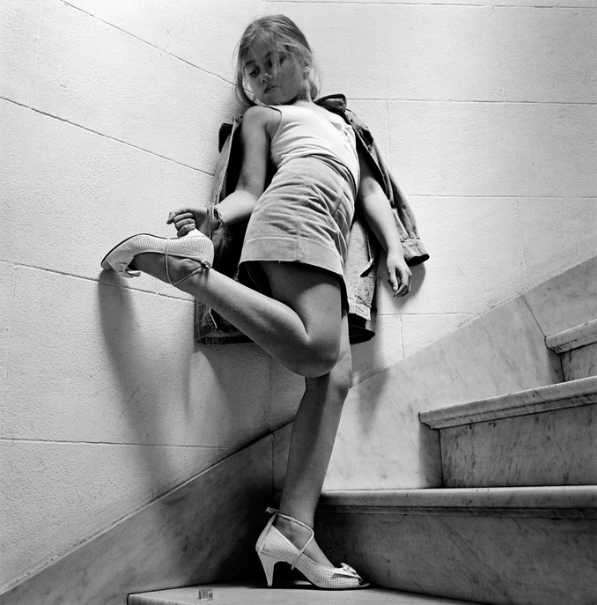
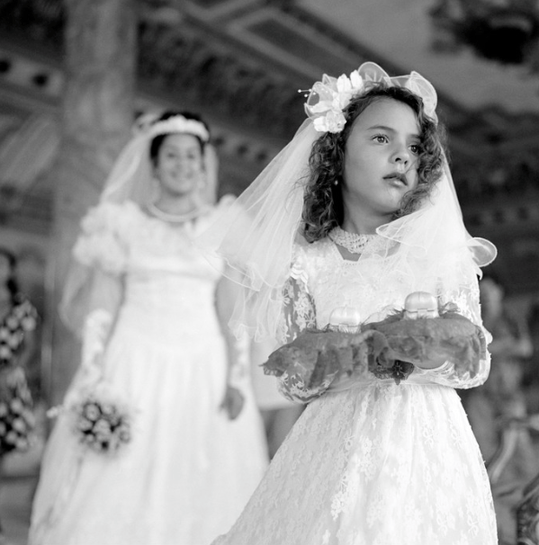
I chose to look at the works of Alessandra Sanguinetti and Erich Lessing. I was drawn into Alessandra’s work because there are so few women in the Magnum collective. One of her photo’s that particularly stuck out to me was from her Sweet Expectations series. This young girl could not be older than 7 and she is photographed struggling in heels. It is adorably sweet playing dress up. Does she want to be like her mom, her sister, her grandmother? Every young girl dresses up. I think this photo is a testament to the ironically bittersweet contradiction that when we’re young you wish to dress up and be like the grown ups but as we get older we wish the process of growing up would slow down. Since this picture is not captioned with a description of the scene, it is left up to the interpretation of the viewer. And when a collection title Sweet Expectations I think this photo is reflective of innocence and a child’s naïveté about growing up.
Another photo that I loved of hers was the photo of a young girl, presumably the ring bearer, and a bride. This photo was also a part of the Sweet Expectations series. There are so many ‘sweet expectations’ in this photograph. Those of the bride who has fantasies of the wedding about to occur, about her approaching marriage, about her future with the love of life. Expectations of the ring bearer to not trip, or lose the rings, to one day be a bride herself. The bride’s expression, while blurred out in the background, can still be perceived as happy. The young girl in contrast looks innocent, a bit distant, but sweet nonetheless.
While both of these photos are stunning they have a melancholy tone to them. Alessandra does a wonderful job of capturing the vulnerable moments in life and although they are beautiful they are equally sad.
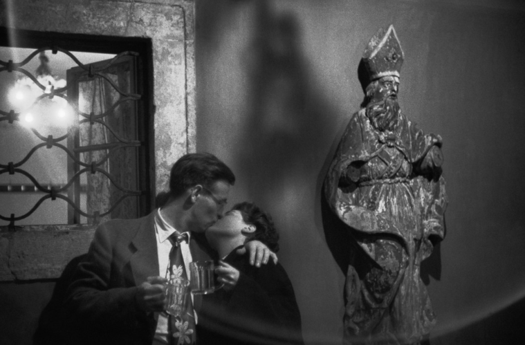
Erich Lessing in contrast, does a fantastic job of capturing life’s candid moments of joy. There is almost more hope in his photos than in those of Alessandra’s regardless of her series title. For example, in this first photo it captures a young couple in a tavern sharing a kiss. An intimate moment with so much hope. Are they dating? Married? Is this just for the night? Whatever the reality is, the viewer is more prone to feel the hope of young love. However fleeting, young persons disregard the odds and throw themselves into things, such as relationships, wholeheartedly. Perhaps this couple isn’t young, which makes the sentiment all the more sweet and hopeful. A love to aspire to. A love that lasts a lifetime.
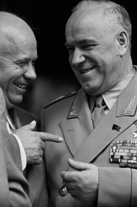
Another photo by Erich Lessing is that of the first secretary of the Central Committee of the Communist Party joking with Soviet Minister of Defence Marshal. Regardless of the circumstance, this photo appears to be candid and clearly the subjects look happy. I feel that Lessing had a keen eye for capturing the little joys and small victories in life.
© 2024 Photography Through the Lens of Magnum and VII
Theme by Anders Noren — Up ↑




Recent Comments