Author: bcs338

Portrait Photography with Steve McCurry – by Ben Searles

Photographic technology was first developed in the early 1800s, with the development of the camera obscura and photolithography methods. In 1927, French inventor Joseph Nicéphore Niépce took the first ever true photograph. Since then, amazing advances in the art and practice of photography have been made, from faster lenses, to smaller and lighter cameras, to the introduction of digital censors photo editing software, and more.

Photography was first developed as a way to capture the world in a snapshot. Only later did people begin to view it as an art form, as something that was created with an artistic, rather than documentary, mentality. Photographer Alfred Stieglitz was largely responsible for this shift in cultural thinking, with his early 1900s work. Since then, journalistic photography has continued on its similar path, maintaining its ethical devotion to truth in imagery, while art, or more artistic, photographic has bloomed in its own right.

These days, we live in a society plastered wall to wall with photographic imagery, and the vast majority of it seems to lean towards the fictional, artistic side. And often, it is not all that hard to tell if a photographic is a work of journalism or a work of art. Journalistic imagery is far less stylized and is almost always candid. On the other hand, artistic photography is usually far more contrived and created, and can be extremely stylish. 

Holmes writes, “documentary photographers strive to be objective recorders of real events and don’t meddle with their pictures. And usually they are working on assignment…” (Holmes) Journalistic photography seeks to tell the truth, and represent it through pictures. In contrast, art photography tells fictional stories, with made up details, and characters that do not exist in the real world.

The one arena where it can be hard to see the line drawn between the real world and the fantasy art world is portrait photography, a practice used by both artistic and journalistic photographers. Portraiture is the only time that a journalist is ethically allowed to pose their subjects in the photo. Portraiture is also usually the only time that subjects of photojournalism acknowledge the camera—and they often look right into it.

But there are still rules for journalistic portraiture. As Knight asserts, “The subject isn’t usually doing anything, again because the viewer should not be confused as to whether the photo is a posed portrait or a real, documentary piece of journalism.” (Knight) Indeed, the New York Times “Guidelines on Our Integrity” states that “Pictures of news situations must not be posed. In the cases of…portraits…intervention should be unmistakable to the reader, and unmistakably free of intent to deceive.”

That is not to say that journalistic portraits cannot be artistic. Upon a glance over the body of work or either Magnum or VII, one would notice that all of these photographers, while depicting real, documentary images, do so in a way that is artful and pleasing to look at. This is apparent in all of the work of the tow agencies, but especially in the portraits.

One photojournalist that takes entirely truthful, yet highly stylized, portraits is Steve McCurry. My intent with this project was to explore this art/journalism distention by attempting to recreate the distinct style and emotion characteristic of his work. I felt that a visual format was most conducive for this examination, because of course photography is visual, so what better way to explore a another photographer’s style and intent that by doing my own photographic work? This way, I can put myself behind the lens, in the “driver’s seat” and force myself to make all the same choices that McCurry himself made. I felt that only through actually creating my visuals can I fully explore the distinction between the contexts, motives, and back stories of creating portrait photographs that are considered journalism or documentary photography, rather than fine art or commercial work. I wanted to explore this project because with much of my own work, I leave myself wondering into what camp my photos fall exactly. What makes a snapshot of someone art—even if the circumstances of the photo are completely natural and unposed—and what makes it documentary work. I felt that using McCurry’s work as a lens to explore this question was a great start to answering this question.

McCurry, who was born in 1950 and joined Magnum in 1985, has become legendary for, among other things, his portrait work. He is probably most known for his photo of a young Afghan girl with striking green eyes, which appeared on the cover of an issue of National Geographic. He is famed for photographing in India, Pakistan, Afghanistan, Lebanon, and Cambodia. He is perhaps most noted for his portrait work.

After looking over a good portion of his work, specifically his portraits, I noticed some artistic trends. Purely stylistically, McCurry seems to always employ filmic, saturated (but not overly) colors, high contrast yet slightly crushed blacks, centered, chest-up framing, relatively shallow depth of field, and moody use of shadows. As far as the content of the frame, he tends to shoot in the field, against often very character-building (for the subjects of the photos) background, and is able to expertly capture emotion. This is partly due to his focus on the subjects’ eyes. Always looking into the lens, the subjects have eyes that true to the saying, allow a peak into their souls, and consequently make the photo overwhelming compelling.

I was highly inspired by these photos, so I decided to make my own. My photographic exploration can be viewed at my site: http://bencsearles.weebly.com/ , which shows a project that I called “ATTEMPTING TO CAPTURE THE ‘HUMAN CONDITION’ THROUGH PORTRAIT PHOTOGRAPHY IN THE SPIRIT OF STEVE MCCURRY.” All photos were taken in what I considered a journalistic, rather than strictly artistic, context. The first shot, a portrait of the homeless street artist Lex posing in front of his work, I took while assisting my friend Erin shoot a short documentary focusing on Lex’s life and work. Because we were interacting with Lex as journalists and documentary filmmakers, this photo serves less as a piece of fine art, which happens to include the photographic representation of a human, and more of a factual documentation of the contents of the frame. This is how Lex looks, and this is him posing in front of the his art, on the street where he sells it almost every single day.

I feel that I was able to mostly successfully capture the McCurry portrait spirit with this shot. Lex is center framed, shown-chest up, and placed in front of a blurry, character-building backdrop. He is staring deeply into the lens, and has a somewhat pained, yet very complex look on his face, especially apparent in his eyes. The photo is colorful, but not too highly saturated, and the colors are filmic and defined with a fair mount of contrast.

My though process behind the rest of the photos is similar. Every photo is framed similarly, and every subject is framed in front of a background that I feel works to contribute to the subject’s character. More importantly, these are all photos that while they are (hopefully) aesthetically pleasing, were taken in a journalistic context, as a way to document, rather than eventually entertain. For the last three photos, I broke away from the standard McCurry portrait framing, to take photos that I felt leaned slightly more towards my own style.

Observation on Interconnections – Searles

I noticed a trend among some of the photographers that we discussed this semester, such as viewing photography of a means, rather than an end, for social change. Often, these photographers have goals besides simply taking and displaying their photos. For them, in varying degrees, photography is just a tool is used to uncover injustices, tell untold stories, and/or make changes in the world.

This is apparent in the work of Ron Haviv, who saw the terrible conditions that hundreds of thousands of innocent civilians in the former Yugoslavia endured. He chose to stay in the area despite receiving littler media coverage of his photos. Now, more than 20 years later, some of his photos have been part of the effort to punish Serbian war criminals. Probably the most prominent example of this type of thinking is Marcus Bleasdale, who corrects people when they refer to him as a photojournalist. Rather, he sees himself as an activist, and uses photos to spread his message against conflict minerals in the Congo. He sends his photos to politicians as a way to pressure them into changing policy, and has over time seen good progress.

In the end, this idea is wrapped up in what seems to be one of, if not the, central debate of photojournalism: what is more important, art or content? Are the Magnum and VII photographers artists, journalists who tell visual stories, or something deeper and more humanitarian—something more Bleasdale-esque? Do the photos matter for their own value, or for what they can do? The answer seems to be slightly different for all journalist/documentary photographers.

McCurry Response

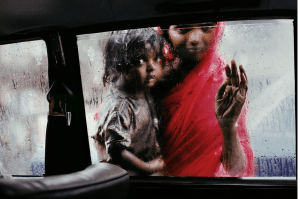
Two children look into car window, one is dressed all in red

I remember first seeing this image while scrolling through the Magnum website at the beginning of the semester. It instantly struck me, for multiple reasons. First, as I have written many times, I am very drawn to cinematic, filmic images. The rich colors, shallow depth of field, and relatively low contrast makes this photo look like it could be a still from a movie. I can imagine the story of a father leaving his young wife and child in a taxi to go off on a quest of some sort. And I can also image that McCurry experienced a similar situation; he was in a car, maybe a taxi, and and this woman and her child in some way desired to be inside with him

But regardless of the actual details of the story behind the photo, the photo speaks for itself, with the both physical as well as more metaphorical separation and yearning that it depicts. McCurry, and his camera, were able to look out from the comfort of the inside of the car. Outside, the woman and her child stand in the rain, separated from the the inside by the glass of the window. In the same way, these possibly lower socioeconomic Indian citizens are separated from McCurry, a relatively wealthy white man, by both a physical piece of glass, but also a social and economic divide.

The two subjects of the photo are hauntingly beautiful, and McCurry expertly captures their looks as well as their emotions. I am reminded of probably McCurry’s most famous photo, the portrait of an Afghan girl with striking green eyes.

I greatly enjoy both of these photos, but in a way, both seem to delve into the realm of what some photographers refer to as poverty porn; images that beautifully capture impoverished peoples, yet are devoid of any true meaning or understanding of the people’s actual lives.

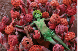
Man covered in green powder is held by others covered in red powder

Where McCurry was able to capture sorrow and yearning in the photo I described above, he was able to capture joy and devotion to tradition in this one. The man in the middle, covered from head to toe in green powder, is completely at peace, overjoyed and overwhelmed by emotion, as he participates in the Hindu celebration of color, Holi. Everyone in the photo is simultaneously extremely serious and extremely lighthearted; they are passionate about the events they are taking part in, yet at the same time, they are all having a really good time. They are devoted to this tradition, in the best possible way.

Upon first glance, this photo is somewhat abstract. The whole photo appears to be a mass of red, with a strip of green in the middle. Shot from above, the red turbans of the men appear as just round red blobs. Closer inspection might deceive the viewer into thinking the photo was altered in Photoshop; all of the men around the edges of the photo are completely red, while the man in the center is completely green.

This photo provides a stark contrast to the one above. Where the image of the mother and daughter outside the car window might have showed the hardships and separation of a foreign culture. This photo of the colorful men does the opposite; it shows a group of foreign people that are extremely happy and rich in tradition.

It is interesting to compare McCurry’s photos in India to the work of Martin Parr, specifically his Reporters Without Boarders series.

Of course, the most obvious difference between the two groups of photos are the actual photographic styles. McCurry employs, as I mentioned above, a much more film-like style; the contrast is relatively low, and the blacks are slightly crushed. He uses natural (or what is made to look like natural) lighting. The colors of his photos are rich, but not overly saturated, with a tendency towards a focus on the red and greens in the images. For the most part, he goes for very classical compositions, almost never completely centering his subjects.

It is hard to actually express this notion in words, but McCurry takes what could be describes as highly “professional,” artful images. They look like they were taken with expensive equipment, by a highly skilled photographer. In contrast, Parr embraces a lo-fi, cheap camera aesthetic.

He shoots with a flash, making his subjects very bright. Because of the flash, objects in the frame cast harsh shadows. Parr’s photos have much higher contrast and saturation, and just look much more stylistically “cheap.” He also uses stylistically wrong composition, centering his subjects. But this intentional; it creates a feeling of discomfort or uneasiness in his work.

But despite these differences, both photographers are doing similar work in their series. Both have gone to a relatively unique cultures, and just photographed the daily occurrences, in an attempt to get an overall mood for the location. Yet the other key difference between the two projects is their tone, and their treatments of the subject themselves. McCurry takes grand, cinematic shots, that seems to convey a sense of respect and awe for his subjects. Parr, on the other hand, is borderline making fun of his own subjects. He captures them in a sort grotesque, almost mean way, making the people he photographs into spectacles for others to look down upon.

Searles, Haviv Photo Response 

In the year 2000, photographer Ron Haviv published Blood and Honey, a photo book depicting his documentation of the conflict in the former Yugoslavia between the Serbs and the other ethnic groups in the area. One of the most notable and lasting photos from the book depicts a Serbian paramilitary member kicking the body of the dying civilian.

Almost all the major global publications, such as NYTimes, NPR, The Guardian, and more, have commented on this photo, mostly as part of book reviews for Blood and Honey. Overwhelmingly, the response to this image seems to be a feeling of great emotional power. It has been called the “most powerful and famous [image] from the Bosnian War.” (Peter Beaumont, The Guardian) Others have called it “one of the most gripping in his new book” (JOHN KIFNER, New York Times), “one of the most striking images to come out of the Balkans in the last decade of violence” (Kate Milner, BBC), and a photo that “speak[s] for [itself]” (Wade Goddard WAR PHOTO)

This image has a strong power to it, it seems, because not only does it depict something striking, but because it has larger connotations. This picture represents one of, if not the most, horrible things about the war—its effect on civilians. Hundreds of thousands of innocent people were killed or displaced, and this photo does a good job of showing the utter lack of care that the actual militants had for those that had essentially nothing to do with the actual conflict. As Sharon Sliwinski writes, “this war’s ravages are visibly inscribed onto the very bodies of the people whose likeness Haviv captured with his camera.”

This images has mostly been commented on by Westerners. Indeed, it is very hard, if not impossible, to find African or Asian commentary on it. In addition, although it has been displayed in gallery spaces around the world, it is far more prevalent in Western-oriented settings. Interestingly, it has also been displayed in place where it was taken, in galleries such as War Photo Limited in Croatia and Belgrade Gallery in Serbia.

As far as the legacy of the photo, Haviv himself would probably be most important to speak with. Among so many other reasons, part of what makes this image impactful is just how close he was to danger when he snapped the shutter. He was almost a part of the conflict, as he was essentially imbedded with the Serbian army, and saw many of the atrocities that they committed first-hand.

It would also be important to speak with the subjects of other photos he took that survived. Many of the photos Haviv took were made into sort of symbols for the war, and it would be fascinating to see their opinion on that. Oftentimes, they did not actually choose to be photographed, and they did not choose for their own images to take on greater meaning than just representations of themselves.

SOURCES:

http://www.torontophotographyseminar.org/sites/default/files/uploads/SliwinskiPhotoViolence2009.pdf

http://www.theguardian.com/education/2001/jun/17/artsandhumanities.highereducation

http://news.bbc.co.uk/2/hi/europe/1347218.stm

http://www.nytimes.com/2001/01/24/books/pictorial-guide-hell-stark-images-trace-balkans-descent-photographer-s.html

http://www.warphotoltd.com/news/6

Ben Searles

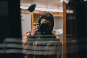
Author behind camera taking a photo of a mirror

I am a sophomore at Gallatin, concentrating in filmmaking and journalism. I am extremely interested in camera, and I love images. I am a photographer and DP, and I hope to make a career as a DP in the film industry. I am currently interning at the web video dept. for Popular Science, which is kind of weird for me as I am much more humanities-based, but thats what I ended up with and it is something different, so it is interesting to me. I am from Atlanta, I love the Falcons and the Hawks (although its sometimes hard to be a fan of them), and I love MF DOOM and The Strokes.

flickr.com/photos/bensearles/

VII Response, Searles

While Magnum’s website felt strictly like a gallery, existing only to show the impressive and historically significant work of important past photographers, VII’s sight felt more like it was actively trying to engage me and sell me something. And this makes a lot of sense; Magnum has been one of if not the most important photography cooperatives in the past sixty years. VII, on the other hand, while already quite prestigious, is still very young. So, Magnum doesn’t need any design frills on its website: it is Magnum after all, and can rely on the work itself and its own name. VII has to make its site much more interesting, because far less people even know what VII is.   

And the site does feel very current. The thin, san-serif fonts, white background, and large images gives it a fresh, modern edge. But despite the more advanced design, the VII site seems to function in much the same way as that of Magnum. There is the latest stories section, an interactive map, and a store section. I think these are just in place to give the website a professionality and approachability; they are sometimes useful but also somewhat generic. Obviously, the real reason people would go to the VII site is to view the images, and these features of the website are not the images. Overall, the site seems classy, yet forward thinking. It seems to show a photo agency that produces high quality, modern work.

The main difference between the web presence of the two agencies is that VII has a whole different site for its photo gallery. And while Magnum showcases what seems like a “highlight reel” of its photographer’s work, VII seems to show almost all of its photographers’ entire portfolios. In addition, VII gives you the option of creating a lightbox, a sort of custom folder for photos that you choose. I noticed that VII puts a watermark on all of its images, and to be honest, I find this incredibly lame. I know that this is the digital age where lots of images are often stolen, and many photographers do use watermarks, but I have always believed that the value of the photograph should speak for itself. Besides being used with proof images that are shown to clients before the photo is fully purchased, I feel that watermarks add a sort of arrogance on the side of the photographer, who assumes that the photo is so good that it needs to be “protected” before anything even happens to it. I believe that if the image is good enough, someone that wants to make money off of it will give the photographer their due. Also if someone likes the photo enough, they will ask for, and probably have to pay for, a high res version of the image.

One VII photographer’s work that I highly enjoyed was that of Australian photographer Ashley Gilbertson. I think what drew me in at first were the colors that he uses in his photographs. Especially in his earlier series, which I am assuming were shot on film, the colors are extremely filmic—very rich and warm, slightly faded. I am very fascinated with the series “9-11 Memorial,” which feature portraits of some of those whose relatives were killed in the attacks. These photos I’m almost sure were shot on medium format film, on maybe a Mamiya; the colors are very, very filmic, there is a ton of detail, and the frames are square. But equally important to the value of these photos is their content. Taken eight years after the attacks, these people are still obviously in a great deal of pain, yet there are still very human and somewhat awkward. I am especially drawn to the first photo in the series, which shows a woman holding a bright orange-ish yellow umbrella, holding her hand to her mouth in pain.  I think in all the photos, but in this one in particular, the look of the photo—the colors, framing, composition—perfectly complement the content. The image is beautiful, and I think perfectly and respectfully portrays this woman’s grief.

I also really liked Gilbertson’s photo “Boxing in Reseda,” specifically the photo that shows a man doing pull-ups with a young boy watching. I think this too was shot on medium format, for the same reasons, and similarly, this images and all of the images in the series are beautiful. Once again, I am extremely drawn to the colors and tones of this photo. Even though it was taken in 2012, it has this classic, timeless feel to it. It feels so charmingly foreign, with these Eastern European children training in a old-looking, dirty gym in Los Angeles. They are so serious and mature looking, yet they have a sort of innocence, or false maturity. The lighting in this photo is very nice, with crushed black shadows and nice pools of light. In addition, the lines in the photo, specifically the the brick in the wall, the pull up bar, and the piping for electrical cables, work very well for the composition. This photo is overall very cinematic, which is an aspect I look for and especially enjoy in photos.

I am also interested by the photos of Chinese photographer Sim Chi Yin. Like Gilbertson’s photos, many of Yin’s photos are square frames, although I’m not sure they if are medium format film or digital. Yin’s images are also quite cinematic, and they also feel very powerful. I think this is a similar effect to Gilbertson’s 9-11 memorial photos; the complete marriage of style and content makes the image as powerful as possible. One photo that I feel does this well is from Yin’s “Pollution in China,” series, which shows two men standing in front of a field of crops. In the background is a smoke stack, and the whole scene is hazy, presumably from pollution in the air. Once again, the coupling of everyday people being affected by the problem at hand and the striking imagery gives this image a certain beauty.

I also enjoy the series that Yin shot titled “The Great Divide,” which explore the migrant workers in Beijing. Here, Yin also portrays pressing social issues with beautiful, cinematic pictures. One of the first few images in the series shows a man pushing a cart filled with towels, his died blond hair and a medical mask shrouding his face. This image is powerful to me because it shows what appears to be a young millennial, maybe not much different from myself, stuck in a poor economic system. Just like his clothes and hair, the images is somewhat glamorous, but when you dig more deeply, there is definitely a very dark side. This photo  definitely looks digital to me, despite being a square frame. 


Solange S. Schwalbe, who worked at the twin towers for four months, cries during the eighth anniversary memorial ceremony at Ground Zero in New York, N.Y. on Sept. 11, 2009. Today, eight years after the attacks on the twin towers in downtown Manhattan, hundreds of family members and friends of the 2,572 victims gathered by Ground Zero for the memorial.

Solange S. Schwalbe, who worked at the twin towers for four months, cries during the eighth anniversary memorial ceremony at Ground Zero in New York, N.Y. on Sept. 11, 2009. Today, eight years after the attacks on the twin towers in downtown Manhattan, hundreds of family members and friends of the 2,572 victims gathered by Ground Zero for the memorial.

David Kaminsky, 11, looks on as Alim Jumakhonov, 18, does pull-ups at The Sport Club, which David's father Tolik Kaminsky owns, in Los Angeles, Calif., May 30, 2012. Tolik, a professional boxing coach who was born in Ukraine where his father taught him boxing, began training David at five years old for a professional boxing career.

David Kaminsky, 11, looks on as Alim Jumakhonov, 18, does pull-ups at The Sport Club, which David’s father Tolik Kaminsky owns, in Los Angeles, Calif., May 30, 2012. Tolik, a professional boxing coach who was born in Ukraine where his father taught him boxing, began training David at five years old for a professional boxing career.

Residents of Sihoupo village near Handan, China on Aug. 12, 2013. The Hebei providence, rich with iron ore and coal, produces ten percent of the world's steel, but also includes seven of China's top ten most polluted cities, including Handan.

Residents of Sihoupo village near Handan, China on Aug. 12, 2013. The Hebei providence, rich with iron ore and coal, produces ten percent of the world’s steel, but also includes seven of China’s top ten most polluted cities, including Handan.

A young migrant delivers a mountain of towels to a hair salon in Beijing, China, Jan. 2, 2013. The sprawling metropolis has an ever-growing so-called "floating" population of migrant workers from all over China. On the outskirts of the city, clusters of migrants wait for work assembling furniture, making deliveries or fixing floors, pipes or ceilings. In downtown Beijing too, there's an army of migrants, all but invisible: cobblers, chefs, couriers and cleaners working amid five-star hotels, luxury car dealerships and posh restaurants.

A young migrant delivers a mountain of towels to a hair salon in Beijing, China, Jan. 2, 2013. The sprawling metropolis has an ever-growing so-called “floating” population of migrant workers from all over China. On the outskirts of the city, clusters of migrants wait for work assembling furniture, making deliveries or fixing floors, pipes or ceilings. In downtown Beijing too, there’s an army of migrants, all but invisible: cobblers, chefs, couriers and cleaners working amid five-star hotels, luxury car dealerships and posh restaurants.

Magnum Site Response, Searles

Magnum’s website gives the company an air of class and prestige. There are few frills or cute design tricks; rather, amazing images are presented cleanly and in a well-organized way. I like that you could sort images not just by photographer, but also by category and continent. I also like the sheer volume of viewable content available to website visitors. The other pieces of the site, including the blog, interactive map, store, make the overall experience for the most part helpful and engaging.

The site successfully makes Magnum feel historically rich, but it also shows flaws with this style of self-portrayal. The sight doesn’t exactly have a “young” vibe, and loses in some way because of it. They actual viewer for the images its clunky, and the overall design of the site feels generic to the point that it is somewhat boring. Despite this, it gets its main job done. It puts the work of Magnum photographers on center stage


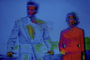
I am fascinated by the work of Belgian photographer Harry Gruyaert. I was at first drawn to his photos—specifically the series “TV SHOTS”—because they confused and intrigued me. The series’ images, which Grayert created by photographing the screen of a damaged television, are distorted and neon-colored. These 1972, highly stylized photos predate Photoshop by almost twenty years, yet they possess a strangely off-putting, modern feeling, combining a familiar, retro corniness with a vague, unsettling undertone. One of the photos I am most drawn to from the series, titled “Soup Opera. Couple,” shows a man and a woman, both staring purposefully off to their right. The frame is filled mostly with the blue of the background and the man’s jacket, but is contrasted with the bright red of the woman’s dress. There is little detail on the two’s faces, which are both covered with unnatural, bright colors. The whole image has an odd, computerized emotion of sadness: something dramatic must be going on in the soap opera, but the details are too warped and destroyed to figure out what exactly.

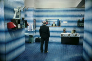
I was also very interested in Gruyere’s photo, “Russia. Moscow,” from 1989. Taken as part of Gruyaert’s travels throughout Europe and North Africa in the 1980s and 90s, the image depicts a balding, suit-clad man staring pensively into a wide mirror in what appears to be a blue tile-walled bathroom. The stylized lighting, nearly monochrome subject matter, and use of creepily cinematic mood makes this photo reminiscent of the work of photographer Gregory Crewdson. More than almost all of other Magnum photographers, Gruyaert seems to straddle the line between what is true journalistic photography and what fine art photography. But while the true artist Crewdson’s photos are highly constructed scenes, those of photojournalist Gruyaert depict real things. The shot “Russia. Moscow” looks like it could be a still from a movie—it suggests a story and leaves you wondering. Yet, the image shows a real place in a real moment in time.

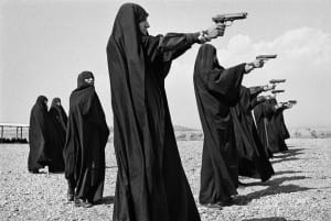
I was also very interested in the work of French photographer Jean Gaumy. Gaumy too seems to be as much concerned about a photo’s look as he is its content. His compositions are so geometric and aesthetically pleasing, yet they feel so natural; they achieve the Henri Cartier-Bresson decisive moment effect, capturing the perfect balance to make the photograph the best it could possibly be, both visually and meaningfully. I am drawn to Gaumy’s 1986 photograph “Veiled women practice shooting on the outskirts of the city.” It is essentially just several women practicing their aim, but their matching black robes, their line formation, and the baronesses of their surrounding landscape makes this photo very well put together. The women in the photo are part of a female Iranian militia in the 80s, who fought in the Iran-Iraq war, so what makes this photo so powerful to me is its complete merging of beautiful imagery and historical record keeping.

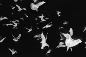
I also enjoy the 1984 photograph “ Seagulls flying past the French trawler ‘Koros’.” Similarly to Gruyaert’s soap opera TV photo, this photo draws you in with the very ordinary—birds—being presented in a subtly off-putting, almost creepy way. Either something was done in post processing, or Gruyere used some kind of flash while shooting the birds in the dark, but the black background of the birds is strange and unnatural. Gruyere took this photo as part of a series on a fishing boat in Ireland, and like a lot of his work, these photos are classic examples of “the decisive moment.” The birds in “Koros” fill the frame so evenly and geometrically, with the size of the birds trailing off from the larges one in the bottom right corner. Like almost all of the photos that seem to interest me, this photo is cinematic, and seems to suggest a story. The birds are flying somewhere or away from something, and the beautiful way in which Gaumy shot them makes you want to know the answers.

Man in blue and woman in red distorted by blue filter

G.B. & FRANCE. 1972. TV SHOTS Soap Opera. Couple

man in blue room standing in front of a mirror

SOVIET UNION. Russia. Moscow. 1989.

Women in veils pointing guns to the right

IRAN. Tehran. 1986. Veiled women practice shooting on the outskirts of the city.

White birds flying against black background

Seagulls flying past the French trawler “Koros”.