Magnum’s website gives the company an air of class and prestige. There are few frills or cute design tricks; rather, amazing images are presented cleanly and in a well-organized way. I like that you could sort images not just by photographer, but also by category and continent. I also like the sheer volume of viewable content available to website visitors. The other pieces of the site, including the blog, interactive map, store, make the overall experience for the most part helpful and engaging.
The site successfully makes Magnum feel historically rich, but it also shows flaws with this style of self-portrayal. The sight doesn’t exactly have a “young” vibe, and loses in some way because of it. They actual viewer for the images its clunky, and the overall design of the site feels generic to the point that it is somewhat boring. Despite this, it gets its main job done. It puts the work of Magnum photographers on center stage
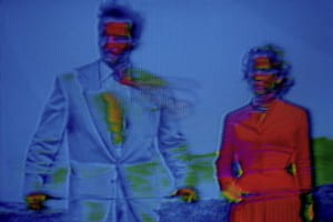
I am fascinated by the work of Belgian photographer Harry Gruyaert. I was at first drawn to his photos—specifically the series “TV SHOTS”—because they confused and intrigued me. The series’ images, which Grayert created by photographing the screen of a damaged television, are distorted and neon-colored. These 1972, highly stylized photos predate Photoshop by almost twenty years, yet they possess a strangely off-putting, modern feeling, combining a familiar, retro corniness with a vague, unsettling undertone. One of the photos I am most drawn to from the series, titled “Soup Opera. Couple,” shows a man and a woman, both staring purposefully off to their right. The frame is filled mostly with the blue of the background and the man’s jacket, but is contrasted with the bright red of the woman’s dress. There is little detail on the two’s faces, which are both covered with unnatural, bright colors. The whole image has an odd, computerized emotion of sadness: something dramatic must be going on in the soap opera, but the details are too warped and destroyed to figure out what exactly.
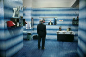
I was also very interested in Gruyere’s photo, “Russia. Moscow,” from 1989. Taken as part of Gruyaert’s travels throughout Europe and North Africa in the 1980s and 90s, the image depicts a balding, suit-clad man staring pensively into a wide mirror in what appears to be a blue tile-walled bathroom. The stylized lighting, nearly monochrome subject matter, and use of creepily cinematic mood makes this photo reminiscent of the work of photographer Gregory Crewdson. More than almost all of other Magnum photographers, Gruyaert seems to straddle the line between what is true journalistic photography and what fine art photography. But while the true artist Crewdson’s photos are highly constructed scenes, those of photojournalist Gruyaert depict real things. The shot “Russia. Moscow” looks like it could be a still from a movie—it suggests a story and leaves you wondering. Yet, the image shows a real place in a real moment in time.
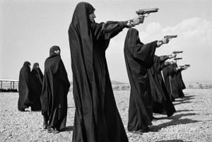
I was also very interested in the work of French photographer Jean Gaumy. Gaumy too seems to be as much concerned about a photo’s look as he is its content. His compositions are so geometric and aesthetically pleasing, yet they feel so natural; they achieve the Henri Cartier-Bresson decisive moment effect, capturing the perfect balance to make the photograph the best it could possibly be, both visually and meaningfully. I am drawn to Gaumy’s 1986 photograph “Veiled women practice shooting on the outskirts of the city.” It is essentially just several women practicing their aim, but their matching black robes, their line formation, and the baronesses of their surrounding landscape makes this photo very well put together. The women in the photo are part of a female Iranian militia in the 80s, who fought in the Iran-Iraq war, so what makes this photo so powerful to me is its complete merging of beautiful imagery and historical record keeping.
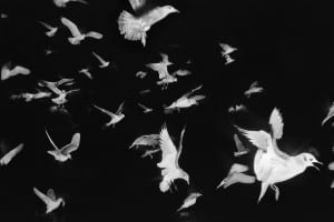
I also enjoy the 1984 photograph “ Seagulls flying past the French trawler ‘Koros’.” Similarly to Gruyaert’s soap opera TV photo, this photo draws you in with the very ordinary—birds—being presented in a subtly off-putting, almost creepy way. Either something was done in post processing, or Gruyere used some kind of flash while shooting the birds in the dark, but the black background of the birds is strange and unnatural. Gruyere took this photo as part of a series on a fishing boat in Ireland, and like a lot of his work, these photos are classic examples of “the decisive moment.” The birds in “Koros” fill the frame so evenly and geometrically, with the size of the birds trailing off from the larges one in the bottom right corner. Like almost all of the photos that seem to interest me, this photo is cinematic, and seems to suggest a story. The birds are flying somewhere or away from something, and the beautiful way in which Gaumy shot them makes you want to know the answers.
G.B. & FRANCE. 1972. TV SHOTS Soap Opera. Couple


Great description of Grayert’s “TV” images. And in fact, great descriptions throughout! You pay careful attention to visual elements like composition, and that serves your writing about the images very well. Now ask yourself: Are there other questions to be asked about these photos? Either questions that move away from/go beyond the visual elements, or that grow directly from the visual elements? How can you harness your wonderful descriptions to delve deeper?