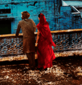
The only word to describe Steve McCurry’s work on display at the Rubin Museum is dramatic. Perhaps there are those that would disagree with me, but I cannot help but notice the “punchiness” of his photos. His photos are aesthetically gorgeous; his cropping and framing are always on point. What is more wondrous, however, is his use of color. You can see in some of his photos where he saturated the overall color in order to highlight the colors of India (see photo below).
We can see in this photo how he most certainly played with he colors of this photograph. The “tell” is in the lady, who looks like she’s been subject to a lasso tool on photoshop:
Some may argue against his editing approach. If you are displaying a work about a group of people, should you be editing or should you keep something fairly “natural”? Of course, RAW images do need slight adjustments, yet when is editing “too much”? Or, does editing help extenuate a message, that the people of India are colorful and diverse.
Regardless, it is an undeniable fact that Steven McCurry knows how to use color well. We can debate the use of his editing, but it is pictures like these that prove McCurry grasps the importance of color:
Here is a perfect example. McCurry took this during the Holi festival, where people throw sachets of color powder as a celebrate activity. Someone might argue, “But Taylor, Holi is inherently colorful!” Just because Holi is a holiday filled with rainbows does not meant that a photographer’s photo of the day will inherently be “great” just because there is color bursting everywhere. Here, McCurry creates a great visual story by introducing a quasi-dichotomy into the narrative of this image. The stark contrast between the bright green and the rich red is more powerful than if McCurry shot an image of all the different colors sachets used during Holi (red, orange, yellow green, blue, purple, etc.). Having a rainbow image would be beautiful, but almost too overwhelming: focusing on just red and green helps the viewer understand that the time is very colorful, while also allowing him/her to see the expression on the green man’s face (happiness).
The image of the woman holding a child in the rain is also another image where McCurry demonstrates his understanding of color. Why most of the image uses an analogous color scheme, McCurry introduces a pop of bright red. While the idea is slightly reminiscent of the cheesy Bed Bath & Beyond black and grey photos of London (with the old red phone booth being the only subject that’s in color), McCurry manages to use the red in a seamless manner.
The strategic use of red in this image helps draw the viewer in; to stun us first, and to have us ask questions later. Questions, such as, why is the woman peering into the (apparent) taxi? Is she looking to see if someone is not inside, so she can use it? Why did she not bring an umbrella out with her that day?
As a whole, McCurry’s use of color in his works shows the vitality of the area, and how vast/diverse the nation can be. India is quite a large space that is filled with different castes, traditions, cuisines, and expressions. His colors also demonstrate the beauty that can be found in any pocket of life; for example, we can find beauty in the simplicity of a woman holding her child, perhaps calling a taxi. What I love about this work is that it shows just how unique photography can be, and how each photographer can have their own “signature.” McCurry’s works (think: his image of the Afghan girl) typically rely on the visual voice of the people, while also utilizing color to push the narrative. In comparison to another photographic work we discussed, Ashley Gilbertson’s Bedrooms of the Fallen, we can see where the author’s “touch” comes into play.
While McCurry’s piece focus on the vitality of the people, Gilbertson’s focuses on the absence of the subject. One can debate that Gilbertson’s images of the bedrooms reveal the complexity of the lives of each fallen soldier, what truly matters is that they are gone. Their bedrooms remain, but they have disappeared.
Unlike McCurry’s vibrant images, Gilbertson uses a minimalist approach to tell his story. Thought the entire piece, he chooses to keep his work black and white. The absence of color can symbolize a multitude of things: the absence of the soldier in his/her family’s life, the absence of metaphorical “color” from the families’ lives, and the idea of the room being a “snapshot” in history.
What is important to note between McCurry or Gilbertson is that the use or absence of color can affect the interpretation and the resonance of the work. Both India and Bedrooms of the Fallen are strong visual stories, yet their use of colors and hues is completely different. As photographers ourselves, we must remember how every little detail (not just color, but even cropping) in our images can affect the story and the impact on the viewer. As Picasso once said, “When I haven’t used any blue, I use red.”


Leave a Reply
You must be logged in to post a comment.