The VII photo website was aesthetically pleasing on top with their latest projects featured in a clean way allowing the images to speak for themselves. However as you scrolled down you reached the main home page with a map featured in the center. While it was creative to show where all of the VII photographers are around the world, the map is dull and outdated and not at all aesthetically pleasing in contrast with the top of the page. Moreover, I found the website more difficult to use than that of Magnum. When you want to look at a photographer’s work, there is no dropdown menu or list provided. Rather a mosaic of photos where you must hover and find the portfolio link versus having the photo hyperlinked to the photographer’s page. Also I found it ironic that the website of a photo cooperative website did not have a tab dedicated to their photographers in the header of the website. Additionally, the website is not mobile friendly which I found out when I had tried to navigate it on my iPhone. In this day and age, and after reading the articles regarding VII and their plans to update their cooperative in every way possible, it was disappointing to visit such a lackluster site.
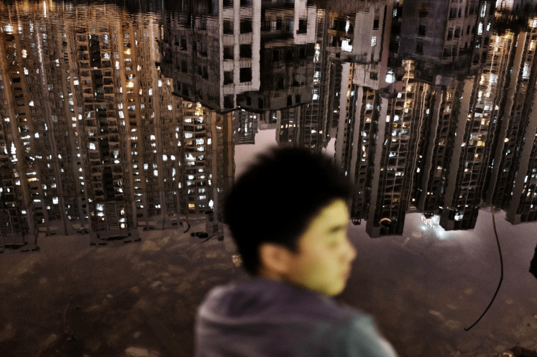
The first photographer that drew me in was Sim Chi Yin who is based in Beijing. The first photo that immediately struck me was the first photo featured in Sim Chi Yin’s portfolio slideshow. In this photo the face of a young man is blurred out and instead the focus of the shot is the reflecting city lights on the water to which he is sitting on the shore of. You can see the dilapidation of the city in its reflection yet the skyline is still breathtaking.
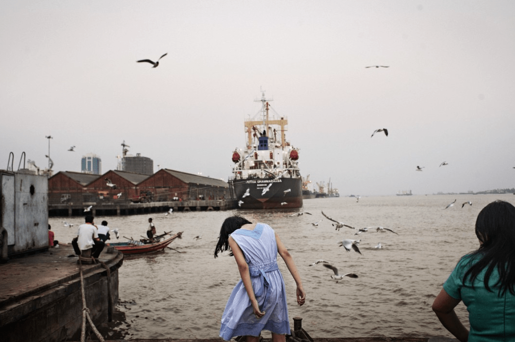
Another photo that I loved was of the harbor yard with seagulls flying all around and a young woman in a blue dress in the center. Once again the city’s run down appearance is evident, this time through outdated boats, musty buildings and a bleak gray sky. I feel this photo encapsulates the decisive moment to which Henri Cartie-Bresson speaks of. The seagulls appear so perfectly placed it as if they are photoshopped and the woman’s head has dropped at just the right angle that it adds to the bleakness that the sky and the harbor yard already speak to.
In both photos the persons featured were not the subjects, their surroundings were. I am not sure what this specific assignment was for but I can assume that these two photos were shot for the same project as they were located in sequence with each other and they have very similar themes. For example both of these photos were shot in a landscape format, they both depicted daily life in some Asian city (perhaps Beijing) and the person was minuscule if not irrelevant to the photo’s surroundings. An afterthought. This last theme speaks to the anonymity a city provides and this anonymity was depicted through the photographs by the fact that neither the man nor the woman’s faces were clearly seen.
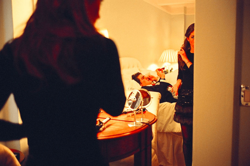
The work of Jessica Dimmock was the second photographer’s work who drew me in. I did love Dimmock’s street style shot of the Chanel bag and Louboutin shoes however the two photos that struck me were the picture of the couple in a room getting ready for what appears to be a fancy night and the woman captured in a raw moment of vulnerability.
The picture of the couple in what one can assume is a hotel room resonated with me as it reminded of my parents getting ready as well as of me and several of my ex-boyfriends. As cliche as this shot may be, I feel that many people can identify with it. This photo encapsulates a societal norm that women care what they look like when they are going out, especially if it is an upscale occasion, and men could care less. This photo shows how the man is ready and probably has been for some time thus why he is laying down and chatting on the phone. The woman is still getting ready, fiddling with her hair and putting on the last finishing touches. While nothing is particularly groundbreaking in terms of lighting or composition or subject matter, this photo struck with me because I simply liked it. While I do not like the stereotypes this photo perpetuates, I cannot say that I’ve never been this woman. I’ve seen this scene play out many times in my life and it’s the familiarity of this photo that resonated with me the most.
Once again the decisive moment was captured. The photo itself is almost entirely out of focus which alludes to the woman being scared, as if she is running from something. Scared of what we don’t know, we can only imagine. It’s in this unknown, that the source of the horror is in our imagination, that scares the viewer the most. Her expression leads us to think the worst about what could be haunting this woman. For this reason I view this photo as the decisive moment, as the exact moment when her fear is at its climax. However I think one could argue that this is not the decisive moment due to the lack of explanation surrounding her horror and what is causing it. The vulnerability of this woman transcends gender and allows any viewer to identify with her.


Dear Gabriella,
The first two photos you chose are, I agree, so stunning! Your insights are strong. And is there really no context –what these photos are about? When/for whom they were shot?–to be found on the website?
At another point, you write thus: “I’ve seen this scene play out many times in my life and it’s the familiarity of this photo that resonated with me the most.” And this leads me to ask—how powerful a tool or technique is familiarity when photographing a story or an issue? Should those ‘familiar’ images trump other kinds of styles at times? If so, when?
For me, that last image you discuss looks like a movie still—and that in turn has me attach all manner of associations to it.