VII is a much newer, more modern agency compared to Magnum – the work on the site is all from within this century, while Magnum’s archives span nearly an entire century of work. Thus, VII’s collection is smaller and contains lots of categories that feel relevant to the news cycle I’ve grown up with: the Iraq War, the Refugee Crisis, the 2004 Olympics, Obama’s inaugurations, the 2010 Haiti Earthquake, and even the Iowa Caucus from last week. Everything seems very up-to-date, current, and like a true encapsulation of the past fifteen years of worldly events.
The site itself is similar to Magnum’s with its sleekness, and it takes a red and (mainly) white theme (as opposed to the black and white themed Magnum site). On that topic, most of the VII pictures are in color; the black and white photographs are certainly a minority in the collection. I have to say this surprised me – sure, much of Magnum is not in color because it comes from a time when color was not an option, but the modern black and white photos on the Magnum site seem artistic, intentional, and appropriate. The black and white VII photos, at least for me in the little amount I’ve spent with this content, seem a little forced and unnatural. Perhaps it is simply that they stick out on the more colorful VII archive.
Another big characteristic that I noticed of the VII website is the heavy amount of text. Captions, descriptions, bios, and other pages of the site are much wordier than the Magnum website. It seems to be more common for modern websites to have less text, especially one dedicated to a photography archive, but VII has a lot of words on its pages. Many of the photographers’ work that I was looking at was very specific and pertained to very focused times or events, so the detail certainly helped to provide background and context.
I approached the site with the search function and just started looking up significant events and people from the past decade or so, like the ones I named above. This allowed me to get a feel for the site and the types of photographs that were contained in the archive. Many of the pictures were unique and striking, while this also served as a reminder that VII photographers do not live in a world with limited film: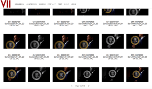
The pool of VII photographers is much smaller than that of Magnum, which obviously makes sense, but still surprised me a little – there may not be many people, but they have a massive, impressive body of work to show for themselves. To focus in on two photographers, I set out to find women. I first selected Ashley Gilbertson, looked through many photos of Iraq from 2003-2005, veterans programs, and families of soldiers. I then read through Gilbertson’s bio and learned he is in fact a man, but I was too struck with his work to move onto another person. Gilbertson spent a long time photographing refugees in the early 2000s, then ended up in Iraq for the middle of the decade, and moved on to working on the effects of war (veterans, suicides, families, brain damage) – his career has taken a very natural direction. He has received numerous awards for his work, being honored with the Robert Capa Gold Metal, an Ellie Award, and an Emmy nomination for some of his multimedia work in most recent years.
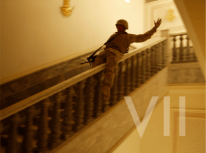
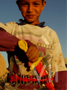
I was drawn to one striking characteristic of Gilbertson’s work: he’s captured very heavy, intense scenes, but sprinkled throughout images of war and illness and destruction are photos that appear overwhelmingly joyful:
This is a photo of a Marine in Saddam Hussein’s palace in 2003, and below is an Iraqi child playing with some fake weaponry.
Gilbertson has a remarkable ability to capture something positive in the face of a lot of negativity and violence. Without the context provided in the captions, it’d be hard to guess these images are both from a heated Iraq in 2003.
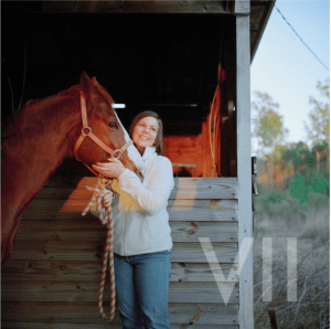
After covering the Iraq war, Gilbertson moved onto veterans affairs and the personal effects of war on involved individuals. A lot of these images, such as stressed Veterans’ Suicide Prevention Hotline employees taking desperate phone calls, are filled with hard, raw emotion and pain. Gilbertson again, though, captures beauty and happiness through all of the terrible circumstances. For instance, I was really drawn to a series of photos involving this woman, specifically this image:
This is an Iraq war photographer who came home from war, suffered from PTSD, struggled with contemplations of suicide, and now has a hard time day-to-day with life. Directly from Gilbertson’s caption, “Today, to prevent overwhelming feelings, she smokes a pipe in the woods near her home and rides horses.” This has the looks of a stock photo of “happy woman with horse,” which is yet another instance of Gilbertson’s ability to contrast light and darkness, both literally and figuratively.
I moved on to Jessica Dimmock, confirmed she is a female photographer, and started looking through her work. She’s photographed a wide swath of people and events, made a music video for Moby’s “Wait For Me,” and served as photographer and videographer for the HBO mini-series The Weight of the Nation. Her folders of work range from Hurricane Sandy relief, Gossip Girls stars, and Hillary Clinton to photos of paparazzi, families with autistic children, and factory workers in Vietnam. She’s done it all.
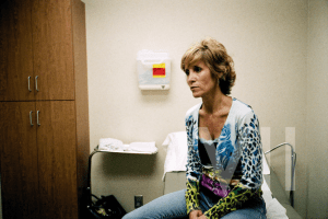
I was particularly struck by her low-resolution photo series about the faces of uninsured Americans. There are a lot of photos of this one woman, Sandy Flanigan, and her struggle with not being able to afford cancer treatment.
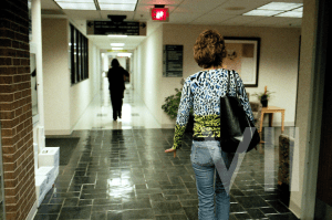
When she was diagnosed with leukemia and given six months to live in 1999, her health insurance premium skyrocketed and she had to drop her coverage. This photo is from 2007, where she is still alive but struggling to find care for a tumor that has been growing for months. This next photo is after her hospital visit, where she was examined and then charged exorbitant amounts for tests and pharmaceuticals, leaving her family helpless, stressed, and in debt.
We hear about uninsured Americans constantly in the news and in politics, but rarely do we get faces assigned to statistics and numbers. A politician may tell a story about “someone they met” along the campaign trail who was without coverage, but this is different. Dimmock, though, has captured the pain and struggle of the day-to-day life of an uninsured woman so well in this series. In the second photo, even though we cannot see her face, Sandy’s stride and hand gesture tell us everything her face is saying – she is concerned about living, about the toll her sickness is physically placing on her, and the financial toll it is taking on her family. She needs help, and she cannot get it. Along with all of the VII photographers, Dimmock gives a face to this pain and a voice to the helpless.
Dear Sarah,
Interesting observations! For instance, here: “The black and white VII photos, at least for me in the little amount I’ve spent with this content, seem a little forced and unnatural. Perhaps it is simply that they stick out on the more colorful VII archive.” Could you give some examples to illustrate your point? Indeed, you provide such a great example for this statement, “sprinkled throughout images of war and illness and destruction are photos that appear overwhelmingly joyful.”
Regarding Dimmock’s work that you focus on, you end on a great note with “Dimmock gives a face to this pain and a voice to the helpless.” By way of playing Devil’s Advocate, I’ll ask: are there any limitations to giving a single face (or a few faces)?