Like some posts previous to mine, I had a hard time examining the VII website without automatically contrasting it in my mind with Magnum (which I suppose is normal seeing that Magnum is succeeded and rivaled by VII). The first, most obvious difference is that VII is “current” or “hip”. This was evident to me when reading the press release –the use of bold color, current fonts, and strong graphics contrasted greatly to Magnum’s website, which is a touch plain by comparison. While Magnum has history on it’s side, VII has the new era. For them, this is the norm, not an adjustment. In one of the interviews, Ashley Woods puts a lot of emphasis of them as an “online” agency where the archive and work of all the photographers will be online and available to editors instantly – a relatively novel innovation which is important for the immediacy of photojournalism.
They’ve included a map to show where each of the photographers are in the world, as Magnum did. This speaks to the larger framework of how versatile and widespread such a small organization can be. It also shows how important it is to them, still in the current day, to cover all parts of the globe. Even though they put so much emphasis on being everywhere at once, VII has kept their organization deliberately small and it is probably much easier to manage that way since it is a cooperative.
One thing I noticed about VII as a group is they put a lot of significance on wanting to educate others. One of the five main tabs of the website is education. They offer various workshops all over the world as well as internships and mentor programs. While workshops aren’t free or cheap, these world-renowned photographers still take the time to spread their knowledge.
I like that their new photographers photograph mainly things they know/ places they grew up in. I think there is a large disconnect often times between the journalist or photojournalist and the things he/she is trying to convey. It is easier to present on something that you not only know well but have a personal connection to. It is one thing to sympathize with a community and quite another to be part of it. Danny Wilcox Frazier focuses on photographing in America, showing the devastating effects of an ever-shifting economy.
The second photographer, Sarkar Protick, I’ve picked to walk about was born and is based in Bangladesh. He himself is a photographer, teacher, and lecturer – a testament to VII’s commitment to education. Protick’s photos spoke to me because of his strong personal aesthetic and how beautifully dreamy yet haunting his photos are. Like Pinkhassov, from my last post, I was in awe from how carefully he rendered his photos, how lighting played such a big role in his photography. I now follow him on Instagram, and this aesthetic followed him even onto social media. He is very blunt and to the point in his captions, often just writing what he is portraying like “tea, no milk” or “picture of Jesus hangs in a drawing room”. While his captions are straight forward, his photos are not.
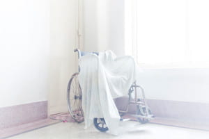
It was in the afternoon.I was sitting on my grandpa’s couch. The door was slightly open and I saw light coming through, washed out between the white door and white walls. All of a sudden it all started making sense. I could relate what I was seeing with what I felt. John and Prova, my grandparents. While growing up, I found much love and care from them. They were young and strong. As time went by it shaped everything in it’s own way. Bodies took different forms and relations went distant. Grandma’s hair turned gray, the walls started peeling off and the objects were all that remained. Everything was contained into one single room. They always loved the fact that I take pictures of them, because then I spend more time with them and they don’t feel lonely anymore. After Prova passed away, I try to visit more so John can talk. He tells me stories of their early life, and how they met. There are so many stories. Here, life is silent, suspended. Everything is on a wait. A wait for something that I don’t completely understand
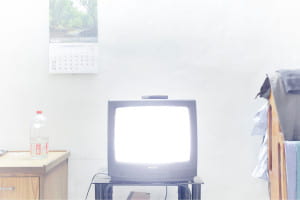
It was in the afternoon.I was sitting on my grandpa’s couch. The door was slightly open and I saw light coming through, washed out between the white door and white walls. All of a sudden it all started making sense. I could relate what I was seeing with what I felt.
His series “what remains” portrays his grandparents and their home in a state of perpetual wait and suspense. The photos are very light in color, featuring a dreamy, foggy overlay and a multitude of pastel shades. However, the photos are still very vibrant and well lit. This kind of effect is very hard to achieve and speaks to his mastery. More so than just being beautiful, he explores an intimate relation with his grandparents with these photos from who feels distant yet utterly close to.
While this series is more of a personal piece, his work is also political. His series “Land in which We can trust” portrays a people who are forced to live in constant fear of their land literally going under water. Some of the work, like his other photogtaphs, can just be considered art because of how beautiful and gentle they are. However, a photo like this one of the men on the boat displacing from their homes, shows a different tone.
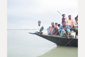
The islanders returning from their races on the continent. The Jamuna river can reach 17km wide during the rainy season. In the region of “tanks”, the voracious river absorbs everything, islands and houses, forcing people into exile. At the current rate of global warming, the country will lose up to 17% of its territory by 2050 and will have between 13 and 40 million climate displaced.
The pastel dreamy sea and sky don’t have a cloud or ripple in sight. The men on the boat could look like they’re just fishing or taking a trip. The haunting thing about this image is the man all the way to the left of the boat, in the center of the composition. He looks at you straight at the camera with a hard expression, but looks like he’s almost looking through you. Like nothing in front of him matters anymore. He looks determined, yet defeated.
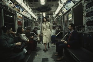
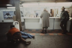
Christopher Morris is the second photographer who I truly enjoyed (who, funny enough, won the Robert Cappa medal). The pieces that stood out to me belonged to his unpublished series on the New York subway system – shot in 1981. He shot it with ektachrome film and a magenta filter. The photos truly show the grunge of the time. Now living in New York and constantly hearing about “the way New York used to be” it was wild for me to see first hand how much really did change in a mere 30 years. Even the graffiti was somehow dirtier. The website describes the project in better words that I ever could “Morris captured the mix of grime, decay and erratic movement that epitomize a moment in New York’s history memorialized in popular culture as a dark, dire metropolis. With New York’s subterranean transportation as his backdrop, Morris contrasts rebellious graffiti with blase attitudes and counter-culture performances with seas of expressionless commuters to show rare moments of intimacy amid a gritty, hard-edged urban metropolis”. This speaks to my earlier point – I connect with this precisely because I do live here and do know so much about it. If I saw these photos of a metro in California or Montreal I would not have the same reaction to them.
The photos themselves are striking and beautiful and I think speak to the kind of aesthetic that film produces. Organic in a way – less perfect, less staged. I like that these photos are not perfectly lit or color corrected. I sometimes forget that even though VII is a newer agency, a lot of their members are older and didn’t grow up in the digital age so their earlier work is shot on film. The rest of Christopher Morris’s work is good as well but this is what stood out to me.
Dear Michelle,
This is a great point for us to extend in class discussions: “I think there is a large disconnect often times between the journalist or photojournalist and the things he/she is trying to convey. It is easier to present on something that you not only know well but have a personal connection to. It is one thing to sympathize with a community and quite another to be part of it.” One thing I’d ask is that in recognizing all of the strengths of this position are there simultaneously any weaknesses? Any counterarguments to your perspective, that is?
I was intrigued by these lines: “He looks at you straight at the camera with a hard expression, but looks like he’s almost looking through you. Like nothing in front of him matters anymore.” And I’ll pose to you a question that I asked similarly in response to Tristan’s post: how does this penetrating gaze into/past the camera affect the viewer?