# Blog 2: Sound Visualization
Younian Liu portraying
Take the ‘A’ Train by Duke Ellington and His Orchestra
🎧Listen to this Blog if you want to rest your eyes =)
Chapter I The Favourite
When I first got this assignment, my impulse was really simple, that was to find my favourite piece of music and take this chance to create a portrait for it. There were three candidates:
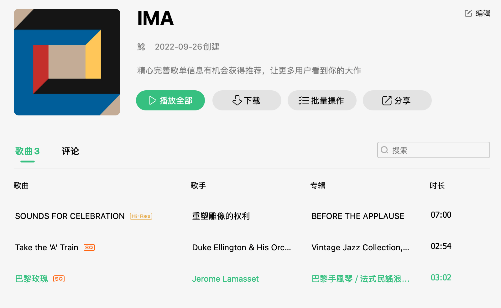
It took me almost an hour to decide which piece to choose. But at the end, after quite some struggle, I picked this jazz piece Take the ‘A’ Train of Ellington’s edition. (Start the video below and enjoy while you read!)
No-vocal Version:
The reasons are:
- I don’t want the lyrics in SOUNDS FOR CELEBRATION to interrupt with my interpretation and give me an easy way out.
- Prof. Ian had shared with me how he would portrait Rose de Paris so it would be hard not to integrate his originality into my work.
- I’ve practiced another piano version of this piece when I was a freshman. The effort I put in it possibly made it seem more preferable. Here’s a video clip of me struggling with this piece in the freezing winter on 8F. JAZZ IS SOOO HARD TO PRACTISE!!!
Chapter II Flibbertigibbet’s Design Process
STEP 1:

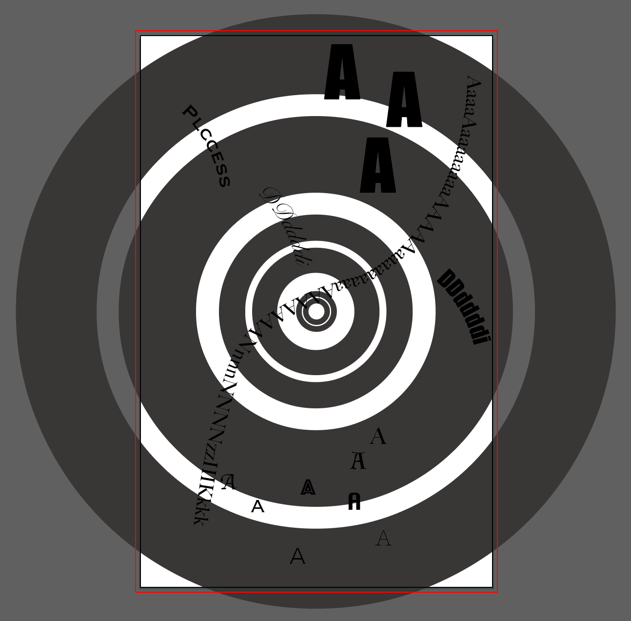
The general feeling it gives me is noisy, positive and has a power of rushing forward. But at the same time, it is organized and harmonious. So, the first image that appears in my mind was a tunnel/horn that is now the major object of the whole design. And base on this first impression, I did the following design.
STEP 2: What a Mess! Let Me Comb my Thoughts!
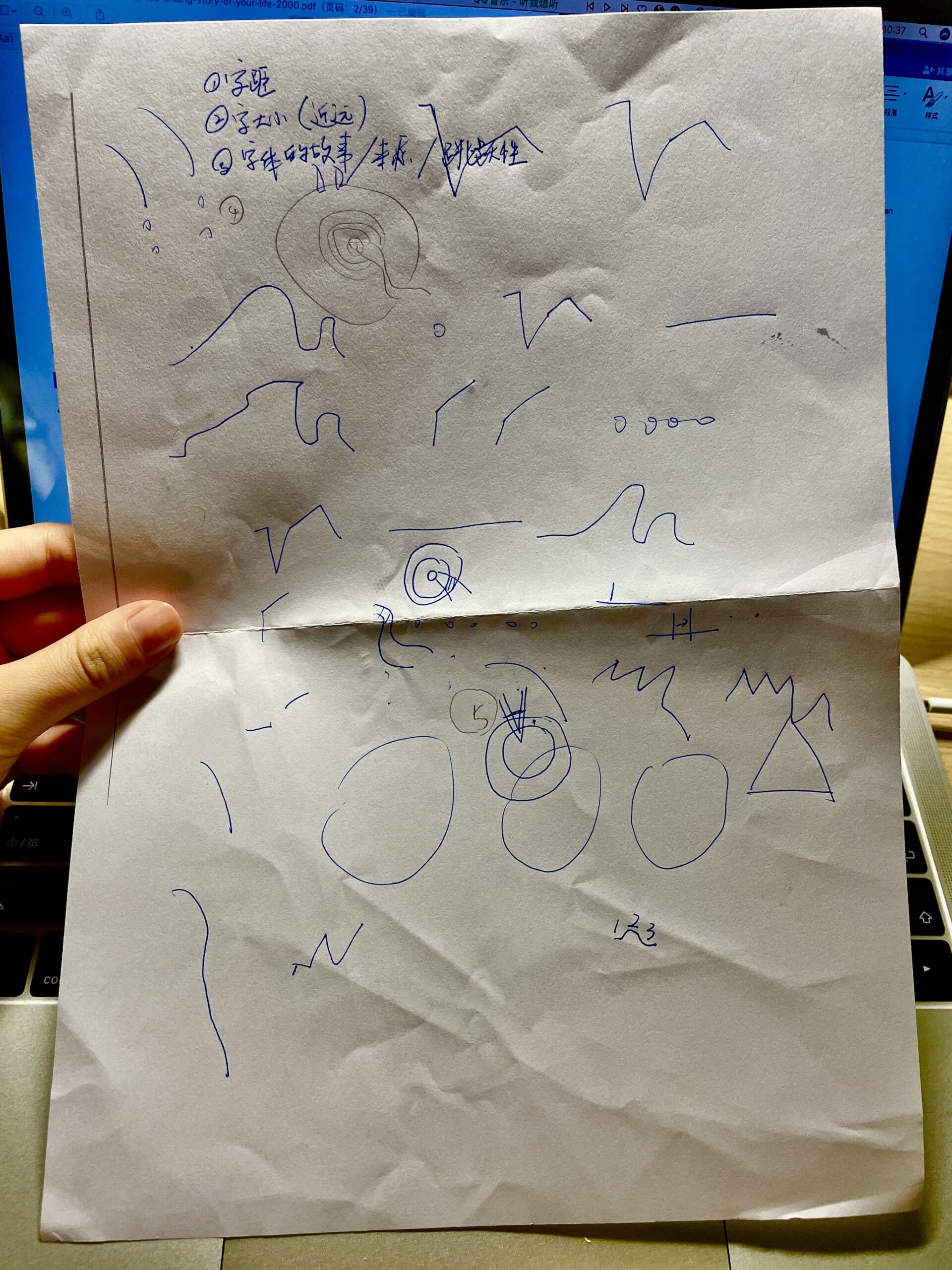
I couldn’t really figure out which other complementary elements to use just by hearing to the music because the content is really rich and appears to be random if not analysed clearly. So, I tried to record some inspirations while listening in a linear manner. It turns out to be helpful in justifying my design.
STEP 3: Working towards Details
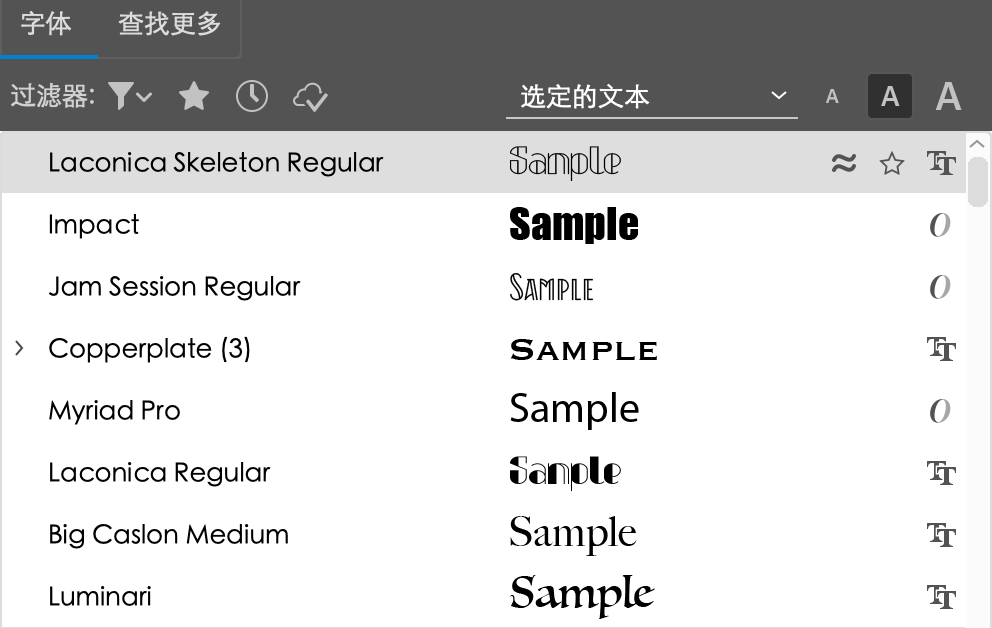
1. Jazz developed out of many forms of music, including blues, spirituals, marches, etc. It also incorporated interpretations of American and European classical music. So, I chose fonts that looks classic yet still with a few twists that can show the root of the music, and also, hopefully would remind viewers of the sign board of jazz clubs in New York. I didn’t do a lot of effects on the alphabets because I want to keep the classic flavor as they are.
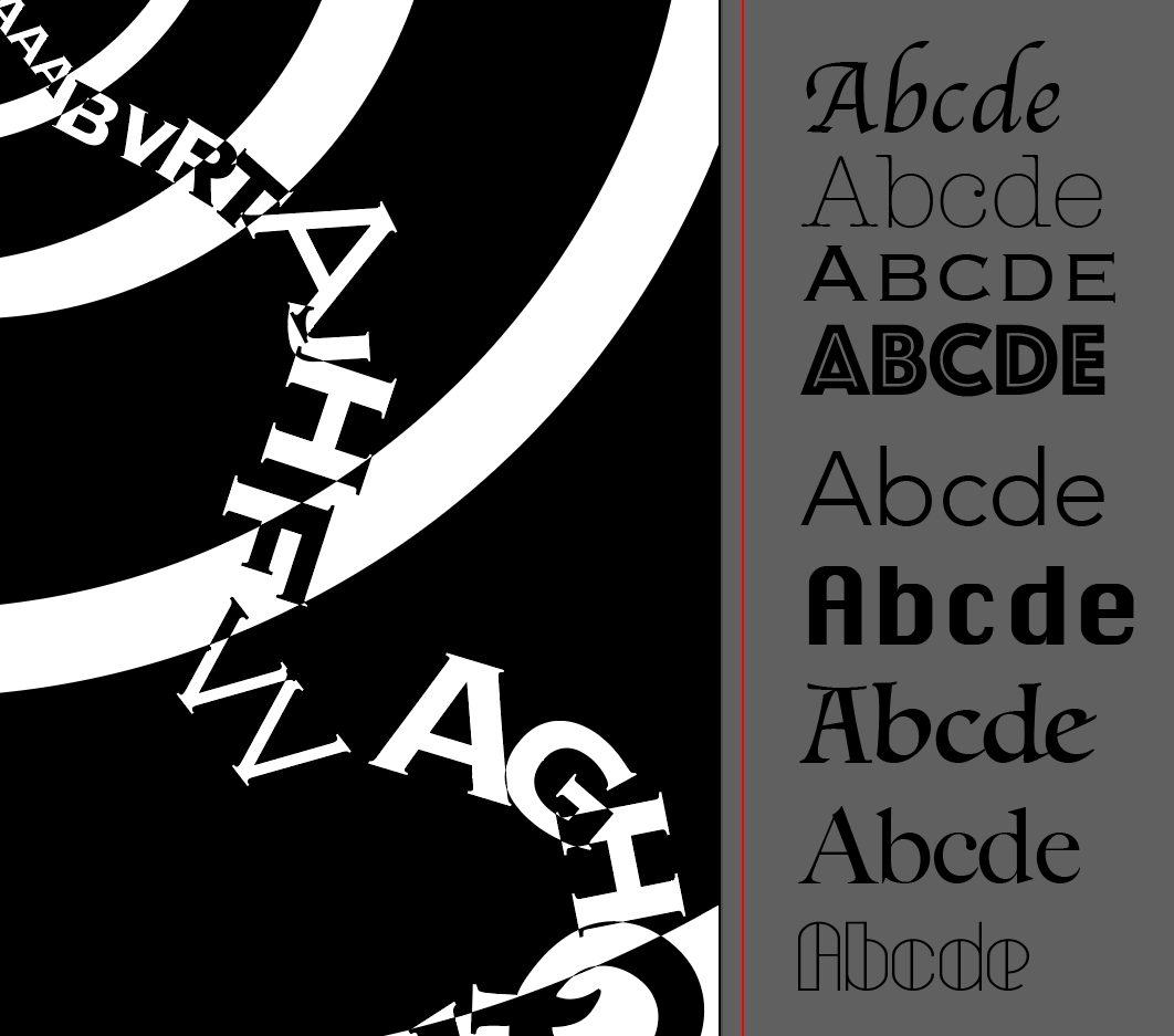

2. This music was performed by an orchestra including string bass, alto saxophone, trumpet, banjo, drums, etc. So different fonts are also interpreting different instruments.
The As and Ds are the trumpet that stands out from many other instruments and set the tone that is rushing forward and impact force.
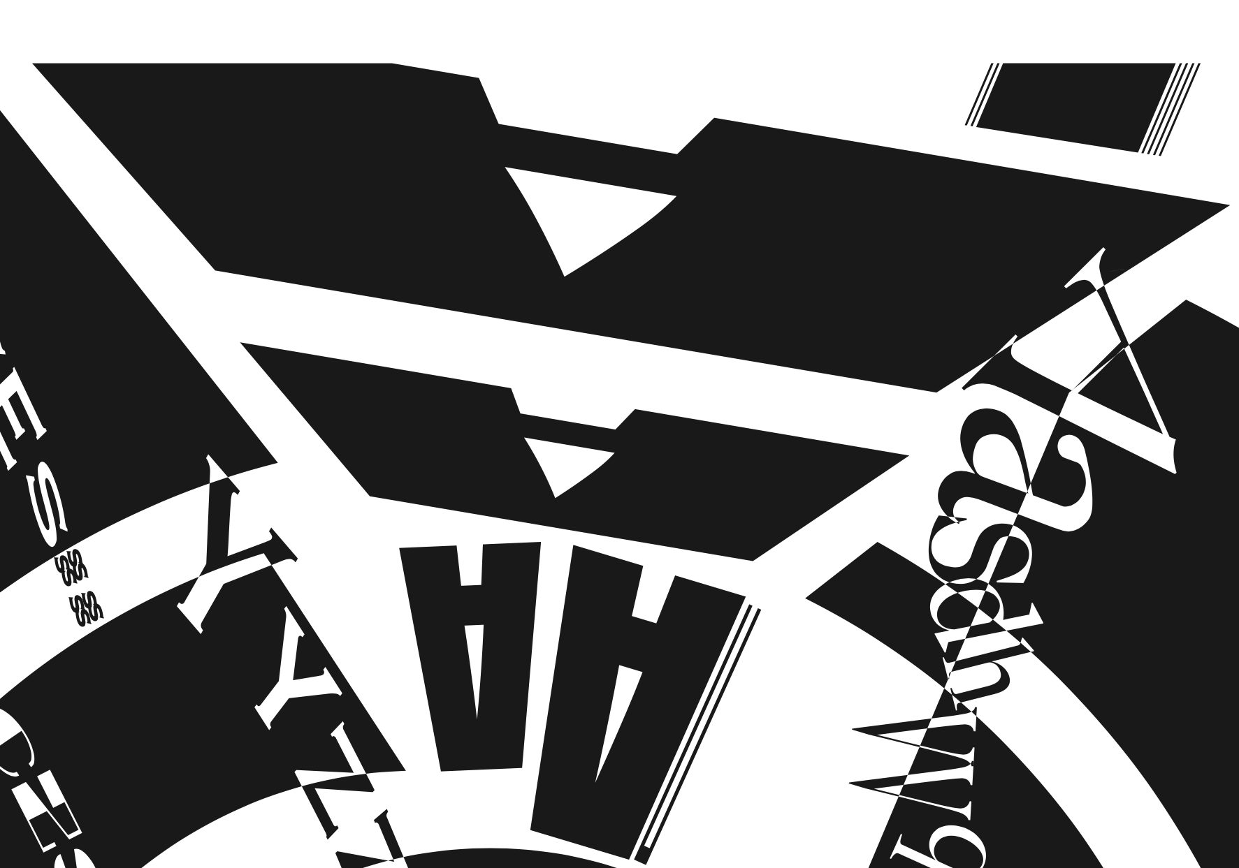

The I s in the south-west corner represents the brush kit that is responsible for holding the rhythm.

3. The 3 Os as the base is a tunnel, or a horn from far to near. But the original design seems too heavy and dull, so I make some cuts to “let some fresh air in”. The curls of alphabets coming from the middle (or you can consider it the far end of the tunnel) to present a sense of motion, like the train or the buzzing sound in the streets of a big city like NYC or SH.
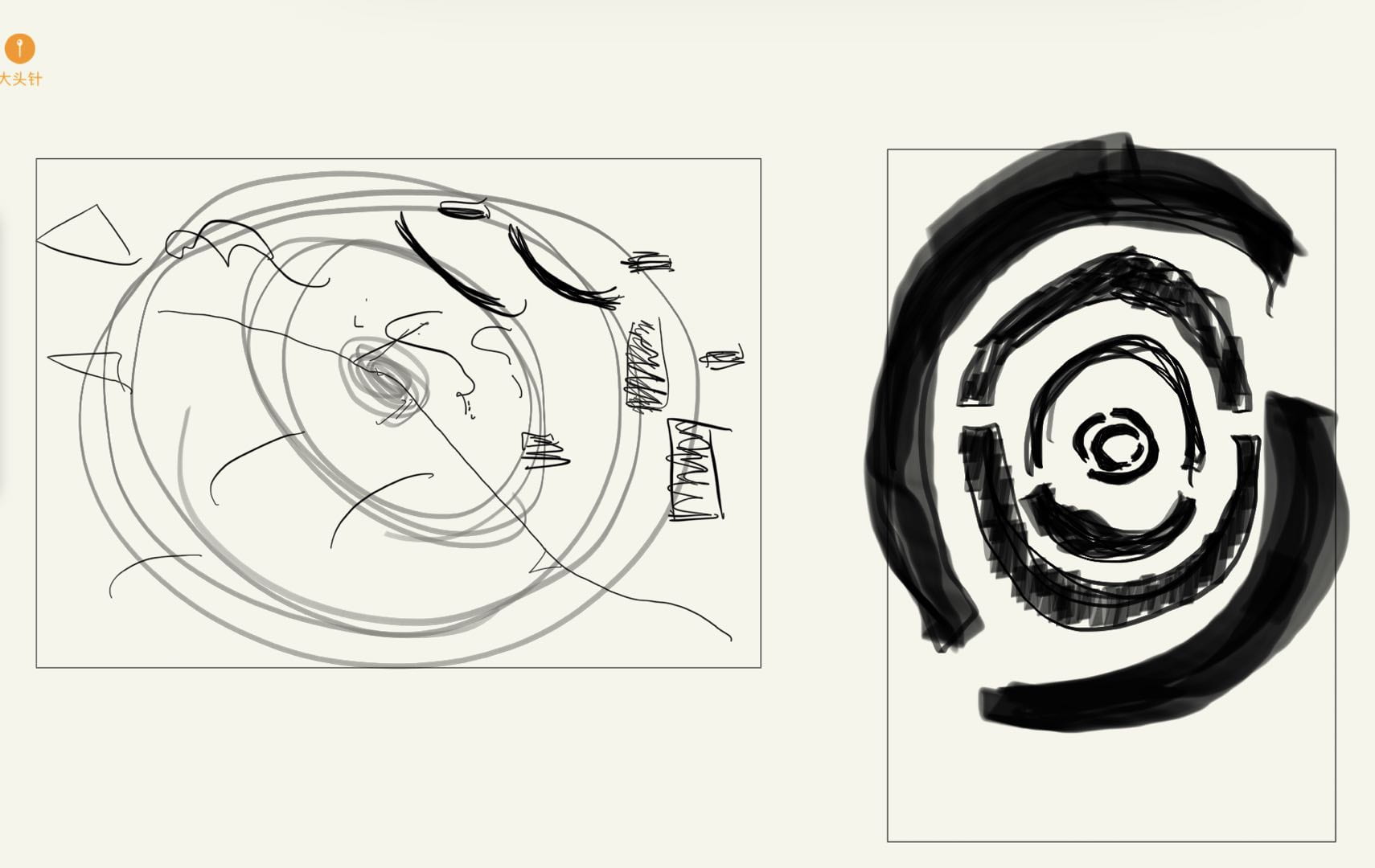
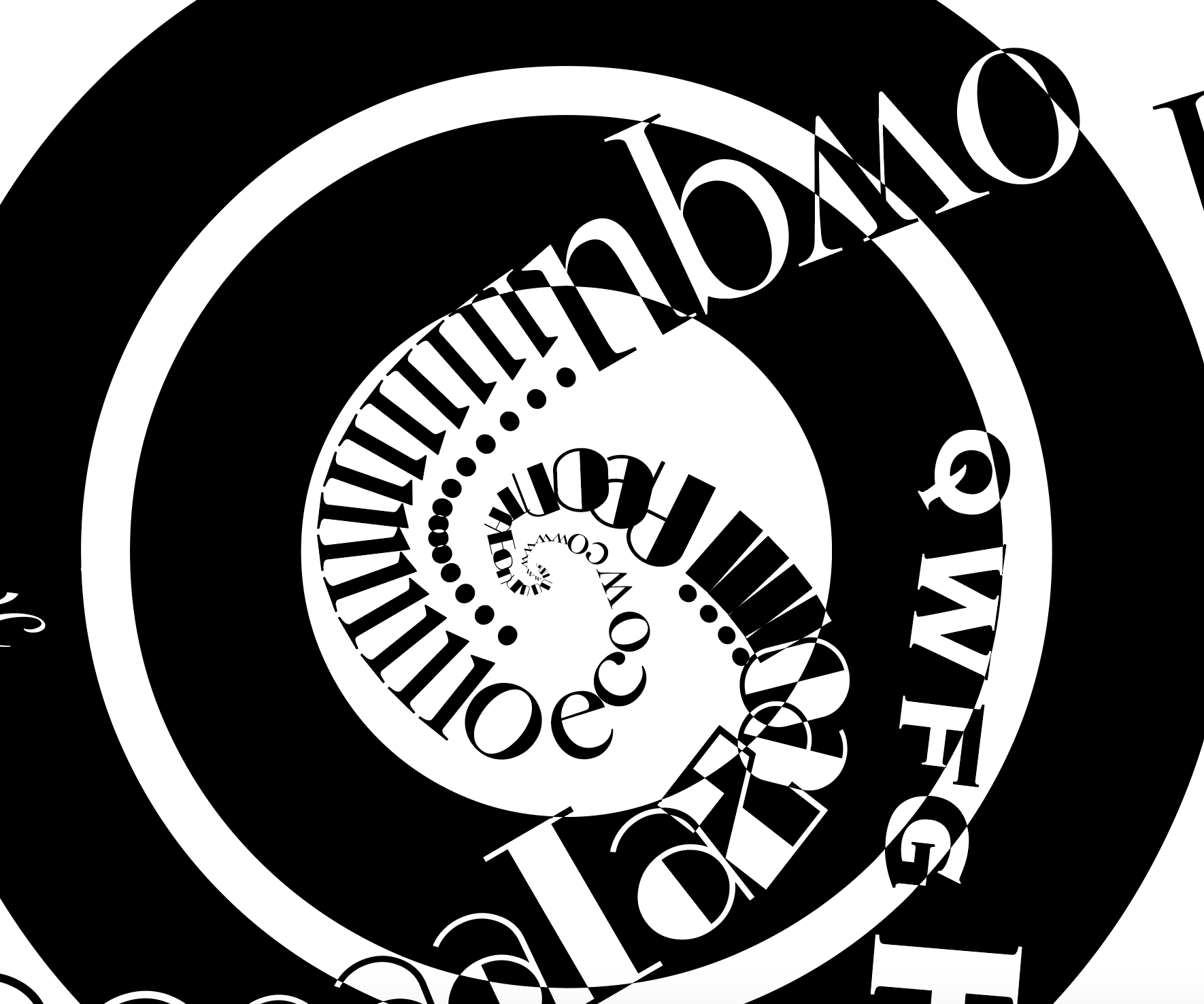
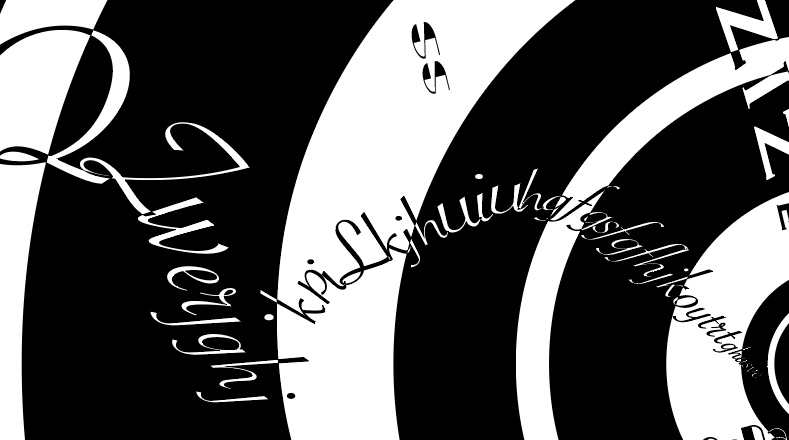
4. I actually didn’t align all the alphabets in one curl and added some lines here and there to show the improvisation and the naughty notes in jazz music.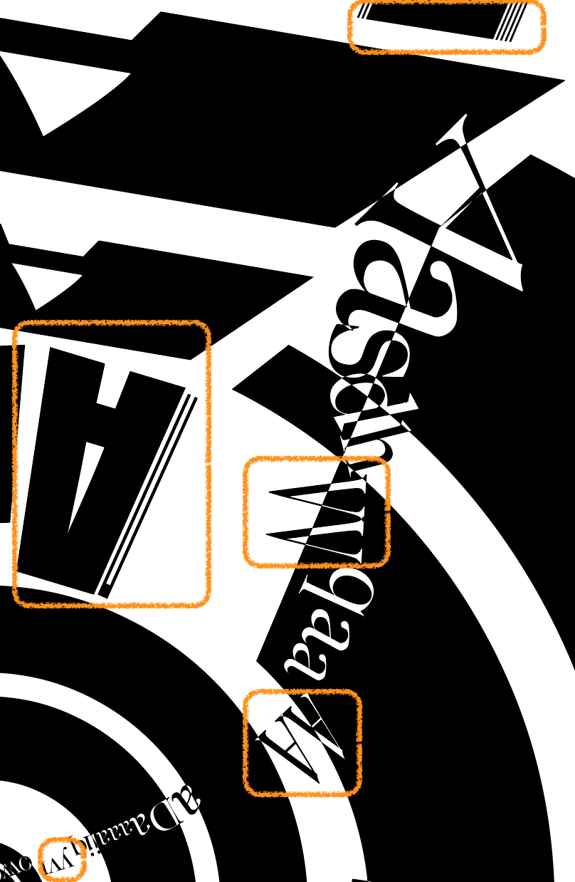
5. The left side features two kind of patterns that are the two very important recurrent theme of this piece.
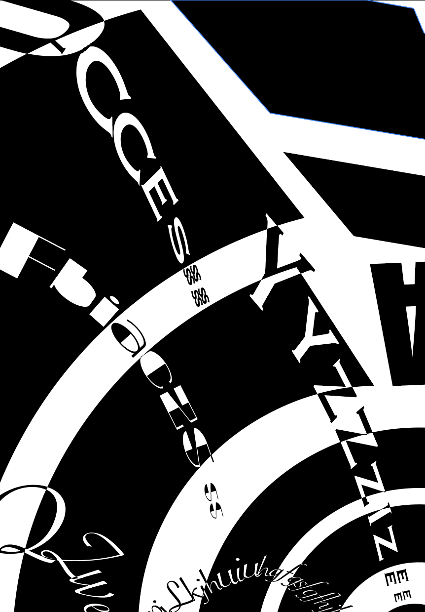
STEP 4: Mid-critique Showed Me A Bright Way Out!
The main problem before the critique was I don’t know how I should combine the small elements with the base. Prof. Ian gave me instructions that I should not let the small elements distract viewers from the main Os, that’s why I choose not to cut out the paths. And during office hour, he gave me instructions that I should make sure no elements stand alone. That’s why I added the lines (Step 3.4) to echo the brush kit design.
STEP 5: Gestalt Check
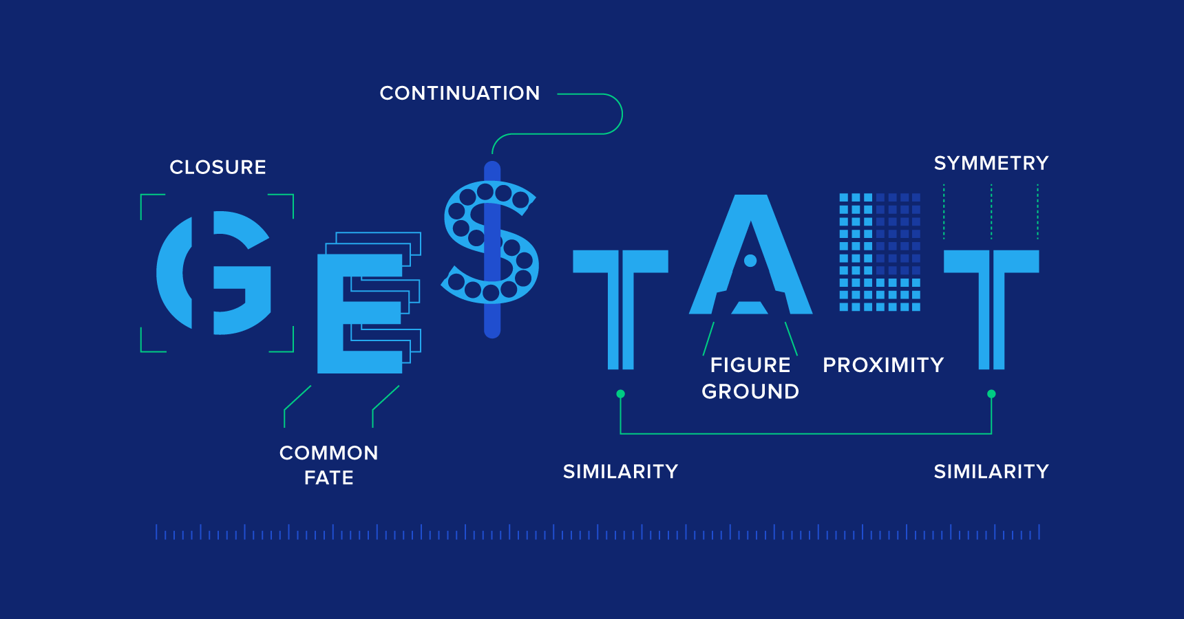
To be honest, I didn’t think about Gestalt Theory intentionally in this project. I guess it’s the practice in previous works shown below that leads me use the theory subconsciously. I used the idea of closure, continuity, figure-ground, and symmetry this time.
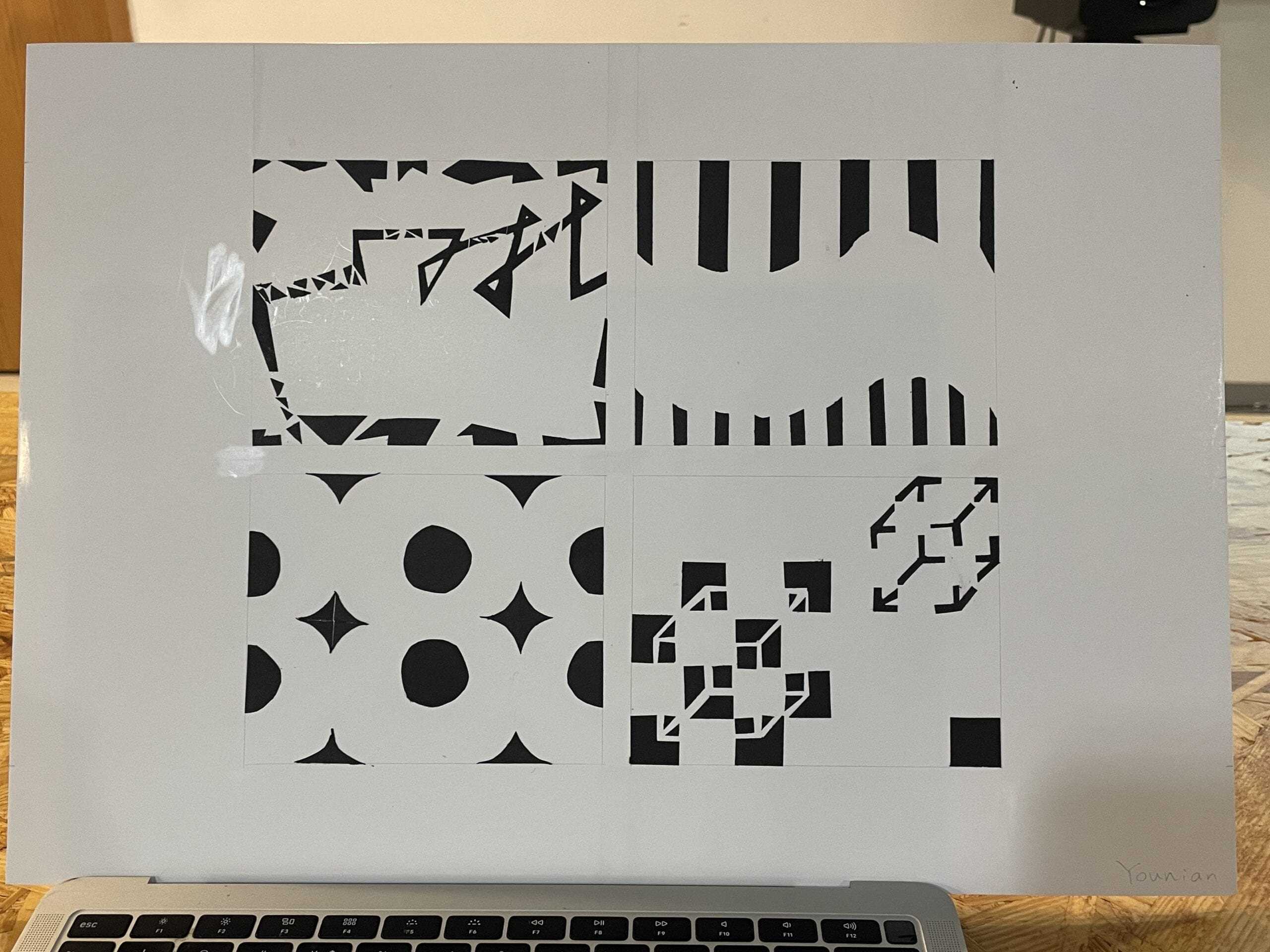
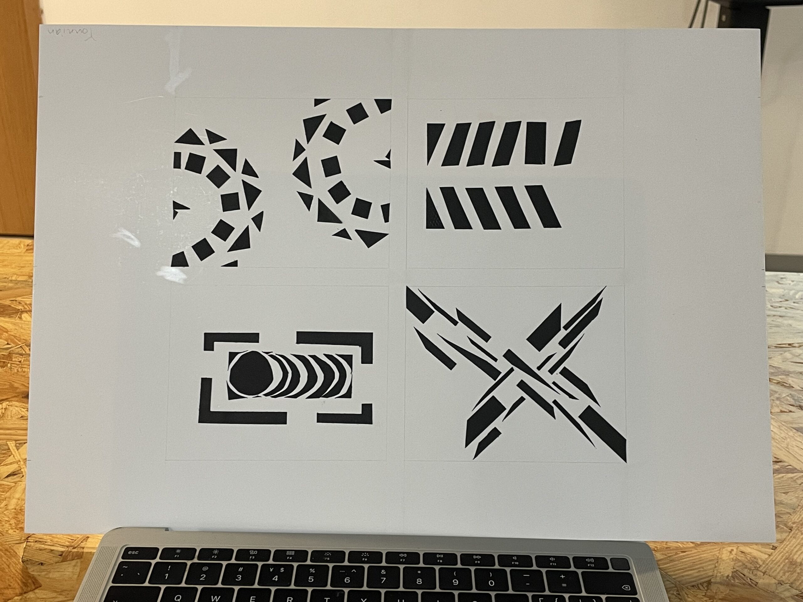
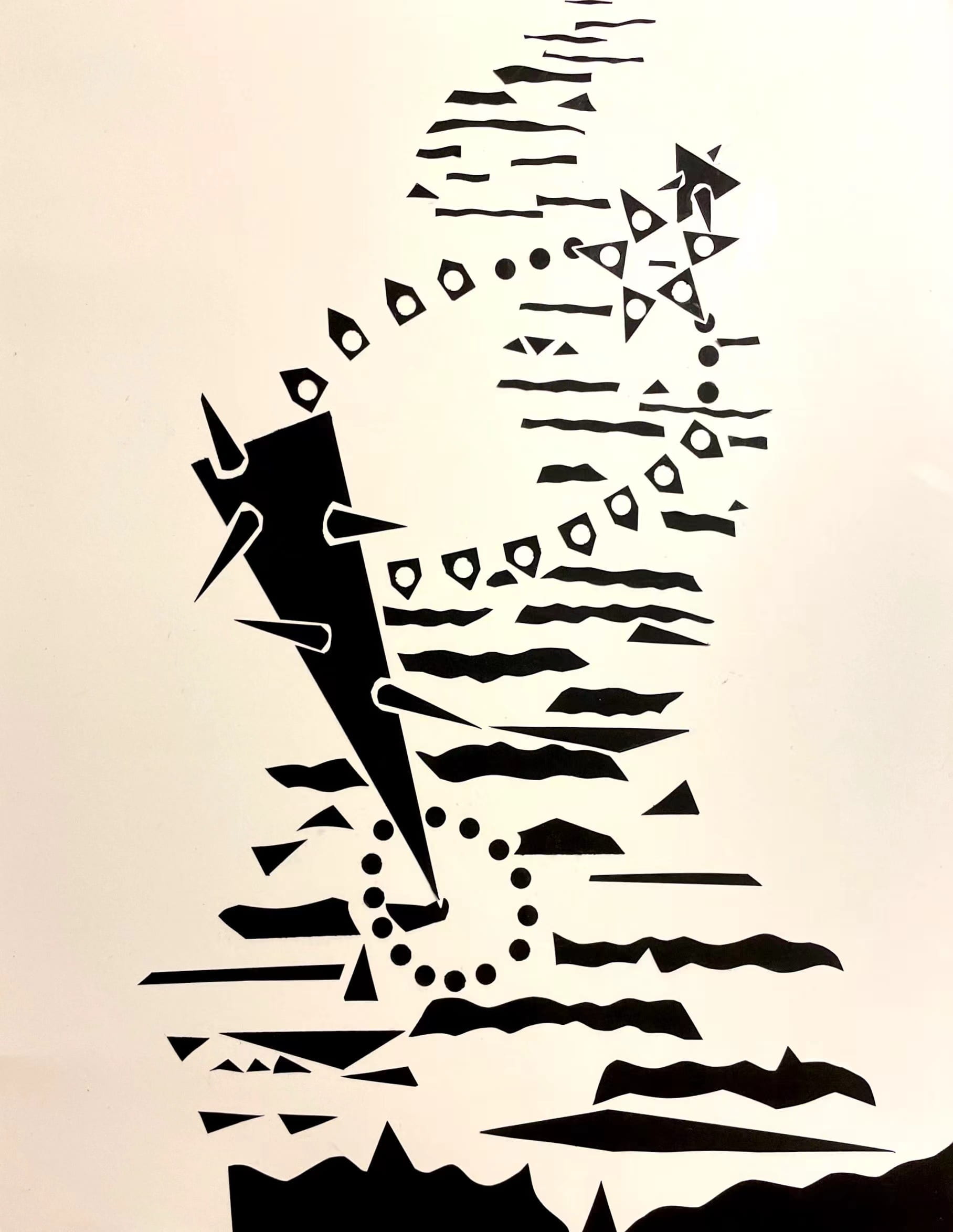
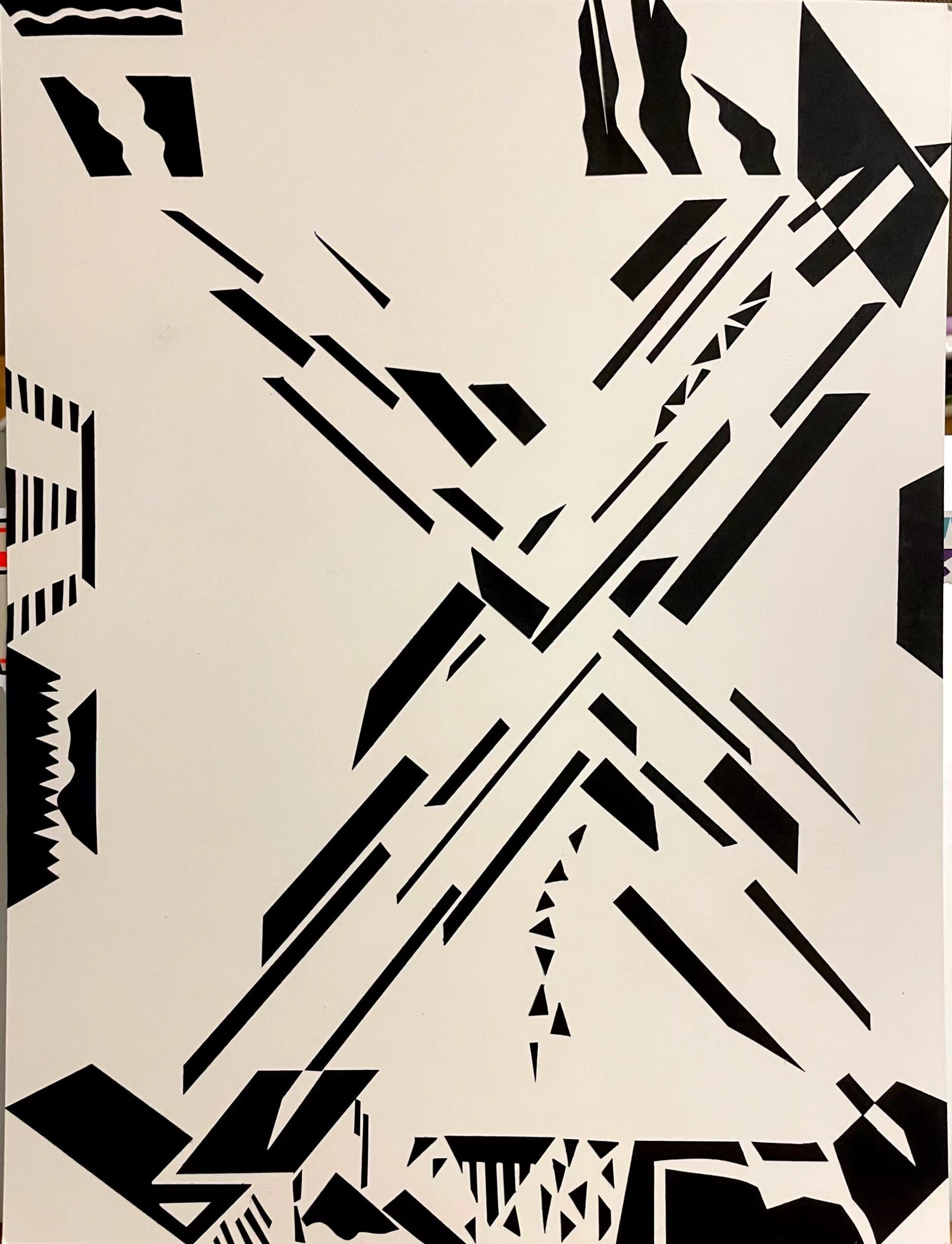
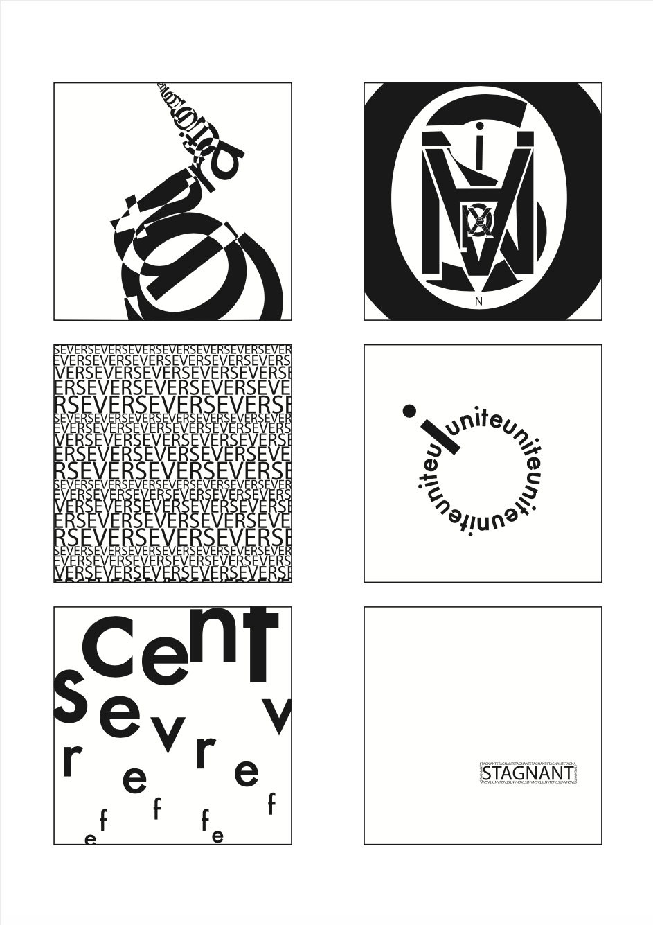
The thing I learned from One Black Square particularly is there need to be a main object that can attract people’s attention and all other elements should not get in its way.
Chapter III Les Confessions Conclusion
If I have more time, I would explore more on how I can combine Gestalt Theory more with my design. And also, I can explore more different effects and functions in Ai so that my work might have more “artistic” scent and can present the 3D dimension better. That said, I think this design, even though simple and old-school, can still fit the music well. I kind of like it more than designs that are “too contemporary”.
Fin.
Oct 9, Pusan, Younian Liu
Jingqiao T2/3/4 under lockdown
