Xiangyi Zhong
Diptych Project
Concept
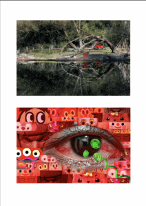
The overall concept of my diptych is to present a communication between the artificial and nature. Generally speaking, there are one visual similarity and three pair of contrast in the diptych design, centering the mentioned topic. The two pictures resemble in the layout, or the composition, with an eye-shape figure in the middle. The first and most intuitive connection of the two is the contrast color effect of red and green. Another pair of contrast is the artificial and the natural. The last one is the overall atmosphere or effect of peacefulness and tension.
In the first pair of comparison-the red and green contrast, I used the most basic and common example of the contrast color theory, because I believe these two color can form a strongest visual shock at first sight. Basically, there are only 2 color tones in both of the pictures, with the part of green and red corresponding to each other.
Similarly, the artificial and natural part also correspond to one another. In the first picture, the frame is almost occupied with green woods, with only two small, but eye-catchy artificial red objects in the center. It gives a feeling that the whole green nature is surrounding, and wrapping around the two artificial things. The second picture is totally on the contrary. The whole surrounding consisting of small pieces is all eyes from artificial products while in the middle, the jellyfish is the only creature, or 100% thing in the entire frame. However, I did not want the two look completely the same in the composition. Therefore, I added an element-the “vine.” Starting from the eyeball, and extends to the bottom right corner of the screen. It’s green, and artificial, but designed to be bionic, which looks like a natural vine. I personally take this “vine” as somewhere between the artificial objects that are extremely easy to identify, and the totally natural creatures.
With all the elements above, the feelings of the two pictures are different as well. Personally, the first one represents a quiet and peaceful feeling. Rather, the second one, with the intendedly emphasized bloodshot eye, feels more scary, tense, and creepy to me.
Process
At the very beginning, although not knowing exactly about the idea of the second picture, I was sure that I would go to a park to take photos for the first one. The whole park is full of green, therefore I was easily attracted by the red color there, including red tricycles, boats, kites, etc. The photo I finally chose was just one of the many photos I took without much design thoughts.

