Name:Xiangyi Zhong
Title of Music: Prologue ( Tango Apasionada)
Artist Name: Astor Piazzolla
Concept and Design
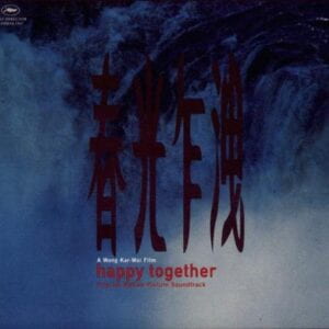 My reason for choosing this piece of music was really simple-I just watched a movie, the music in which touched me deeply. Even several days later, the story and the scenes in the movie still kept emerging in my mind every time I heard this song. So inevitably my design was influenced by the movie elements, e.g. waterfall, dance, and smoking as well.
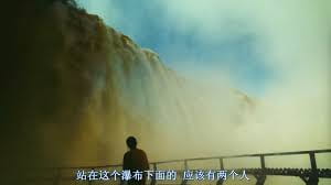
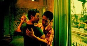
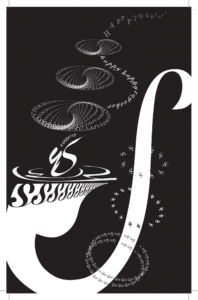
Generally, the whole music leaves me a melancholic and blue tone like water. According to this feature, I chose to use black background without thinking twice. The big S shape, like a pipe, is to represent the main melody played by accordion. Apart from the main melody, other instruments in this music also work well together, achieving an elegant harmony. Therefore I chose the 3 circles to signify the rhythmic drum beat. I arrange them roughly in two lines, one of which looks white like a dish and the other like a ring with dark inside, forming contrast in brightness. The left line of circles imitate the smoke coming out of the pipe, while the visual effect looks not only like smoke or air, but more like something rising from a pond of peaceful water. “Water” or “smoke” is rising from the middle of the pipe, stretched like two people leaning on each other, doing tango. The smoke lingers, fades, and goes beyond the frame, letting views to imagine a roughly closed loop with the starting end of the pipe. The smoke rings on the left is designed whirlpools, forming a bright leaning S in the middle of each circle, echo with the big “S” figure. To demonstrate similarity theory in Gestalt, I shaped the fading smoke as “S”, added patterns composed of a line of “S”( also one of the dancers is an “S”).
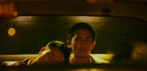
the scene accompanied by this chosen tune
Process:
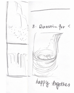
The main melody played by sounds soft and smooth like the feeling of water, while the overall low pitch makes it heavy and deep. So I decided to use a strong and conspicuous stroke as the central and main shape in my design. As for the specific shape-also required to be letters-I found the curve of “S” closest to running river. When first dragging a big bold “S” on the screen back and forth, I accidentally found its similarity with the shape of a pipe. Connecting these, I stretched the “S” to make it more like a pipe with some water effects. Concerning the personal water feeling of the music, I drew a brief draft:
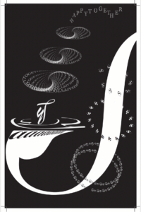
my work by mid critique
During the mid critique, I got quite surprised that lots of comments I received generally matches with my own understanding of the music. By then I didn’t plan to stress and repeat the “S” effect in my design, which was suggested during the mid critique. However, I was actually hesitating and struggling about adding some “S” effect, corresponding Gestalt theory better, cuz “Less is more” is also considered to be another principle in design. In the end, I added a little more “S” shape elements, trying not to break the general balance and to keep a tidy and peaceful overall effect. I believe the most successful change I made is stressing the stroke of the big “S”. In my view, this creates a stable and solid base at the bottom of the whole picture. I also pull the right end of the “S” inside the frame, allowing people to more clearly recognize the shape comes from an “S”. In addition, zooming it in to make the edge beyond the frame adds more geometric figures to the whole work.
Conclusion
Generally speaking, I think my work reflect my feeling about the music I chose. For further improvement, if possible, I would consider repeating the main stroke in parallels to form better emphasis. How to add one more layer of information is also worth considering.
Image of Project: PDF version
Wang, Kar Wai. (Director).(1997). Happy Together[Film].
Piazzolla, Astor. “Prologue( Tango Apasionada)”. Spotify. https://open.spotify.com/track/3iyLIGZLXWdlyGvMkLhRtL

