Categories
Communication Lab

Photo Diptych

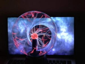
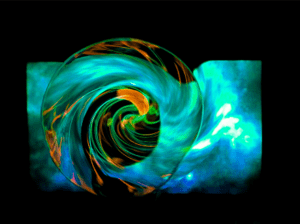
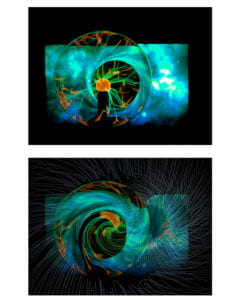
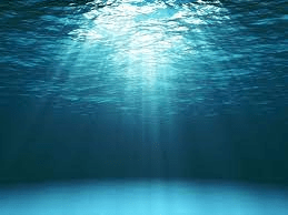
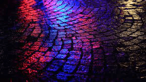
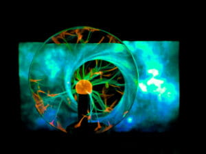
My work is called Abyss. I use compare our virtual digital network as Abyss to match the characteristics of the digital world, uncertain, uncanny, and dangerous. The virtual word is an extension to the reality, as Beth Coleman mentioned in Hello Avatar, we humans now are constantly shifting through the physical world and the virtual one, making an integrated “X-Reality”. It offers us brand new dimensions and limitless possibilities( the blazing of colours). However, there are always dangers that you may get sucked in by the black hole and get overwhelmed by the abyss.

For the composition part I firstly adjust the colour of the raw file.

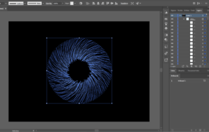
Then I utilize the creation from illustrator.

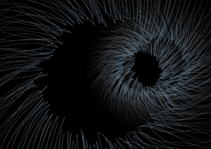
At last distort the surface and blend them together.


Categories
Communication Lab

In Your Own Image–Fred Ritchin

  1. What does Ritchin mean with the “fluidity of the digital”? Give an example of digital imaging/digital photography that exemplifies this.

In the book, Ritchin mentioned in the foreword that “the fidelity of the mechanical age was being replaced by the fluidity of the digital. ” From my perspective, it indicates the transformation in technology and photography. Photos are no longer shot by the rules of light and electricity. With digital imaging, the image can be easily manipulated, since the information context of the picture can be interpreted and altered by algorithm. So, to say that, digital image is not a type of new photography, but indeed a new media. 

Calvin Klein Apologizes on Its Queer-Baiting Ad Showing Bella Hadid Kissing Virtual Influencer Lil Miquela

The photo of the Artificial Instagram Influencer Lil Miquela(right, CGI) with model Bella Hadid

It is super easy to manipulate an image to fool people’s eyes, even the whole appearance of a people can be built up.  

   2.  Reflect on the extent to which photography is capable of capturing reality; and compare it to other media (technology) (e.g. text, video, virtual reality, books).

I would to compare the process of taking a picture as select a point on the time axis, and froze everything of a certain physical space from a certain perspective. According the reality on that moment on that right spot is captured in a 2D frame, serving similar function as our eyes do. For example, the biggest difference between picture and  video is about the motion. Photos are used to capture a fixed time point, or it is still. But videos are for record a set of movements happen in a period of time. While Words involve not only visual but but only the language perception. 

Categories
Communication Lab

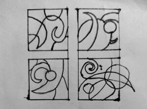
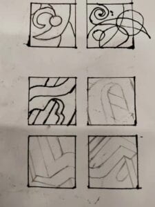
Pattern Thumbnails

Categories
Communication Lab

Colour and Atmosphere

Project Description:

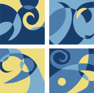
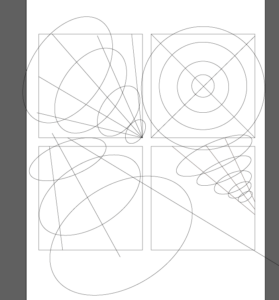
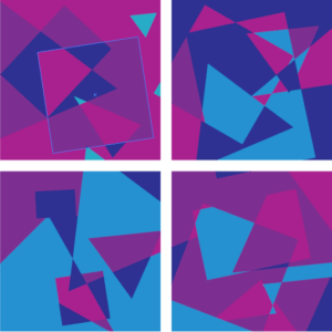
Design four non objective / abstract paintings using the same type of shapes throughout, changing the sizes and positions of the shapes to create four or more areas broken into 55%, 25%, 15% and 5% of the total area.

Scheme #1 Starry Night

The colour scheme came from my favourite impressionism painting Starry Night by Vincent van Gogh.
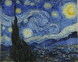
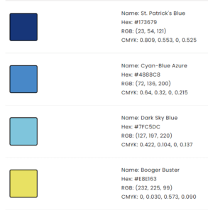
The colour scheme, as well as the painting itself, give me an overall sense of peacefulness, because the dark blue and yellow coordinates well together. The dark blue calm people down, while the bright yellow wrap people up with brightness and warmth. The whole image triggers my imagination and my yearn for the mysterious starry sky.

For the pattern, I also absorbed from the painting and utilized circles and curvy angles, respectively to stand for moon,stars and moving clouds.


Scheme #2 Young Feminine
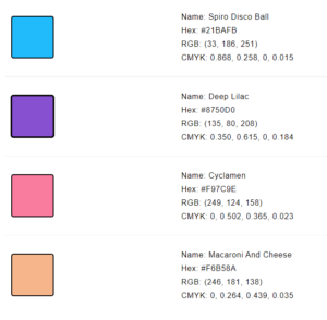
The first moment I saw this colour scheme, the game Monument Valley came to me.
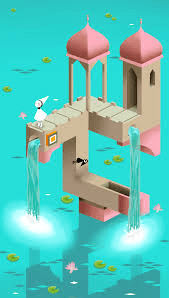
The four colour altogether create a feeling of a dreamlike realm, like a princess’s palace in fair tale. it also can be associated with sweetness, wonder, candies, marshmallows…

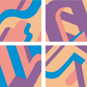
In terms of the patterns, I implied the framing strategy a bit, and altered the perspectives and angles of each image to get four versions, also combining the segments with curves for arcs and pillars. 

One of the challenges is that I think four colours are not enough to illustrate all the surfaces 100% clearly. So it is more like a puzzle-like, transformed dimensions

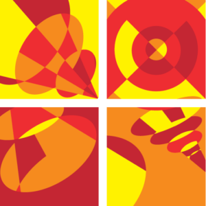
Scheme #3 Sun Rays


I Set the Value K zero for all these four colours so that they are the brightest. They really bring out the heat to our face. The patterns are sun rays from different angles and observation angles.

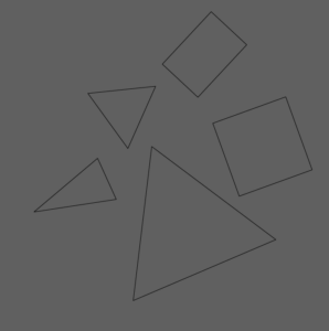
Scheme #4 Fragment Era

These four colours are close to neon lights, representing for mystery, and fake, distorted visions. Additionally, It’s a bit like cyberpunk here, give people a dizzy feeling, a sense of high technology of the digital age. And the combination of these polygons make the image looks fragile, indicting the fragmentation of our era, questioning about the authenticity of the things we see.

Alternative Designs

 Timber

Categories
Communication Lab

Pioneer Plague

Project description: create  (draw the plaque and describe) your own Pioneer Plaque to explain a piece of human history to aliens in Story of Your Life. 

We want to present this pioneer plaque on behalf of China. After discussion, we think the written language system in China can be counted as the most developed one. So we decided to utilize the Chinese Characters. 

Introduction of Chinese Characters:

Chinese characters, also known as Hanzi (漢字) are one of the earliest forms of written language in the world, dating back approximately five thousand years. Nearly one-fourth of the world’s population still use Chinese characters today. As an art form, Chinese calligraphy remains an integral aspect of Chinese culture.

There are 47,035 Chinese characters in the Kangxi Dictionary (康熙字典), the standard national dictionary developed during the 18th and 19th centuries, but the precise quantity of Chinese characters is a mystery; numerous, rare variants have accumulated throughout history. Studies from China have shown that 90% of Chinese newspapers and magazines tend to use 3,500 basic characters.

Chinese characters have evolved over several thousands of years to include many different styles, or scripts. The main forms are: Oracle Bone Inscriptions (Jia Gu Wen 甲骨文), Bronze Inscriptions, (Jin Wen 金文), Small Seal Characters (Xiao Zhuan 小篆), Official Script (Li Shu 隸書), Regular Script (Kai Shu 楷書), Cursive Writing or Grass Stroke Characters (Cao Shu 草書), and Freehand Cursive (Xing Shu 行書).

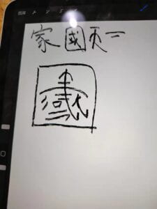
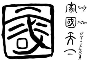
Design Process:  Finally we chose the four Chinese characters, respectively “家(family), 国(nation), 天下(the world)” It is from Daxue, and is used to provide guidance for people’s way of living a meaningful life. Besides aspiration, we want to expand to the meaning. 天下is not limited to the world but the whole universe. We define the four characters as a complete set demonstrating the alignment of their meaning. And the ultimate goal is to convey the message of peace and inclusiveness that we humans are willing to establish friendly relationship and will treat them equally just like ourselves.

Basically the logic is to separate the characters and regroup them into a new pattern. We also got some inspiration from seal cutting patterns. We mainly chose 篆书 and 金文.  As we know, the aliens depicted by ted-chiang have simultaneous mode of consciousness, and they can perceive the information as a whole. So they can identify the elements with interpretation.


Categories
Communication Lab

Colour Scheme Pratice

Colour Scheme Practice

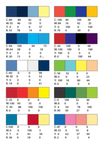
Number Colour Scheme Name Source
1 Starry Night
2 Complementary
3 Aqua
4 cyberpunk
5 Tufts Tufts Color Scheme » Blue » SchemeColor.com
6 Summer Vibe 
7 Flame
8 Dollar Tree 
9 Liverpool FC
10 Young Feminine Feminine Kit Color Scheme » Blue » SchemeColor.com
Categories
Communication Lab

Sound Visualization

Project description: a black and white visual representation of a piece of music of their choice using typographic symbols and characters. How can the musical  elements within the song (tone, timbre, rhythm, speed, etc.) be interpreted into visual graphics? Additionally, music evokes emotions. How can your visual graphics convey emotion?

I chose June: Barcarole (The Seasons, op.37a, no.6) by Russian composer Tchaikovsky.

June: Barcarolle, Op. 37a/b | Music Shop Europe

Sound track:

Appr

eciation:

The song is depicting the scene of a peaceful summer night.  I can imagine rolling a boat on a glistening river under the moonshine. The sentences really make me feel like I am paddling, and the boat is swaying. 

The characteristic of barcarole is that the same section of melody with repeat for two times. The overall atmosphere is slightly grieve with a sense of solitude. I think there are great thinking between the piece. Starting from 1:33, the tune gets more lively. It’s like suddenly have some inspiration. It reaches to the climax at 2:14 (asking a profound question). Afterwards , it goes down and go back to echo with the beginning ( get no answer, find solution impossible). The great theme may be concerning with death, the meaning of time, whatever, the feeling of the piece by no means should be limited to a plain surface, but many more dimensions.

Design elements:

I found a Russian font called moon that is often used in children’s storybooks, since it is a Russian piece, and the name fits the song. Also the characters are cute and have many elements that I can make use of.

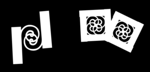
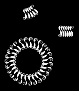
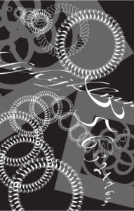
I want create a picture of dreamland. I pieced four “r” together to form a swirl. indicating that it is in dream. Then I found that the loop by “s” is beautiful, so I rearrange and adjust them to get a tunnel. 

Final work:

Reflection: I didn’t manage to quite get across what I feel about the piece through my presentation on class. Maybe I should rehearsal a little beforehand. Also about the documentation, it is better to record more processes and drafts on the blog, meanwhile I complete my design.