Author: Ting Yang
Reverse Storyboard
Memory Soundscape project
🌟Concept
The memory I chose is the daily life in my middle school. Every day is scheduled the same, full of tests and tests. It was a very stressful period. But every night I kept practicing playing the piano, which makes me feel relaxed and help me forget the bad mood.
💫Process
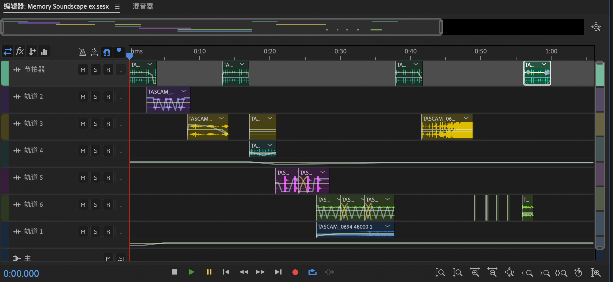
For the recording, I used the Tascam. The sound quality was super good but the volume was low and the sounds were only on the left track, so I made all the sounds louder and copied the left track to the right track before editing.
To emphasize the repetition, I use a slowly pressing button sound to make it sound like metronome to segment different parts of a day, which also implies the piano although there is no piano music.
Then I will explain every sound in order.
1. I choose the beeping sound to show the alarm clock, which also represents the annoyed beginning of one day. I use the pan here to show that I’m still in the dream and unconscious but I have to get up, which is torturing.
2. The sound of the plastic bag means eating breakfast, and the noisy sound show my nervous feeling of experiencing the busy and boring day again.
3. I use the Stepping sound with pan and echo to show that I’m walking upstairs to the classroom via a spiral staircase like stepping into a whirlpool.
4. The gong sound is to show the beginning of tests. I want to convey that there are too many tests, so I use the pan and every change of the sound track means one test.
5. After the gong sound, the test starts. I choose the pencil-writing sound to demonstrate a testing situation. Besides, I add a chaotic dryer’s sound and use echo to make it more chaotic to show that I’m dizzy, painful and can hardly breathe during the tests. The more and more louder noise also represent the headache is more and more serious.
6. The next part is a clicking sound with echo. When I’m testing, I always unconsciously keep pressing the button of the button-press pen. This action can show my anxiousness. The echo is also used to strengthen the anxiousness.
7. I end the clicking sound suddenly with several single piano notes to make it like a sudden relief from the chaotic testing environment.
☀️Conclusion
I received some unexpected feedbacks during the review session. They all like my project and appreciate the nice use of pan and how I use the metronome sound to segment the project. I’m glad that all my classmates understand my concept well and feel the same feelings. I’m very grateful to these compliments.
However, I also notice that when it’s played in the classroom with the certain volume. The echo of the clicking sound is too loud and makes the audience hard to notice the piano sound coming after it, which kinda reduce the sense of relief. If I have more time, I will try to control the volume and test it in the classroom.
The Uncertainty of Documentarism
Q: What is the significance of the authenticity and representation of the truth in the media that you consume on a daily basis? What is the role of a live broadcast?
A: The authenticity and representation of the truth in the media that we consume on a daily basis affect our cognition of the world a lot. As for news, the authenticity and the representation of the truth is extremely important. In this digital age, we can receive super huge amount of information every day through different media. In other words, media helps us know the world and it can control what it wants us to see. If some of the news on this media are fake, then it will lose its authenticity because we won’t trust it any more, or our world view may be somehow distorted by invisible but powerful hands. Therefore, as Hito Steyerl said in “The Uncertainty of Documentarism”, “doubt will never be cast aside fully.” We will suspect all the information we see because different forms of representation show different perspectives of one thing. But this can be exhausting and unnecessary.
However, for the media with the property of entertainment, the authenticity and the representation of the truth is not at the first place. We don’t care about the truth and we just want to see the emotional power of the information it conveys.
A live broadcast gives the audience more sense of reality. It makes us feel what we see is real and eliminates the uncertainty. We believe that the picture and the recorded video can be edited but a live broadcast can’t be edited. We want to see what is happening now directly so no one can lie to us. Also, the bullet comments allow us to communicate with who is on the broadcast. It’s more like the interaction with the audience but not one-side conveying information. Therefore, it satisfies our need of seeing reality with our own eyes and engaging with it more.
Diptych Project
《Plastics》—Ting Yang
💡Concept
The topic I choose is the relationship between people and plastics. I used a clay figurine to represent all human beings and a Pom Pom to represent plastics.
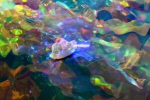
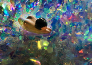
In the first photograph, there is a person swimming freely and happily through the plastics which look like beautiful reef corals. I want to convey the idea that people love using plastics because their convenience and wide range of uses benefit our daily lives a lot. They make our world work easily.
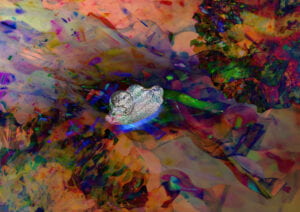
In the second photograph, the person enters a micro world of plastics. The plastics are not that gorgeous any more but disgusting and dangerous. Plastics pollution exists because plastics can release harmful chemicals to the surrounding soil or water and they are hard to break down. This pollution not only affects ecosystems but also our humans. We may take in the plastics by eating animals who eat plastics and plastics can go into our blood and threaten our health. So I also make the figurine here plastic-like to arouse people’s awareness.
The two photographs are contrary. The first one is macro and good while the second one is micro and bad. The contrast can make my appeal for reduction of plastics use stronger.
⏰Process
1. Staging and Photograph Part 1
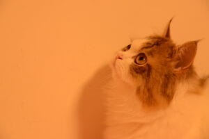
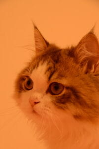
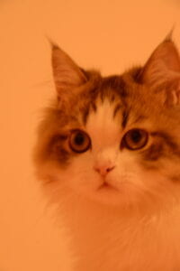
At first, I chose my cat as my model because I want to convey the idea about the relationship between pets and their owners. However, capturing a cat movement was too hard and I didn’t master using a camera, so I abandoned this idea.




 (Dark and orange cat photos)
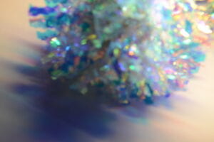
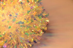
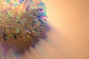
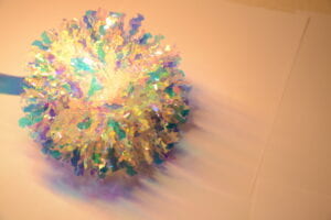
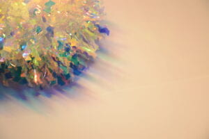
Then, I tried to take photos of many things like a light ball and a Pom Pom. And after taking photos of these single plastic objects, I found out that the colors of the Pom Pom’s shadow is like the ocean’s. So, the idea of plastic pollution in the ocean came into my mind. I started to combine different objects to see how I can convey ideas better through different compositions.
 (Pom)
(Pom)
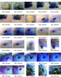
Eventually, I combined a clay figurine with the Pom Pom to show the relationship between people and plastics. I did encounter some problems about taking clear photos. Most of the photos I’ve taken are either blurred or dark. Only about 10 percent of the photos could be put into use. So I tried to find the problem. It turned out to be the inappropriate shutter speed. Luckily, after fixing it, I finally got the pictures I want.
However, It was hard for me to choose the best two photos, so I asked for my classmates, Ken and Claire, for help. They suggested me choose relatively dark pictures, so It can be more like pollution. And they both thought the picture I chose at last had a great composition. I really appreciate their help, which is crucial for my project.
2. Image Part 2
In the photoshop part, I struggled a lot with the details. I used the filters to make the figurine more like plastic-made and adjusted the details again and again to pursue a perfect version. Then I changed the mode of the layer for many times to find out the most “pollution-like” one and the color should be mysterious. I want it to be like a world seen through the microscope. So I added pieces of the Pom Pom to make them like viruses. Finally, I highlighted the man to make it brighter and on the contrary, the background, which is the micro plastic world, became darker.

☀️Conclusion
I like my final project a lot. Although things don’t always go as what I want, I still get an amazing project at the first sight. However, there is something I think I can improve if I have more time. First, the plastic person is not delicate enough. Second, I want to add more plastic chains on the person to show the plastics’ damage to people more directly. But, overall, I’m 80 percent satisfied with my project.
🫧Contact Sheet
🫧Final Project
Pick your memory
🥰 I want to pick my memory of a day in my middle school. I was preparing for my piano grading test while I had a heavy workload in studying in my middle school. Every day, I took many tests in the school and after school, I still had to practice playing difficult piano music. Everything made me stressful. It was almost the hardest time I have been through.
🔆 Although I don’t want to experience this period of time again, it is definitely my most precious memory. It was the first time I had an idea of giving up something that I had been working hard on for years. Contrary to painful memory, it helps me gain the pleasure and satisfaction of accomplishing something I thought I would never finish.
💡 I collect a lot of tapping and clicking sounds, hoping to create a tense atmosphere to show my stress in the memory. Also, I want to use the sound of flicking through book pages to show the scene that I was studying hard. Of course, there will be some piano music but it will be a little mess to show how anxious I was. The whole soundscape will start from an alarm clock to show the beginning of the day. And then use the sound like metronome to segment different parts. The parts will be in order of the piano music, flicking page sounds, the school bell and the piano music again and then be repeated. The end will be a fading sound of metronome to show the feeling of endlessness.
Color and Atmosphere
In Our Own Image (Reading)
- What does Ritchin mean with the “fluidity of the digital”? Give an example of digital imaging/digital photography that exemplifies this.
Definition: From the foreword, we can see “the fluidity of the digital means that we come to the “post-photographic age” and develop a new medium formed with pixels in the computer, so we can express more opinions in photography and transmitted them more widely and fluently. However, this “fluidity” may also make the appearances less objective to trust and cause hoaxes.
Example: As the benefits of the “fluidity” are pretty obvious, I want to give a negative example, which is BBC filters. Someone find out that BBC often use strange, dark and lifeless filters to shoot Chinese documentaries. 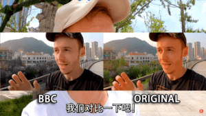
We can see BBC change such a small detail like making the color scheme more dark and cold in these screenshots. The atmosphere of this place suddenly changes. Therefore, BBC makes use of the “fluidity” to deliberately spread its own ideas with maybe prejudice.
2. Reflect on the extent to which photography is capable of capturing reality; and compare it to other media (technology) (e.g. text, video, virtual reality, books).
If the photos are original and not edited, then they can be reliable with their objectivity to some extent, which means they are capable of capturing reality. Of course, editing with one’s subjective opinions will weaken the ability of capturing reality. But if the camera is super old or damaged and catches blurred images with low resolution, then this kind of photography can’t capture reality well. So, at this time, editing images with softwares like photoshop is a way to recover the function of the image as recording the reality.
Compared to other media like texts and books, photography is more specific and direct. We need imagination to understand texts and books while we don’t need anything else but eyes to see the photos. And with the technology developing, editing videos is not a big deal now and it’s similar to photography.
Diptych Concept
· What is the overall concept for the Diptych? What are you trying to convey?
In my Diptych, I may show the relationship between people and their pets. I want to convey an idea that pets are a part of our family but we are the whole world of them. Also, I want to create an atmosphere of the sadness of loss so people can deeply understand my idea that we must treasure our pets with love, or we will feel regretted in our whole life.
· For the Diptych project, one cannot exist without the other. i.e. The existence of both images complete the project. One is only a partial information. What kind of conversation do the two images create and assist each other to convey the concept together?
One image is about pets without people’s company, and the other one is about people losing their pets. I want to express the importance of company between pets and their owner and the two images separately show one role in this relationship, so the whole concept consists of the two images and doesn’t make sense without any of them.
· What image(s) do you plan to take photos?
I plan to take photos of my cat and me myself. One photo is my cat curling, and the other one is me curling but in the same angle and facing each other.
· How do you plan to manipulate the image(s) using Photoshop?
I haven’t used Photoshop before, so I don’t know what kinds of tools it has. But I may use the Photoshop to create something missing in the image, like drawing my cat in the image of myself.
Sound Visualization Blog
- Name: Ting Yang
Title of Music: 《轻轻》(deca joins Version)
(The Link: https://youtu.be/G40vokYG8Y4)
Artist name: 陈娴静
- Concept and Design
*Inspiration
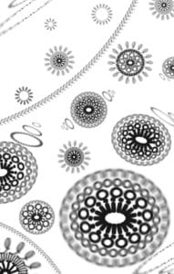
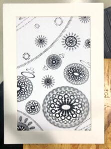
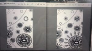
My design is inspired by the kaleidoscope. When I listen to this music, something blooms everywhere, like flowers but more fascinating. So, I want to add some patterns like Mandala, which looks mysterious. Also, some parts of this music make me feel like I’m in the water and mist. Therefore, some blurring and bubbles may fit the music and some ribbons can show the mixed feelings in the music. In short, I want to express a feeling like something blooming in the water and floating up but still impalpable.
* Gestalt theory
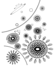
My design contains a lot of similarity and closure. Similarity can be seen everywhere in my design because every pattern is similar. Closure can be seen in every single pattern because the same characters stand close to each other and make them like a ring. And I use the figure/ground. I put a big pattern in the bottom right corner to make it in the foreground. I want the design to look like that the patterns float from the top left corner to the bottom right corner. But I’m afraid I didn’t make the feeling of space strong and I should have added more small patterns in the background.
- Process
* Preparation
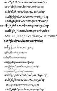
I made a chart to contain all the fonts that I like. I listed every font with every character that I liked so I could see clearly which was the most suitable font of the character. Finally, I decided to choose the character “n””o””i””l””Q” because these characters looked symmetric and could make symmetric patterns pretty well. “Q” was used for the ribbons because I found out that it could make the ribbons feel like lace and become more delicate.
* First version
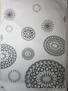
I encountered a lot of difficulties when I was doing this project. I was hesitating whether I should use blurring because it might lower the definition of the image when I printed it out. It could be a lot more pixels than a clear line. And I didn’t know how I could add an impression of space. Most importantly, I haven’t used the Adobe Illustrator before and the lack of familiarity caused a lot of technical problems, which lengthened the time and made my imagination hard to be put into reality.
*Final adjustment
I was stuck in some very slight differences in my different versions. After continuously staring at the design, it was hard for me to tell which version was better, which was a big problem to me.
*Mount
When I was mounting, it was hard for me to cut the window with the angle , so the edges of the cutting were always rough. So I use a very sharp box-cutter knife to clean the edges very carefully. My hands hurt after mounting.
- Conclusion
I like my project pretty much. When I show it to some of my friends, they seem to be fascinated, which shows that my project is impressive at the first sight because of its complicated and mysterious patterns. However, I think there is still much space for me to improve my project. It seems to be too two-dimensional and lacks the impression of space. If I had more time, I would have added more details like some waves and patterns made by smaller fonts of characters. Some waves can make the figure to be emphasized and go to the foreground and smaller patterns can clearly separate the background from the foreground. Also, I may add more different shapes than circles to make it more varied and kaleidoscopic.
- Image of Project
