- Name: Ting Yang
Title of Music: 《轻轻》(deca joins Version)
(The Link: https://youtu.be/G40vokYG8Y4)
Artist name: 陈娴静
- Concept and Design
*Inspiration
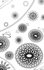
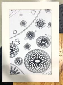
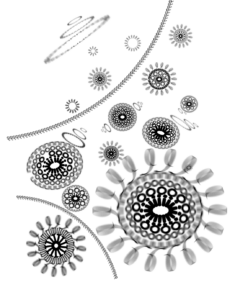
My design is inspired by the kaleidoscope. When I listen to this music, something blooms everywhere, like flowers but more fascinating. So, I want to add some patterns like Mandala, which looks mysterious. Also, some parts of this music make me feel like I’m in the water and mist. Therefore, some blurring and bubbles may fit the music and some ribbons can show the mixed feelings in the music. In short, I want to express a feeling like something blooming in the water and floating up but still impalpable.
* Gestalt theory
My design contains a lot of similarity and closure. Similarity can be seen everywhere in my design because every pattern is similar. Closure can be seen in every single pattern because the same characters stand close to each other and make them like a ring. And I use the figure/ground. I put a big pattern in the bottom right corner to make it in the foreground. I want the design to look like that the patterns float from the top left corner to the bottom right corner. But I’m afraid I didn’t make the feeling of space strong and I should have added more small patterns in the background.
- Process
* Preparation
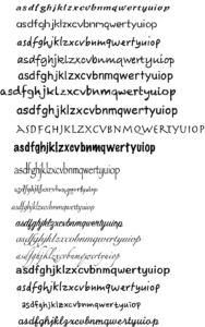
I made a chart to contain all the fonts that I like. I listed every font with every character that I liked so I could see clearly which was the most suitable font of the character. Finally, I decided to choose the character “n””o””i””l””Q” because these characters looked symmetric and could make symmetric patterns pretty well. “Q” was used for the ribbons because I found out that it could make the ribbons feel like lace and become more delicate.
* First version
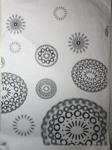
I encountered a lot of difficulties when I was doing this project. I was hesitating whether I should use blurring because it might lower the definition of the image when I printed it out. It could be a lot more pixels than a clear line. And I didn’t know how I could add an impression of space. Most importantly, I haven’t used the Adobe Illustrator before and the lack of familiarity caused a lot of technical problems, which lengthened the time and made my imagination hard to be put into reality.
*Final adjustment
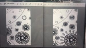
I was stuck in some very slight differences in my different versions. After continuously staring at the design, it was hard for me to tell which version was better, which was a big problem to me.
*Mount
When I was mounting, it was hard for me to cut the window with the angle , so the edges of the cutting were always rough. So I use a very sharp box-cutter knife to clean the edges very carefully. My hands hurt after mounting.
- Conclusion
I like my project pretty much. When I show it to some of my friends, they seem to be fascinated, which shows that my project is impressive at the first sight because of its complicated and mysterious patterns. However, I think there is still much space for me to improve my project. It seems to be too two-dimensional and lacks the impression of space. If I had more time, I would have added more details like some waves and patterns made by smaller fonts of characters. Some waves can make the figure to be emphasized and go to the foreground and smaller patterns can clearly separate the background from the foreground. Also, I may add more different shapes than circles to make it more varied and kaleidoscopic.
- Image of Project
