Shelia portraying
Summer Feelings by Lennon Stella, Charlie Puth
Chapter I: Concept and Design
- Song inspiration :
This project seeks to visually interpret and capture the emotions conveyed in the song “Summer Feelings” by Lennon Stella and Charlie Puth. The song is about fond memories of the good old days spent with a loved one on the beach.
- Brief introduction & ideas: This visual work combines diverse elements like the letter “S,” bubbles, dreamy circles of light, and flowing text to create a cohesive representation of the song, which is characterized by nostalgia, love, and a relaxed California vibe.
Here I list some notable ideas during my creation:
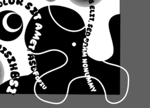
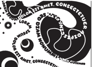
- The black section composed of Letter “S”: The black sections at the top and bottom of the project consist of an enlarged letter “S” from the font “Sunday burger.” The “S” is decorated with thinner and longer lines, resembling waves or a beach. This visual element represents the beach and waves mentioned in the song, contributing to the fluidity and rhythm of the scene.
- Black and White “C”: The black and white “c” shapes are described as forming bubbles, reminiscent of a vibrant drumbeat in a song. This likely symbolizes the lively and upbeat aspect of the song, adding a dynamic element to the visual representation.
- Circle of Light: The circle of light is constructed from several “I,” creating a sense of obscurity and dreaminess. This element adds layers to the scene, aligning with the dreamy and nostalgic feelings of the song’s lyrics.
- Text Flow: Lines of text flow through the picture, and the font “Sunday Burger” is thick and round. This choice of font and the flow of text contribute to the overall aesthetic and mood of the project, ensuring that it remains consistent with the song’s relaxed and nostalgic feeling.
- Lack of Sharp Shapes: I intentionally avoid sharp shapes or objects. ensuring that the visual representation remains harmonious with the song’s mood.
- Lyrics Connection: The lyrics were not my inspiration, but I think The lyrics and the melody of the song are well-suited, which may help the audience understand the emotion it is trying to convey.
“ I hear the rhythm of waves hittin’ on the shore
And I can swear they’re speakin’, speakin’, speakin’They’re tellin’ me to relax, I’m not good at thatBut now, I know I need it, need it, need it (I slide)
Chapter II: Process
- Challenge:
One of My primary goals was to create a visual effect where text lines change color when they come into contact with either black or white sections of the artwork. This implies that the text lines needed to have a two-color appearance, with part of the text appearing black and part appearing white.
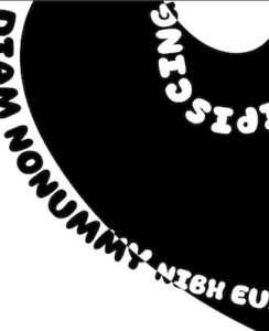
At first, I did not know how to achieve it. It is a complex task to make text appear as if it has black and white simultaneously, especially when the text needs to intersect with different background colors.
- Solution:
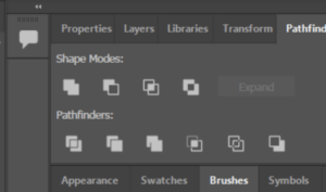
I asked my instructor for help and learned the technique of using a tool called the “pathfinder” to achieve the desired effect. It allows me to intersect shapes and paths in the way I want, creating complex shapes or text effects. By doing so, it became possible to create the text lines simultaneously in both black and white, depending on their position in the board.
- Advice from Mid-Critique
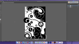
One recommendation is to use the letter “S” more prominently when composing the “beach”. Therefore, I increased the size of “S” in the “Sunday Burger” font within the artwork. By doing so, I created a stronger visual connection between the scene and the letter, where the “S” is a key element representing waves and the beach.
Black sections’ details with not prominent letter “S”:
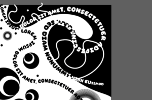
The final version details of black sections:
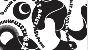 .
. 
Chapter III: conclusion
I would like to explore and add more multiple visual elements such as overlapping shapes or textures that interact with each other. By making the artwork more layered, I as the creator can add depth and complexity to the overall composition, making it more visually engaging. What’s more, incorporating different fonts within the artwork may be a good idea because of its visual contrast, which may represent a collision of emotions of the main characters in the song .
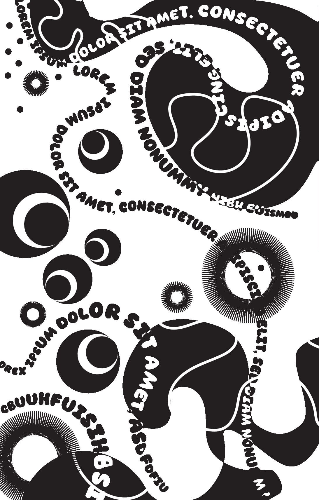
The AI version of the project: https://drive.google.com/drive/folders/1XqvupseMsyRqb6kZASJtDZH0BGGPtPe4