Category Archives: Creative Coding Lab

Fishy Sushi – Creative Coding Lab Final Project

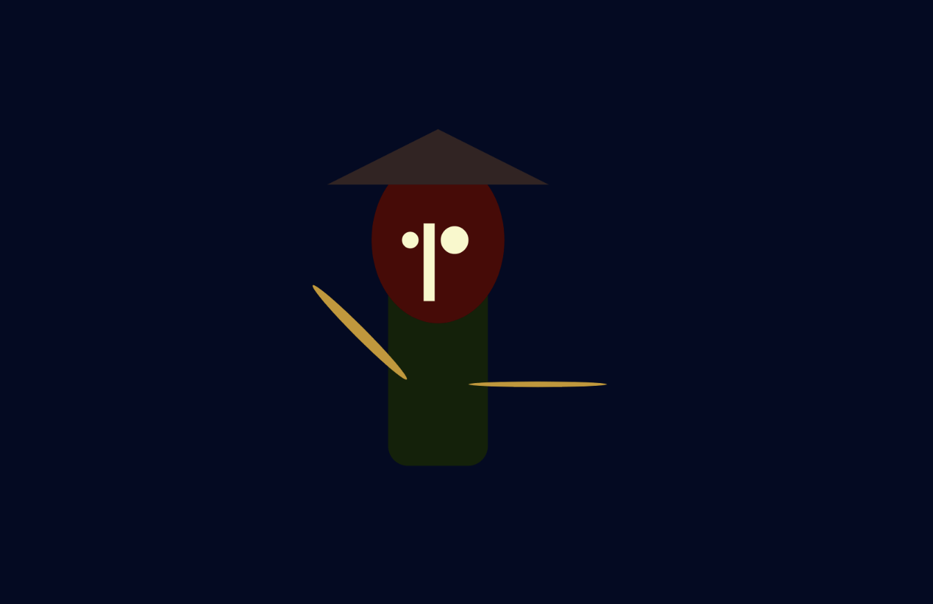
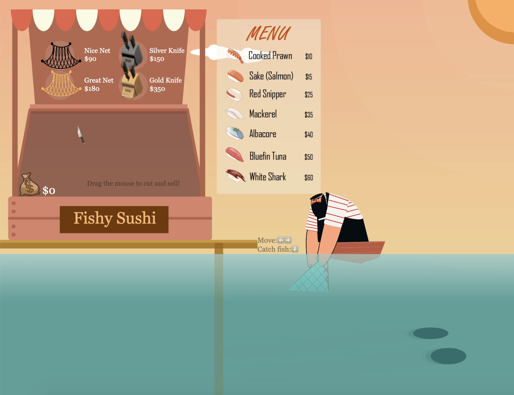
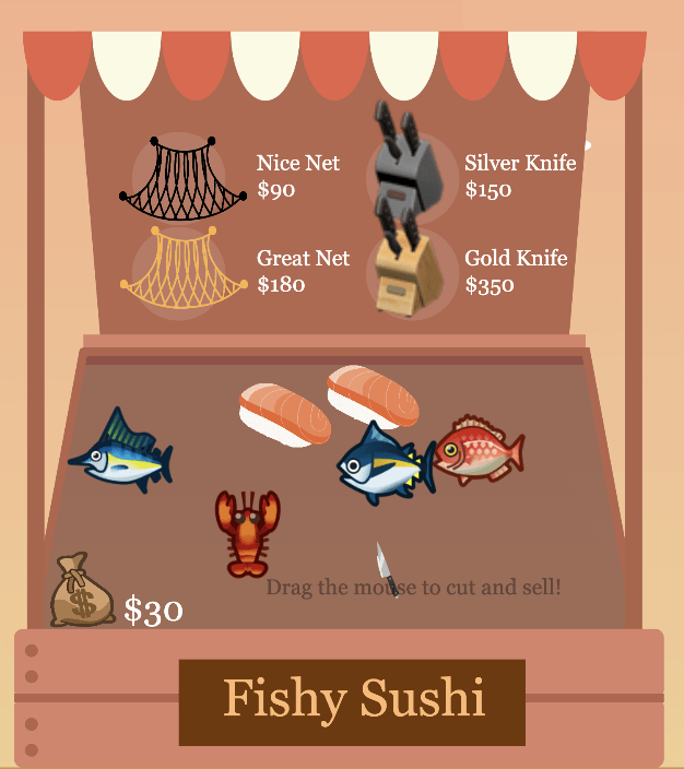
Project Name: Fishy Sushi

Link to the Sketch

Description:

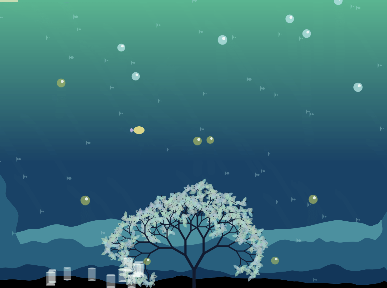
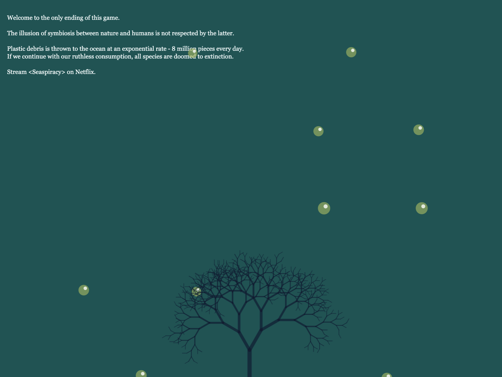
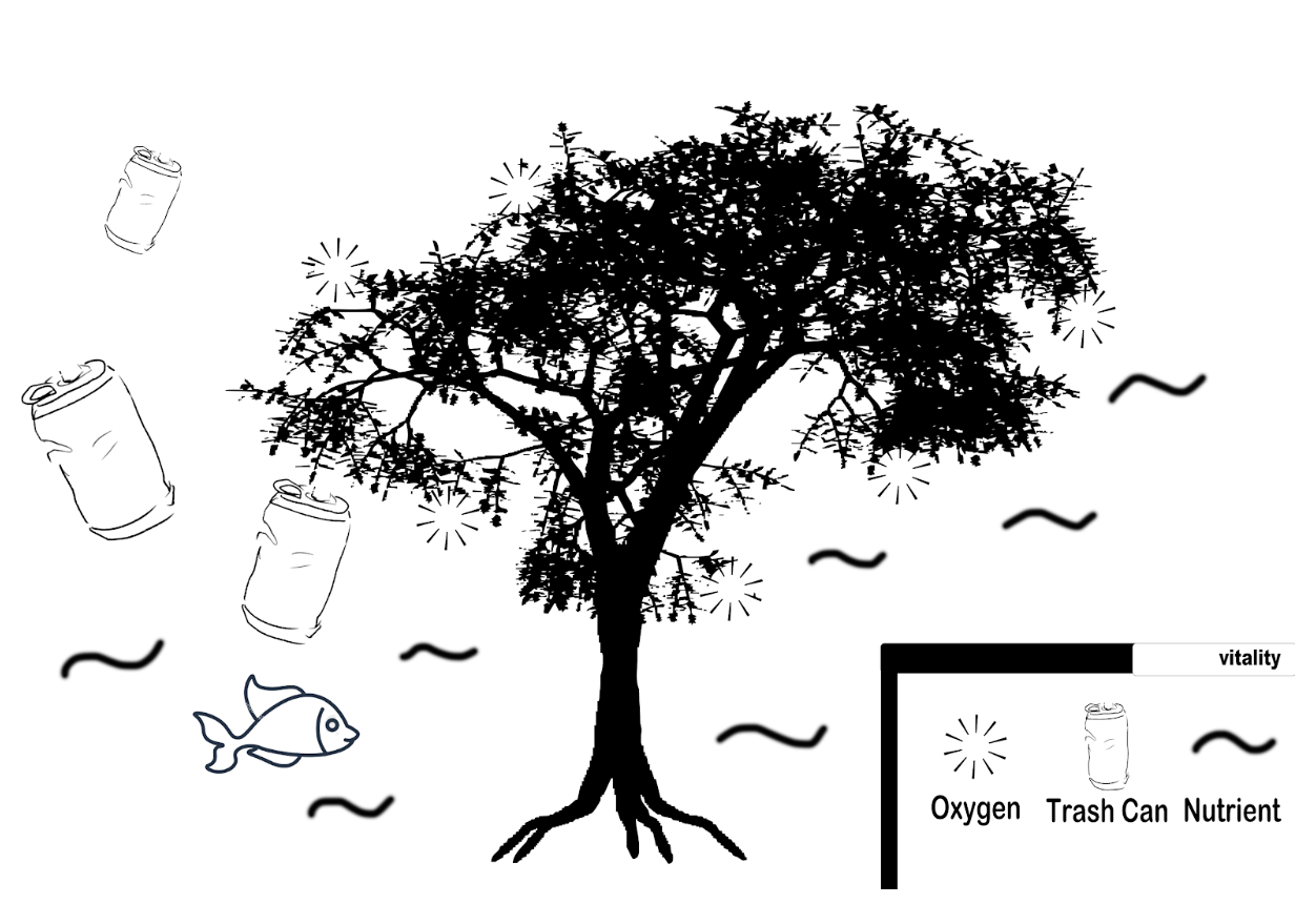
The idea is inspired by the Netflix latest documentary hit <Seaspiracy> which unfolds the cruelty of the marine fishing industry. From our Interactive Experience Project, we held the belief that it is the human pollution that continues to drive the extinction of a series of marine species, which destroys the balance of the biological  chain. Now, with more knowledge and exposure to the truth, we decided to build on the concept of the last project and design another game to communicate our concern to the underwater ecosystem. We’d like to create a sushi business, with sushi serving as a major human consumption of rare marine species like bluefin tuna. We hope to create the entire process of fishing and turning the creatures into dishes. There will also be a monetary system that adds interaction and variety to the design.
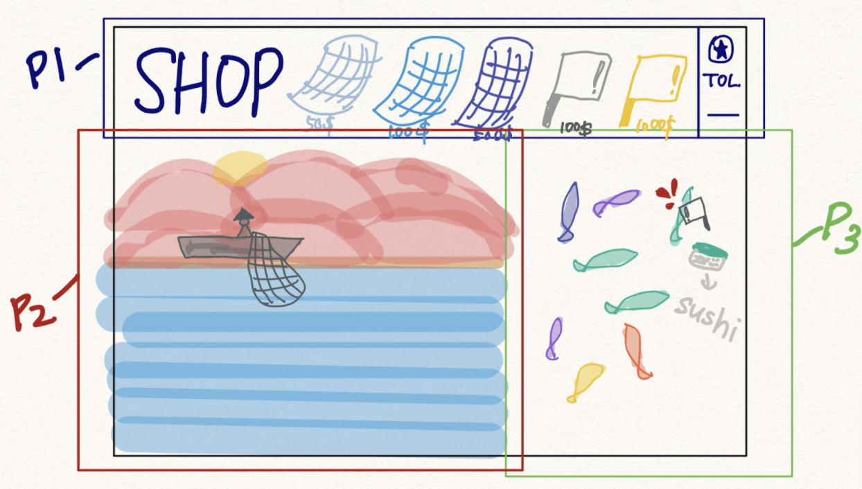
Instructions:

  • Press Left & Right arrows to control the fisherman
  • Press Down arrow to capture the passing fish
  • Shake the mouse to make the fish into sushi
  • Drag the sushi to the wallet to sell them
  • Click the equipment above to buy them

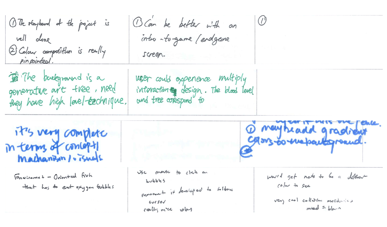
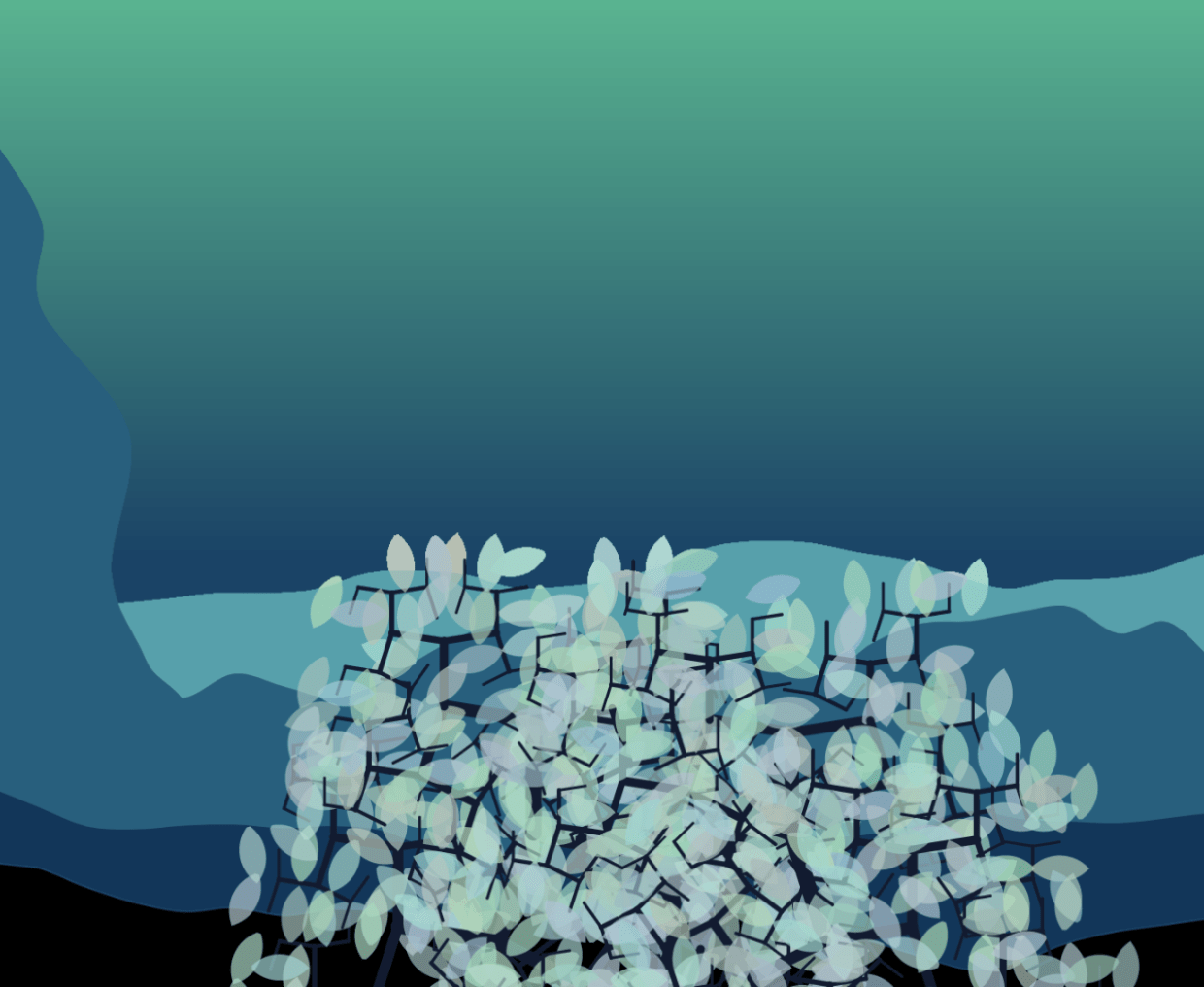
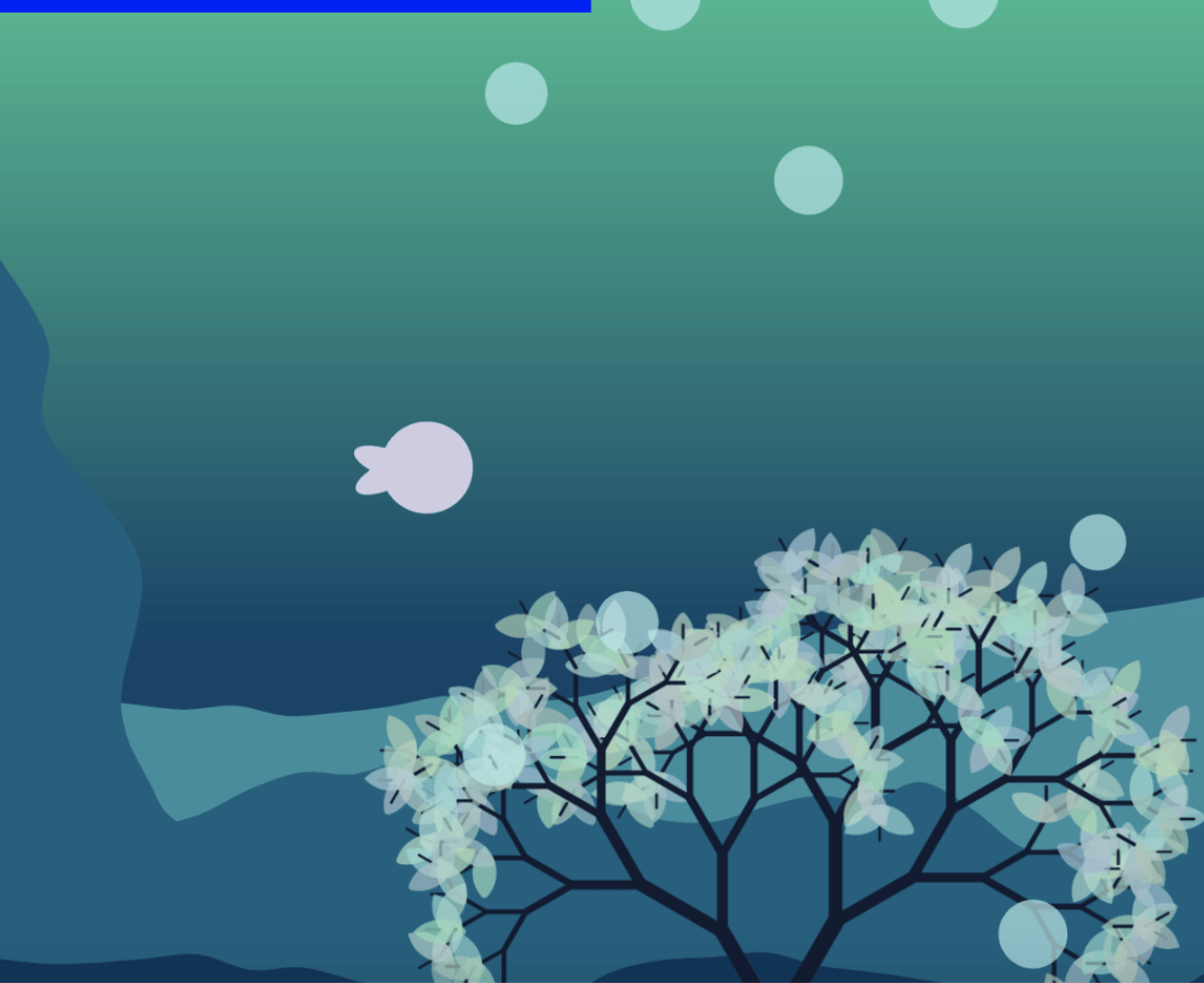
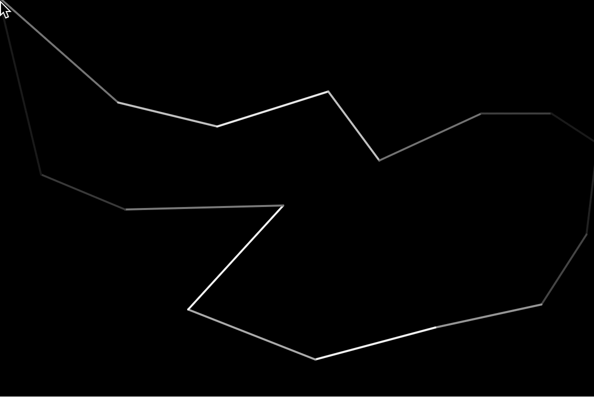
Project Video Demo & Screenshots

Evaluation of Learning Goals:

Previously, I designed my learning goals for this project as the following in the project proposal:

“A more intensive practice of programming using the p5 library which is the most prominent part of this course that can prepare ourselves for advanced electives in interaction design. Besides, it is also interesting to be exposed to the thought process of game development and involve the consideration of persona, user testing, etc.

In short, the specific goals can be defined as 1) more exposure to objects & arrays; 2) a meticulous planning process to design an minimum viable product for a game.”

Learning Goal 1 – more exposure to objects & arrays

Despite the challenge that during the project process, my teammate Cyrene and I had to work separately for most of the time thanks to the difference of our schedule, I think I have gained a great amount of valuable exposure to objects and arrays in p5. 

For example, one major interaction of “chopping the fish and turning them into sushi” is built up from a complex class by me.

class Fish {
constructor(x, y, r, image, suimage,pri) {
this.x = x;
this.y = y;
this.r = r;
this.image = image;
this.suimage = suimage;
this.prevNotInsideFishState = "outside";
this.chopvalue = 0;
this.visible = true;
this.pri=pri
}
draw() {
if (this.visible) {
image(this.image, this.x - 64, this.y - 64);
} else {
image(this.suimage, this.x - 64, this.y - 64, 150, 90);
}
}
mouseDragged() {
let state;
if (
mouseY > this.y + 84 ||
mouseY < this.y - 84 ||
mouseX < this.x - 120 ||
mouseX > this.x + 120
) {
state = "outside";
} else if (this.x - 100 < mouseX && mouseX < this.x) {
state = "left";
} else if (this.x < mouseX && mouseX < this.x + 100) {
state = "right";
} else {
state = "inside";
}

if (
(state == "left" || state == "right") &&
(this.prevNotInsideFishState == "left" ||
this.prevNotInsideFishState == "right") &&
state != this.prevNotInsideFishState
) {
this.chopvalue += 1;
}
if (state != "inside") {
this.prevNotInsideFishState = state;
}
console.info(mouseX, mouseY);
if (this.chopvalue > slicetimes) {
this.visible = false;
this.chopvalue = 0;
}
if (this.visible == false) {
if (
mouseX < this.x + 60 &&
mouseX > this.x - 60 &&
mouseY < this.y + 60 &&
mouseY > this.y - 60
) {
this.x += mouseX - pmouseX;
this.y += mouseY - pmouseY;
}
}
}

mouseReleased() {
if (
mouseX < 180 &&
mouseX > 80 &&
mouseY < 700 &&
mouseY > 600 &&
mouseX < this.x + 60 &&
mouseX > this.x - 60 &&
mouseY < this.y + 60 &&
mouseY > this.y - 60
) {
this.x = -500;
this.y = -500;
money += this.pri;
}
}
}

To figure out the proper structure of this class that both incorporates the image of the fish and the sushi was a time-consuming challenge. Initially I was always stuck with the idea that since sushi and fish are different objects, technically they should be separated from each other. However, sometimes the best solution just came in a blink of an eye. As I constructed the more complex class for the fish, which includes the mouse chopping effect with the bloody bubbles, I suddenly came to know that the constructor might just take another parameter as the sushi image. Then, I modified the class code to allow different images to appear when their corresponding conditions are met. I found the process for writing this piece of code intellectually inspiring, not only regarding executing with p5 the programming language itself, but the broader and more general analytical thinking as well.

Learning Goal 2 – a meticulous planning process to design an MVP for a game

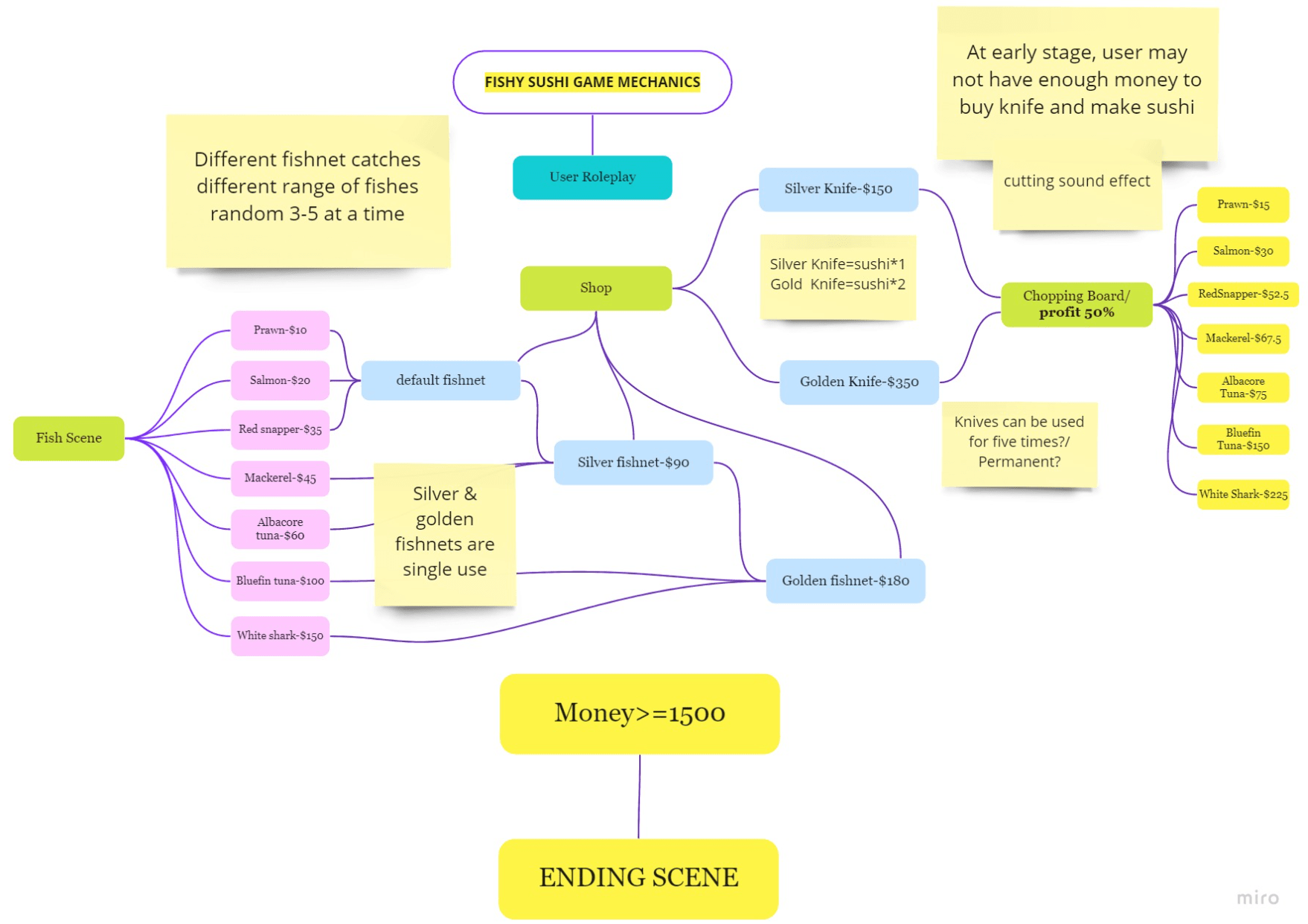
—I do think we have achieved this goal well in terms of not only the interface visual designs but also the game flow, user interaction, and other practices. Especially in the inception of this project, Cyrene and I spent the majority of time sketching out the storyboard and user interfaces for this project before starting to code. Here are the finalized storyboard and the game flow we have created along the process.


Recitation 10 – Data Viz

GitHub Link

In this small engineering exercise I got familiar with the introductory setup process of GitHub, Git and Visual Studio Code. The process was very frustrating to experience in terms of the difficulty to figure out the logic and connection between each segments. I encountered problems with downloading Git at first, realizing that the common practice for installing from the downloaded package on Mac is to change the privacy setting. Then, with the professor’s help, I also solved the problem of pushing my local code to GitHub from Visual Studio Code, which somehow gives out a sense of how engineers work and collaborate in a project of greater scale by each contributing on their local repository and pushing it to the cloud later.

On the coding side, there was not much to dive deeper into at this time. I connected the dots with lines by positioning them from the structure of the JSON file, which is similar to the syntax and construction of arrays.

Final Project Directions

Direction 1

  1. What is the big idea?
  • The idea is to develop our Interactive Experience project further into a more polished game that echoes better with the heated debate on the fishing industry provoked by Netflix’s documentary Seaspiracy. We are thinking of adding multiple pages and conditions to illustrate the dynamic interaction between the status quos of the tree, fish, and the overall ecosystem.
  1. Would it start with a new idea, or does it build on previous work from this class? If the latter, what makes it a significant new project?
  • As described above, this is an extension of a previous project. What makes it a significant new project is the expected more meticulous interaction it should have that aligns with common practice of a prototype in game development. So far the project feels a little squeezed with everything wrapped in a nutshell and users’ performance is limited to clicking, collecting, and avoiding bubbles and trash cans.
  1. What concepts or technologies would it use?
  • The concept remains in a larger context as environmental protection. However this time around we aspire to narrow it down to the cruel reality of fishing while decreasing the emphasis on pollution. In terms of technology, most of it should still come from the practice of programming languages like OOP and arrays but in a more advanced manner than midterm. We are not yet sure if this direction can also incorporate any kind of data visualization. 
  1. What would you hope or expect to learn from working on this project?
  • Scofield: A more intensive practice of programming using the p5 library which is the most prominent part of this course that can prepare ourselves for advanced electives in interaction design. Besides, it is also interesting to be exposed to the thought process of game development and involve the consideration of persona, user testing, etc.
  • Cyrene: My hope is to better understand arrays and objects with its implementation to code a tree with animations and controllable leaves (for example) continuing last project. However, I would also love to delvelop a second episode of the general topic of environment protection. It can be set in a desert where we can probably play with the noise function, or it can be set in a forest where we can create a side road and make the interactive experience like a Scavenger Hunt.

Direction 2

  1. What is the big idea?
  • The idea is to experiment different kinds of programming presentations of facial expressions. During our photography practice, we are interested in the area of portraiture where the people’s microexpressions play a significant role in the connection between the photographer and people. We might want to create an art piece that celebrates this kind of relationship – trust, surprise, collaboration, etc. in the moment when a person is being pictured.
  1. Would it start with a new idea, or does it build on previous work from this class? If the latter, what makes it a significant new project?
  • This starts as a complete new idea.
  1. What concepts or technologies would it use?
  • The technical tools we imagine using the most is from what we learned after the Interactive Experience project. We love the visual display in the example from the pixel array slide about the various manipulations of a person’s facial expression. So we could start from there and see what we can add beyond just playing with pixels, which we predict can be combined nicely with the knowledge prior to the midterm.
  1. What would you hope or expect to learn from working on this project?
  • Scofield: A hands-on practice and thought process of producing a digital piece of fine arts. I was fortunate enough to have met some artists currently in the industry and got to know the exact process of producing a piece of artwork, and delivering it to museums and galleries. I’d like through this direction to practice the first half of the process and also think further about how and where this interactive artwork about faces can be displayed – maybe in an installation, in a dark room, etc. Besides that, I’d surely expect the continuous advancement of my programming skills especially in the direction that relates to digital imaging.
  • Cyrene: Through the exploration into webcameras and facial recognition, I hope to develop a set of pieces of coding work with distinguished visual metaphor to demonstrate individual facial recognition. I  wish to interpret human moods and facial expressions in a meaningful but artistic way, applying psychological and biological knowledge.

Direction 3

  1. What is the big idea?
  • A data visualization of a city’s culture and its relationship to the citizens within a social context. At this early stage, some of the  key words come to mind are museums, brand, advertisements and subway stations. We will continue to work together to clarify a specific topic in the coming days.
  1. Would it start with a new idea, or does it build on previous work from this class? If the latter, what makes it a significant new project?
  • This is a brand new project. We have decided to challenge ourselves to make it into a highly interactive data visualization, and if possible, in a 3-D version (very likely to try).
  1. What concepts or technologies would it use?
  • P5.js as our main coding tool and Adobe Illustrator as our main visual design tool.
  1. What would you hope or expect to learn from working on this project?
  • Cyrene: I hope to get a basic understanding of how WEBGL works. More importantly, this project will equip me with the ability to use coding as a skill for a practical purpose. I wish to combine the narrative storytelling of a city civilization with an effective visualization (or what is called data journalism), to best illustrate how I perceive the world and culture around me. 
  • Scofield: I think this is a novel and engaging project that really drives us to stretch ourselves out of the idea of ‘interaction’ that this course has laid much emphasis on. Instead, we start to explore another spectrum of coding that is interwoven with a greater social context in terms of people’s welfare, behavior, and the urban landscape. We are able to brainstorm how data can be visually presented, designed, and categorized in a meticulous manner. I do expect millions of technical difficulties that arise along the way. However, I’m very much looking forward to the ideation process and the thoughts behind every decision to visualize the numbers into sketches. 

Going deeper – Direction 3

Topic Inspirations: 

The Rhymes Behind Hamilton

Urban Tree Networks from Senseable MIT

StockHolm Stad from Senseable MIT

Airbnb

Deardata (more general but emotional topics)

How the Pudding team uses Mapbox?

Visual Inspirations:

Galaxy of Covers

Tasty data from Senseable MIT

Unfolded

Interactive Portrait – Painting Lady

Interactive Portrait – Painting Lady

link to my sketch

In this recitation exercise, I manipulated a painting from an artist I was fortunate to work with before that wildly communicates post feminism through her meticulous color palette and subject matters.

I experimented with the pixel arrays by first setting up a variable r that maps the value of mouseX from 0 to height to 10 to 100. Then I utilized a nested for loop to grab part of the pixels by incrementing x and y axis by 5 and r respectively, which jumps from pixels to pixels and provides space for me to draw larger rectangles later. Then I obtained the color value of the positioned pixels by img.get and drew out rectangles with it. Finally, the image takes on a nice effect where the pixels seem to have been enlarged but the color palette and overall structure and aesthetics are maintained finely. I especially love the flowing vibe from the larger rectangles which echo with the showering theme of the painting.

Interactive Experience – Symbiosis

Link to the Project: https://openprocessing.org/sketch/1154659

Concept

Our concept is the symbiosis and coexistence of the two ends of the world. Imagine a world where the land is turned upside down. All the species would have to live on the nourishment in the water. We’d like to depict a simplified version of this ecosystem to stress our love and concern for the sustainability of our planet.

We will sketch a banyan tree underwater with its leaves slowly growing and generating oxygen for the system. There will be a little fish at the beginning who is fed by the nutrients falling from above. The fish accelerates the growth of the tree while it has to constantly collect the oxygen bubble from the tree to stay alive. Sometimes, there will be trash cans falling which, if the fish fails to catch, would pollute the ecosystem and impact the health of both the fish and the tree.

User Testing Feedback

Concept and Project Execution / Interaction Design / Other Comments

Project Diary

3/21:

After our discussion about the concept and estimation of our technical ability, Scofield sketched out a simple storyboard as a representation of Minimum Viable Product.

We expect to start drawing all the visuals out with code from today.

3/22:

In our meetup, Cyrene did a little more research in terms of how our visuals would look like as well as the color palette. After that, she sketched out the underwater background of our project. Scofield found out about the Algorithmic Botany channel from Daniel Shiffman’s The Coding Train to look for inspiration and solutions for the major tree structure in our project. However, it turned out that the programming in that particular channel was done on Processing and made use of linear algebra which neither of us is familiar with yet. We then decided to come back to utilize the translate() and rotate() to sketch the tree out.

During the process, we encountered a major and common problem, that is, to find solutions that would stop the tree from looping without noLoop(), which prohibits the looping of everything in our code. When we went to Professor Steele for help, he first showed us the frameRate from the console to demonstrate how much calculation time the tree structure is occupying. Then, we discussed that it would not be ideal to solve it by changing random() into noise(), etc. which would later still impact the flow of the loop of other elements in our project, as the calculation time is still not close. Professor advised utilizing createGraphics() to place the  tree fully on top of the canva so its effect is separated from the main code.

Scofield experimented with this strategy afterwards and was puzzled by which functions should we add pg. , that is, the name of the graphics, before the functions’ names. We learned from Professor that in most cases, the drawing functions are what needs to be prefixed. However, the result looks like this –

It seems that there’s still one parameter that is not yet incorporated into the graphics. And we found out that it was angleMode(). This is a valuable lesson to learn that the underlying functions like angleMode(), rectMode(), that determine the formula drawing functions follow should also be added to the graphics as well. So here’s the desired outcome we’ve achieved – 

3/25: Presentation Feedback

Professor: some mechanisms to make the tree sway to correspond with the underwater scenario – we will consider adding this after we tackle the major interaction point in case we spend too much time on additional visuals.

Reflection: We are a little afraid that we have allocated too much time on the visuals. It is urgent for us to start working on the interaction design part in a timely manner.

3/27-3/28:

We have roughly discovered the technical approach to designing the vitality bar to represent the HP of the ecosystem. On our own test run, a question regarding the current stage of the project is that the vitality bar decreases too slowly in a spontaneous manner. Therefore it is unlikely for users to actually expect the crash of the ecosystem as the bubbles provide extremely high add-on to the overall vitality. Therefore we need to find a way rather than lowering the frameRate for all to match the extent of the natural decrease of vitality and the increase brought by oxygen bubbles.

Scofield will design the trash cans the next day in a similar mechanism with the rising bubbles and its interaction with the fish. A side note here is that we still expect to polish the visuals a little more especially on the details of the fish and the color palette of the vitality bar. Currently they look a little bit plain and rigid.

3/29:

Today Scofield has finished the falling trash cans as the last major visual component of our project. To echo the overall aesthetics of the underwater scenario, the trash cans somehow fail to take on a usual and recognizable look with simplified shape and certain transparency. While Cyrene adds the trash cans back to our main code, however, we discovered that it appears abrupt with the oxygen bubbles that float upwards from the trees. They both appear in a number that is large enough to cover the entire screen, which hurts the elegance and tranquility of the visuals. This needs reconsideration.

3/30:

We figured out lately that it is both conceptually and visually better to keep the trash cans at the bottom of the screen. While we came up with this, Professor also suggested that the trash cans can be given a floating effect to go up and down iteratively in a range. This nicely corresponds to the context that the story happens underwater.

3/31:

We are making major final changes to the project today. We got the feedback on the general game design perspective that a game usually gets more fun and appealing if the difficulty increases over time. Therefore, we thought of adding another type of bubble – toxic bubble that would decrease the life value of the ecosystem. This also makes up to the error that it doesn’t make sense for the fish to eat trash although it occasionally does in real life. Moreover, we also considered that the ending could take on a more philosophical and interesting look by being one-way, meaning there’s only one ending that the ecosystem would crash down. This aligns with the reality of humans’ exponential rate of marine pollution while also speaking to the recently released documentary <Seaspiracy> on Netflix.

4/1:

In the morning before our presentation, we picked up a piece of soundtrack of deep ocean to add as the background music of our project as the last step 🙂

Interpretation of Result

I think our final outcome of this project largely echoes with the initial perception of how it would take form. The concept of sustainability and underwater setup was immediately conveyed once we sketched out the gradient background with the color palette pinpointed. We expected the difficulty along the way at the beginning – the life value bar, the interaction between the fish and other objects, and the tree structure. Although we haven’t achieved the ideal solution for each one of them, they are at least complete and can be integrated into the game mechanism.

Life Value Bar – We considered this as the most hard trouble to tackle before we started. We Googled relevant solutions but found the materials out of context and are bundled in much more complex structure of programming. Therefore, we figured out the way of just using rectangles to represent the life value by its length, which worked just fine. We set up a boolean variable so that it controls whether the rectangle’s length would increase, decrease, or maintain the current status.

Interaction between fish and other objects – This serves as the core value proposition of the project. We went through a lot of experiments to arrive at the final version. It was a good decision to distinguish the visual of hitting the oxygen bubble and toxic bubble. However, I wouldn’t say it doesn’t have any room for improvement. So far, the game still feels a little monotonous with the fish constantly going up and down with a single expected behavior.

Tree Structure – We asked Professor Steele for help with this a lot. Initially we had the tree built up using functions, which somehow limited our use of it with the fact that it is generative. After solving the problem of its iteration on canvas by moving it to the graphics, we had the idea of transforming its language into a class. But we did not end up with sufficient time to make this polish happen, which we both regret and would definitely do if given more time.

Objects and Arrays – Plague

link to my sketch

This exercise turns out quite similar to the last one but I’ve gained a clearer understanding of how objects and classes work in JavaScript by adding more methods rather than display as well as other visual variations.

I created this simple particle system to express the feeling and behavior of spreading, encountering, and transforming. I started off the same as last time by brainstorming what kinds of properties a snaky ray would intrinsically have. Sooner than before, I was able to test run successfully a single ray from which I managed to build on its relationship with the frontiers and color change.

At this point I also gradually realized how important the chosen color palette is to the overall presentation of a coded visual. Sometimes it does take some time to figure out the nicest combination to even convey the little concept in a small piece of exercise like this. For example, the usual theory of contrast color doesn’t actually work finely in this as the yellow would bring too much energy and delight that doesn’t align accurately with the heaviness of the black hole and fading of purple rays. Instead, a dark denim blue may fit in quite well.

Object-Oriented Programming – Error

link to my sketch

In this recitation exercise I explored the fundamentals of Object-Oriented Programming by generating an cyber ‘error’ message in a text box.

I started my thought process by thinking about what core properties do a text box containing the text ‘error’ has. They should include the x and y positions, width and height of the text box. Therefore I wrote the constructor() function with these four parameters to initialize my sketch. The next step is to use drawing functions to allow the numerical properties to apply to a tangible shape. I then created the display() method under the class with functions like text(), rect() and a desired color palette setup. This is to make sure that when I create an object from this class by calling “new Error” and display it, I can successfully see it take form on the canva, which is a critical point for other add-ons.

After the display() works, I started to brainstorm other properties for the error message, like textSize(), distribution on the canva, potential rotations, etc. With these in mind, I recalled our practice of translate() and rotate() a couple of weeks ago and applied them here. I found myself forgetting about the fact that after you translate(x,y) then the position (0,0) would refer to the (x,y) on the previous canva. But it was scanned out later! Other than this, I struggled a little on whether we should add arguments to methods besides constructor() as I found the issuance of this.xxx in other methods are somehow hard to grasp the logic of. With the help from the professor, I was eventually able to distinguish their relationships and created the rotating and ‘paralyzing’ effect successfully with the use of speed().

I also found arrays extremely critical in terms of scaling and looping the objects. It also finely stores all of them for possible future reuses.

Generative Visual – Atomic Illusion

Generative Visual: Atomic Illusion

Final Visuals


Process Documentation

The idea of this project is originated from Sprawl by Mark J. Stock. Stock’s piece does not incorporate a highly complex code structure and methods, but manages to contrast two seemingly different growth patterns in a sharp way: the railings as ‘preconceived, designed, restrained, and considered artificial’; the tree branches as ‘impulsive, disorganized, unconstrained, and natural’.

I’ve also found the patterns in Stock’s piece less distant from a beginning programmer like myself as Stock is able to create the visual with basic geometric shapes in a progressive manner.

Week 2 Checkpoint

I started my project by exploring the contrast of order and disorder with common shapes like lines and circles.

The majority of my time in the past week has been dedicated to building up the structure of a spreading function that can, seemingly randomly yet with a tree-like pattern, display shapes in the canvas. I did a little research to find out the structure is mainly accomplished by using translate() and rotate(). I tuned each of the functions’ input on p5js Web Editor in auto-refresh mode that sped up the process effectively. And I was able to achieve the results as shown by the screenshots below.

I made the visual refresh using the mousePressed function and switch from the disordered one to the ordered while the frameCount reaches 5.

As for the next step, I’m attempting to brainstorm more details about the expression or order and disorder in addition to the basic shapes I have incorporated so far. I also want to experiment with color gradient in the background as I find it might serve as a nice add-on to the visual of my project. I still haven’t decided whether there should be any kind of animation, movement, or interaction yet. I will keep considering if that fits the overall presentation.

Week 3 Checkpoint

I was content with the core aesthetic representation in my project done in the last week, that is, the random whirlwind structure where circles and lines are most often scattered but connected once every 4 iterations. However, the thorny issue at the moment turns out to be that it is rather difficult to continue to add more elements or graphic consideration to the whirlwind as I’ve rendered it uncontrollable possibility of filling the entire canvas. I attempted to manipulate the whirlwind’s relative position on the canvas, either inclining to the left/right, but discovered that few other visual elements within my programming reach can echo with the whirlwind nicely by aligning with one another and each occupying half the space.

I’ve then come up with the idea of proportionately reduce the size of the whirlwind by situating it in the middle and leaving space on all sides of the canvas for other creative inputs. This approach eases the pressure on the visual of the whirlwind which sometimes can get a little too haphazard and overwhelming. It is also at this point when it occurred to me that this graphic resembles a transformation process of atoms. I decided to change the color scheme from bright yellow and denim blue to black and red, which fits better with my personal imagination of the physical, mechanical, and microscopic landscape. I would also attribute my immediate change of the color scheme to my obsession with Japanese shrines that usually feature a feast of the red color palette. I have no idea why I tend to connect the atomic transformation to the sacred territory of Japanese cultures. But the simple yet interesting combination of circles and lines keep reminding me of representative objects oftentimes seen in those shrines, like lanterns and candied haws on a stick.

Inspiration Along the Way – Japanese Shrines

Week 4 Checkpoint

The final touch on this project is to add more elements on the rectangles along the side to set off the whirlwind structure. Returning to my inspiration, which is Mark J. Stock’s piece that vividly presents a contradiction between constraints and growth, I realize my project somehow lacks the presence of power and control. Luckily, as we start to explore the sin(), cos(), noise(), and random() in class, I discovered that this family of functions are a good option to generate a light, uncertain, yet steady presentation of shackles. I incorporated mainly the noise() function with frameCount that brings in the flow of the time to establish a matrix-looking, four-sided, magnetic field.

At this point, the project seems almost complete until I suddenly realize a more delicate contrast of the whirlwind and the peripheral field can be crafted with a simple if statement. Since every 4 iteration, the whirlwind will connect with each other to generate a tree shape, I wonder why not stress this thermonuclear-ish vibe by allowing it to break through the constraints. Hence, I modified the code to manipulate the appearance of the rectangles also with regards to the frameCount to be consistent with the iteration of the whirlwind.

Reflection

I am fond of the eventual visual of this project as it surprisingly goes well against my initial expectation of applying various color schemes, complicated shapes, and user interaction. Sometimes a single stream of one color can find its way with black, grey, and white in a proper manner.

On the technical side specifically, I dedicated the most of my time for this project exploring and experimenting with the family of transform(), rotate(), and scale() to construct the whirlwind. This was actually inspired by my proviso little programming knowledge in analytics on Python where we build up a decision-tree to sort and filter different parameters of a data frame. I borrowed the idea of conditionally adding depths to the decision tree to Javascript to create the randomly generated whirlwind.

The most troublesome technical issue encountered in this project was to deal with the relationship between draw(), redraw(), noLoop(), loop(), and frameRate(). I simply cannot let the whirlwind appear too fast as it derives its aesthetics away by not giving enough time for the audience to examine its organization. But setting up a low frameRate at the beginning would manipulate all the frameRate in this project, which would make my use of the noise() function very unnatural. I tried to use createGraphics() to resolve this issue but received feedback from Professor Steele that it also is inferior to the setting of frameRate(). Therefore, I can only switch to use division, multiplication, and other mathematical manipulation on the frameCount to control the speed. This was a time-consuming process but indeed motivated me to closely assess the corresponding relationship of different functions concerning the time frame.

Ideas for Improvements&Advancement

I could foresee this project as a starting phase of a sci-fi generative arts piece. I feel that sometimes it works better to go back to the most basic geometric shapes at the beginning when my programming experience is limited. However, in the future, I’d possibly like to abandon the simple circles and lines in the whirlwind structure and instead create more sophisticated shapes like lightnings, water waves, or a more realistic representation of atoms. I could also think of changing the style this project is delivered from showing one iteration roughly each second to a smoother manner. Perhaps the style of the turning of a gear system is an interesting way to go for.

Imaginary Creature – a goblin

link

For this week’s exercise, I’ve sketched a goblin that is a common imagery in horror movies. During the process, I continued to realize and practice the thinking pattern of a programming language that heavily relies on the coordinate system.

translate() function is profoundly useful to mediate the difference between drawing with JavaScript and with a common tool like pens. By switching the origin of the coordinate system back and forth, I am able to position different parts of the sketch in a more straightforward manner. Compared to the drawing exercise of a photo of the living space in week 1, I’ve got rid of the trouble of constantly referring back to the top left origin of the canva, struggling to find the coordinates of different shapes.

The push() and pop() functions serve as a critical supplement to the application of translate, which, however, also demand more logical thinking and structuring especially when involved with rotate() and scale().

To look ahead, I still feel restricted about the current tools and the associated protocols. The programming syntax could be developed better with fewer laborious demand like push() and pop() to prevent the transformation from going messy. I could potentially foresee that there will be more convenient and sensible shortcuts to manipulate the programming language in our favor.

Interactive Drawing

link to my sketch: https://editor.p5js.org/zz2748/sketches/CZWtmLj0s

This week’s exercise leads myself to build up an interactive drawing plane by playing with variables to deliver different results.

// 1.1
function draw() {
  strokeWeight(2);
  if (mouseX <=300) {
    stroke(map(mouseX,0,300,25,255));
  }
  else {   
    stroke(map(mouseX,600,300,25,255));
  }

  line(mouseX,mouseY,pmouseX,pmouseY)
}

1.1 – In this starting piece I utilized mouseX, mouseY, pmouseX, and pmouseY to create a simple drawing-as-your-mouse-go experience. By embedding an if statement to map the width of the canva to the color of the stroke, I’m also able to add a little variety to the sketch, that is, the closer the mouse is to the middle of the canva, the closer it is to complete white.

//1.2
function mousePressed(){
    if (mouseX <=300) {
    stroke(map(mouseX,0,300,25,255));
  }
  else {   
    stroke(map(mouseX,600,300,25,255));
  }
  strokeWeight(2);
  line(mouseX,mouseY,a,b)
  a = mouseX
  b = mouseY
}


 1.2 – By replacing pmouseX and pmouseY with variables that can store the mouse position from the previous mouse press, the drawing rule is switched to connecting lines with the mouse each time which can deliver a more geometric shape.

//1.3
function mouseDragged(){
  if (mouseX <=300) {
    stroke(map(mouseX,0,300,25,255));
  }
  else {   
    stroke(map(mouseX,600,300,25,255));
  }
  strokeWeight(2);
  a = pmouseX
  b = pmouseY
  line(mouseX,mouseY,a,b)
}

1.3 – Experimenting with the mouseDragged function, the drawing experience becomes more feasible than the former two, where a line will be drawn each time the the user presses and drags the mouse and will not if the mouse is released.

//1.4
function mouseDragged(){
  stroke(col.r,col.g,col.b)
  strokeWeight(dist(mouseX,mouseY,a,b)/15);
  a = pmouseX
  b = pmouseY
  line(mouseX,mouseY,a,b)
} 
function keyPressed(){
    if (keyCode === LEFT_ARROW) {
    col.r = 57;
    col.g = 59;
    col.b = 81;
  } else if (keyCode === RIGHT_ARROW) {
    col.r = 43;
    col.g = 44;
    col.b = 62;
  }
}

1.4 – Expanding from 1.3, I incorporate dist(mouseX, mouseY, a, b) to calculate the distance between the current the previous mouse positions and therefore determine the strokeWeight in terms of how fast the mouse is moving. The keyPressed() function allows me to attach different colors to certain keys that contribute to a drawing of my favorable color palette.

Reflection:

This progressive exercise has enhanced my understanding of how programming is mapped to a visual result, which is super fascinating to a coding beginner. I’ve enjoyed the process of constantly circling back to p5.js Reference to read  the argument that a function takes, which can then be utilized creatively under a logical statement. For example, when creating the first sketch, I came up with the idea of mapping the grey color scale to the width of the canva. After understanding how map() works, I was only able to map in one direction, either from left to right or the other way around. However, when nesting into an if statement, I could easily control the degree the direction to which the map functions, which allows me to deliver a map of two direction (left to right & right to left) and potentially even more(with else if statements).

After finishing the four experiments, I also thought of adding more visual elements based on the velocity of the mouse. But I am still struggling with the final result.

//1.5
function keyPressed(){
    if (keyCode === LEFT_ARROW) {
    col.r = 249;
    col.g = 230;
    col.b = 176;
  } else if (keyCode === RIGHT_ARROW) {
    col.r = 236;
    col.g = 208;
    col.b = 45;
  }
}

function mouseDragged(){
  if (dist(mouseX,mouseY,a,b) <= 20){ background(96,95,133) }else if(dist(mouseX,mouseY,a,b) >= 20 && dist(mouseX,mouseY,a,b)<80){
    background(80,79,111)
  } else {
    background(68,67,90)
  }
  stroke(col.r,col.g,col.b)
  strokeWeight(dist(mouseX,mouseY,a,b)/30);
  a = pmouseX
  b = pmouseY
  line(mouseX,mouseY,a,b)
}


 I wanted to add the change of the background in relation to the velocity of the mouse. Although the result I got so far aligns with this goal, I cannot draw out a constant sketch as the background seems to refresh it out all the time.  The final question is reduced to how to arrange the order of each section of the code, which I will reach out for help in the upcoming class.