Magnetic Memories: Explore My Travels🧳
By Sara He 🐾
github code link🛤️ live project link🛣️
Project Description🧲
Explore a world of memories on our website, where users can journey through the refrigerator door to discover a collection of unique refrigerator magnets. Each magnet on the fridge door holds a unique story, serving as a memento from various journeys. Carefully observing each magnet, some come to life, narrating the tales of their travels. Through interactive features, users can delve into the animated narratives behind these magnets, virtually reliving the sights and sounds of past adventures.
In a world 100 years from now, the ways people travel and their destinations evolve and iterate. Simultaneously, more advanced devices may store their memories complete and clear, ensuring they are never forgotten. Placing the refrigerator magnets into a space-time capsule, when future generations discover this website, they can gain insight into how people traveled and used refrigerator magnets or other objects to preserve their memories in this “primitive” manner.
Embark on a journey of exploration as you uncover the rich tapestry of memories adorning the refrigerator door, each magnet offering a glimpse into the traveler’s world.🗝️
Design and Composition🎨
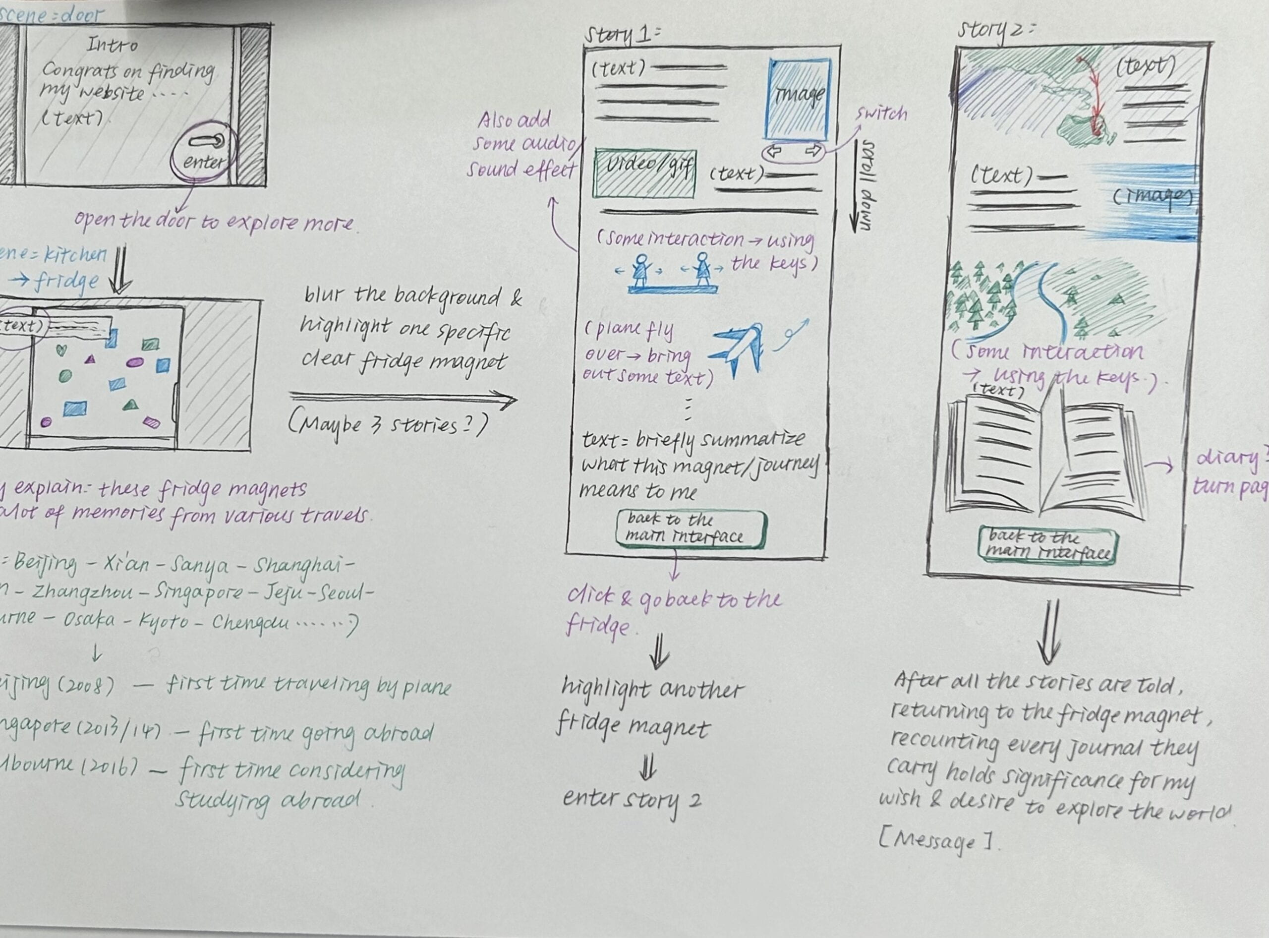
For this project’s design, I aim to showcase a complete storyline. The main page depicts a room scene with a fridge at its center. I created a welcoming page and incorporated a door-opening effect to smoothly transition to the main page. To simulate users approaching the fridge, I implemented controls using six different keys for movement.
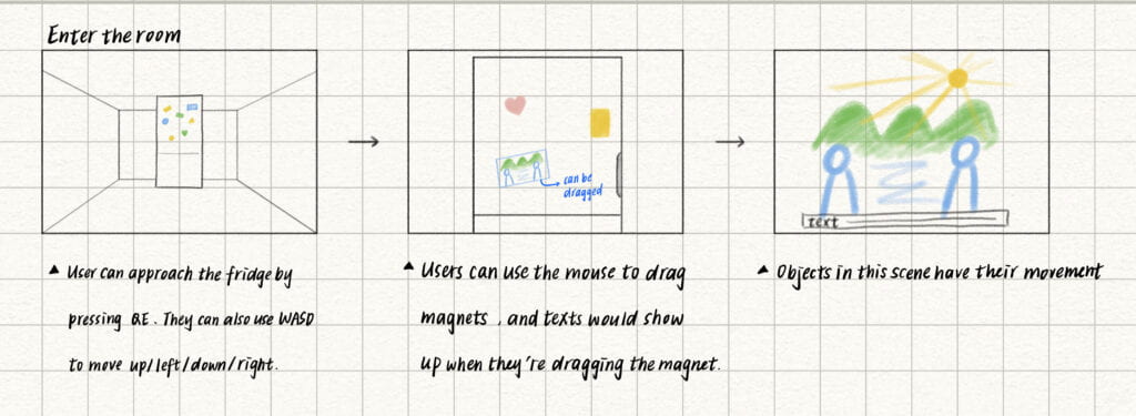
Then, users can go through two stories by interacting with the fridge magnets. In the first story, by pressing the left and right arrow keys, they can view a filmstrip, with the content transitioning from simple sketches to corresponding photographs of real scenes as they move. In the second story, users can place orders and, accompanied by corresponding sound effects, consume the items they ordered. Once they finish eating and drinking, they unlock the second narrative segment.🍽️
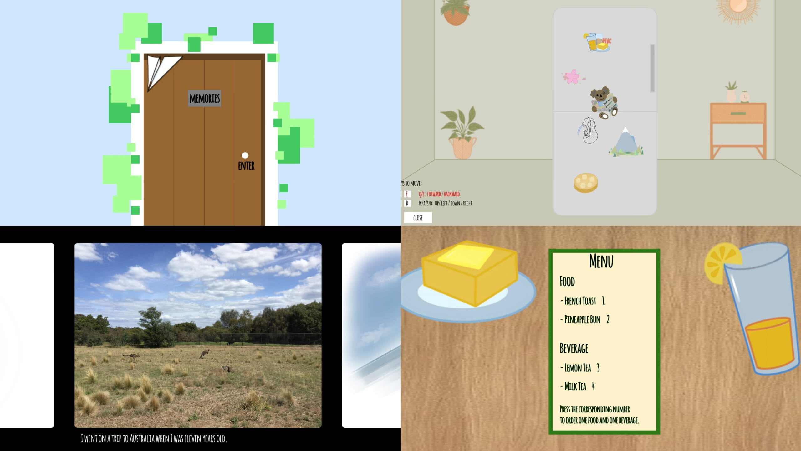
Finally, when users return to the main page, they will see the diary on the ground. By clicking it, they can uncover the real message that I aim to convey through this project.
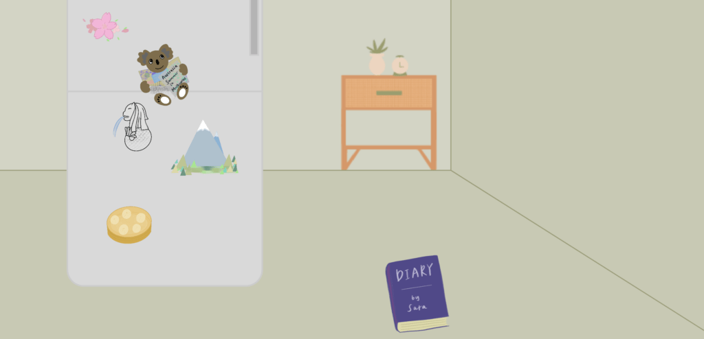
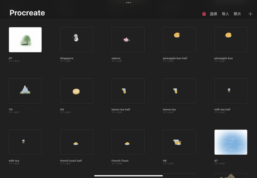
(hand-drawings of lots of elements in this project)
The project mostly reflects my initial vision and has most of its functions working. However, I believe it could benefit from some tweaks in details to make it more functional and visually appealing. For instance, smoothing out the trajectory of the paper plane’s flight on the welcoming page would add realism. Also, adjusting the placement of furniture on the main page and linearly reducing the height of the beverage during consumption in story 2 would improve realism. One minor issue is occasional desynchronization between text and audio, affecting the narrative slightly.
Technical🔭
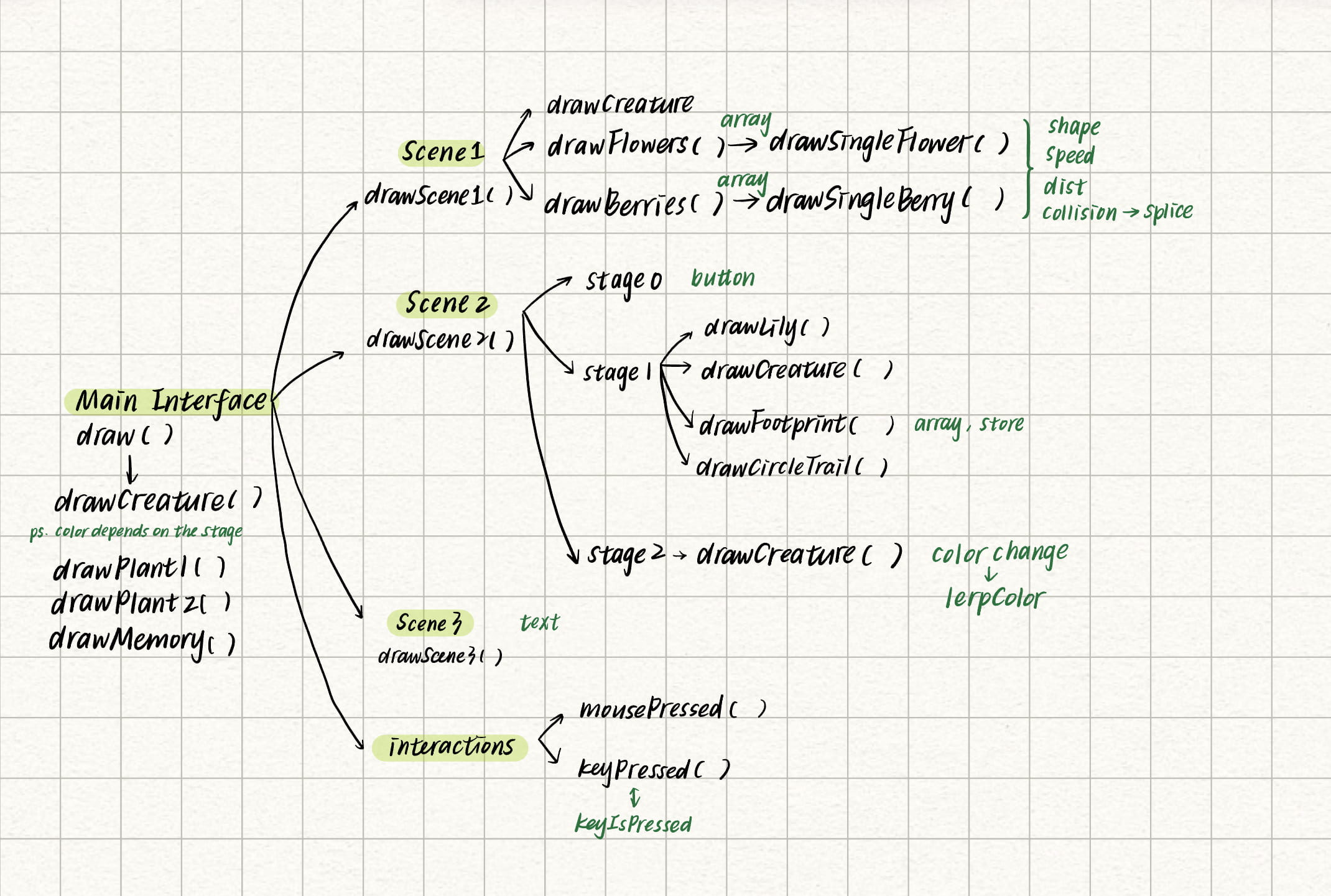
This project consists of four JavaScript sketches. To clarify the logic of the code, I created a mind map to understand the key effects in each sketch and their interconnections.
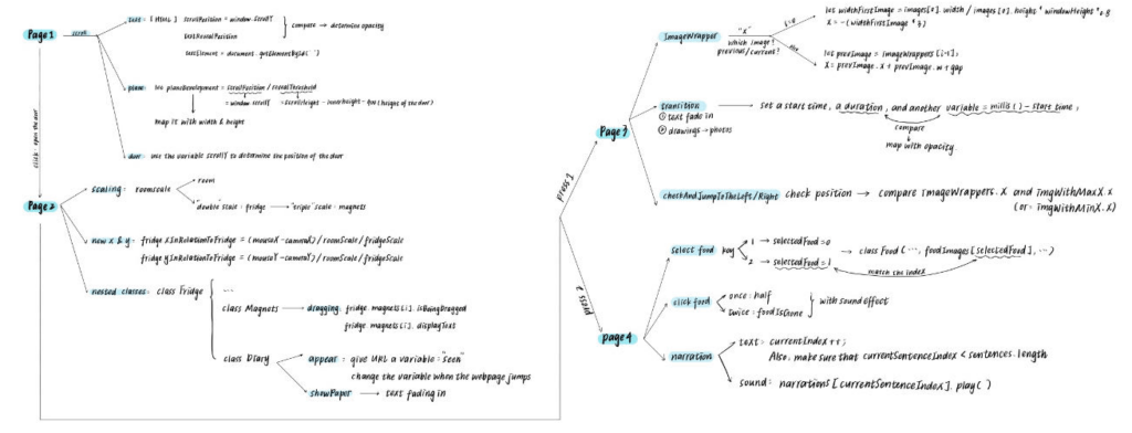
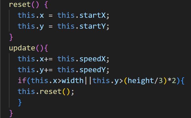
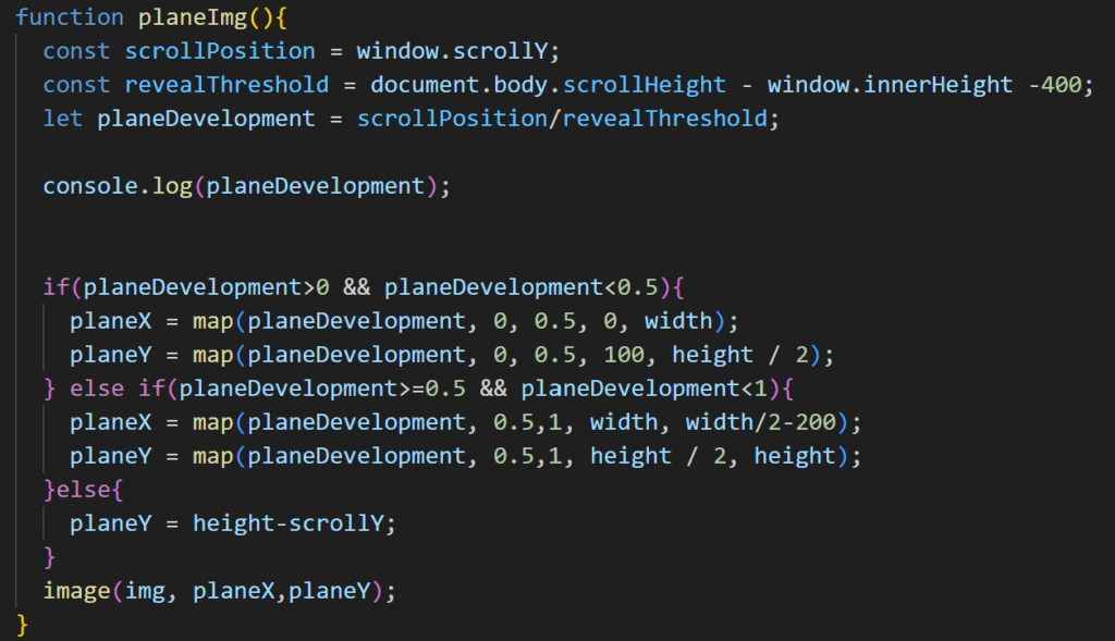
When drawing the paper airplane on the welcoming page, I employed a variable named ‘planeDevelopment’. I determined the position of the plane by dividing ‘window.scrollY’ by a specific ‘revealThreshold’. Then, I mapped its x and y coordinates accordingly.
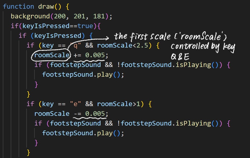
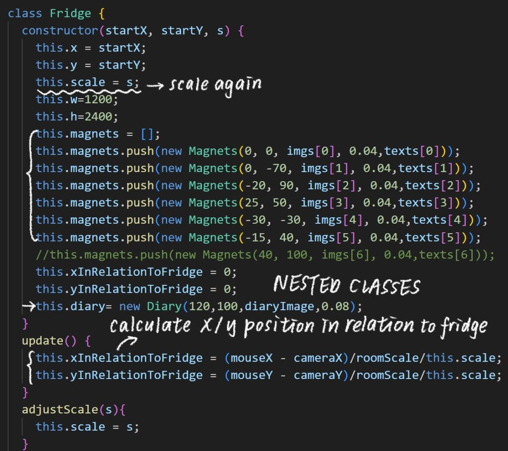
One tricky aspect was dealing with nested classes and multiple scaling. At first, I was quite confused and the scaling wasn’t accurate. But after organizing the nested structure, renaming variables, and applying scaling step by step, recalculating coordinates as needed, I finally got it right.
When creating the imageWrappers, I created the horizontal position (x) for each ImageWrapper. If it’s the first image (when i is 0), it calculates the width of the first image relative to the window height, then sets x to be three times that width but negative, so it appears off-screen to the left. For subsequent images, x is set based on the position and width of the previous image plus a gap.

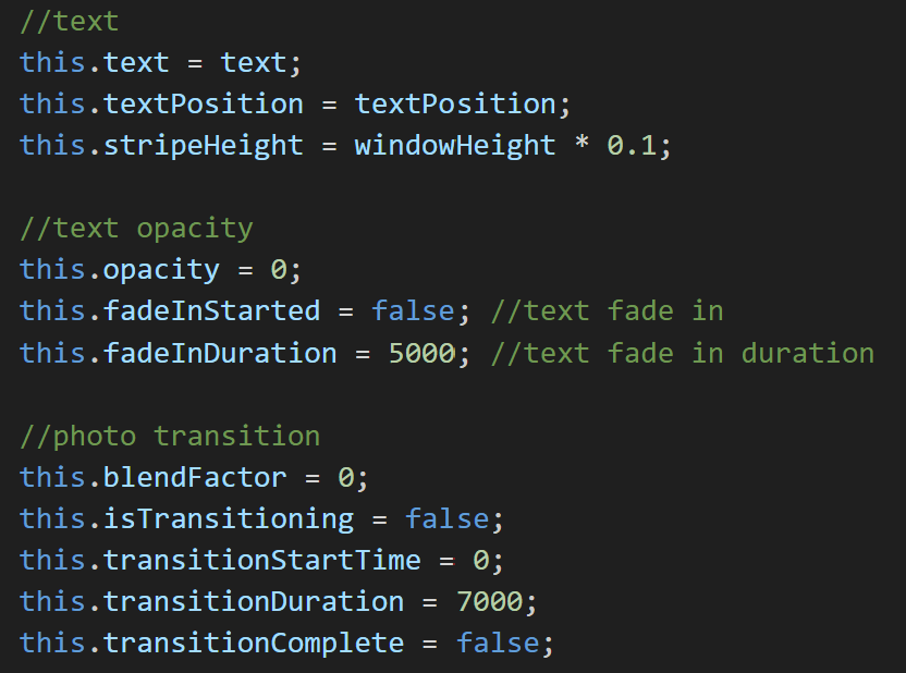
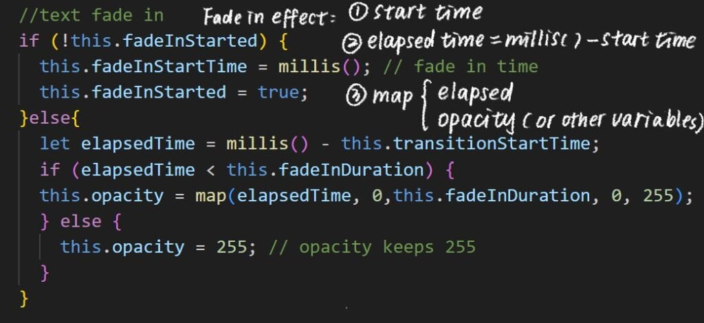
I’ve implemented fade-in effects multiple times in this project, whether it’s for text or images. One common pattern I noticed is that to achieve the fade-in effect, I need a variable to store the start time, then I track the elapsed time. After that, I map the elapsed time to other variables to control the fading effect.
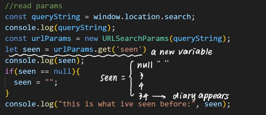
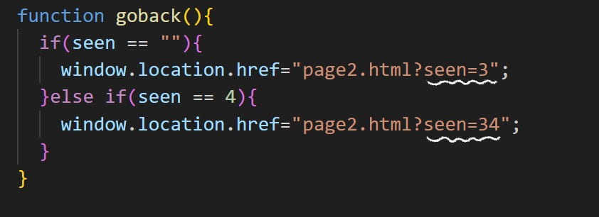
In this project, the diary will only appear on the main page, which is page 2, after users have visited both page 3 and page 4. So, I need to keep track of which pages users have visited. To accomplish this, with the help of professor Leon, I attempted to add a variable called ‘seen’ to the URL. This variable changes each time the user visits a page (and we can see its changes in the URL).
Reflection and Future Development🔮
Reflecting on my project’s journey from its proposal to its current version, I’ve witnessed significant growth. Initially, my ideas were somewhat scattered, and I struggled to find clarity. However, over time, I methodically unraveled the complexities, gradually bringing each component to fruition. This process taught me the importance of patience, persistence, and organization. During the process of overcoming challenges, my understanding of coding has deepened. When meeting with LAs, I found myself able to articulate my ideas more clearly, discuss the approaches I had tried, and explore potential solutions. Additionally, compared to my midterm project, which focused more on creating images and movements, I feel that in my final project, I have made more attempts and applications of logical and functional code, which signifies progress.🙌
As for the future developent of this project, there’s still plenty of room for improvement. For example, making sure the sound matches the text better and keeping the magnets within the fridge door. Professor Marcela also offer me some good ideas, like making the liquid levels go down gradually on page 4 and simplifying the action keys to avoid confusing users.
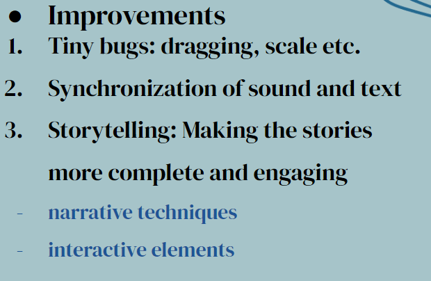
For me personally, what I really want to improve is my storytelling skills. In this project, I’m still using a lot of basic techniques like displaying images, adding narrations, or simply clicking on objects. In fact, after seeing some amazing websites and playing some really engaging narrative games, I believe there are many more dynamic, fun, and engaging ways to explore.
Credits & References📝
Sound effects
- Page1-open door: pixabay-opendoor
- Page2-footsteps: pixabay-footsteps
- Page4-eating and drinking: pixabay-eating drinking
Narrator: Me
Images
- Magnets, landscape drawings, food, beverages, and diary: Me
- Page3-photos: Me and my mom👩
- Page4-Hong Kong background: pinterest
Storytelling inspiration
- Game: What Remains of Edith Finch
- Website: Welcome to Pine Point
Special thanks to Professors Leon, LA Carrot and Danni for technical support.🤩🙌
