Sound Visualization Project: Documentation
Name: Rebecca Xiong
Title of Music: Bohemian Rhapsody
Artist Name: Queen
Concept and Design
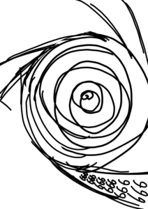
As Bohemian Rhapsody combines ballad, opera, and rock, I plan to show this feature in my design. This song also is divided into different parts with several climaxes, which means I need to create several visual centers in the poster. My first draft features a swirl with three kinds of fonts gathering together in the middle, but it is too simple and can’t represent the changing rhymes in this song.
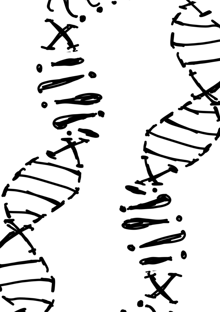
For the second draft, I use the double helix of DNA to show the inner conflicts of the song, but there are still problems: there is no visual center in the picture, and it can’t represent the rhymes.
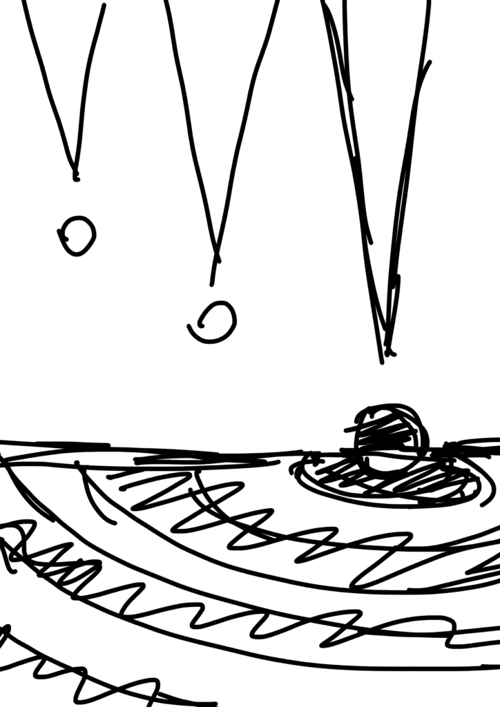
For the third draft, I decide to use exclamation marks to represent the several climaxes in this song, and use different letters in the bottom to represent different genres of music included in this song. This one seems to be better, so I decided to keep working on it and had the first version of design.
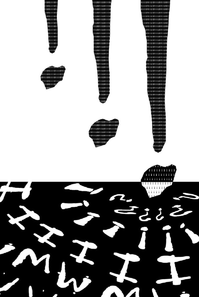
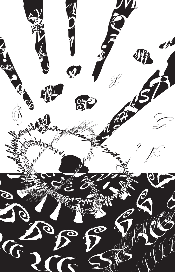
After the mid-critique, I found that the design needs to be more complicated and chaotic, to represent the emotion of the sound, I arrange the elements more randomly, and have the final version.poster1.5
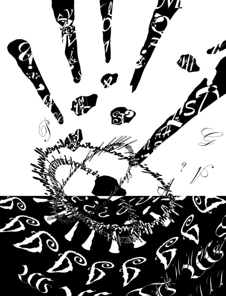
In the final version, I use different fonts to represent different genres of music included in this song. I also use the exclude tool to reflect Gestualt theory: I use the principle of closure to imitate the shockwave with different fonts and letters. It is mainly influenced by the star shape with stripes that I made during the black square project. I use random letters to fill the upper part of the canvas to make it more dynamic. The whole design is like a scene of catastrophe: the meteors are falling down, hitting the ground and making shockwaves. It reflects the shock I felt when I firstly listened to this song.
Process
During the mid critique, I see many classmates using various kinds of fonts and use the exclude tool to create richer visual experience. This inspired me greatly, so I decide to use these skills to make my design more messy. The version for mid-critique is lack of change, I learn from it to add more random elements to my design.
Conclusion
If I had more time, I want to use the pen tool to bend some elements, and make the poster look more three-dementional.
Image of Project
