Creator: Yuyang Hu
Project: Enjoy the nature in the era of information explosion
Concept for the diptych
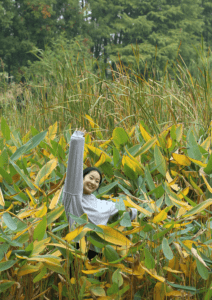
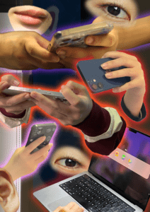
In my photo diptych project, I used images that have obvious contradistinction with each other to present how people receive piecemeal information from their digital devices and how they really enjoy themselves in nature when free from the digital world. The two pictures respond to each other mainly in a contrasting way. I used contrast colors in each photo to present their difference. Besides hue, I also tried to make the compositions of the two pictures look similar, so that the audience may find some connections through the structure.
I would claim that the research comes from my observation in daily life. Nowadays people tend to spend a lot of time on their digital devices such as their phone and laptop, but they don’t seem really happy with it, or we can say that people can’t get real happy feelings by watching piecemeal information via electronic devices. On the other hand, when aiming to spend time with family or friends, most people would choose to go to a park or other outdoor sites to enjoy nature. While cutting off from their phones, people can feel true happiness.
Process
(1) Process in staging and photographing part I
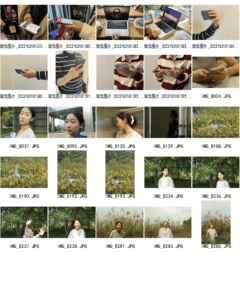
I went to Century Park with my model and found some places with dense plants, and took some pictures of a girl laughing in nature. When taking the photos, I guided the model to express her happy emotion by laughing and having big movements. I took a lot of pictures and later picked the most satisfying one with the girl having a big smile in the middle of some plants, and has a good composition.
Then I used Photoshop to make some adjustments to the hue and articulation of the photo. I made green to be the most obvious color in the picture, in order to draw a contrast to the other photo, whose overall hua will be red.
(2) Digital process in creating part II image
Describe and assess the most significant steps you have taken, problems you encountered, solutions you found and compromises you
ended up making. Include images of different iterations if you have any. When editing the second image, I tried to combine different images of “hands holding a phone” into the picture. First I encountered some technical issues, for I couldn’t successfully select the hand and phone without having other elements, and I learned to use erasers to “clean” the layer mask to solve the problem. At the beginning of my editing, I used the same picture of a hand holding the phone and used it several times to show that people use phones too much time, but I found that particular image repeated so many times and the final effect was not satisfactory. So I took some more pictures of hands holding phones and used them in my picture to make the frame look more dynamic. I also chose different colors for different hands to show that the information that people can get from their phone is vivid. And the fact that the colorful lights surrounding hands and phone will make the audience of this picture feel that the information was dazzling.
Conclusion: improve the project
During the in-class critique session, I received some suggestions from my classmates and professor, which I found very valuable. According to the Gestalt Theory, it is better to have some repeating elements in the two pictures. My professor encouraged me to make some digital devices appear in the first picture for there are a lot of them in the second picture, so if the girl in the first picture can hold her phone while smiling without looking at her phone, the two pictures could have a more obvious connection. I found it makes a lot of sense, and I think it would be interesting if the girl in the first picture can throw her phone away, because it can show that she doesn’t need the phone at all. However, that might be difficult to achieve.
Image of Diptych


