Name: Zhiyan Wan
Title of Music: We’ve never met but, can we have a coffee or something
Artist Name: In Love with a Ghost
Concept and Design
When asked to choose the music, I immediately thought of this song. Though it has no lyrics, it is a very interesting and enjoyable song which I can imagine a lot while listening. I can hear someone pouring water and ice being added into water. These specific sound makes me imagine a scenario where two strangers happen to sit on the same table and have a coffee together. The bit has changed a little bit in the middle part of the song. So I think there may be a chat taken place between the two strangers. It’s like two people living in quite different world interact with each other by coincidence, quite magic communication.
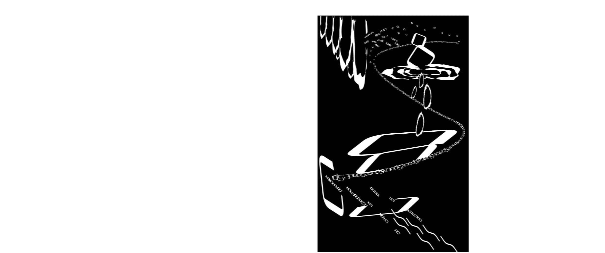
In my design, I’d like to show this amazing connection between two strangers or unrelated materials in different world. I’d like my viewers to start from the top left corner. With letters stronger from the edge to the middle, viewers can feel the similarity between these characters and guided by the trend of approching the middle top part. I use several letters on the top left corner to show something like a wall is broken by these letters and that’s the start of the connection. Then I intend to guide these small letters to another curve shaped “S”. This “S” curve shows how I feel the flow. At first the flow is delicate but as the song goes the flow becomes a bit stronger and changeable. So there is a change in size of the letters composing the “S” curve. This curve also shows the continuity theory. And the right part where there are a few drops shows the theory of similarity. The drops are my favourite part of my composition since they concisely convey the feeling of the song I chose.
In my Black Square project, I used continuity by organising different sizes of small fragmants into two lines. This inspired me of using the “S” guideline in my sound visualization project, though it’s not that effective in guiding the viewers because of some interrupts by other parts.
Process
My original design
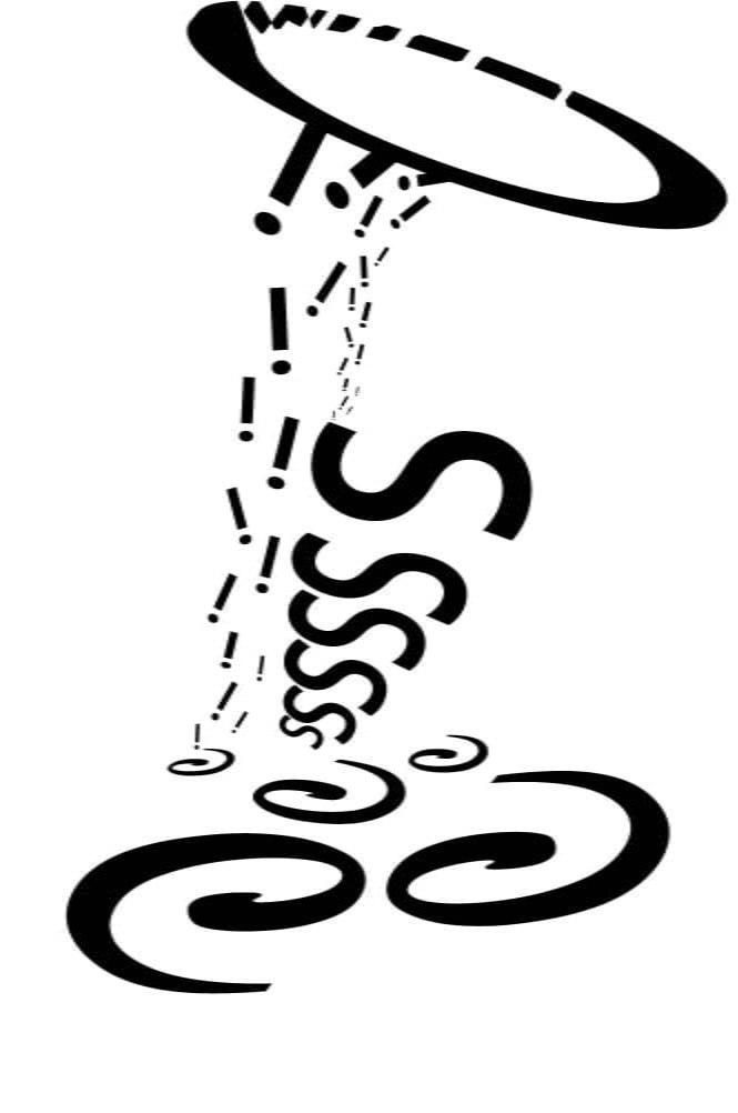
My original design was rough and didn’t fit the emotions of the chosen song. Meanwhile, I was struggling with how to use the different tools in AI. I didn’t make so much change of the letters I chose at first. They were easy to be recognized. But right after our mid-critique, I completely restarted my project. With the help from learning assistant, I learned further about tools in adobe illustrator. And I also kept in mind what Yunmi pointed out: the expressions should be more delicate according to the song I chose and contrast is needed. Thus I was inspired by these new ideas and tried to make a better composition. Even though I gave up my first design and created a new one, I still use some ideas in my first composition like the movement of dropping down. In words, my final composition is much better than the original one.
Conclusion
If I had more time to improve, I’ll try to put the different parts of my design in a better order. Although there is an “S” guideline, I didn’t make good use of it. I destroyed the guideline because of the drops. So if I could improve my design, I’ll move the drops to follow the guideline and combine the different parts to make it more like a whole.


Leave a Reply