Categories
COMMUNICATIONS LAB

Visual Metaphor

Meet me at, Ninj and David

CONCEPT & STORY: 

Our main concept was the feeling of nostalgia and missing someone. The storyline is about how the two characters are doing the same actions but in different settings and environments. They are not together but they have a strong connection between them that makes them meet each other at the end.

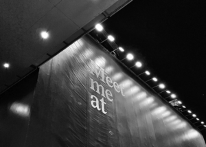
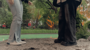
We were inspired by the short film “Kingyo” by Edmund Yeo. The reason why we were inspired by the film and decided to make our own version of a short film is simply because it gave us the feeling that something is missing and the theme was not too bright nor too dark yet aesthetic in its own unique way. Therefore we decided to make it a bit more unusual or interesting, we decided to not show our full body and instead only shoot our legs walking around places. 
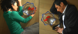
Kingyo by Edmund Yeo 

CREATION PROCESS & EXECUTION:

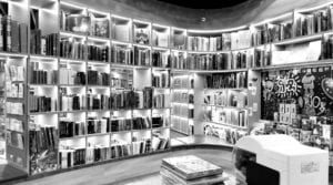
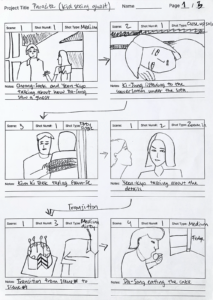
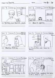
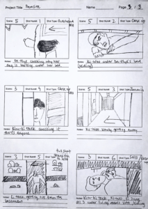
In our first storyboard, our original idea was to place our video that side by side in split-screen, but it made it seem like we were comparing those two characters’ life therefore we instead placed each scene one after the other. Creating the storyboard, made it easier for us to film our scenes as it contained the basic information of where to film and what angle to use. Since both of us were amateurs, we used our phones to record our film as we both agreed that filming on the phone will be easier to record movements and bring them with us to different locations. 
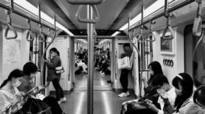
locations

And because most of the scenes we shot were in public space, it was difficult for us to film at the right time. We took at least 10 shots for each scene to get the perfect shot because we were keep getting disturbed by people walking over, metro leaving and having a tilt in the video. But however, after trying for many shots, we figured out how and when to film and improvised our filming skills in public. I also think recording the narration was challenging as it was in Korean, and though we were going to add subtitles, we wanted to deliver the meaning and the message with my voice and the pace of my reading. Which made us record the narration over and over to get the perfect one.

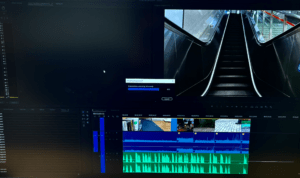
During the editing process,  we tried many different ways of placing each scene to ensure the storyline was clear to the audience. We not only focused on de-noising our narration audio n audition but also worked hard on the colour grading in premier-pro in order to make the videos which were shot in different areas with different lighting mixed with each other. Because and fortunately the theme of our film did not require any use of effects like special effects and visual effects, we only worked on the placement, added subtitles, did colour-grading, and edited audio so that they go well.
COLLABORATION:

As I also mentioned in our visual metaphor proposal, we divided our work equally and I think the work we did was really teamwork. Everyone in IMA who took or taking the communications lab course at the moment told me your “partner” matters a lot because there were many students whose partners were doing nothing and ended up doing their project alone. Hence, I think I was lucky to work with my dear partner and friend David because we understood each other very well during the whole process of making our final project. We listened to each other very well but also commented on how we each thought about each other’s ideas and suggestions.
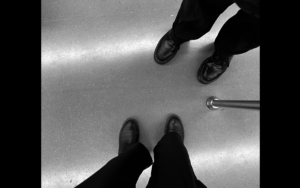
David and Ninj

I also felt grateful for Day for helping me record my or our audio. Though he did not speak Korean, he did a really great job of giving suggestions and tutoring me on how to fully express our narration in a way that matches the overall theme of our short film and I want to thank him for being such an understanding yet supportive partner and great friend during my freshmen year. Among all the new things I have learned from my partner was to focus even on the tiny details. When working with Day, I noticed he pays attention to every single detail of his work while editing and it was my first time seeing someone who pays more attention to small details than me so it was nice to have him as my partner. 

AESTHETICS & RESULTS:

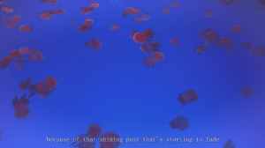
As the aesthetic and overall theme we chose to go with our final project was nostalgia and gloom, we colour-graded our film with mostly green and blue hues to give it a “feeling of blue”. However, at the end of our film, the ending scene, we decided to give it a bit of liveliness by adding orange and warm tones because our two characters meeting each other meant warmth and love. 
Categories
COMMUNICATIONS LAB

Reverse storyboard: Parasite

Parasite scene 1:21:00 

Categories
COMMUNICATIONS LAB

Memory Soundscape

The Concept:

The project was inspired by the sounds and feelings I have heard and felt on the first night I’ve spent in the hotel for quarantine after landing in China. As I was overwhelmed with all the thoughts of me having to live in a foreign country without my family, and having the anxiety of not wanting to test positive for each quarantine tests, I tried to express those combination of feelings by layering mulitple recordings. Turning a memory into a soundscape was not an easy process as the term of “memory” is more close to abstract idea, and I didn’t want my soundscape to be simple and clear, but wanted it to be a bit more abstract, I used sounds such as water drops and shaking beads to represent the sound of a fast beating and anxious heart beats of mine. And to as I also wanted to add the feeling of eeriness, I added effects on some of the layers, also to add dimension to my memory soundscape. 

The Process:

To list all the sounds I’ve used in my project:

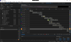
  • shaking beads, knocking, stovetop, water drop1, water drop2, water drop3, necklace chain, bottle cap dropping, guitar, seed cracking, vitam C tablets fizzing, shoes sweeping, turning book pages, keyboard sounds and tearing paper sound.

As I mentioned I didn’t want to recreat the actual sounds I’ve heard while staying at the hotel, I wanted to play with different sounds that didn’t actually related to my memory. However, after recording many unrelated sounds, I’ve realised all the recordings were not going well together smoothly. Therefore, to not make it too abstract, I rerecorded and added recordings of water drops, that differs from one another, to make the audiences listen and feel how quiet yet noisy the hotel was. The opening and the ending of my project was what I think the most focus went into, because I thought having an edgy start that catches people’s attention while also having tight ending was crucial. To do this, I used a guitar’s low E note and reversed it to make it sound like it is a beginning of a journey because it was the beginning of my memory. And for the ending, I used the recording of a page tearing audio to give an impression of the journey has come to an end because I’ve teared the page. 

To me, the process of editing, combining and layering the audios was actually fun and the most interesting part of the whole project. I had all the sounds I’ve needed to create my memory, so I enjoyed while struggling to have to smoothest transformation of each recordings. The only challenging thing was how my drafts sounded unusual on different speakers and even headphones. But by fixing the parts that needed the volume to be lowered or boosted and  adding a little touch ups, I got the result I was expecting for the final one. One of the lessons I’ve learned while editing the sounds is how small edits and touch ups can make up a huge difference in recordings and the more you spend time by adding details, the more the recordings get combined and blend to each other evenly.  

The Conclusion:

I am overall very happy with my memory soundscape project, and since it had to be only 60 seconds, even if I had more time I wouldn’t have did anything because sometimes, simple is the best! But if I still had to fix something, it would be me adding up more unique audios and make the transitions more smooth. 

During the presentation, it was interesting to hear how my fellow classmates have perceived my project. Some got my intention right, of how it sounded creepy and like a starting of a sci-fi film, while some said it could be about gambling because of the coin dropping sound… And as everyone observe a certain information all differently it is hard to make the meaning behind your art work clear to all. However, based on their feedbacks, I could’ve focused more on layering the recordings. 

The Image: 

Categories
COMMUNICATIONS LAB

Reading response / The Five Obstructions

  1. Response to “The Uncertainty of Documentarism” by Hito Steyerl.

Steyerl’s theory of how the “unbroken belief” of the documentary form is being challenged is how it has stopped corresponding to reality and has become abstract. In other words, Steyerl states in the article that in the past, it was only considered a form of the documentary if the document had captured something clear and visible, while the change has made the abstractness or the uncertainty of how the document represents something can also convey the truth. 

For example how those CNN images still acutely express the uncertainty of the real world even though the images are all low resolution and could only see patterns of something green and brown moving across the screen. “The closer to reality we get, the less focused and jumpier the images become. 

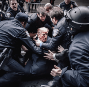
Nowadays I think it is really difficult to differentiate the reliabilities and inaccurate news and content because of the highly developing technologies. For instance, an image of the former president of the united states, Donald Trump getting arrested created by an AI has caused a lot of buzz on many social media platforms. In fact, I myself believed the false image until I checked the comment section. Therefore, compared to other media such as articles or images, live broadcasts bring trustworthy information.

created by Eliot Higgins using Midjourney v5.

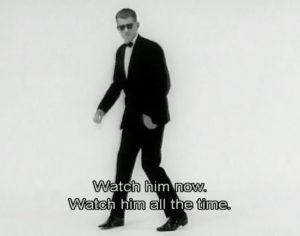
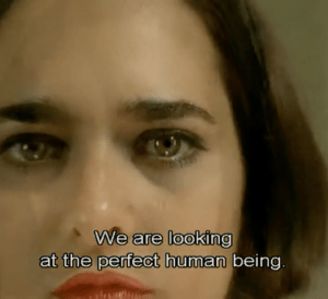
2. Five Obstructions (2004) by Jorgen Leth & Lars von Trier

The rules of each obstruction are simple: 

#1 It must be shot in Cuba and each sets and shots have to be shorter than 12 frames. 

#2 It should be shot in the worst place to shoot a film 

#3 It should be made with Leth’s freedom of style 

#4 It should be a cartoon

#5 It should be re-created by von Tier

Though Danish director Jorgen Leth was challenged to remake The Perfect Human, the way Leth go back and forth from Cuba to India, Belgium to the U.S. and stopped at Denmark to show it to von Trier shows how committed he was to refilm the original film. In the film, von Trier said “This isn’t a competition with yourself, this is therapy” to Leth, and this brings out von Trier’s intention with his project with Jorgen. Indeed, when it comes to filmmaking, I think people should have in their mind that there’s no right or wrong and should always challenge themselves to try new methods. The same goes for Leth, von Trier’s goal was not to make Leth’s film a great remake of The Perfect Human, but to observe the process of filmmaking more like a “therapy”. 

The first remake observing the first obstruction in Cuba was fun to watch as Leth had the limitation of only using 12 frames as it also added a bit of rhythm and humanity as it contained Cuban culture. For the second one, I enjoyed watching Leth himself being the performer and part of his artwork. The third, the one that was the most different in the style compared to von Trier’s original one shows how two artists in the same art field can differ when making art. Then, the fourth one was my favourite of all the 5 obstructions as it had to be an animation. Although the message or theme an animation and film deliver differs, it was interesting to see a short film recreated as a cartoon. The last, and the most meaningful obstruction kind of gave me the impression of two artists sharing knowledge or just simply uniting with filmmaking as a bridge.

As a person who enjoys watching behind-the-scenes videos of films, it was almost fascinating when I watched this documentary film for the first time. It not only made me learn all the processes of filmmaking but also made me understand that exploring the limitless possibilities of cinematography is more important to stick to a certain rule and there is still a lot to be exposed in the film industry. 

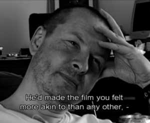
Img from “Five Obstructions” (2004) by Jorgen Leth and Lars von Trier, taken from Kanopy.

Categories
COMMUNICATIONS LAB

Memory

It was when I spent the first night at the hotel of the quarantine after I landed in China. Because it was my first time so far away from my home, without any of my family members, I was overwhelmed with all the emotions I felt. The loneliness, excitement, scariness and mostly the homesickness. I was quarantined in Guangzhou and probably not the central part of the city because it was usually pretty quiet, which actually made me even more lonely.

I remember the feeling of having to stay in this unfamiliar place, where people spoke a different language, scared me the most. Because it was such a hot day, I decided to take a shower while thinking of what to do for the next 9 days. And because I was not used to the new and odd Chinese dishes, I cooked ramen for my dinner.

I also remember I was not being able to figure out how to connect my phone to the wifi so I stuck there for the whole night in total silence. Well, as there is no such thing as silence, I heard water dripping from the shower head in the toilet as well as mopeds passing by the building and the AC blowing at its highest frequency. Nothing made me miss home so much that I cried myself to sleep, only to wake up by the sound of something like a coin dropping but went back to sleep because I was too afraid to think about what will happen next.

Categories
COMMUNICATIONS LAB

Photo Diptych

Ninj Tumurkhuyag

Fruit of time

CONCEPT:

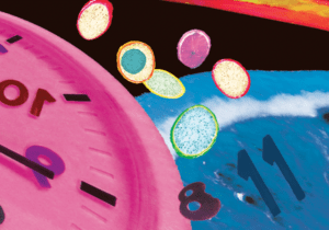
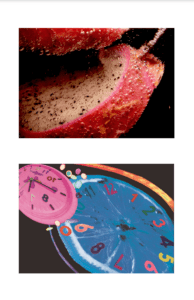
The overall concept of my project is the abstractness of time. The idea of combining two different things, fruit and time was inspired by Salvador Dali’s melting clock as I tried to define time as conceptualised space in our mind. 

PROCESS:

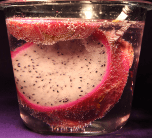
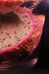
I. The process of trying to capture the right moment of the dragonfruit was difficult as my image was more focused on the details of the bubbles. I’ve used a dark background to emphasise the fruit and tried different angles of lighting to make the bubbles look as defined as possible. 

I. The second part of the project, creating a digital image was also difficult as my still image was all about details. By adding small details such as tiny dragon fruits, I tried to depict the bubble. I also played more with the colours to make my image more like pop art.

CONCLUSION:

In conclusion, if I had given more time to work on this project, I would’ve definitely added more details and filled up the dark part of my image. 

FINAL PROJECT:

Categories
COMMUNICATIONS LAB

Photo Diptych

Overall concept: 

– Shapes, colour combination

– Close-up shots, details

The digital image will be created as an abstract version of the still image. Therefore, I’m thinking of taking as many detailed close-up shots of colourful fruits as possible. And by cutting, dividing all the details, I will be able to use them to create one object. 

Categories
COMMUNICATIONS LAB

Reading response

Fred Ritchin: In our own image

According to Ritchin, what he meant by the “fluidity of the digital” was how the field of digital media in photography is flexible and is always in the process of changing and being presented with a new challenge. Indeed, it is stated on pages 18 and 19 that “…new kinds of photography are slowly emerging including strategies for documenting realities heretofore inaccessible.” An example could be an AI image generator which creates realistic images based on any input that you provide. Moreover, Ritch also mentions that photography should not only use to capture memory, but also offer flexibility in both analogue and digital environments. (20)

Photography is often perceived as pictorial evident of a certain event and as a medium that portrays reality. However, though a photograph can capture the moment, it only shows one dimension of real life, therefore you can say that it cannot fully portray reality. Other media, such as films or videos, on the other hand, have a multidimensional spectrum and are capable of representing reality in a slightly more vivid and detailed way compared to just displaying a single image because they can include sound as well. In fact, “They also overestimate the power of the technology saying that ‘the camera never lies is as foolish as asserting that the computer always does.” (126)

Categories
COMMUNICATIONS LAB

Sound Visualization

Ninj Tumurkhuyag

“Starry Night” by Peggy Gou

CONCEPT & DESIGN:

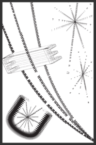
For this project, I’ve chosen a house genre of music. “Starry night” has fast beats and also has strong kick-drum parts. For the overall conceptualisation, I’ve illustrated the repetitive four-on-the-floor beat with the letters W, M and V, because it has the image of sound waves.

To portray the sound of the drums, I have created small sparks of letters and to express the chorus where the only part of the song that has lyrics, I’ve also added the capital letter E. I used the ideas I have used in my “One Black Square” assignment as well as the continuation principle to make dimensions to the image by wrapping the letter “E”. 


THE PROCESS:

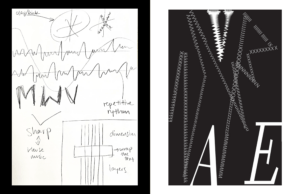
I first started with a sketch I’ve drawn while listening to the song and created the first draft. To have some idea of how to illustrate the music, I listened to the song, “Starry Night”, every day on repeat.

The sketch and the draft:

Then I got feedback during the mid-critique that since the music itself is a bright and powerful song, changing the background colour and adding more elements and details might help to improve the project. Therefore, I’ve changed the background colour to white and added more details and dimensions. 

CONCLUSION:

If I had more time, I would’ve worked on adding more details to express every small and important beat of the song. I would’ve also tried to play with more different fonts, and editing techniques. 

The finishded image of the project:

Categories
COMMUNICATIONS LAB

Pioneer Plaque

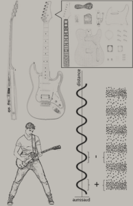
In the top left portion of the image, there is a front and side view of the electric guitar to showcase what we are essentially trying to present to the aliens. To the top right side of the image, there are the components of what the electric guitar is composed of. This part was a bit tricky since we weren’t totally sure of how this was going to convey the full meaning of what exactly it is constructed of. In the bottom left corner of the image, there is a depiction of a person playing the guitar. This is especially important since it gives major clues about how to use an electric guitar, and most importantly who uses it. This part of the image is essential to the image as a whole since it shows who this is coming from (humans). In some way, it shows our anatomy and depicts our head, legs, arms, hands, fingers, and overall body structure. To the bottom right side of the image there is a depiction of the pressure and distance,  and right beside it is the depiction of the air molecules’ motions and sound propagation. 

For human beings, any social system’s formation, development, and functioning depends upon communication. Music is like any other form of communication for us. It is a powerful tool allowing everyone to express their emotions, intentions, and meanings. In a way, it is the tool that connects the human species, their communities, and their generation. Since the aliens in the story “Story of Your Life”  by Ted Chiang seem to have more of an organic structure of language. I would describe this Electric guitar to them as “Loud, Electric, Instrument, Musical” it is not much you could elaborate on since they don’t have the same sequence of thought since humans produce sentences in a linear form rather than as a whole. 

There were many complications when trying to compose this final image. Such as the top right corner we introduced the idea of musical notes, which later on we found out was not allowed since it is considered a “language” [depicted below] so we thought long and hard about what to replace it with, which is when we thought the simplest and straightforward answer would be the composition of the electric guitar itself. I.e. the many physical parts that come into play when constructing. Another thing that wasn’t necessarily a barrier but rather a mistake was on the bottom right corner of the image we forgot to depict which way the sound was going, this could have been really confusing to decipher if we were just starting to learn sound. [Depicted Below] but overall everything turned out fine.