Sound Visualization Documentation | Section 24
Name: Nina Chen
Song Name: Dive Back in Time
Artist: 白鲨JAWS
Concept and Design:
Originally, this wasn’t the song I chose. My original choice of song was Always With You, a theme song in the ghibli movie Spirited Away. However I scrapped that idea because I didn’t really know how to visualize the vision I had with just letters. Then again the assignment was to just visualize the song but for me, I couldn’t visualize just the song, I was imagining a scene in the movie as well.
In the end I chose the song Dive Back in Time, the opening theme song of a donghua called Link Click. It’s a song conveys how the two main character has to work together to “fix” or what I like to call “alter” the past so that some deaths can be avoided.
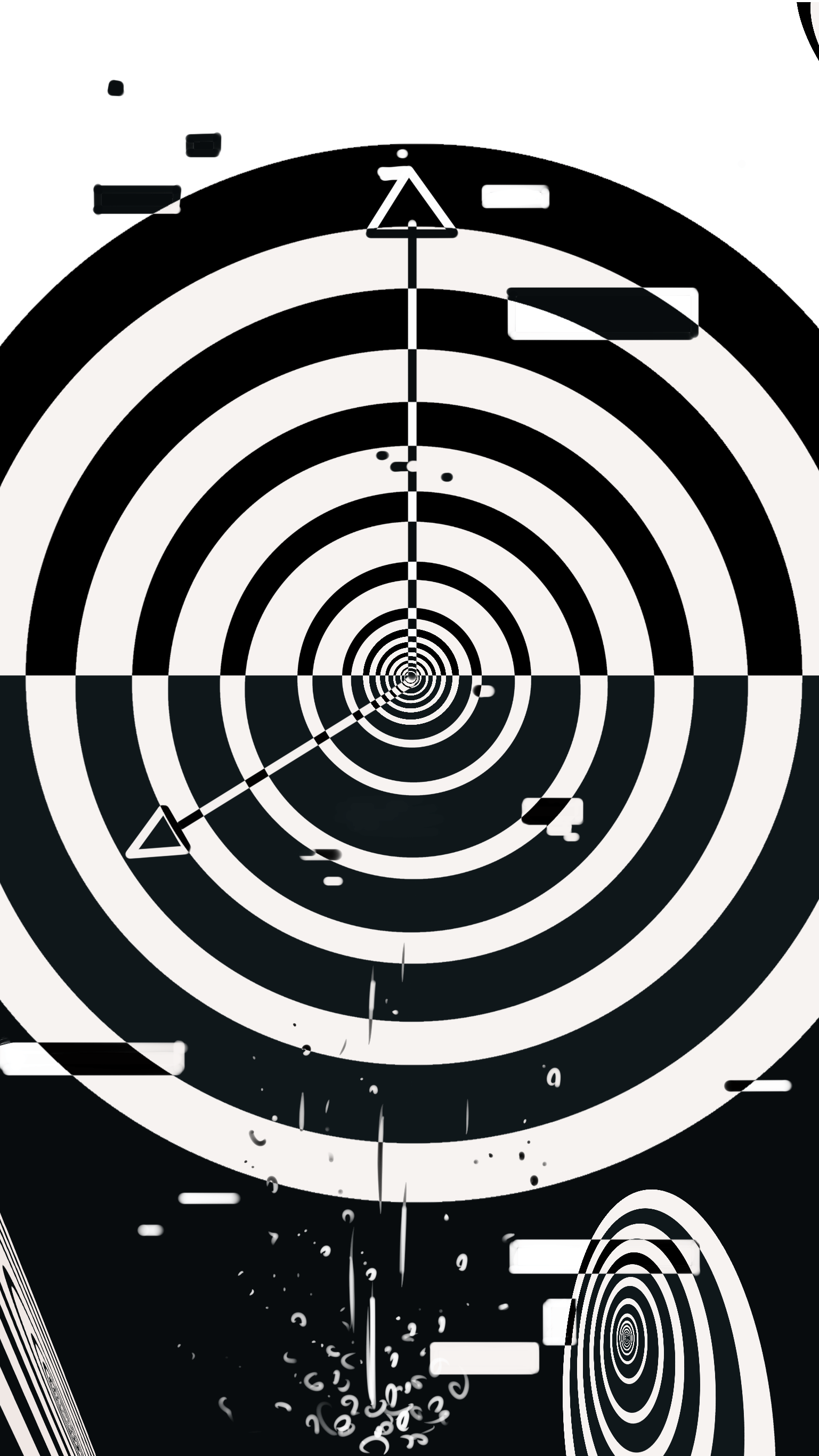
My design is based off the pre chorus and chorus of the song and with a more heavy focus on the lyrics instead of the melody. Since I was also being influence by the donghua, all I had in mind was clocks. The lyrics repeating “dive” gave me the idea of not only one but multiple circles distorted on the side, with the main being the clock in the middle. Since its “dive” I figured why not also incorporate the bubble idea I had when I tried to do a visualization of the previous song.
Process:
My first design was still based on the first song I picked and I didn’t like it in the end because i felt that it was too blank and very incomplete. However, I also didn’t know how to add more to make it less blank.

The change of mind came to me during class critique time where I was just thinking of time passing and I got reminded of the song Dive Back in Time. Within that moment, I was hit with the inspiration and drew it down so I don’t forget the idea.

With this sketch and showing it to our professor, Ian, we both decided this would be a better design than the last one.
Working on this was pretty easy but it was also very tedious since I had to go over every overlapping parts and change the colors to either black or white depending on what color was overlapped originally and then flip the two. An issue I ran into was not knowing how to merge the layers so that I can use the fill bucket on newly added elements. This resulted in me scratching the whole thing again and redid everything before I filled bucket the different parts. This also mean that later added on elements may not really line up with the rest as nicely as if I had it there from the start.
This was the result of my efforts in the end:

I also just realized I had flipped the colors in the final version.
What would I do if I had more time?:
In conclusion, if given more time I would probably refine it a bit more. However, I am not quite used to adobe illustrator so part of me also don’t want to spend more time on this anymore due to the annoyance of trying to figure out how to do use some tools. There’s also a lot of different features that I’m not quite sure what it’s supposed to do.
Next time, I would like to be more familiar with AI before starting a project and diving into it blindly.
Project Image:

