It was the night before Christmas, and my older cousin was supposed to come back home around 8 PM from the airport to join our Christmas party. However, he called my aunt saying that he had some other unfinished business, so he wasn’t able to make it back. This made my aunt angry and down since she hasn’t seen him for half a year as he works in Chicago. My aunt didn’t hide her anger as she started to show attitude with her every task. She would violently throw a dish into the sink and mutter curse words under her breath. The entire house was silent except for her because of the intense tension. I urgently texted my cousin, scolding him. Just as I was about to call him, a doorbell rang and there he was, standing in front of the door with a big grin. My aunt didn’t enjoy the prank, but she was happier than anyone for him to be back.
Month: October 2022
Diptych Blog Post
A. Makayla Hsieh – (d1e)t
B. Concept
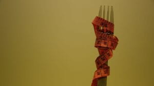
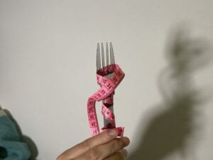
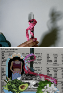
These two images have the same fork and body tape connecting with each other with the figure-ground concept. In picture one, an individual is holding a fork with body tape entangled. There is a casting shadow enlarging the fork and body tape, creating an ominous feeling. In picture two, the background is a nutrition chart of a sugar-free protein bar package. I decided to make the food that girls cannot eat during a diet in black and white, while putting the suggested healthy meals in color. In the mirror is a girl with a very pretty body, representing the “inspiration”/”goal” of a diet. These elements are all placed in the center so that the fork can connect to the fork in picture one.
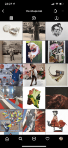
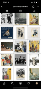
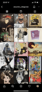
I followed many instagram pages that posts collages for inspiration on picture two. Here are some great accounts you can follow to add some artsy photography to your feed on a daily: @pariscollagecollective, @absurdist_collageclub, @thecollageclub.
C. Process
- I knew I wanted to do something about my understanding of diet, but I didn’t know how to effectively communicate my idea. During my first photography session, I set up a tea party setting with tea, cupcakes, a mirror, and cute accessories in room 818. My initial idea was that the first picture would be delicious dessert whereas the second picture would be what’s going on in a girl’s mind when she sees this dessert. However, after the in-class criticism as well as discussing with peers, I realized that the connection wasn’t strong enough, so I decided to conduct another photography session.
Some pictures from the first photography session:
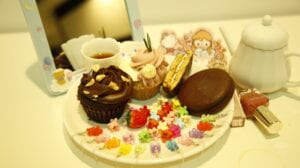
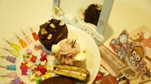
This time, I had some guidelines in mind. First, I needed to structure/stage my picture as an art piece instead of just taking pictures like a tourist. Secondly, I need to think about the gestalt theory.
During my FYD, I took pictures of the cake we bought and messed around with the concept of people pointing knives/forks towards the cake.
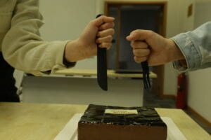
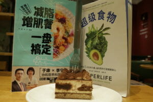
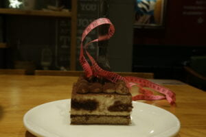
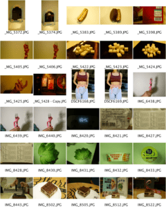
After that, I went to the bookstore in the mall next to our dorms and took pictures of the fork in a tiramisu as well as books on dieting. When I went back to my dorms, I asked my roommate to hold up the fork & body tape while I asked my other roommate to use her lamp to create the shadow effect shown in the picture. Finally, I took pictures of the nutrition charts of the food that I can get my hands on.
Some pictures from the second photography session:

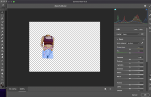
2. For picture two, I used the camera raw filter effect to adjust the contrast, sharpness, texture, detail, and saturation of the elements. The camera raw filter is a great tool to adjust your image all at once, and I really enjoyed playing around with it. Cropping out elements was a pain at first with the magic wand as it requires intense focus and skillful hands, two things that I lack. I spent awhile trying to find a better alternative to effectively crop the elements of my picture without spending so much time and effort. I discovered the object selection tool, and this was a life savior. In addition to that, I found out that you can choose to manipulate your selected objects with the + and – button on the top left corner without having to use the paint brush to clean up the parts you don’t want. These features were my best friend when I was making my collage.

D. Conclusion
If I had more time to work on my project, I will try to make image two more abstract by using the Gestalt Theory. Right now, it is very organized, and I think there should be some abstractness.
E. Image of Diptych + Contact Sheet
“In Our Own Image” Reading Reflection
- What does Ritchin mean with the “fluidity of the digital”? Give an example of digital imaging/digital photography that exemplifies this.
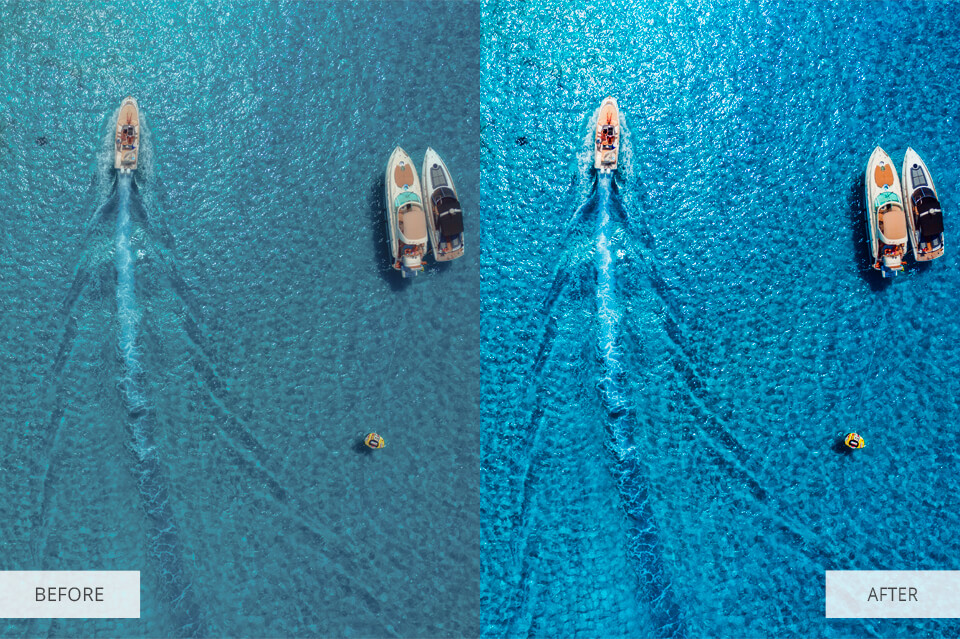
Ritchin states “the fluidity of digital” has replaced the “fidelity of the mechanical age”. “Fluidity” means changeability, which is a great representation of modern photography. In the past, photography is only accessible for those who can afford an actual camera whereas everyone can take pictures with their smartphones nowadays. In addition to the camera app on your phone, there’s a variety of other apps that one can easily download to enhance their pictures to their likings. Below are some examples of how people can change their images:
Expand Pictures (to elongate one’s legs)/Compress Pictures (to make one look slimmer) >>> could be done on apps like Spring and Pro Retouch
Remove background elements >> could be done on Photoshop and websites

Adjust Brightness >>> could be done with the Photos App, Adobe Lightroom, and Photoshop
2. Reflect on the extent to which photography is capable of capturing reality; and compare it to other media (technology) (e.g. text, video, virtual reality, books).
Photography is only capable of capturing one moment visually. Compared to text descriptions and books, photography is can be more easily interpreted since one has to have a good imagination to see what a writer is describing. Videography on the other hand, and capture the 360 surroundings along with audio. However, it is also limited as the videographer has to do a good job capturing the moments and the editor has to communicate their ideas effectively. The best technology when it comes to capturing reality is VR because with VR glasses, one can directly experience reality.
Diptych Concept Assignment
I hope that my Diptych conveys the social pressure around the idea of “weight” amongst the Chinese population, especially women. Compared to my peers in the United States, I’ve realized that my Chinese friends are very obsessed over the number on the scale on a daily basis. Though it is good to control one’s weight to a healthy number based on the individual’s height, Chinese people prefer to be underweight to satisfy the society’s beauty standards. This often results in individuals skipping meals, but it can worsen to eating disorders like anorexia. Below are comparison pictures of what is considered “beauty” in the United States versus China.
:focal(999x0:1001x2)/megan-thee-stallion-american-music-awards-self-love-body-performance-fb-2000-e7805c77593041469f2d92a6d0ac8c30.jpg) .
. 
For the left of my project, I plan to take a picture of a girl holding a cake on a scale. This idea might not be pursued in my final work since I believe that there is a more impactful way I can take this picture to convey my message.
On the right of my project, I plan to take pictures of some food, a number on the scale, a body measuring tape around a fork, food that will make you skinny, cut outs of business marketing revolved around weight and more. I plan to cut and combine these pictures with the concept of surrealism. I will also play around with the colors by lowering the saturation level. The link here (https://pin.it/3I7II7i) is my inspiration board for reference.


I hope the combination of the left side and the right side can convey that Chinese girls are constantly thinking of their weight whenever they eat.
Symphony No. 5 by Beethoven Sound Visualization Project
Makayla Hsieh, Symphony No. 5 by Ludwig van Beethoven
Concept and Design
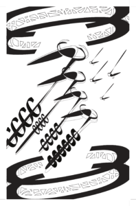
Beethoven constructed Symphony No. 5 when he was almost deaf. Losing the ability to listen is highly detrimental for a musician, but Beethoven is still determined to pursue his musical passion as he continued to produce famous musical compositions after he became completely deaf. Though Symphony No. 5 is well known for the first ominous verse, you can actually hear a more hopeful tune as the music proceeds. The concept of this piece follows this hopeful tune to convey a positive connotation.
This piece is created with different modifications of the letter “C” in Adobe Illustrator. I used Gestalt Theory to conduct a cylinder-like pole on the top and bottom of the composition. One can see the cylinder through the closure and proximity aspects of the Gestalt Theory. There are four arrow-like patterns shooting upwards in the middle of my piece as if it’s trying to charge out of the cylinder while there are smaller arrow-like patterns trying to push it back down. This indicates the upbeat tune and positive connotation of the symphony. Reflecting from One Black Square, I wanted to add structure into my piece instead of having it spread out. I hoped that the viewers of my work can follow the flow of my work.
Process
Besides the cylinder structure, I had a very different design at first, as seen here.
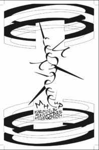
However, I changed the composition since I had technical difficulties with Adobe Illustrator as my free trial expired during the lockdown. Since I didn’t save my original work onto cloud, I still wasn’t able to make changes on my existing after I made my payment. Once I restarted, I thought the arrows shooting upwards conveyed Beethoven’s message more accurately than my original design. As I was playing around with the features, I discovered the eraser tool and decide to use it for the poles so the design wouldn’t be as dull. I ended up cutting up the “C” into small shapes so the viewers can use closure to tell that it’s a “C”.
I learned from the mid-critique that designers should introduce an element more than once to restore balance and give the viewers more room for interpretation. Therefore, I made sure that my elements collaborated with each other smoothly.
Conclusion
If I had more time to edit, I would look into creating other elements to convey my message instead of excessively repeating the same elements. I would also make more drafts since there is always more than one way to convey the meaning of a music piece.
Pioneer Plaque – VR Goggles
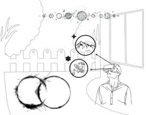
We would like to introduce a piece of technology from Earth called virtual reality goggles. They allow us to see a realistic visual field without being physically present. Once you have the goggles on, it feels like you are living in a different dimension. It allows you to experience all types of scenery which is why we are recommending this technology. As Heptopods are discovering more about human life and Earth, it will give them an insight into how humans perceive the world and close to a first-hand perspective on Earth as transportation between the two worlds may be difficult. These VR goggles provide audio as well. There are different sounds from different planets and galaxies which are affected by their respective atmospheres such as pressure, gravity, and other factors.
Heptapods can bounce back and forth between the future and present. VR goggles are similar in a way that what it is showing is timeless. The virtual dimensions do not have a time which Heptapods do not perceive anyways. We thought this would be a perfect technology to introduce to Heptapods, so we created this pioneer plaque to convey our message.
As seen from our pioneer plague, there is a man wearing VR goggles outside of a building with a fence and two trees. This is his current setting. If you look closely at the VR goggles, you can see two special star-like buttons, these are the different modes on the goggles so that one may choose where he wants to be. With a click of either button, the VR goggles will bring this man to new sceneries. We represented this concept via arrows and the same star-like buttons. As shown in our diagram, the top button will take the viewer into the wonders of nature in a mountain whereas the second button will take the viewer to explore the unknown world of outer space. Now in this reality, he feels one place but sees and hears another. On the left hand side, we have embedded Heptapods Semasiographic language that specifically translates to “learn” and “human”, in hopes of the Heptapods to understand our message that this is a human technology that we want them to learn more about. Lastly on the top, we showed the planets in alignment to convey how easy it is to experience planets just from where you are. We hope that this is comprehensive representation that the Heptapods will understand.
Ten Color Palettes
“There’s a reason we don’t see the world in black and white.” — Celerie Kemble
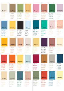
To the left are my 10 color palettes that I extracted from 10 different pictures. Different color combinations give us different vibes. For instance, the first color palette (beige, brown, green, yellow) will give you nature vibes as you can think of brown tree trunks, green leaves, and yellow sunflowers. Colors can convey a certain meaning to us, as warm colors will make us feel fuzzy and cool colors will make us feel soothing.
I categorized each color to primary, secondary, or tertiary colors except for the color black because the color black is the absence of color whereas the color white is the combination of all colors. Primary colors include different saturations and values of red, blue, and yellow. Secondary colors include different saturations and values of green, violet, and orange. Tertiary colors are the combinations of primary and secondary colors. Below is my favorite song with a color as the song title, hope that you like it!
https://youtube.com/clip/UgkxFyN8BOvyNM62ORuvEP1T6CWpvTuHQqiM
