Group Research Project

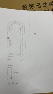
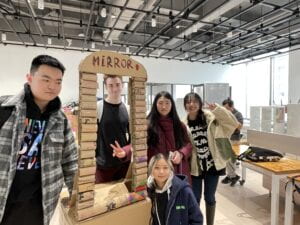
This artifact is derived from Doris’s proposal inspired by The Ones Who Walk Away from Omelas. It responds to the interactive mirror we found in the “Research” phase of the project. This mirror can reflect the viewer and reflect the sad child who suffers for the happiness of people in Omelas.  The viewer can have a conversation with the mirror.

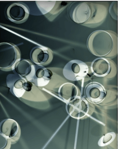
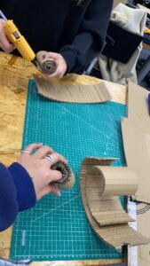
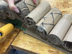
Doris painted the sketch for the mirror. We started by making as many reels as we could. And then we stuck them together to create the frame. During the process of making the mirror, I spent most of the time making the mirror. After making the frame, I came up with how we could build the base of the mirror to make it more stable. We weren’t sure how to make the top. Sean made great efforts to cut the cardboard in a curved shape and make it the top. We wanted to make a mirror that was about 1.8 meters tall like a normal mirror. But when actually making this artifact, we realized this was too much work. I proposed that we could make the mirror as long as we could and put it on a box. The biggest challenge for us was to make it stand. The bottom was still a big reel, which made it unable to stand on its own. We worked together to use cardboard to create a triangle to hold it and used tape to strengthen it. Eventually, we made the mirror stand. Our group decided to make this mirror with reels to make it thicker and more beautiful to watch.
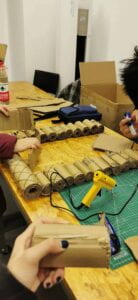
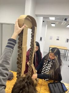
Our basic script is that there’s a carnival in Omelas and there are two pairs of viewers and reflections. The viewer looks into the mirror. The mirror will show the reflection of the viewer first, but it’ll gradually change to the image of the sad child. For the performance, I suggested that girls could take selfies. The viewer could introduce the background and have conversations with the mirror holder. And our performance intended to provoke the audience’s thinking about the reason behind happiness. In my opinion, the successes of the artifact are as follows. Our artifact stands out because it’s not like any of the other artifacts in other groups. It’s one of the biggest artifacts presented in our section and it’s good-looking on the outside. It’s stable and can stand on its own. And it fits into the narrative. For the failure of the artifact, even if we added a button on it, it might seem more magical than technical. Our original idea was that there were sensors in the mirror. But we didn’t have enough time to accomplish that.

In the whole process, our teamwork was great. We didn’t have many communication problems. We did everything as a team. We made the mirror together.
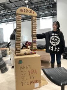
The group with the name Door-ry left an impression on me. This group’s artifact is inspired by The Veldt. There’s a computer that detects the user’s mind. The user can think of one place he wants to go. When he  opens the door, he’ll be in that place. He can feel, touch eat there, and can even bring something back to the real life. This artifact is relevant to the fictions story. It’s like the nursery, but it includes more sensations and interactivity. It meets the criteria of the assignment well. It’s an interactive invention that fits into the narrative. They managed to make many small props relevant to the travel places, which was interesting. However, I feel like the idea of this project is commomly-used. It’s not a very unique idea, but the implementation was great. The computer was well-made. They design a door that the user can use to travel to other places. The user travels to three places and she demonstrates the usage of the artifact well. By making props like little pyramids and sticking the Dory picture on a fish-shape cardboard, they explain how interactive the artifact is. For further improvement, I remember the script saying the computer is the device and the door is just a portal, but I don’t see strong connection between them. Their performance could be better if they can demonstrate the device more clearly.

https://drive.google.com/drive/folders/1661WgiI36BlYwgUcssxdlBvu9iB4E1Qn?usp=share_link
Memory Soundscape

Concept

I chose the memory of myself staying up the whole night and couldn’t fall asleep for this project. I hope to convey the actual sound and feelings to the audience. When I couldn’t fall asleep at night, I heard multiple sounds, and my mind was in an unconscious state. I want to show how all the sounds combine together to create a blurry atmosphere. I also want to show the kind of exhaustion I feel.

Process

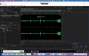
I chose many different kinds of sounds that one could hear at night. For example, the scraping of chairs, the sighs, and the sound of snoring, represents the inner noises in my mind. I also used the sound of chicken and alarm to show how long I stayed awake. I find using shotguns to record really helpful because it helps reduce the noise. The problem I encountered was the bad quality of the equipment borrowed. It’s hard to borrow a whole set of perfect equipment with no problems at all. However, I try to make the best use of the existing equipment. Meanwhile, it’s hard to decide which sound to record. I tried multiple options to find what I’m most satisfied with.

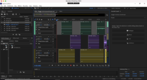
During my editing process, I found it hard to blend in all the sounds and make them sound like a whole piece. I kept adjusting the position, the volume and the effect to make the piece sound more like a whole. I tried to apply all the techniques we covered in class. It was hard to adjust the volume of each sound but I had to make a compromise with it.

Conclusion

According to others’ feedback, my current project is too concrete. The audience can get the scene I want to show directly. I could add more sound effects to perfect the soundscape. Also, I need to do a lot more hard work to master the music and adjust the volume. I agree with their suggestions. It’s better to create a little more abstract piece to show the state of mind instead of only using concrete sounds. Mastering music is also very important.

Five Obstructions

  1. Obstruction 1: no edit more than 12 frames long;   film in Cuba, somewhere he’s never been before;  not allowed to build a set; find answers to the perfect human. Jorgen repeats the same scene multiple times.

 Obstruction 2: being sent to a miserable place; any theme cannot be exploited; film but not show what you’re describing. Jorgen is the man; the meal will be there.

 He uses drama from real-life restraints from filming.  He involves stepping up and showing the distance and tells the character to just eat and finish the scene. They use a transparent screen to minimize the distance. They interpreted that loosely, putting up a screen and screening off this bit of real life. The whole idea is that we mustn’t see them 

Obstruction 3: wasn’t true to the idea.  make a film with no rules from me.  a free-style film. completely freedom or back to Bombay.  They go up to the set-up and move them around into a new interesting arrangement.     He frames places and things precisely 

Obstruction 4: cartoon. They use aid stuff actively, write a new text into it and breathe freshness into it

Obstruction 5:Lars Von Trier will make the last obstruction, Jorgen Leth will be credited as director, and Jorgen Leth will read a text written by Lars von Trier. Jorgen doesn’t have to do anything.

2. Effect

“It shows me what I really am, an object, human.”  Jorgen makes a film that leaves a mark on you. The movie serves as therapy.

3. Thoughts

It’s interesting how the film master is trying to make crap. In fact, they’re experimenting with something really innovative. The content remains the same but they’re using the basic forms of the movie to recreate the Perfect human. They explored the technique, figures, personal limit, formula, and deprivation of contents. Jorgen keeps reflecting on himself. It’s nice to see how these filmmakers break the boundaries and make a breakthrough.

The Uncertainty of Documentarism Reading

  1. Steyerl talks about how the “unbroken belief” of the documentary form is challenged.  He means that the unbroken belief of the documentary is supposed to be recording reality. However,  nowadays, it doesn’t matter whether the documentary corresponds to reality or not. The question of correct representation is utterly secondary. These documentary images do not represent anything intelligible anymore. However, their truth lies in their expression.
  2. Truth can give fiction the outline and fiction gain inspiration from the truth. Truth is objective and clear. Fiction, on the other hand, is subjective and unintelligible. Fiction can reflect the author’s feelings or opinions about the truth. 
  3. What media presents is powerful and influential. In a world full of uncertainty, we need something authentic to believe in. Representation of truth in the media is especially significant because there exists too much fake information. Fake images and information in documentaries may bring bad consequences and have terrible effects. They can directly influence our feelings. Therefore, the representation of truth matters.
  4. The role of live broadcast should be presenting the truth objectively, showing what is really happening around the world. It’s acceptable to add subjective opinions or feelings, but all should be based on reality.

Pick your memory

There was a night before an exam when I couldn’t fall asleep and stayed awake the whole night. I was physically tired but mentally active so I heard a lot of sounds during the whole night. When I first lay in bed, I could hear my roommates tossing and turning and the moving of the bed. There was also some whispering from afar. And someone upstairs is flushing the toilet. I could also hear the sound of the pages turning and the rustling of the pens against the paper. I tried to fall asleep but I couldn’t, all I heard were my breathing, my heart pounding, and doors shutting outside. There was constantly the sound of things dropping. I was still wide awake and I even heard the sound of the chicken. There was then the clatter of chairs and people’s voices. At last, my alarm went off the teacher told us to get up so I get out of my bed.

Besides recording the actual sound of what I heard, I also hope to manipulate the instruments to create a muffled sound to show how unconscious my mind was. I was really mentally excited at first, but I gradually became exhausted because I couldn’t fall asleep. And I also want to highlight the last alarm part.

Diptych Blog

Don’t let natural beauty fade away

Maggie Wang

Concept

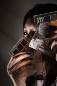
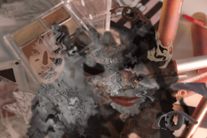
For the first picture, I cover a part of my face with pallets to show how we do our make-up. With the proper use of light, I manage to create a mood of gloom. Part of my face is light, but some part is dark. The main color is grey. It shows that cosmetics can make us look stunning and we really rely on them. For the second photo, I place colorful cosmetics in the background. This depicts the good side of cosmetics. I add a grey part to make it look like ink pouring. It also corresponds to the previous photo because you can tell that the color scheme comes from the first photo. I extract different parts of my face, like my eyes or lips, and put them on top. I adjust the transparency to make them look like my face fade under the makeup.

Process

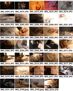
For photographing part 1, I tried different sides of the face with different positions of the pallets covering various parts of the face. At last, I found this position where only my eyes were shown the best because the pallets are combined together with my face. I also experimented with different lighting. I found that dim lights or lights on both sides would make my face look bad. It was better to make the light shine from the left to create good lighting.

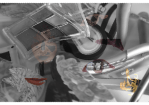
To create part 2 image, I took a variety of photos. First I tried to mix all my cosmetics together which makes the background photo. Then I copied image 1 and removed the color. I used the brush to erase the edges. After that, I used to magic wand tool to cut out the parts of my face and placed them on the image separately. During to process, I try to apply a double exposure effect to make the combination more beautiful, but I couldn’t figure it out so I have to do an alternative. I also found it hard to use the brush tool properly to create the effect I want. The edges seem unnatural so I covered them with small pieces. I worried that there would be so many elements that my main point wouldn’t be obvious, so I also created one without the colorful background.
Conclusion

I will think more about the composition to make the main items stand out more to better express my ideas. I may also change the direction of the face parts to reflect image 1. I’ll also pay more attention to the connection between the two photographs. It’s also important to improve my skill to use Photoshop to better create the effect I want.

Diptych Concept Assignment

The overall concept of the Diptych is that a pair of images are presented together. One cannot exist without another.  I plan to take photos of the cosmetics. Through this project, I try to convey the relationship between people(especially women) and 

cosmetics and express ideas about nature and beauty. I plan to blur and lighten the cosmetics using Photoshop. It implies that cosmetics and make-up can indeed make people look more beautiful if used in a proper way. We get to make a little adjustment on our faces to look better. However, it’s not natural. It’s what we truly look like in the mirror that we should accept.  We shouldn’t let make-up mislead our self-recognition and rely too much on cosmetics. If possible, I want to show a feeling of the cosmetics strangling a person’s face or body. It is to show that we shouldn’t let cosmetics cover us. They don’t define us. 

The first image depicts the beauty of cosmetics. While the second one shows the unreal side of it, making a balance between make-up beauty and natural beauty.

In Our Own Image reading

The fluidity of the digital is a sign of the photograph beginning to lose its objectivity. Digital images are becoming more subjective, attaching more importance to people’s feelings. It may pay less attention to the fidelity of things. It becomes more about communication of interpretation, which is more about communication than an authoritative statement. Digital imaging and photography won’t be just about visible reality. There’s a connection established between the public and the press. Information can be shared on a larger scale. Digital photography will be both solid and illusory. The fluidity of the digital means something more synergistic, utilizing photography and other media. An example of this is digital photography by Zhang Weijian. He recorded the life of a man who is living a hard life. But the work isn’t just to record the reality. It aroused the public’s attention on poor people and showed the photographer’s expression. It created a connection between the photographer and the public.

Photography is capable of capturing what is happening right now or at any second. It can capture reality if the photographer wants to. There are different ways of taking pictures and different people’s pictures vary. All the photos are with subjective ideas. Additionally, what is in front of the camera can be arranged, so we don’t necessarily see the truth. Photographers have to try hard to only get close to reality. A photographer hopes to look harder at and communicate with others. Photography won’t always tell the truth, but even fake things are reality. Books can be fictional. Words are much more subjective than photographs. Video is actually just photography in motion. They can be added with music and character dialogues to express ideas more comprehensively than photography. But on the other hand, photography gives space for people to think more. Virtual reality surely enables people to fully immerse themselves in the scenes. And it’s an extension of 3D technology. But it offers a different way of communication from photography.

Sound Visualization Documentation

Shiyu Wang

Experience

By Ludovico Einaudi

  1. Concept and design

One Black Square inspired me that we can use different shapes to make our thoughts not concrete and not abstract, just somewhere in the middle. Viewers can make guesses about our designs, but they can’t tell directly what they are. From the previous designs, I learned to make good use of the edges to make my image bigger than the paper. In the sound visualization project, I try to explore similarity, proximity, closure, and continuity. I designed similar Os,Es to connect the whole image. Also, I try to use continuous E to create a big image. I want to explore the figure/ground relationship by cutting some parts of the characters.

2. Process

I love Experience this song so much, so I immediately decide this song for this assignment. This song gives me a feeling of everything growing. It’s vital and lifeful. I can feel the cycle of life. Therefore, I just create my feelings separately in my first version, showing the different stages of growing. However, during the mid-critique, the professor pointed out my problems. I was telling a story which wasn’t right. Plus, there wasn’t a main figure in my design. I also broke the rule of not using transparency. There wasn’t a connection. Then, I worked hard to select a specific letter and repeat it multiple of times to create the connection. I also place a big “E” to create a shocking feeling. However, the professors still think my design looks like random elements mixing together. I don’t know how to improve it.

Maggie Wang Com lab3

3. Conclusion

If I have more time, I’ll think about how to make my design looks less like random elements putting together while still showing my idea. I also need to better use the Gestalt theory and figure/ground relationship. I need to get a better understanding  of the theories.

Copy of Maggie