Don’t let natural beauty fade away
Maggie Wang
Concept
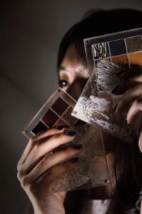
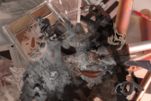
For the first picture, I cover a part of my face with pallets to show how we do our make-up. With the proper use of light, I manage to create a mood of gloom. Part of my face is light, but some part is dark. The main color is grey. It shows that cosmetics can make us look stunning and we really rely on them. For the second photo, I place colorful cosmetics in the background. This depicts the good side of cosmetics. I add a grey part to make it look like ink pouring. It also corresponds to the previous photo because you can tell that the color scheme comes from the first photo. I extract different parts of my face, like my eyes or lips, and put them on top. I adjust the transparency to make them look like my face fade under the makeup. 
Process
For photographing part 1, I tried different sides of the face with different positions of the pallets covering various parts of the face. At last, I found this position where only my eyes were shown the best because the pallets are combined together with my face. I also experimented with different lighting. I found that dim lights or lights on both sides would make my face look bad. It was better to make the light shine from the left to create good lighting.
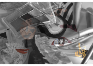
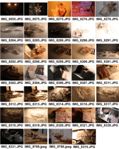
To create part 2 image, I took a variety of photos. First I tried to mix all my cosmetics together which makes the background photo. Then I copied image 1 and removed the color. I used the brush to erase the edges. After that, I used to magic wand tool to cut out the parts of my face and placed them on the image separately. During to process, I try to apply a double exposure effect to make the combination 
 more beautiful, but I couldn’t figure it out so I have to do an alternative. I also found it hard to use the brush tool properly to create the effect I want. The edges seem unnatural so I covered them with small pieces. I worried that there would be so many elements that my main point wouldn’t be obvious, so I also created one without the colorful background.
Conclusion
I will think more about the composition to make the main items stand out more to better express my ideas. I may also change the direction of the face parts to reflect image 1. I’ll also pay more attention to the connection between the two photographs. It’s also important to improve my skill to use Photoshop to better create the effect I want.