 Title
Title
Atlantis
Project Description
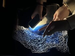
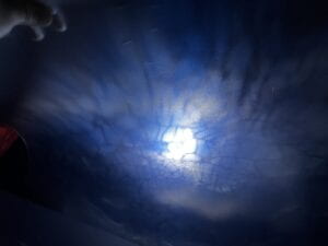
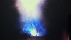
The theme of our project is the lost kingdom of Atlantis. The Lumia we create demonstrates the beginning and demise of Atlantis. We aim to use light and different materials to create the visual of the ocean and aurora. Our group noticed that many of the Lumia shows create the aurora visual, which gave us the feeling of the ocean, so we decided to make visuals of the deep ocean. The addition of material and color demonstrates the change in the kingdom of Atlantis.
Perspective and Context
Lumia is the art of light. In the reading A Radiant Manifestation in Space: Wilfred, Lumia and Light by Keely Orgeman (Yale University Press, 2017), Wilfred paid attention to the “tempo of movement, the intensity of color, and levels of brightness and darkness,” which is important for Lumia. Our project tried to establish the relationship between light and music. We used light to explore complex concepts like the born and decay of nature. The documentary Lumia mentioned that some audience heard the music while watching the Lumia, but the Lumia was in fact silent. This shows that it’s only a visual performance, but it can interact with other senses. Our project also aims to create an immersive experience.
The reading “Cosmic Consciousness” from Visual Music: Synaesthesia in Art and Music Since 1900 (Thames & Husdon, 2005) emphasizes the feature of visual music, which is “creating a kind of ideal world, a universe of linked senses in which all elements–sound, shape, color, and motion–are absorbed into one another”. Our project tries to use light to create visuals that correspond with the music and arouse all senses.
Development & Technical Implementation
Our group started by finding materials to create visuals. We decided to use the basic materials in the lab since they already have amazing reflections and could create amazing visuals. 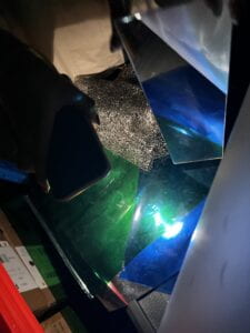 As we put the materials and different fabrics together, there were already visuals that we thought
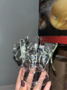
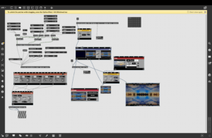
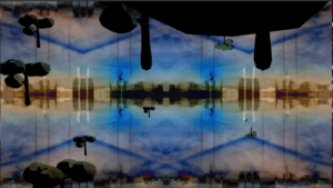
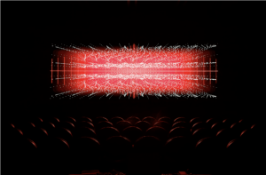
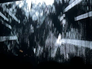
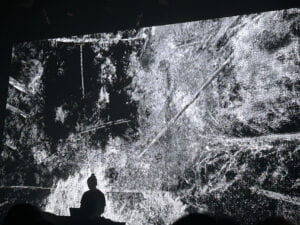
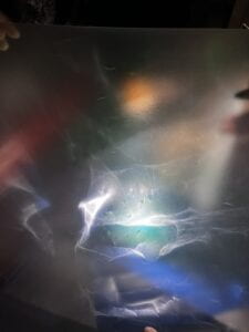 were suitable for the project. We explored many different materials and also used plastic bottles and glass to generate some visuals. The visual gives us the feeling of the deep ocean and the Atlantis. We could start with one color as the beginning stage of Atlantis, then add more colors demonstrating its development. In around 3 minutes begins the prosperous stage of Atlantis, with most colors and visual effects in Max. Around 4 minutes, we gradually take away the materials and the colors fade showing the fall of the kingdom. The audio corresponds with the visual. It starts with bubble sound, then more audio pieces gradually add up, and finally die down.
The first problem we encountered was the setup. Since we constantly need to add and reduce material, we first wanted to make a spinning installation so that the material could 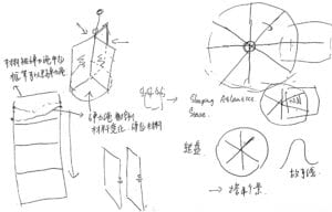
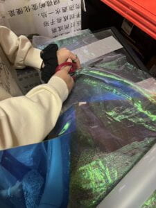
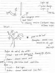 show by itself. We also thought of making a cupboard-like installation using bouncy thread so that we could take off the fabrics by moving the thread. In the end, we decided to keep it simple. We made a screen using a semitransparent and matte fabric. To avoid the wooden frame affecting the visual, we stuck silver fabric onto the frame.
The foundation of the setup is the reflective silver material and the red, blue, and green transparent paper. The light directly shines on the silver paper and the visual will be projected on the screen.


Performance
The performance was kind of unexpected. We rehearsed several times before the final review, but the first time had the best effect.
Since the pixel of the webcam is too low, we decided to use our phone, but it disconnected twice during the two performances. However, even when we were using our phones, the visual was still not as clear as expected. Also, the light was a bit low and the effect was not that good.
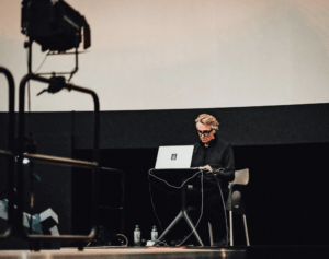
I was in charge of the audio, the overall effect was great, but some transitions were too sudden. When I turned on one module, the sound suddenly turned super big and affected the whole piece. The Max effect added was cool but we could make it correspond with audio more. Our group feels that real-time performance is really full of the unexpected.
Team Work
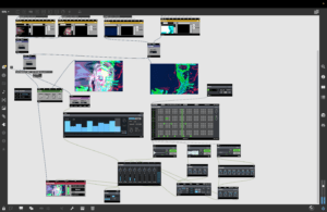
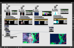
During the creation process, we came up with the theme and visuals together. When the visual was set, Chanel was in charge of adding Max effect to the visuals. Sophia and I searched for audio, made a 5-minute piece, and added the Max effect together. In the performance, I controlled the audio, Chanel controlled the visual, and Joy and Sophia managed the setup. The team communicated well.
One drawback of the collaboration for a performance like this is that the visual and audio were made separately, so it was hard to make them perfectly fit with one another. The benefit is that the use of the materials can be more complicated and create more beautiful visuals.
Conclusion
Previous research on Lumia and abstract film gave us inspiration for this project. The group’s cooperation and communication were effective. Through this project, I learned that we can create beautiful visuals with a simple setup and material. However, in real-time performance, there are full of the unexpected. The execution of the performance didn’t quite live up to our expectations, but we did our best. Most of the time, the final performance will not be satisfying and it can be hard to reproduce the visuals we thought were great in the creation process. I’d say our project is a beautiful Lumia, but lacks some creativity, especially when watching other groups’ performances. The other groups’ usage of different kinds of material other than fabric and the use of fireworks, paint, smoke, and face was very creative and inspiring. In the future, I’d like to try more like this.

 Title
Title As we put the materials and different fabrics together, there were already visuals that we thought
 were suitable for the project. We explored many different materials and also used plastic bottles and glass to generate some visuals. The visual gives us the feeling of the deep ocean and the Atlantis. We could start with one color as the beginning stage of Atlantis, then add more colors demonstrating its development. In around 3 minutes begins the prosperous stage of Atlantis, with most colors and visual effects in Max. Around 4 minutes, we gradually take away the materials and the colors fade showing the fall of the kingdom. The audio corresponds with the visual. It starts with bubble sound, then more audio pieces gradually add up, and finally die down.
 show by itself. We also thought of making a cupboard-like installation using bouncy thread so that we could take off the fabrics by moving the thread. In the end, we decided to keep it simple. We made a screen using a semitransparent and matte fabric. To avoid the wooden frame affecting the visual, we stuck silver fabric onto the frame.