Internet: Open the world to each of us. Open each of us to the world.
💻Concept:
Inspired by the TED speech “Tracking Our Online Trackers” in my EAP class, I decided to create a Diptych to show the possible danger that the Internet might pose to us under its colorful mask.
In the speech, the speaker Kovac mentioned that while the Internet opens the world to each of us, it also opens each of us to the world, which indicates that our identity, every single behavior, and every piece of information is actually being watched by the public. Therefore, while we enjoy our free search online, we should also be aware of the possible danger hidden behind it to make better use of it.
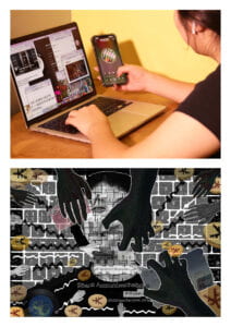
The first photo shows a person sitting in front of a computer browsing various web pages. The room is warm and bright, and the computer screen is colorful. I wanted to create a happy and relaxed mood when people see the world through the web.
The second photo has an overall dark tone. The angle of view is from behind the screen to the person sitting in front of the computer. The subject of the image is a grayish-white person with various personal information about herself on her face. She is smiling because she is oblivious to the fact that her information has been stolen, and her eyes are colored, a reflection of the web page she is viewing. On and around her face are black hands and wires. They reach out from nowhere and go straight to the subject’s personal information. There are also coins and bank cards in the image, representing the possibility of black hands using the gotten information in business transactions for money.
The image of the camera can show the bright side of the Internet, while the Photoshop image can show the dark side of it. They are two perspectives of the same scene. Only from both of them, can we see the complete Internet.
💻Process:
Part1:Staging and Photo1
In the beginning, I chose Chanel as my model. We went to a cafe for the shoot and made the first contact sheet. Although I was satisfied with the composition of two of the photos, the lighting in the cafe was too dim and did not create a bright and happy feeling. Also, Chanel’s smile was too elegant and lacked a happy feeling, so I decided to re-shoot.
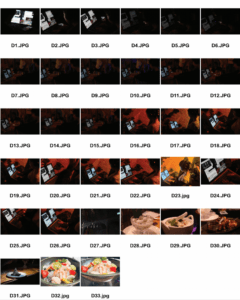
(Contact sheet ver 1)
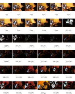 (Contact sheet final)
This time I asked another friend of mine in Commlab; her name is Michelle. We shot in the lounge on the sixth floor, because the overall lighting and atmosphere there are brighter. After comparison, I finally chose this photo.
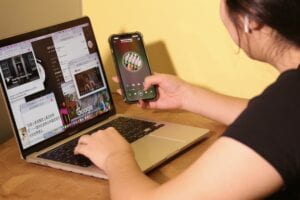
(P1 original)
The text on this photo is clearer. We will look at the computer screen according to Michelle’s gaze. The computer is more prominent as the subject.
I did a simple toning of it in Photoshop to make it a little warmer and to increase its brightness.
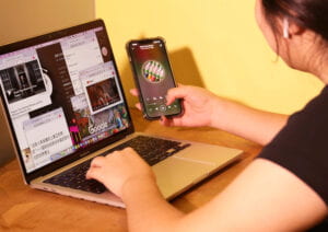
(P1 final)
Part2:Photo2
1)The face composed of information.
a.Combination of information and face.
I took a photo of Michelle’s front face and peeked her face out in Photoshop. I used the Create Mask tool to combine her face with her personal information. At first, the personal information was made up of pieces of paper that I had handwritten. They had a stitched-together feel but lacked an electronic feel.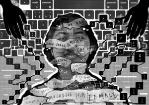
(Draft1)
So I decided to type some of Michelle’s personal information into Google’s search box to take screenshots and save them. I combined them with Michelle’s face. And used the rectangle tool in ps to spell Michelle’s name.
Then I used the stitching filter to make both the face and the message into tiny squares. And I erased some squares to create a stitched-together look.
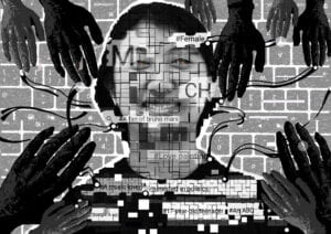
(Draft2)
b. Selection of messages.
At first, the messages I chose were rather general and did not show the scary atmosphere of privacy invasion well. I listened to Professor Inmi’s advice and added some more personal information, but at the same time, I kept some general information, because I think this information classifies people, studies people’s preferences, sells people as commodities to advertisers, and earns people’s money in an invisible way.
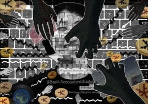
(Final Version)
2)The layout of the hands:
At first, I only placed two hands (in draft1) at the top of the picture, but later I added more hands in order to show that there were many hands behind the scenes. In the Final critique, Professor Inmi and my peers mentioned that these hands (in draft2) seemed to be just around the face and did not control the face. After consulting Professor Inmi for more advice. I made the following improvements and attempts at this.
a.Change the hand movements
First, I re-shoot the picture of the hand. The hand in the previous picture was Photoshopped from the hand of a school Halloween poster. 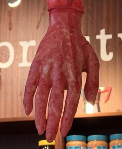 It did not have a grip but was just gently slapping the surface of a person’s face. So I retook a picture of the grasping hand.
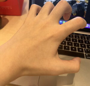
In the final version, I kept both. The extended hand represents a feeling of trying to reach the message, while the grasping hand represents a feeling of already holding the message in hand.
b.Change the scale of the hands
I took the professor’s advice to enlarge one hand and cover more parts of the face. This change adds tension to the image and better shows the main idea of black hands behind the scenes stealing information.
c. Further highlighting the hands
I used white lines around the black hand and black lines around the white hand to further emphasize the hand.
3)Eyes:
I initially used the drawing tool in PS directly to draw two colored eyes but found it a bit dull. So I went to the colored part of p1 and keyed in two circles. After the rubber retouching, it turned into a colored eye, which can echo with p1 at the same time.
4)Background and decorations:
a.Money![]() The money was not in the initial work (draft1 & draft2). I added it after Sophia gave me the suggestion in the final critique. The money was drawn on my phone’s notes app.
The money was not in the initial work (draft1 & draft2). I added it after Sophia gave me the suggestion in the final critique. The money was drawn on my phone’s notes app.
![]() I imported them into photoshop and added two filters, colored noise, and convexity, to create an electronic feel. At first, they were very saturated and a little too eye-catching to put in the frame, so I desaturated them in Photoshop and increased the transparency. This made them blend in better with the whole picture.
I imported them into photoshop and added two filters, colored noise, and convexity, to create an electronic feel. At first, they were very saturated and a little too eye-catching to put in the frame, so I desaturated them in Photoshop and increased the transparency. This made them blend in better with the whole picture.
In addition to that, I added two bank cards and a photo of a record to the image.
The bank card echoes the bank account in the facial information.
The record of Leave the door open echoes the video of Mars on the computer screen in the first picture. While it is not too frightening to have this known to the Internet as a personal preference, it shows that the Internet may keep sending people things based on their preferences to earn traffic, and over time people are trapped in an information cocoon and spend a lot of money on invisible costs.
b. Wires〰️ 〰️ At first (draft1 &2), I tried to draw the wires myself, but it was too disorganized and made the image look a bit chaotic.
So I decided to use the rectangle tool and created a few rectangles, then used the wave filter to bend them. They point from the perimeter of the screen to the center of the screen to make the screen look neater.〰️
c. Keyboard⌨️
In draft 1, the keyboard was just something I added to make the image not too empty.
In the later versions, I added the keyboard with filters such as colored noise and overexposure, blurred it, and added a white transparent rectangle on top of it to show the look of a computer monitor.
💻Conclusion:
If I had more time, the first thing I would do is work on my photography skills and take photos of higher quality.
Second, I would go further into hand movements and placement. Maybe I will try to change the hand movements and experiment to see which one has more of an invasive and predatory feel.
💻Image of Diptych:
Leave a Reply