- Zichen (Luna) Feng
Title of Music: I Love You
Artist’s Name: RIOPY
- Concept & Design:
-Inspiration and overall shape:
The song I chose is a piano piece which is an episode from the second season of the French TV series Skam. This TV series tells the story of two men falling in love and healing each other. Their love is full of joy, anticipation but tangled, twisted and full of contradictions. This song is played on the piano when one male lead goes to the other male lead’s house for the first time. The melody reminds me of a leaf involved into the wind, lightly lifting up, and finally floating down to the ground. The main character of the story is caught in a Romance like a leaf. At the same time, inspired by the illustrator exercise of contraction, I established the overall shape of the picture as a spiral wind image.
-The choose and use of letters:
The melody of the song is almost the same from beginning to end, but through the changes in speed and high and low syllables, the whole song becomes rich and not homogeneous.
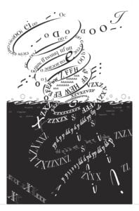
The melody at the beginning is lighter, like the meeting of the main characters. The upper right corner begins with a capital “I” and a series of wavy letters with capital “D, O” are joined by a series of repeating “O” circles. The uppermost circle has a number of lowercase “i, o, e” floating above it. These letters are dexterous and round in shape. I used them to express a sense of pleasure.
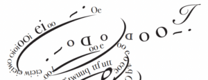
In the upper part of the picture, I used many letter “i”s to show a sense of movement.
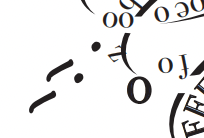
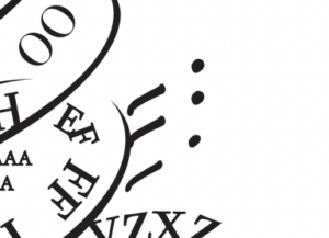
Gradually, the melody becomes urgent, as if the main character has become torn and contradictory after spending time together, so I started to mix some sharp letters, such as “f, q, w”, with the rounded letters in lowercase, and then changed them from lowercase to uppercase to show the further deepening of the torn emotion.

In the fourth “O” circle from the top to the bottom, I placed a row of capital “A “s as a shade to indicate the change of emotion.
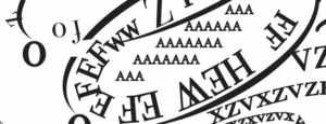
In the middle part, I used the more acute and symmetrical letters “C, Z, X” to express more contradictory and tangled emotions, and used their symmetry to divide the scene into two parts.
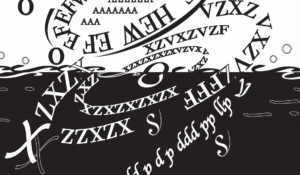
When the music entered the second half, I felt that the melody became more and more slow and low, like drowning. I wanted to use the two vertical lines consisting of “s” and “i” in the lower part of the picture to express the feeling of slow fall, which are interconnected but seem to be separated from each other. Around the vertical lines is an “S”-shaped spiral, as if trying to protect the two vertical lines in the middle, but can not grasp. They can only fall together with the two lines in the middle. “S”-shaped spiral is mainly composed of “b, p, d, p”, I tried many kinds of fonts, and finally chose this one because it brings me a feeling of falling down. And around the “S”-shaped spiral, I added some chains made of capital “X, Z”. It is like a kind of shackle to bind the spiral in the middle.
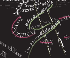
(I will introduce the letters of the middle divider in the process section.)
-The relationship between figure and ground:
In the top half of my work, the background is white and the figure is black; in the bottom half, the background is black and the figure is white. I did this to fit the emotional direction of the song and to create a sense of contrast in the image. When I want to strengthen the contrast, I make the figure thicker, and when I want to weaken the contrast, I make the letters thinner to show a gray tone.
-The use of Gestalt Theory:
-Symmetry: The whole picture is roughly symmetrical along the diagonal.
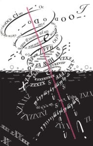
–Continuity: The whole spiral is continuous from top to bottom.
–Similarity: In the lower part of the picture, I tried to use different fonts to distinguish the different components.
-Inspiration drawn from the One Black Square Assignment:
![]()
In the One Black Square critique, the professor mentioned that we need to find ways to make the image feel extended, to make the viewer wonder what else is beyond the image, and to try not to put things in the four corners, as this tends to lock the image up. So this time I learnt from my last experience. I placed a capital ‘I’ in the top right corner, hoping that its shape would give a sense of outward extension. In the bottom left corner, for balance and echo, I placed a chain of “X’s”, consisting of a thicker “X” and a thinner “X”. I hope this will create a sense of mystery and allows the viewer to imagine.
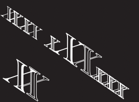
Also, in the One Black Square assignment, we had to create pieces that were not too figurative. And all my work at the time was too figurative. So I learnt from the last time and stopped thinking about figurative things. Instead, I focused on the emotions that the piece could bring to me. And let them lead me to think about the organization of the letters.
- Process:
-Beginning:
At first, I wanted to use some letters to form a chain as a background to wrap around the spiral, and show the melody and emotion of the piece by loosing it from the spiral and rewinding it to the spiral. But after trying, I found that this would make the picture too cluttered and would reduce the flexibility of the spiral, so I gave up the idea. Then, the idea of dividing the background of the picture into black and white came to my mind. Also, I placed a row of “X”s at the dividing line to divide the image and hoped to show a sense of contradiction and entanglement by doing so. But the result was not as good as I had hoped. 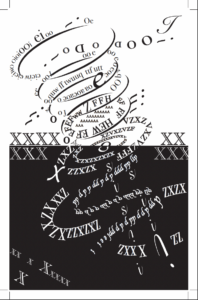
-Midterm Critique:
In Mid-critique, the professor mentioned that the dividing line in the middle was not interesting enough. Meanwhile, my peers pointed out that the direction of my spiral in the second half was not clear enough. I then made modifications to these two deficiencies.
-As for the dividing line, I first removed the chain consisting of two “X”s. To make the top and bottom parts less cut off, I considered turning the dividing line into a curve. This reminded me of a wave, so I tried to add some bubbles made of “o”s above it and some bubbles made of “i”s below it. The result looks good! ( I thought so myself.) But I soon realized that this might not fit our assignment‘s requirement. I wasn’t very clear on this point and wasn’t sure how to express this doubt in English. So I wrote an email in Chinese to ask Professor Ian for some advice. He suggested to me to use some letters to create the curve. Based on this suggestion, I made adjustments again and used some consecutive “S” to create a wave effect.
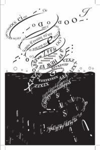
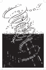
-In order to make the lines in the bottom half more clear, I simply deleted the original composition of the picture completely. Then, I reassembled an S-shaped spiral. As for the chain that was originally around it, I didn’t know how to place it, so I simply deleted it.
-Final Critique:
In Final Critique, Professor Inmi asked me about the whereabouts of the beautiful second half of my original work. Based on the professor’s suggestion, I decided to revive the original second half. On this basis, in order to make the lines clearer, I hollowed out the letters of the “S” shaped spiral that should surround the part behind the falling letters in the middle, hoping to create a sense of space and better explain the direction of the spiral.
- Conclusion:
This project is interesting, but also very time-consuming. I think a big part of the reason why it took so much time was because I was not proficient in using Illustrator and I was not familiar with many of its features. So if I had more time to complete this task, I would first of all practice some of its functions more before I start designing. Secondly, I should try more to adjust the changes suggested by the professor and peers in the mid critique. Try more possibilities. For example, I might not only divide my picture into two parts in black and white, but also create more black and white variations through the arrangement of letters; or I might try my original idea of using letters to create chains and chains again to see if I can create a more interesting design by adjusting and integrating the shapes; or I might look for a way to make the “S” spiral in the lower half of the chain to make it more beautiful and clear.
- Image of Project:

Leave a Reply