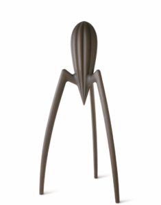
One of the designs that I don’t like is the Juicy Salif:
I don’t have a real reason why I do not like this design except for the fact that I find it very off putting. It reminds me of an alien, spider, and cactus all at once. I see no reason why someone would want this in their house or in their office space. It is also very bland. There is no color so the only place I could see this would be in a dreary dystopian looking place that sucks the life out of you as soon as you enter the premises. Though it is designed to be a lemon squeezer, it doesn’t look very helpful as it looks like people would struggle to juice the lemon without getting their hands all sticky. Additionally it doesn’t look very ergonomic friendly and I think that many people who struggle with grip would not be able to use this item.
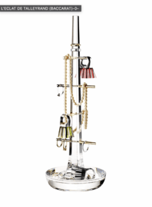
One design that I really like is L’ECLAT DE TALLEYRAND (BACCARAT):
I really like this design because it is very simple but the designer made it in a way that looks very luxurious. I like it because it can be used as a center piece on a table but also can be used on a night stand or a vanity. There are many uses for this item not just to organize your own jewelry. This design drew me in because its sleek, clean, and simple. I don’t like designs that are very “extra” meaning including things that are not necessary for the use of the item.
Links:
https://www.starck.com/
