Challenge 1: Unnecessary Inventions and Whimsical Devices


Challenge 1: Unnecessary Inventions and Whimsical Devices


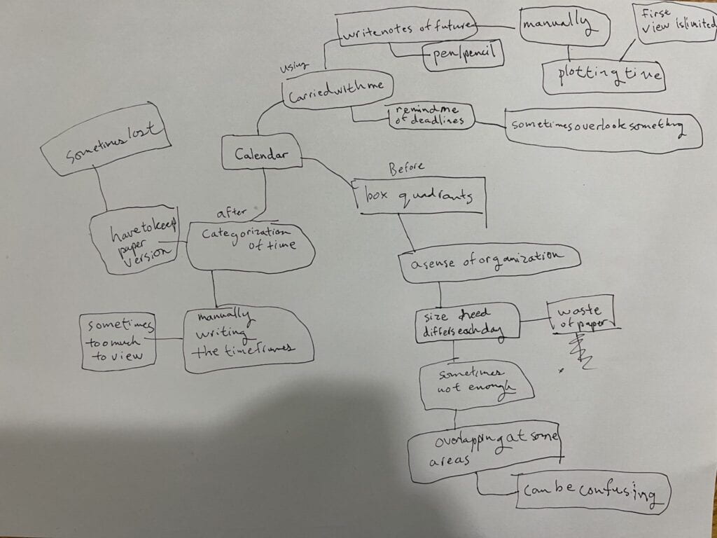
For the ambient interface, I feel that the “tap” and “movement” signal works best with the ambient interface of a calendar. I enjoy the tap signal because it catches the awareness of the person through the sound while not being very noisy. It would a sort of alarm in a sense. Likewise for movement, I feel that people are often overwhelmed with the tasks that they have and I feel that seeing the number of tasks you have planned for the day through the signal pointing up aids in pushing people to accomplish tasks to reduce the number of calendar events left.
I think that if this signal was added to a calendar, I would speculate that the end result would be one that is a reminder of the tasks you have remaining through the movement signal and the tap signal to notify that it’s time to move on to the next time. It would be a sort of task manager that reminds you that you have to complete things in a certain amount of time. Through this, I would imagine that the end result is that whenever you write on this calendar, it will be like notion which has the task bar for the day. According to the number of tasks you have planned, it would point up a number to let you know how much is planned. Afterwards, there will be the tap to tell you to move to the next task or as a reminder of how much time is left, similar to people in the SAT test rooms saying 10 minutes left to complete it. After you finish, you can cross the item out in the calendar. By this, I mean that the number reflected in movement will lower by one and you might also receive a response of a tap to resemble an applause to get you in the flow of the next task.
I feel that there isn’t much more that I would add to the calendar as the others don’t apply to well to create a momentum in the day where shadow is too noticeable and irritating, Rhythm likewise stops the flow through the sound. For the button, it could be a feature added to initiate the movement, but it’s not necessary. I feel that air doesn’t have too much do to with a calendar as it might be too subtle or too disturbing.
Something that I think about that I have interactions with everyday would be a calendar. I feel that in this day and age, there is endless information. We have to keep track of time in a time-lacking society. We have to think about the world linearly in terms of time and subject ourselves to endless schedules.
Some interactions with the calendar is the actual state of writing things down. Everything we write will have to be thought out and planned. We must have an idea of time and how it interlinks with others. We must keep time in a linear manner only to drown in the robotic nature of the time and work system of society. We must also use the calendar to plan our future… plan the unknown.
As our world intersects more and more with mixed reality, augmented reality, and virtual reality. I feel that there will be an intersection of the realities with physical reality in the way that we interact with the world.
Nowadays, I would consider the world to be interacting through a digital reality. Currently, how we interact with the world, especially in metropolis cities such as Shanghai, Shenzhen, or Tokyo, we revolve around the phone and mobile device. In China, there has been a push of having the digital become integrated within the lives of people. We can understand this through how people move and interact in the world, be it WeChat Pay, delivery apps, social media, and even health codes… Everything. When this happens, our understanding of interacting with the world has already been changed and evolved compared to China 10 years ago.
In such a fast changing society, I feel that the future of reality is coming and it will become implemented faster than we expect. It won’t merely be as simple as the digital reality phase in which we still feel within the physical reality, but it will be augmented reality as the central form of reality. When we move to the counter, we may see the digital reality in 3D space. When we complete homework, we may have an educational interface that can be seen through glasses. This brings in positives such as more articulation for people in education and daily life. It can make things more efficient as well as provide more personalized assistance to others, however this sort of world will also cause issues of inequality as well as leave hundreds of millions of people “left behind”. I remember that there were statistics saying that over 20% of the elderly in China do not have a mobile phone at all. When there is such a disconnect, it scares me to wonder how many others will be left behind in this rapidly developing society.
Who will be left to resolve physical world issues?
How will society be more complicated and intersected?
How will the “left behind” stay in society?
The bad. That’s that.
Dieter Rams is a revolutionary industrial designer who has essentially created the standards for the industrial design industry. Having previously worked at Braun as the design director for over 30 years, Braun has excessive experience creating the designs for Braun but it is also speculated that he left Braun because every design is being repeated, causing waste and defying his theory of products being long-lasting. Rams discusses the 10 principles of good design which are the following.
It is when these 10 principles are considered and met that good design exists where the most critical to Rams might be the factor of being long-lasting.
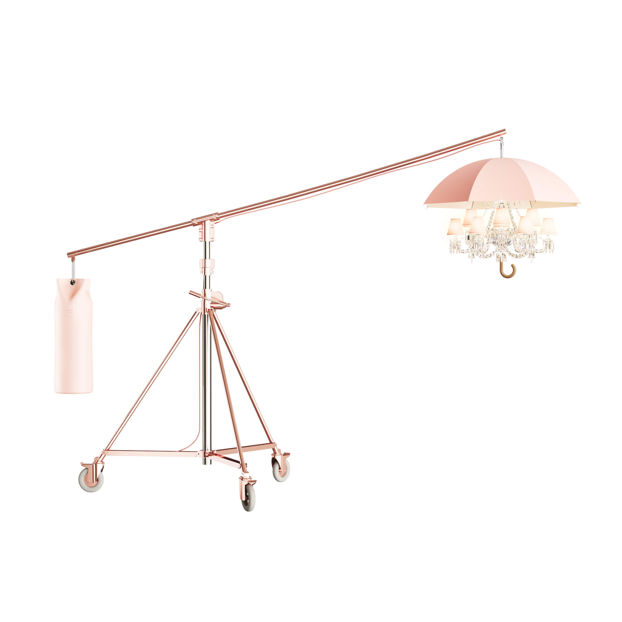
If we consider Starck in relation to the theories, Starck makes a lot of interesting designs that follow most of the theories except that it’s not as little design as possible and that it may not be long-lasting/environmentally-friendly. I feel that if we consider the lamp that he designed, it truly isn’t something that appears to be minimalistic in design. There’s a lot to the design that isn’t even necessary such as the crystals on the lamp. If we consider the product in terms of understandability, I would argue that it lacks intuitiveness. People do not understand exactly how to use the lamp when they see it which is the problem. If we consider that the product isn’t even good intuitively, it could be argued that the product doesn’t fulfill a true need of users to be useful, hence the production of it could be considered as not being environmentally-friendly, despite having innovation in the aesthetic aspect of the product.
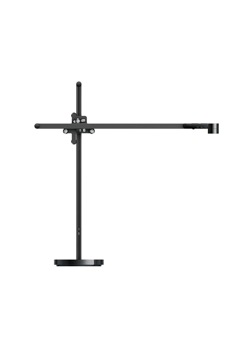
If we consider Dyson in relation to Rams, I would argue that Dyson fulfills more of the principles of Rams for the same product of a lamp. When we view the functionality or features of this product, It’s meant to provide accessibility to the user in terms of how they use it, but also provide sustainability within this product. This could be understood by the design theory of Dyson to make this last 60 years which is more than half a lifetime in most cases. When a product is made to be minimalistic in design while still fulfilling user needs of rearranging the lights for viewing, it can be argued that it fulfills the principles of good design. Even the lighting of the lamp is designed in a way that is meant to have the user experience light in a natural way, showing the designing of products to the smallest details. Therefore, if I were to consider both Dyson and Starck in relation to how they design while noting the principles of good design, I would say that the two differ in their intention of design. While both are innovative and provide amazing design, what makes Dyson stand out is his vision of clarity and purpose within his designs. All of his designs are meant to solve issues for the long term, not be something that fulfills functions for a short while.
Lastly, if I were to consider something designed that is a good example of a good design, I would consider my eco-friendly utensil kit. Being made of recycled plastic, it is something that I can bring around without too much of a hassle. I can use it to fulfill my eating needs and everything can be stored back to one area for when I eat. I guess this is something that does have good intention behind it which fuels the determination of it to be good design.
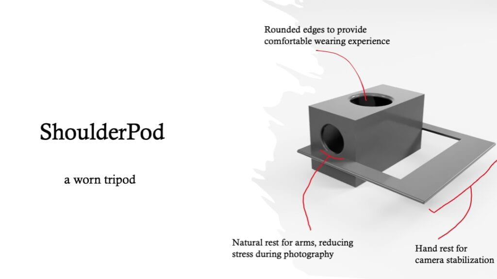
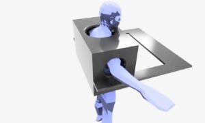
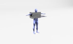
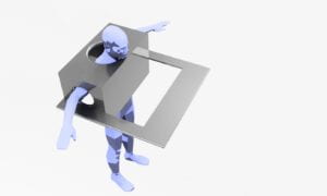
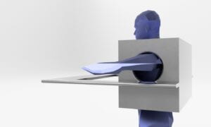
For this week, I modified the dimensions of my product according to my own dimensions and added a human model from TurboSquid. Due to the models not having the ideal arm position, I wasn’t able to modify it to the intended design.
Below is the render of the product in a white environment. There is an armrest to allow the user to keep their arms out.
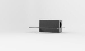
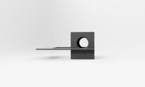
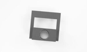
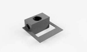
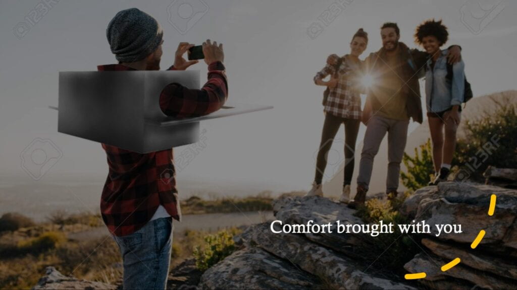
Renders in a snowy environment with the sunrise. I would imagine that one would use this as an armrest during traveling.
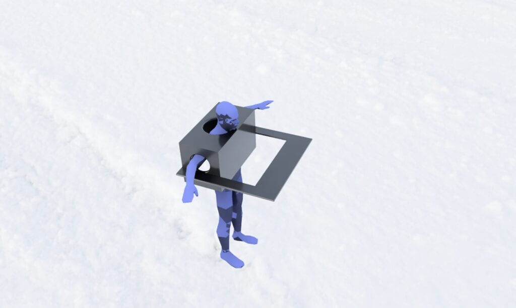
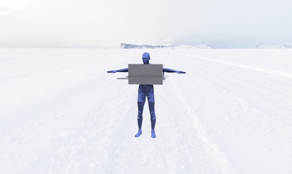

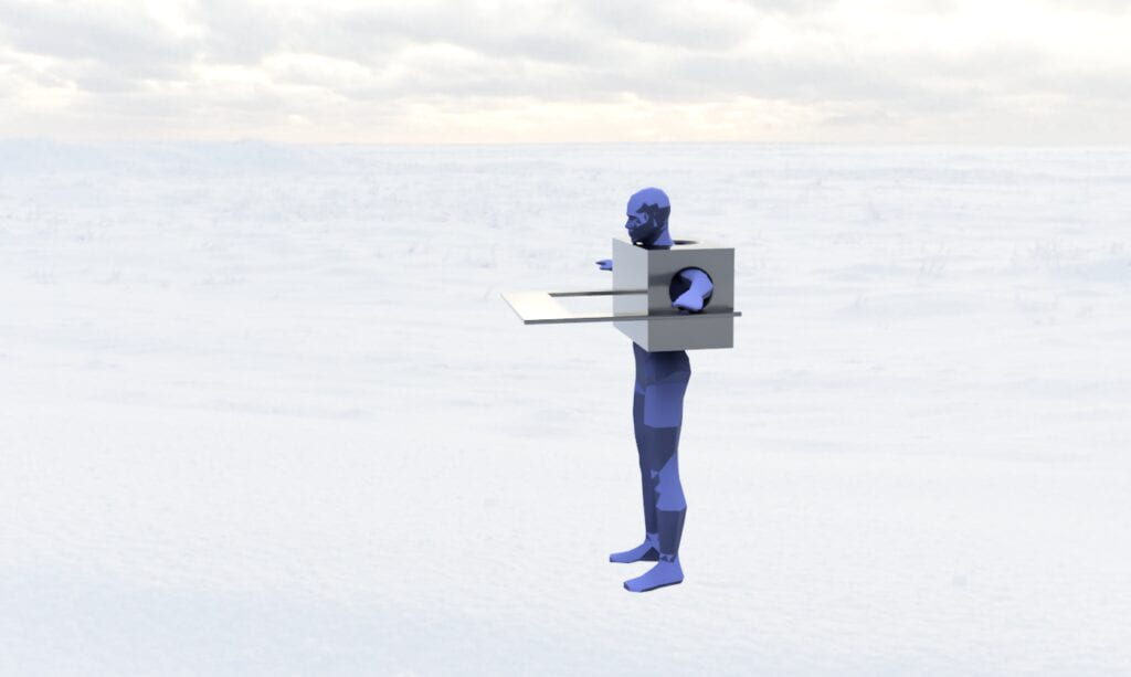
Renders on perspectives of the product

James Dyson is an industrial designer most famously known innovating the vacuum cleaner and dryers. As someone with the philosophy of making change one single step of a time, Dyson is one who does not yield to the classic designer schema. With every prototype, he learns from his shortcomings and develops more ideas as he progresses, even making 5000 prototypes for the vacuum cleaner of 1983. Furthermore, Dyson takes on a rather artistic perspective to resolve issues. Rather than understanding the science behind something, Dyson observes, prototypes, and experiments to understand what he works with, often developing another way of making something. For his most famous work of a vacuum cleaner, it’s from the experience of being angry because of how loud the noise from a vacuum cleaner is. It was through Dyson’s close observations of how the vacuum bag works that his designs continued to evolve from there.

For products, I felt that the lamp was interesting in terms of how it is mimicking nature and trying to bring the natural to industrial design. Having features of tracking the lighting and time to reflect the source of light as well as adaptation of light level, the Dyson lightcycle offers new ways for modern era humans to experience the world around them. Being a photographer, I observe and study the sun’s movement whenever I complete my jobs. I understand how light works so I can also know the change, but it is also this natural observation of light that it’s ingrained into our nocturnal cycle. Likewise, I feel that the Dyson lightcycle offers a product that can normalize our circadian rhythm which is something I really enjoy about it (aside from the minimalistic classy design).
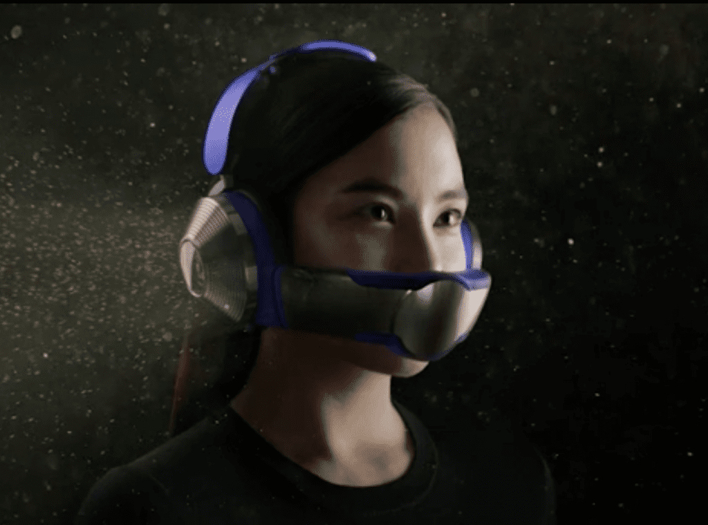
On the other hand, the airpurifier headphones are something that I would say that I’m curious of. Currently, I do not have a positive or negative opinion on this product, but this product is one that sticks out to me due to the reality I could see that this is worn. Being someone that really cares about the air I’m breathing, especially, being slightly germaphobic due to bad experience of being sick, I feel that this product is something that I might use. At the same time, I wonder how accessible this will be in terms of reusing the products. For example, in the case that the earphones don’t work anymore or the airpurifier doesn’t work, I’m not sure how I can imagine using this product.
Philippe Starck is a designer that designs beautiful aesthetic works that have a refined feature about them, often making controversial designs as a means of expressing creativity. When Philippe does do this, it often values the aesthetics of a product over the ergonomics which often defines the user experience. Therefore, I would consider Starck to be more of a designer for himself rather than a designer for the people.
Design I Like
I liked the Baby Our Fire design by Starck which is essentially a candle holder, but designed in a way that it actually filters the light to be more warm and radiant in output. For this design, there is also a clarity for the center of the candle which shows the fire. This really struck to me as it sort of controls the radiance and clarity of light, but does it in an very artistic, aesthetic means. I feel that for this then, it would be a strong product that offers both the aesthetics and the functionality, especially as it’s smaller.

Design I Don’t Like
With such a classy angle for this lamp, I feel that the aesthetics have been brought to another level. Everything is very elegant and classy, yet there lacks common sense behind the design. I feel that specifically, the stand of the lamp is excessive. It’s huge and portable, but with it is a bold statement of luxury. I feel that this is further shown in the chandelier aspect which has many lights and crystals. It allows for light, but the necessity of a standing lamp needing multiple lights and crystals is close to zero. I feel that the overall structure and balance is something I appreciate, but there is too much “luxury” designed of it, albeit creative.

Steps
I first created the basic box of a human body to allow me to understand the proportions as well as size of the product before adding the add-on. 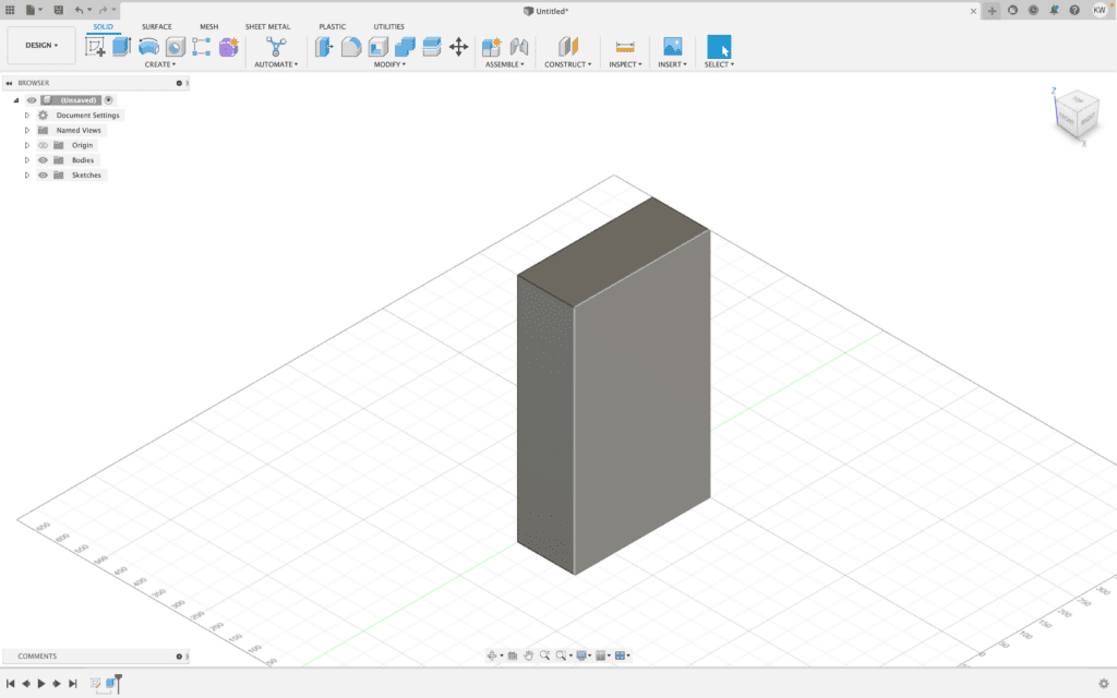
Afterwards, I added holes and the extension part for my hand to rest on. This would then have additional parts with the fillet near the shoulder to guide the way of the hand and not have too sharp of a corner by the shoulder.
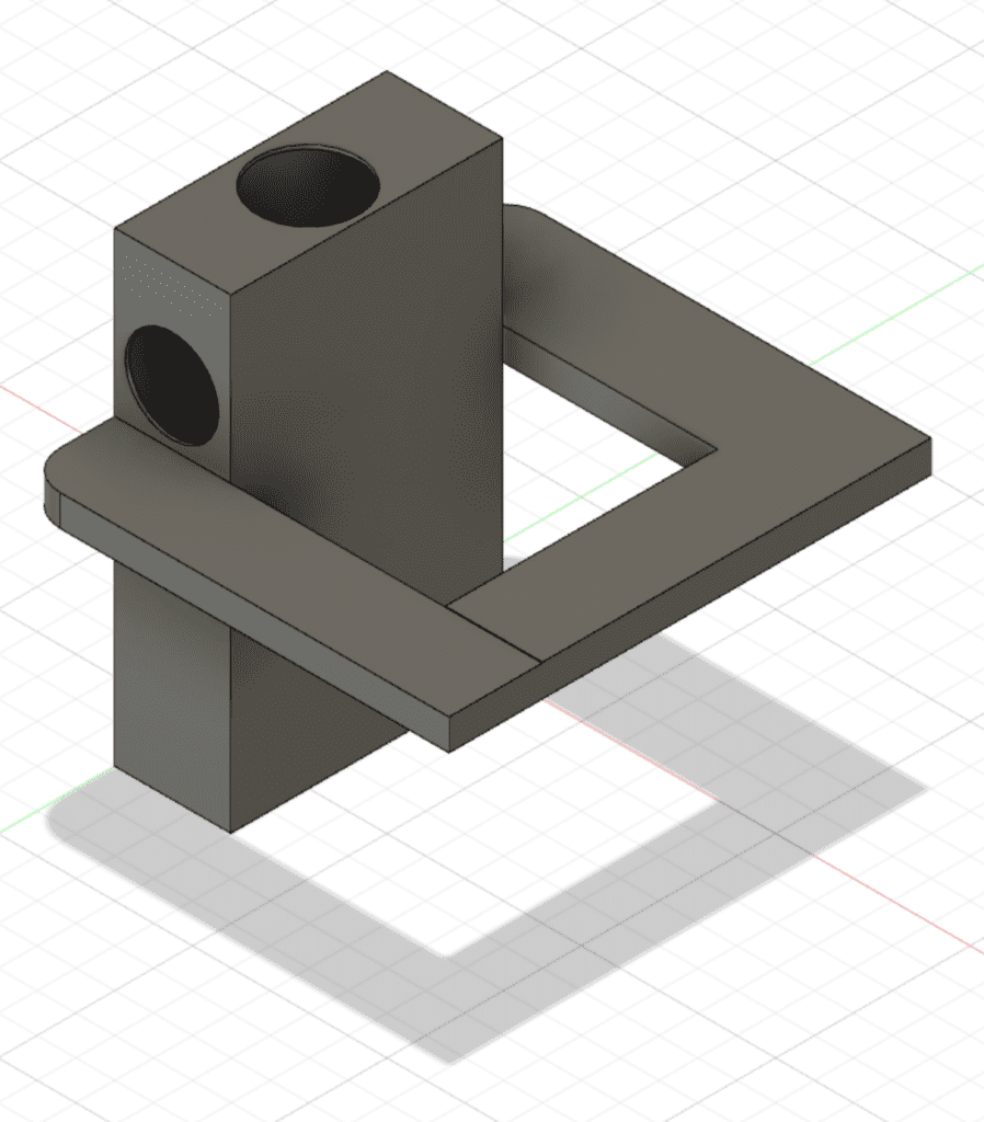
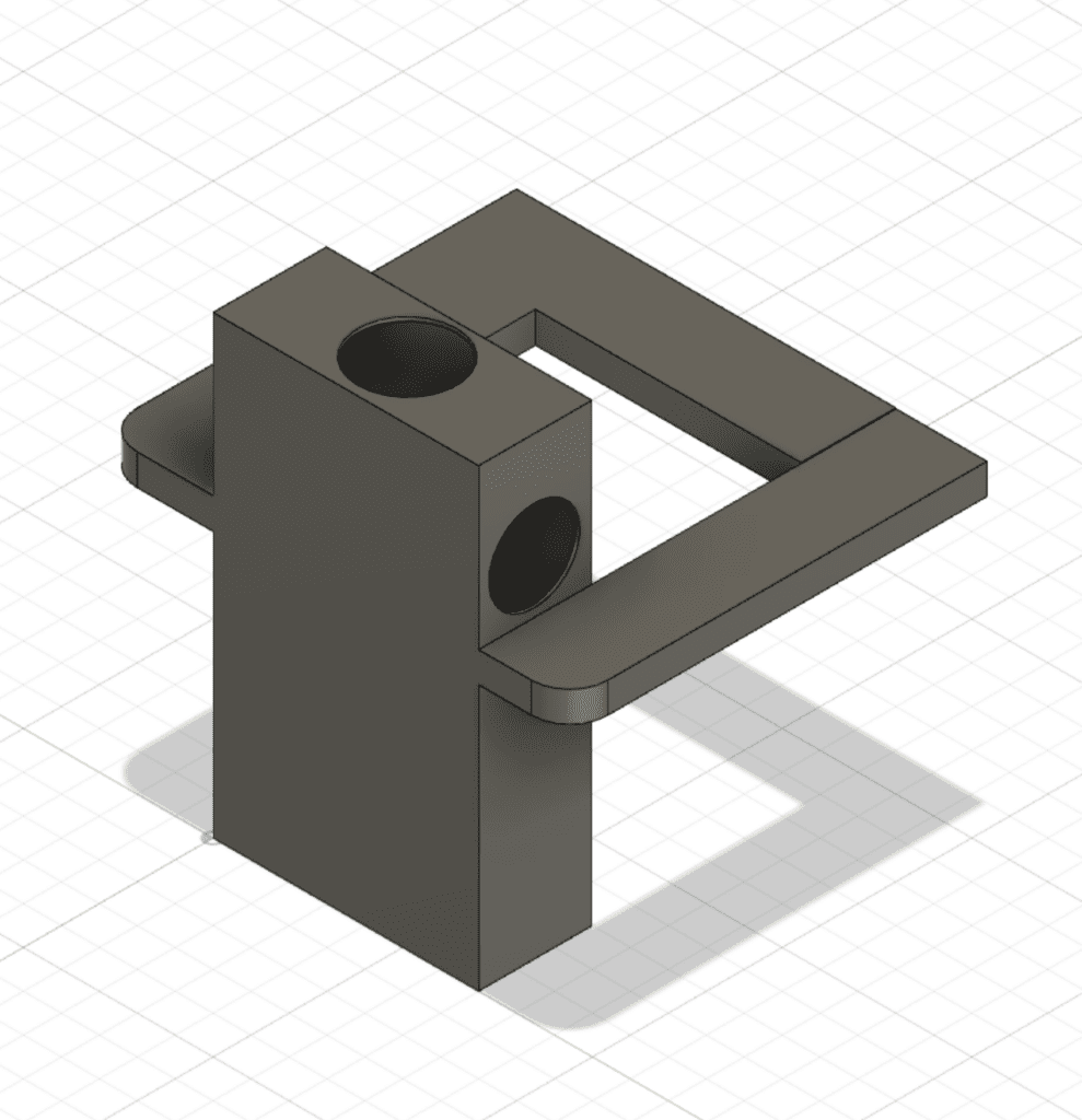
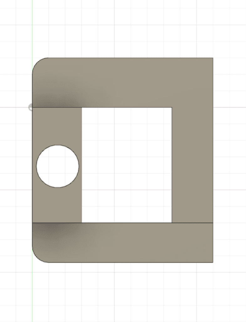
After all this was done, I essentially measured or considered it with my sketch model where the sizes were kind of similar.
Personally, I feel that the Hustwit video of Smart Design really connected to me when they said that they design for the most extremes. I felt that this is the case for a lot of successful products due to the applicability and the accessibility to all. When considering products that spoke to me in that aspect, I immediately thought of two products I use on a normal basis and love. Due to continuous use, it was the connection that I felt with the product that basically would make me not stray away from using it.
The first would be my digital camera. Personally, I feel that a camera is one’s window to the soul. It is the continuous use of it that develops this emotional connection to the extent of it configuring how you would live your life. Many times, it isn’t the camera’s functionality of stopping time that is valuable, but the connection of it to yourself that you continuously like to use it. This, in connection with the camera lens, is what defines the experience of the user. Having taken over 200,000 photos in the past year, I’ve found that the connection that I have with my camera becomes extremely strong. I know exactly when, how, where, and why I would use it. It is also this aspect that I feel that emotional design is something that causes you to grow into the design. The camera, however, is a smart design. There are ergonomics that go to the grip, to the size of the viewfinder, where the adjustments for shutter speed, iso, and aperture are adjusted and more. It was designed to allow the user a simple and brainless experience. While it was done so, there are still often a lack of user friendliness or user optimization. When this happens, the flaws pop up, but it is the emotional connection that fixes and covers the flaws such as the design of the focus on my Sony Camera.
Another smart product that I enjoy using would be the Zojirushi thermal cup. Having the functionality of keeping the temperature warm or cool for half a day, it allows me to essentially bring warmth or chill drinks with me. I can use it in the winter and in the summer depending on what needs I have then. The design of the Zojirushi thermal cup allows me to not feel the heat from the external touch. In this sense, I feel that there is an understanding of the user to not feel things that are too hot or too cold which would keep it user-friendly when holding it during a trip. Furthermore, being something that I drink water from, it is something that I become dependent on, hence creating this emotional connection. When I travel, I would always think about this as one of my key products to bring without realizing it.